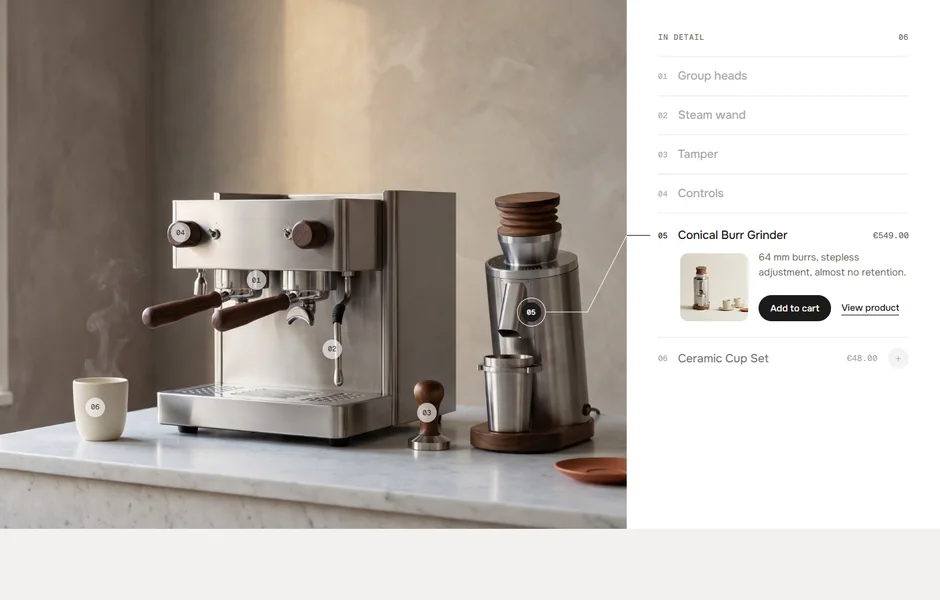
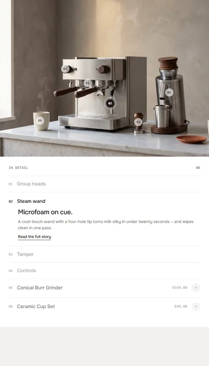
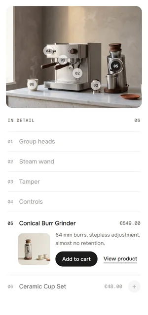
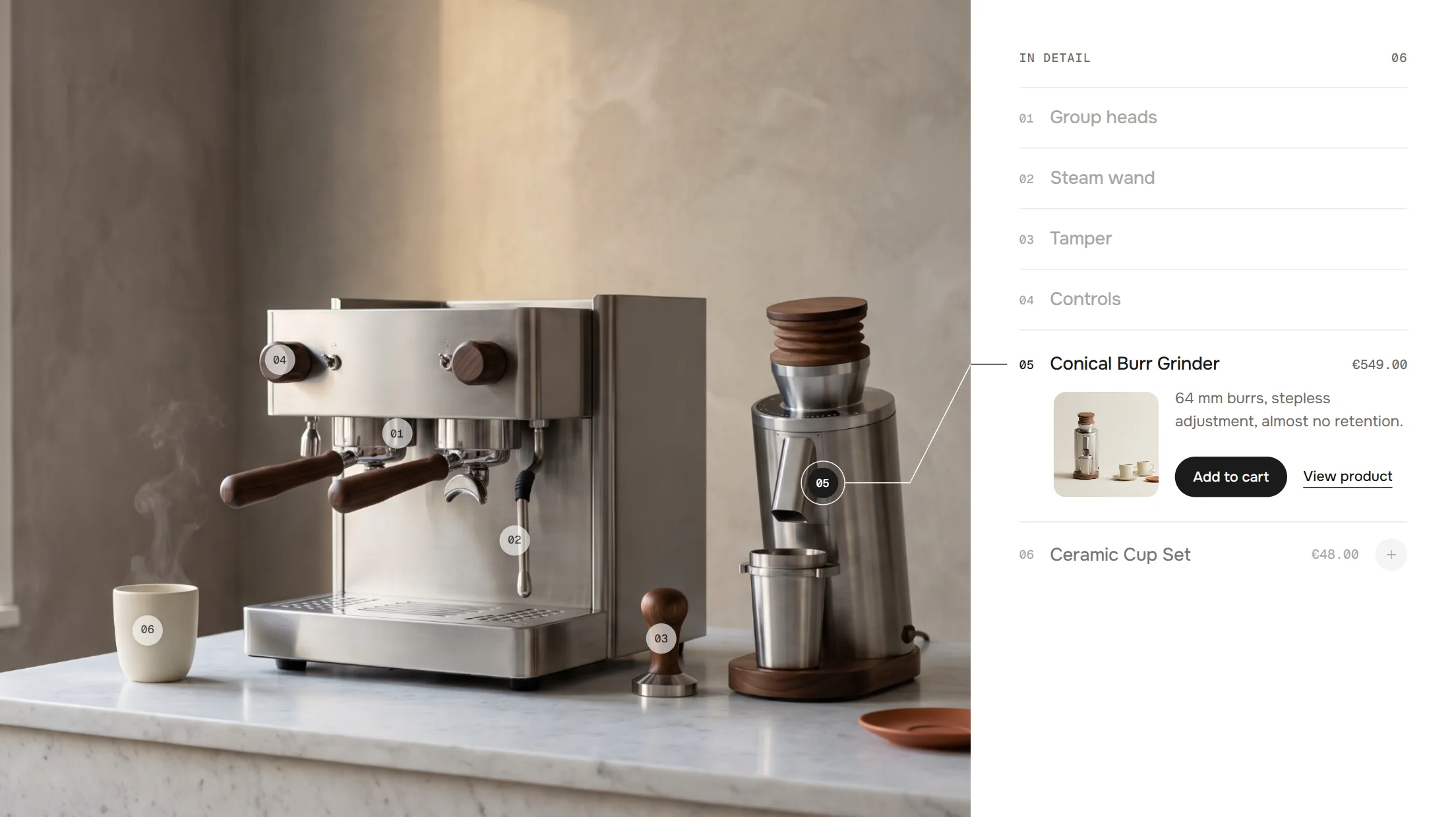
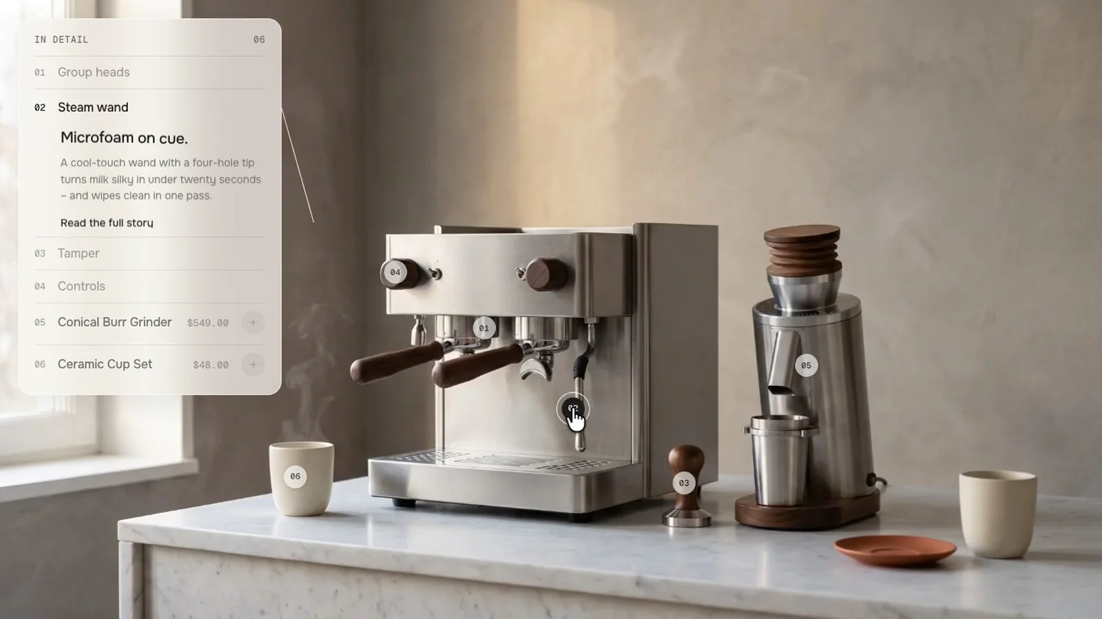
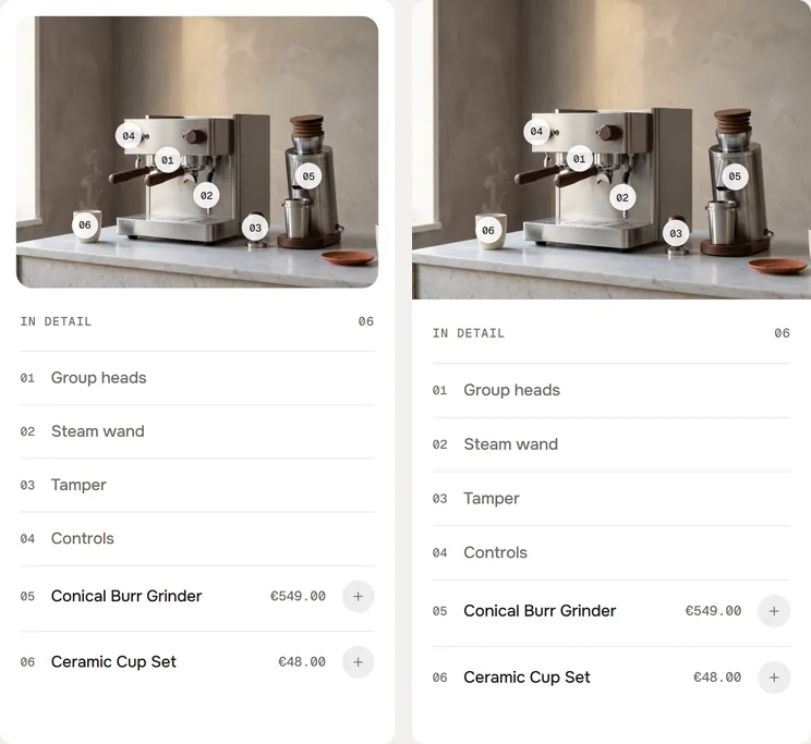
The image sits next to a numbered list of everything in it. Hover a row and a leader line with a running dot points to the spot; products can be added to the cart right in the row.
In your theme code editor (Online Store → ⋯ → Edit code), click the sections folder, then “New File”, name it and hit Enter.
02
Paste the code
In the file that just opened, paste the code below. Then hit Save (top right corner).
Note: Shopify shows no confirmation when a section saves – that’s normal.
03
Add it in the theme editor
Saved? Then reload the theme editor – otherwise the new section sometimes doesn’t show up. After that: Edit theme → Add section → . Everything else is in the sidebar – the Docs below explain every setting.
Code
One file. Copy it, paste it, done.
sections/werk-hotspot-index.liquid
Locked
{%- comment -%} werk · Hotspot Index · v1.5.0 · werk.build/license – do not remove {%- endcomment -%}{%- liquid assign s = section.settings # Demo images and fonts load from the werk demo store's Files (Shopify CDN), so the section looks the same in any store. assign werk_cdn = 'https://cdn.shopify.com/s/files/1/0954/8303/5932/files/' assign demo_hero = 'werk-hotspot-index-hero.jpg' | prepend: werk_cdn | append: '?v=1' assign demo_ratio = 1.7921 assign demo_w = 2000 assign demo_h = 1116 assign demo_alt = 'Stainless steel espresso machine with walnut handles, a grinder, a tamper and cups on a marble counter' assign demo_cards = 'werk-hotspot-index-group-head.jpg,werk-hotspot-index-steam-wand.jpg,werk-hotspot-index-tamper.jpg' | split: ',' assign demo_pack = 'werk-hotspot-index-products.jpg' | prepend: werk_cdn | append: '?v=1'
2599 lines · Liquid, CSS & vanilla JS
Free – just add your email
Every section is free during launch. Enter your email once and copy any code you like.
Edit theme → Home page, or the product, collection or landing page template you want the section on.
2
Add the section
Add section → . The preset brings six blocks on the demo espresso machine – four Feature and two Product – and runs edge to edge without padding.
3
Pick your image
Image → select or upload your picture. Set its focal point in the Shopify admin if the important part isn’t in the middle.
4
Place the hotspots
Click a block – its row opens – and move Position X and Y until the number sits on the detail. Drag the blocks into the order the list should read.
5
Fill the rows
Feature: label, heading, text, link. Product: pick the product – price, thumbnail and add to cart come with it. Then save and look at it once on your phone.
One row per hotspot
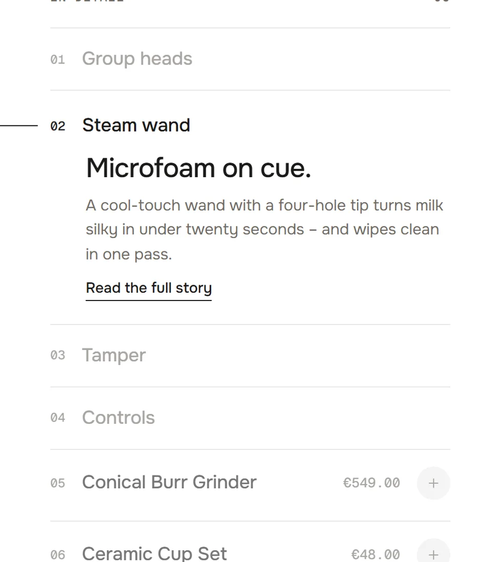
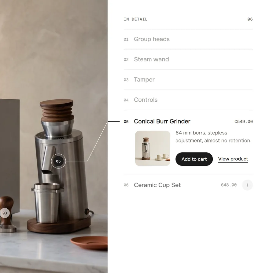
The image takes two thirds of the section, the list the rest. Tap a row or a number on the image and the row opens – one at a time; tap it again to close. Hovering a row lights up its number on the image, and the other way round.
Closed · the row opens · open, with the line to its number
The line
On desktop a thin line draws from the number on the image to the open row, and a small dot runs along it once. It follows when the section resizes.
Feature rows and product rows
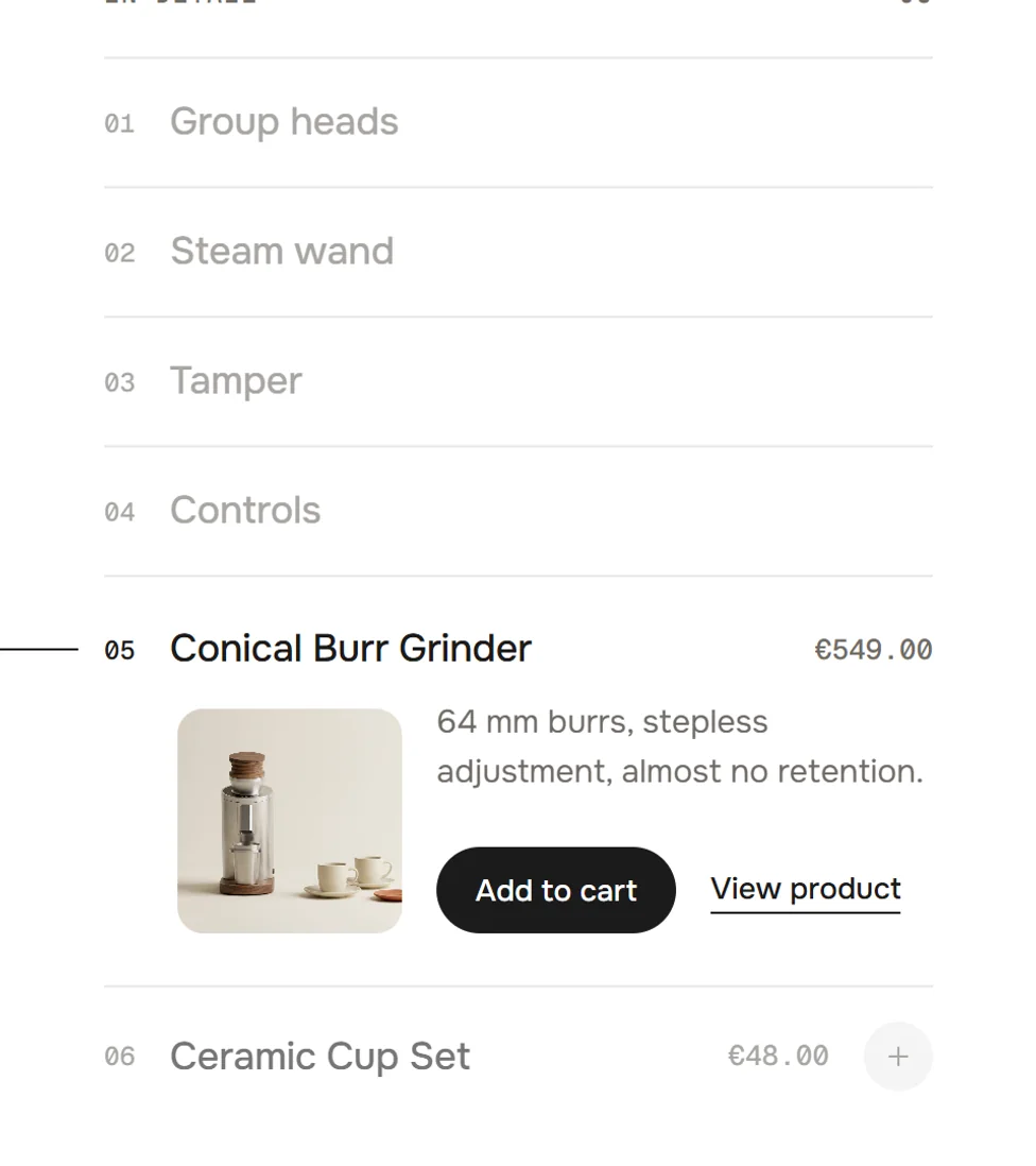
Feature rows open with a heading, a text and a link – no picture, the image is right next to them. Product rows show their price in the row and open with a thumbnail, the short text, Add to cart and View product.
FeatureProduct
Quick add
Closed product rows carry a round plus. One tap adds the product without opening the row: the plus turns, a spinner, then a check that draws itself. Sold-out products show “Sold out” instead.
+ → loading → ✓
After “Add to cart”
In an open product row the button rolls to a spinner, then to a check with “Added”, and a small dot flies to the cart icon. No cart drawer opens: the theme hears about the new item, so cart counts that listen update.
Add to cart → loading → ✓ Added
Hotspots stay in the frame
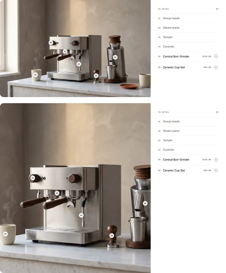
When the frame crops your image – another ratio, a share of the screen, a phone – the image slides so every number stays inside, starting from its focal point. A number that still doesn’t fit is hidden; its row stays in the list.
Good to know
The theme editor opens the row
Select a block in the sidebar and its row opens on the preview – handy while you move the number. Deselect it and the row closes.
Keyboard and screen readers
Rows and numbers are buttons. Enter opens a row, Esc closes it. Screen readers hear each row as open or closed.
Demo content until you pick your own
Without an image the section shows the demo espresso machine. Product blocks without a product show a demo product – its Add to cart opens your catalogue and adds nothing.
Words in the section
Add to cart, Added, Sold out and View product are English and can’t be changed yet. Everything else is yours – heading, labels, texts, links.
Cart counts
After adding, the section sends two cart events. Horizon listens and updates right away; in Dawn and the themes built on it the section refreshes the cart count and drawer itself. Other themes catch up on the next page.
shopify:cart:lines-update · cart:refresh
Look
Default · Classic
ClassicThe numbered list sits in its own column next to the image.
LegendThe image takes the full width and the list floats over it like a map legend, in frosted glass. Rows open in place, a thin line runs from the row to its pin. On tablets and phones the legend turns into a row of number chips; tapping a pin or chip opens the item under the chips (on phones as a glass sheet at the bottom). Card position has no effect here.
Legend position
Default · Top left
Top left, top right, bottom left or bottom right – desktop only. Pick the calmest corner of your image: the legend covers what's behind it.
Only visible in the Legend look
Image
Shows the demo espresso machine until you pick your own. Upload your own for the best speed and privacy. The crop starts at the image’s focal point – set it in the Shopify admin when you open the image.
Height
Default · Image ratio
Image ratioThe section keeps a fixed shape, one for desktop and one for tablet and phone.
Share of screenThe section takes a part of the screen height, whatever the image’s shape.
Image ratio · desktop
Default · 16:9
From 990 px up. 16:9, 21:9, 3:2, 4:3 or Original. On desktop it is the shape of the whole section – image and list together. A long open row makes the section taller, and the image grows with it.
21:9 · 4:3
Image ratio · tablet & mobile
Default · 4:3
Below 990 px, where the list sits under the image: the shape of the image alone. Original, 4:3, 1:1 or 4:5.
Fit to screen height
Default · On
Keeps the image within one screen, below a sticky header. When that would cut numbers off, the image grows just enough to show them.
Height · desktop / Height · tablet & mobile
Default · 80 % / 60 %
30–100 % of the screen below a sticky header, padding included, never lower than 320 px. Only shows with Height: Share of screen. The image crops around its focal point.
Full width on mobile
Default · Off
Below 750 px. Off: the image sits inset with a 16 px margin and rounded corners. On: edge to edge.
Off · On
Placing a hotspot
Position X and Y are measured in % of the image from its top left corner, so a number stays on its detail at every size and crop.
Feature
A detail of the image: a row with a heading, a text and a link.
SettingWhat it doesDefault
LabelThe name in the row and what screen readers hear.Detail
Position X / Position YWhere the number sits, in % of the image.50 %
Card imageNot shown in Index – the image is right next to the list.Empty
HeadingThe big line in the open row.A detail worth a closer look.
TextOne or two sentences.Tell the story behind …
Link label / LinkA text link under the text. Shows when both are filled.Empty
Product
A Shopify product: a row with its price and quick add, open with a thumbnail and the buttons.
SettingWhat it doesDefault
ProductThe product. Empty = a demo product.Empty
LabelThe name in the row. Empty = the product title.Empty
Position X / Position YWhere the number sits, in % of the image.50 %
Image overrideAnother thumbnail. Empty = the product’s featured image.Empty
Short textNext to the thumbnail in the open row.Empty
Show add to cartOff: no quick add and no Add to cart – only View product.On
Card position
Default · Right
Which side the list sits on, from 990 px up. Below it the list always follows the image.
RightImage left, list right.
LeftList left, image right.
Only visible in the Classic look
Index heading
Default · In detail
The small line above the list, with the number of hotspots on the right. Empty = no heading line.
Open first hotspot on load
Default · Off
Opens row 01 as soon as the section comes into view. From 750 px up.
Show label on hover
Default · On
No effect in Index – the list already names every hotspot, and hovering a row lights up its number.
Animations & easing
Default · On · werk Signature
Off: everything switches without movement. Visitors who turned on “reduce motion” on their device get the same. Easing sets the feel of every movement.
werk SignatureSlow start, soft landing
SmoothEven and quiet
BounceA small overshoot
SnapQuick start, gentle stop
GlideSlow in, slow out
Seed entrance
Default · On
When the section scrolls into view, a dot appears in the middle of the image and the numbers grow out of it to their places. Off: they fade in one after another.
A dot in the middle · the numbers grow out of it · in place
Fonts
Default · Own fonts
Use theme fonts swaps every font at once – or leave it off and swap each one with its own URL. Empty keeps werk’s font.
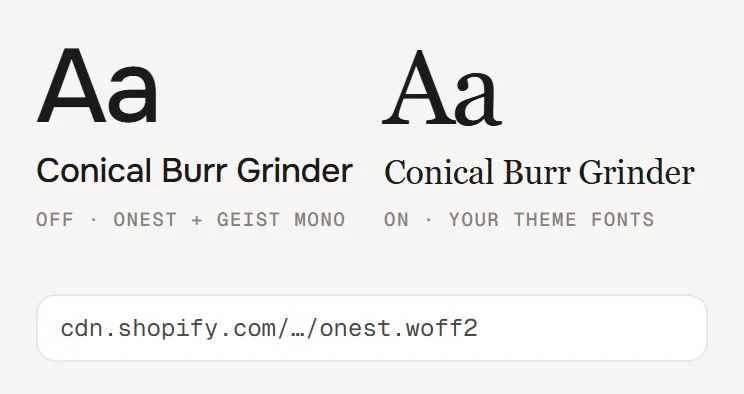
Use theme fontsOff: Onest for text and headings, Geist Mono for numbers, prices and the heading line. On: your theme’s heading and body fonts.
Self-hosted font URL (.woff2)Replaces Onest. Upload the file to Content → Files and paste its URL. Our font loads from werk’s Shopify CDN until then.
Label font URL (.woff2)Replaces Geist Mono – the small labels and numbers. Upload the file to Content → Files and paste its URL.
Colors
Default · Own colors
Use theme colors takes the text and background of the page around the section and hides the fields below; muted text and the buttons are mixed from them. Hotspot always keeps its own colour. Card background isn’t used in Index. Button and Button text give the buttons their own colours – empty keeps the design.
1Background#FFFFFFBehind the list, and around the image with padding
2Text#1C1B1AOpen and product rows, headings, the short line at the row
3Text muted#6F6B65Numbers, feature rows, texts, prices, the heading line
4Buttons & active hotspot#1C1B1AAdd to cart, the open number on the image, quick add on hover
5Button text#FFFFFFText and icons on those
6Hotspot#FFFFFFThe numbers on the image
Buttons
Default · Clean
Use theme buttons gives Add to cart your theme’s style – then only the text links follow the style below. Button style sets how buttons and text links react on hover.
Hover them – click a button for loading → added
View productCleanGrows a touch, the underline runs out and backView productDot to arrowThe dot grows into an arrowView productRolling textThe label rolls up, a copy followsView productFillColour wipes in from the leftView productShineA band of light passes over
Padding top / Padding bottom
Default · 0 px
Space above and below the section, 0–160 px. The preset starts at 0 – edge to edge. Scales down on smaller screens.
Side padding
Default · Match theme
Match theme (the default) lines the section up with your theme's page margin – in Horizon the same edge as header and footer. Themes without one, like Dawn, keep the werk edge. werk default always uses the werk edge, Custom takes your own values in px (desktop and tablets / phones), None runs the content to the edge. This section runs edge to edge as designed, so Match theme keeps it that way; Custom and None still apply.
Desktop · list next to the image
Tablet · list below
Phone · list below, inset image
TabletBelow 990 px the list moves under the image and the line is left out. The image uses Image ratio · tablet & mobile.
NumbersTapping a number on the image opens its row and scrolls it into view.
PhoneBelow 750 px the rows and thumbnails get a little smaller. The image sits inset unless Full width on mobile is on.
TouchNo hover highlight. The first tap opens the row.
AI label
Using an AI-generated picture? Switch on AI label under that picture and pick a corner. The text and the look – pill, info dot or upright along the edge – are set once for the whole section, under AI label. Product cards get one only for an own image, not for the product's.
I see an espresso machine instead of my image.
That’s the demo image – pick your own under Image.
The list is in the wrong order.
The list follows the blocks in the sidebar. Drag them into place – the numbers follow.
My card image doesn’t show.
Index shows no pictures for Feature rows – the image is right next to the list. Product rows show a thumbnail.
I don’t see the line.
It needs a section at least 990 px wide and an open row. On tablets and phones the list sits under the image, so there is no line.
A number is missing on the image.
It falls outside the crop and can’t be moved in – with narrow ratios on phones, for example. Its row stays in the list. Pick a wider ratio or move the hotspot further in.
Add to cart opens my catalogue instead.
The block has no product yet, so it shows a demo product. Pick a product in the block.
Add to cart adds the wrong size.
Quick add and the button add the first available variant. Turn off Show add to cart for products with options – View product leads to the page.
The cart count doesn’t change after adding.
Horizon and Dawn-based themes update right away. Other themes may not listen to the cart event – the item is in the cart, the count updates on the next page.
1.5.012 Oct 2026
NewSide padding. Match theme (the default) lines the section up with your theme's page margin – in Horizon the same edge as header and footer. Themes without one, like Dawn, keep the werk edge. werk default always uses the werk edge, Custom takes your own values in px (desktop and tablets / phones), None runs the content to the edge. This section runs edge to edge as designed, so Match theme keeps it that way; Custom and None still apply.
1.4.011 Oct 2026
NewAI label per picture (EU AI Act). Under every own picture and video a switch with the corner; the text and the look – pill, info dot that opens on hover, or upright along the edge – are set once under AI label. Off by default, nothing changes until you switch it on. Product and collection pictures from Shopify never get one.
1.3.06 Oct 2026
NewLabel font URL (Fonts) – swap Geist Mono, the small labels and numbers, for your own .woff2. With Self-hosted font URL every font can now be swapped on its own; Use theme fonts still swaps all of them.
1.2.06 Oct 2026
NewButton and Button text colours (Colors). Empty = as designed – nothing changes until you pick one. Hidden while Use theme colors or Use theme buttons is on.
1.1.32 Oct 2026
NewSame version as the rest of the family (fix in Hotspot Panel · Drawer on phones). Nothing changes here.
1.1.22 Oct 2026
NewSame version as the rest of the family (fix in Hotspot Panel · Drawer on phones). Nothing changes here.
* Built for Online Store 2.0 and tested in Shopify's Horizon and Dawn themes. Heavily customised or older themes can still clash with it – if something looks off, write us and we'll take a look.




 Background#FFFFFFBehind the list, and around the image with paddingText#1C1B1AOpen and product rows, headings, the short line at the rowText muted#6F6B65Numbers, feature rows, texts, prices, the heading lineButtons & active hotspot#1C1B1AAdd to cart, the open number on the image, quick add on hoverButton text#FFFFFFText and icons on thoseHotspot#FFFFFFThe numbers on the image