Navigation
Magnetic Mega Nav
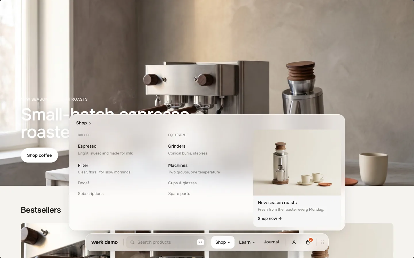
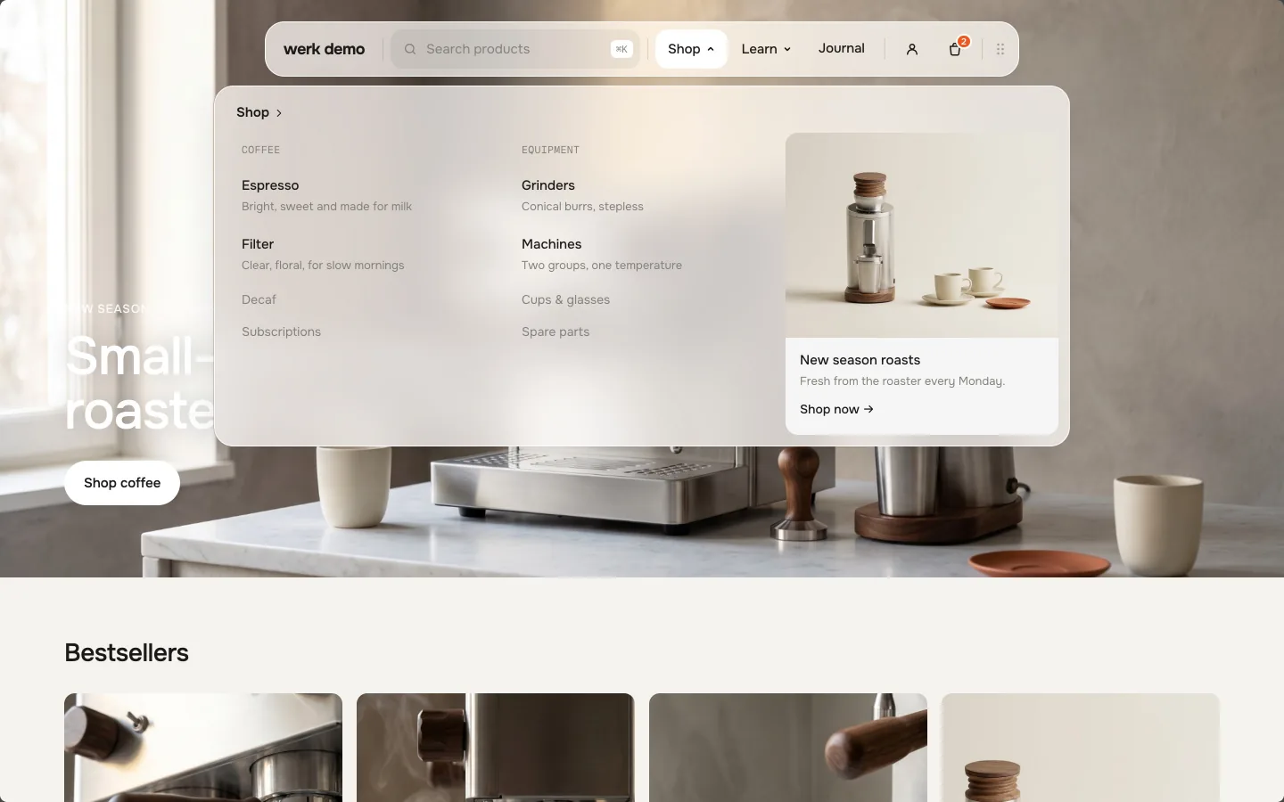
Menu items open wide panels with columns, large links with a description, small links and promo cards. Moving between items morphs the panel and slides the content in from the side you came from. Drag the whole dock to any edge – on phones it becomes a drill-down menu.
- Access
- Free
- Page types
- All pages
- Compatibility
- All Shopify 2.0 themes*
- Styles
- 1
- Customise
- 50 settings · 5 block types
Installation
Takes about two minutes. No app needed.
- 01
Create a new section
In your theme code editor (Online Store → ⋯ → Edit code), click the sections folder, then “New File”, name it and hit Enter.
- 02
Paste the code
In the file that just opened, paste the code below. Then hit Save (top right corner).
Note: Shopify shows no confirmation when a section saves – that’s normal.
- 03
Add it in the theme editor
Saved? Then reload the theme editor – otherwise the new section sometimes doesn’t show up. After that: Edit theme → Header → Add section → . It sits in the header group, so it shows on every page.
Code
One file. Copy it, paste it, done.
Free – just add your email
Every section is free during launch. Enter your email once and copy any code you like.
Already signed up?
More like this
Docs
Every setting, what it does and where you see it. All in the theme editor, no code.
What you can change
Every numbered spot has its own chapter below.
- 1
Open the header
Edit theme → Header. The navigation belongs to the header group, so it shows on every page. - 2
Add the section
Add section → . It comes with an example menu: Shop with two columns and a promo card, Learn, Journal. - 3
Hide the theme’s header
Click the eye icon next to your theme’s own header section. The Mega Nav takes no space in the page – it floats over it. - 4
Make the menu yours
Rename the blocks, set their links, drag them into the order you want – see Blocks. Then save and look at it once on your phone.
- 1
Moving between menu items
Panels open on hover after a short pause, so a pointer passing by doesn’t flash them, and stay a moment when the pointer leaves. Click and keyboard always work. Moving from one item to the next keeps the panel open: its height morphs to the new content, which slides in from the side the pointer came from, the columns one after another.
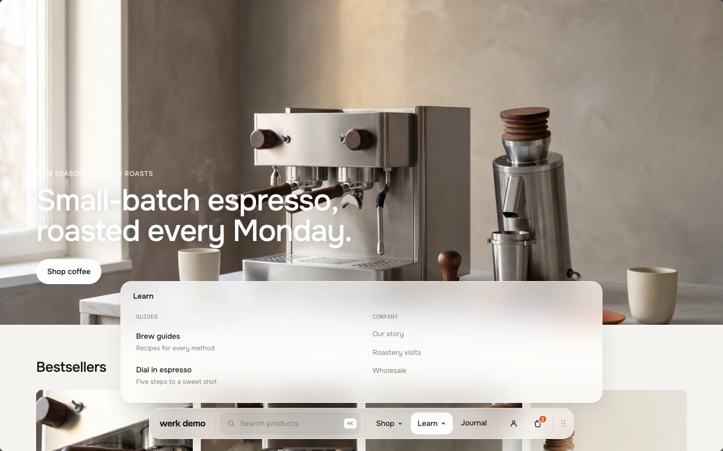
Shop → Learn: the height morphs, the content slides in from the right Throw it to an edge
Visitors grab the handle at the end of the dock and throw it – it snaps to the edge the throw points at. At the left and right edge the dock stands upright and the mega menu becomes a drill-down: a numbered list, a tap opens an item with a Back button, the columns stacked.
Turning is one move: the content blinks out, the empty glass folds into a small round shape, unfolds along the new edge and the new layout flows in.
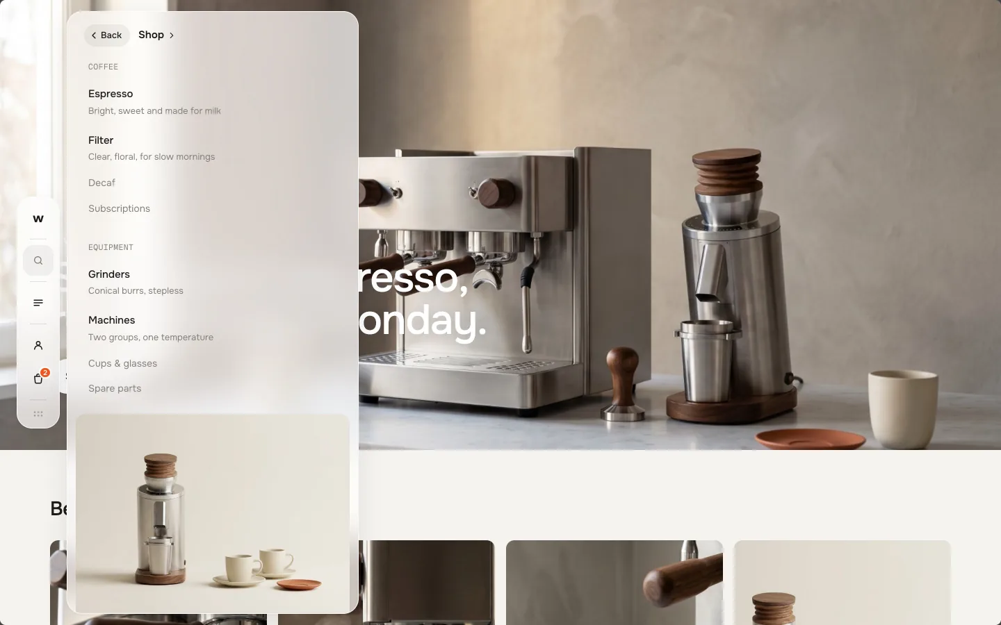
Menu · Shop · Back Panels open away from the edge
The panel grows out of the dock and always opens towards the middle of the screen. Its height follows the free space; long panels scroll. Esc or a click next to it closes it.
Steps aside for your theme
When your theme opens something over the page – a cart drawer, a picture lightbox, a pop-up – the dock fades out and comes back once it is closed. So it never covers a checkout button.
Good to know
It stays on top of everything
The dock and its panels sit in the browser’s top layer, so no sticky or animated theme container can cut them off.
Keyboard and screen readers
Every menu item is a real button with aria-expanded. ⌘K or Ctrl+K jumps into the search, ↓ and ↑ walk through the results, Esc closes every panel.
Theme editor
Click a block and its panel opens, so you see what you edit.
Calm for those who want it
“Reduce motion” turns off every movement, “reduce transparency” gives the glass a solid background.
Menu item
A top-level entry in the dock. With blocks below it, it opens a panel.
SettingWhat it doesDefaultLabelThe text in the dock.ShopLinkOptional when it opens a panel – then it becomes the title link at the top of the panel (“Shop →”). Without blocks below it, this is where it goes.EmptyBadgeA small pill in the accent colour, e.g. “New”.EmptyColumn
Starts a new column with a small heading in mono.
SettingWhat it doesDefaultHeadingThe column title.CoffeeHeading linkOptional. Makes the heading a link.EmptyLarge link
A link with a description – for the main destinations of a panel.
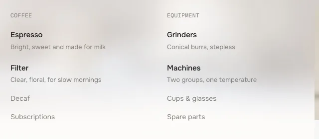 SettingWhat it doesDefaultTitleThe link text.EspressoDescriptionOne short line under the title.Bright, sweet and made for milkLinkWhere it goes.EmptyImageOptional. A small square next to the title.Empty
Small link
A plain link in the muted colour – for the rest of a column.
SettingWhat it doesDefaultTitleThe link text.FilterLinkWhere it goes.EmptyPromo card
A picture with a title, a line of text and a link – at the end of a panel.
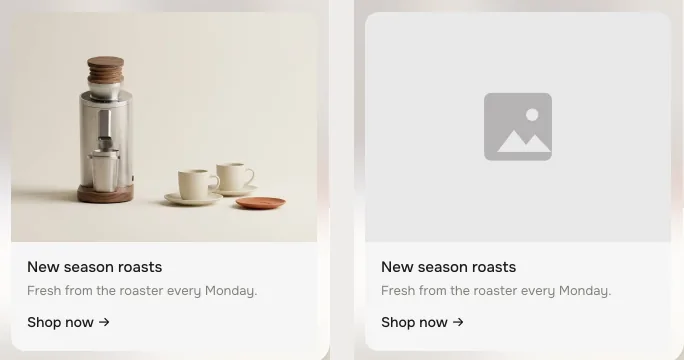 SettingWhat it doesDefaultImageThe picture on top of the card. Empty = Shopify’s placeholder.EmptyTitleCard title.New season roastsTextOne or two lines.Fresh from the roaster every Monday.Link labelThe link under the text, with an arrow.Shop nowLinkWhere the whole card goes.Empty
- Position
Position
Default · BottomThe edge the dock starts at. Visitors who moved it see their own edge instead. On phones it always sits at the bottom.
Top: the panel opens downwards Let visitors move it
Default · OnShows the handle. Off: no handle, the dock stays at Position.
Remember where it was moved
Default · OnKeeps the edge a visitor threw it to for their next visit. Only a real move is saved.
Distance to the edge
Default · 24pxSpace between the dock and the edge of the screen, 8–48 px.
LogoLogo
Default · Inside the navigationLogo image
Default · EmptyWithout an image the dock shows your store name as text – upright at the left or right edge only its first letter.
Logo width
Default · 72px40–200 px.
Link the logo
Default · OnA click on the logo takes visitors to your home page. Off: the logo is just a picture, no link.
Logo link
Default · EmptySends the logo somewhere else, e.g. a landing page. Empty = your home page.
Menu button label
Default · MenuThe menu button shows on phones, at the left and right edge, and when the menu items don’t fit in one row. On phones only the icon shows.
Show search
Default · OnVisitors type right in the dock and the results grow out of it. Live search from Shopify’s own search: up to four products with image and price, plus collections, pages and blog posts. Results come after the first letter, Enter opens the full search page.
Search style
Default · Search fieldWhen the dock gets crowded, the field turns into the icon on its own.
Placeholder
Default · Search productsThe text in the empty field – in the dock and in the search panel.
Show cart
Default · OnA bag with a live count. It updates the moment something is added anywhere on the page.
Cart opens
Default · The theme's cart drawerIf your theme has no cart drawer, the cart page opens.
Show account
Default · OnA person icon, or the customer’s initial once they are logged in. Only shows when customer accounts are turned on.
Show country / language
Default · OffA globe that opens Shopify’s country and language selector. Only shows when your store sells in more than one country or language. On phones it moves into the menu.
Colors
Default · Own colorsUse theme colors takes the text and background of your page and hides the fields below.
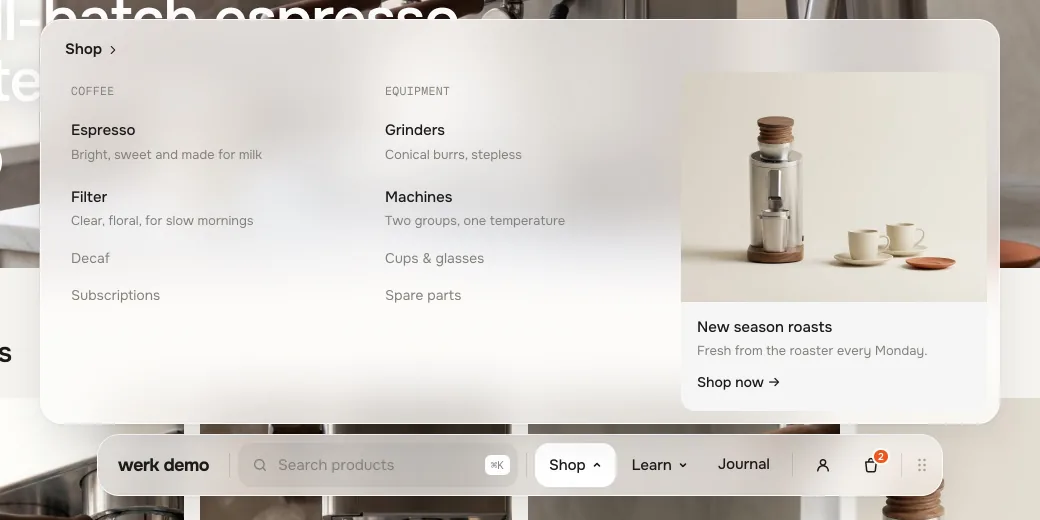 Background#FFFFFFThe glass of the dock and the panelText#1C1B1AMenu items, titles, store name, iconsText muted#85827CColumn headings, descriptions, small linksAccent#F2571FCart count, badges, the current page dotText on accent#FFFFFFNumber in the cart count, badge text
Background opacity
Default · 72 %40–100 %. Below 100 % the page shows through, blurred like frosted glass. 100 % = solid.
Fonts
Default · Own fontsUse theme fonts swaps every font at once – or leave it off and swap each one with its own URL. Empty keeps werk’s font.
Link hover style
Default · CleanHow links in the dock and the panels react on hover. They are not underlined at rest.
Hover them – click a button for loading → added
Brew guides CleanGrows a touch, the underline runs out and back Brew guides Dot to arrowThe dot grows into an arrow Brew guides Rolling textThe label rolls up, a copy follows Brew guides FillColour wipes in from the left Brew guides ShineA band of light passes over Animations & easing
Default · On · werk SignatureOff: panels switch without the height morph and slide. Easing sets the feel of the snap and every panel.
werk SignatureSlow start, soft landing SmoothEven and quiet BounceA small overshoot SnapQuick start, gentle stop GlideSlow in, slow out - Menu button labelMenuMenu button on phones, at the side edges and when the items don’t fitPlaceholderSearch productsSearch field in the dock and in the search panel
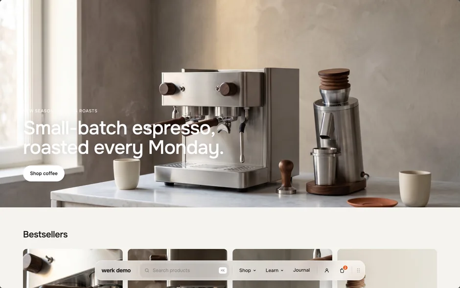
Desktop · panel on hover 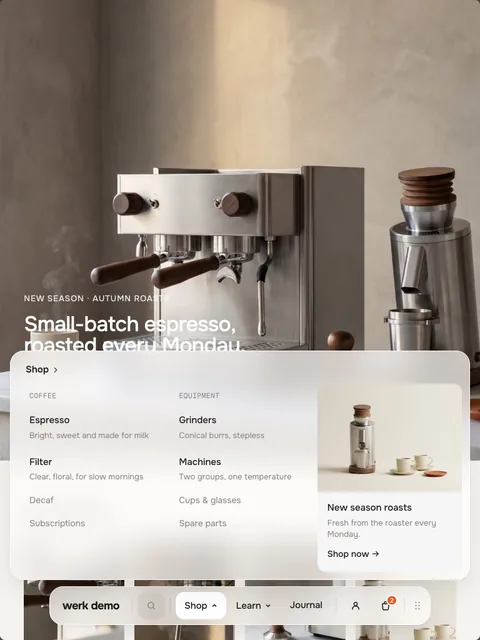
Tablet · panel on tap 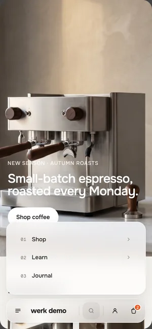
Phone · drill-down PhoneBelow 750 px the dock sits at the bottom and can’t be moved. The menu button opens a numbered list of the menu items. The search opens at the top of the screen, above the keyboard.Drill-downA tap on a menu item opens its panel with a Back button. Columns stack, the promo card comes last.TabletPanels open on tap. With many items the search field becomes an icon first, then the items move behind the menu button.TouchOnly the handle starts a drag – a swipe on the dock scrolls the page as usual.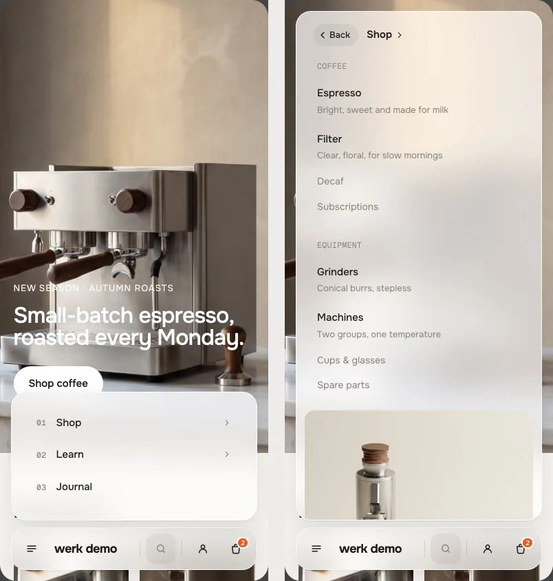
Menu · Shop - Horizon4.2TestedCart drawer and live countDawn16TestedCart drawer and live count
Magnetic Nav or Mega Nav?
The Magnetic Nav reads your Shopify menu and opens small dropdowns. The Mega Nav is built from blocks and opens wide panels with descriptions, images and cards. Use one of them, not both.
Your Shopify menu stays as it is
The Mega Nav doesn’t read Content → Menus. Your menus keep working for the footer and other sections.
AI label
Using an AI-generated picture? Switch on AI label under that picture and pick a corner. The text and the look – pill, info dot or upright along the edge – are set once for the whole section, under AI label. In the mega menu, small link images show just the (i).
I see two headers.
Hide your theme’s own header section with the eye icon in the header group.
A block doesn’t show up.
It sits above the first Menu item. Drag it below the item whose panel it belongs to.
A menu item opens no panel.
There are no blocks under it before the next Menu item – then it is a plain link.
Links ended up in the wrong panel.
Every block belongs to the nearest Menu item above it. Drag it under the right one.
The promo card shows a grey picture.
That’s Shopify’s placeholder until you pick an Image in the block.
My menu items are behind a menu button.
They don’t fit in one row next to search, cart and account. Use Icon only for the search or shorten the labels.
The dock is at a different edge than I set.
You moved it yourself while testing – it remembers that. Clear the site data in your browser, or turn off Remember where it was moved.
The cart opens a page instead of the drawer.
Your theme has no cart drawer the section knows (Horizon, Dawn), or Cart opens is set to The cart page.
- NewTurning to the left or right edge (and back) is now one move instead of a jump: the content blinks out, the glass folds into a small round shape, unfolds along the new edge and the new layout flows in.
- NewSearch: visitors type right in the dock and the results grow out of it – no second field in a panel. At the left or right edge the icon unfolds into a field and the dock widens into the page. Phones, Icon only and a crowded row keep the search panel.
- New⌘K / Ctrl+K puts the cursor in the field, ↓ ↑ walk through the results, the hint reads „Ctrl K“ outside macOS.
- NewThe dock steps aside while the theme shows something over the page that locks scrolling (Dawn's cart drawer, lightboxes, pop-ups) – before, it sat on top of them and covered the checkout button on phones.
- NewPhones: the search opens at the top of the screen and never gets taller than what the keyboard leaves free – before, the keyboard slid over the field. An X closes it (touch screens have no Esc key).
- NewThe menu icon turns into an X while the menu is open, and the X closes it – also from a drill-down.
- New⌘K / Ctrl+K no longer opens the theme's own search window on top (Horizon).
- NewFocus rings are in the text colour instead of the accent.
- NewSmall touches: the first results flow in one after the other, thumbnails zoom a little on hover, rows and buttons give on press.
- NewA menu taller than the screen scrolls with a thin bar in the text colour instead of the system scrollbar (Windows). Screens with overlay scrollbars – macOS, phones – look as before.
- Fixed„No results“ in the search had a dashed frame.
- FixedEscape on a search result closed the results and opened them again a moment later.
- Fixedmoving from one menu item to a taller one (Learn → Shop) flashed a scrollbar while the panel grew – on Windows it also squeezed the content for a moment.
- NewAI label per picture (EU AI Act). Under every own picture and video a switch with the corner; the text and the look – pill, info dot that opens on hover, or upright along the edge – are set once under AI label. Off by default, nothing changes until you switch it on. Product and collection pictures from Shopify never get one.
- NewLabel font URL (Fonts) – swap Geist Mono, the small labels and numbers, for your own .woff2. With Self-hosted font URL every font can now be swapped on its own; Use theme fonts still swaps all of them.
- NewLogo link: choose whether the logo is a link and where it goes – empty = your home page. Before, it always went to the home page.
- NewFirst stable release – stress tested, full docs.
* Built for Online Store 2.0 and tested in Shopify's Horizon and Dawn themes. Heavily customised or older themes can still clash with it – if something looks off, write us and we'll take a look.