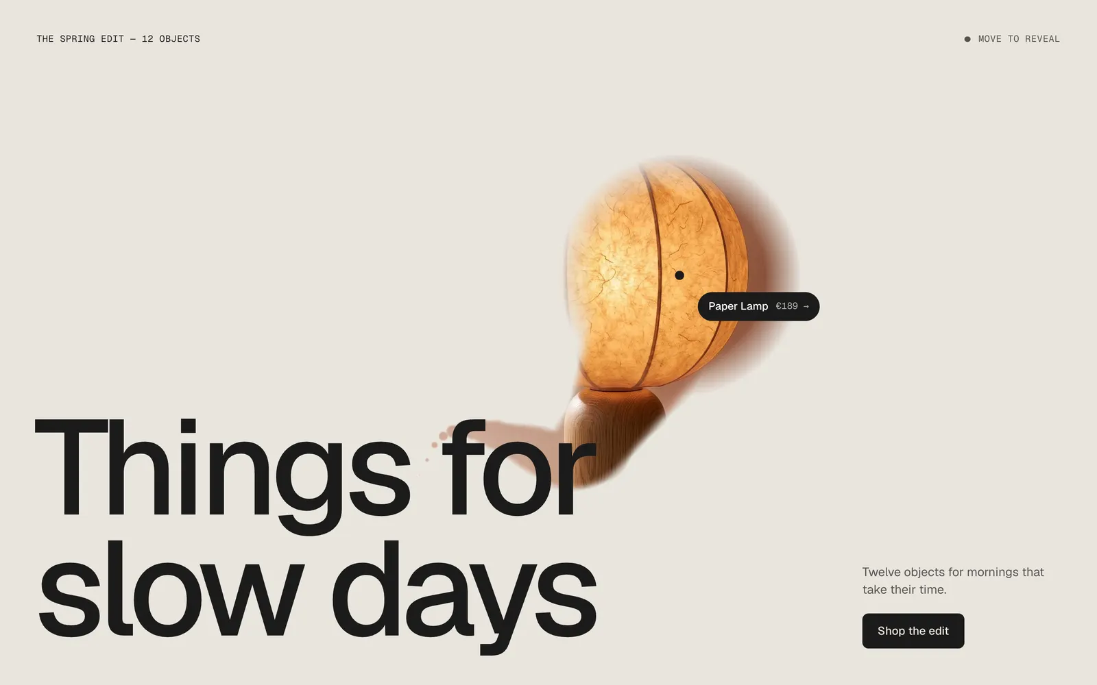
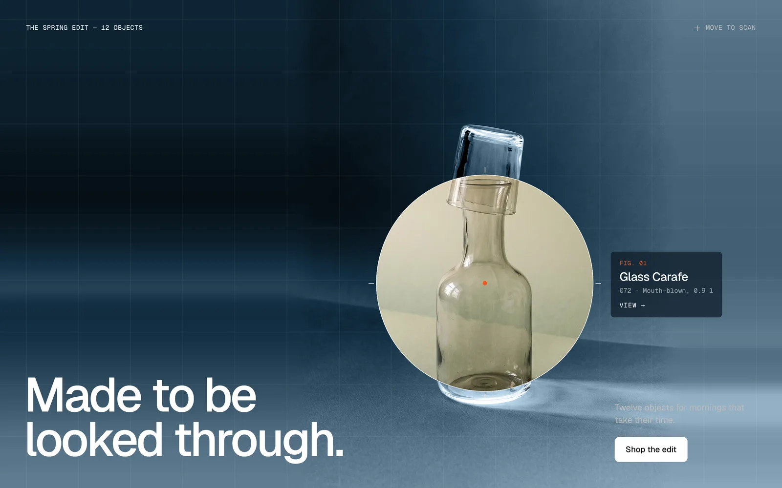
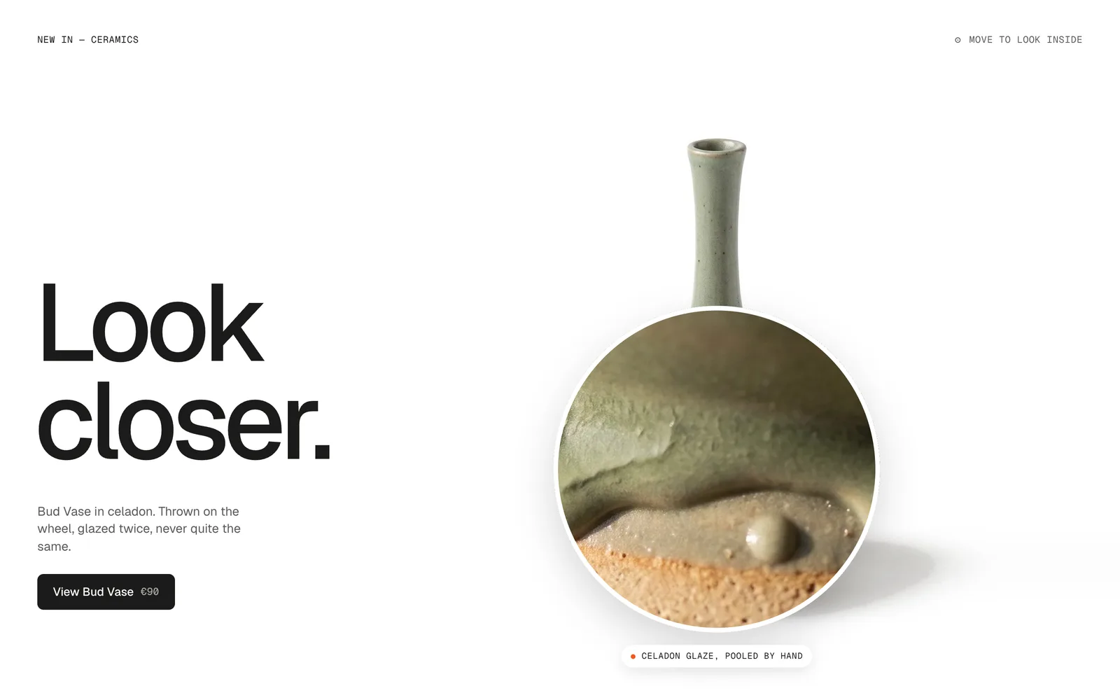
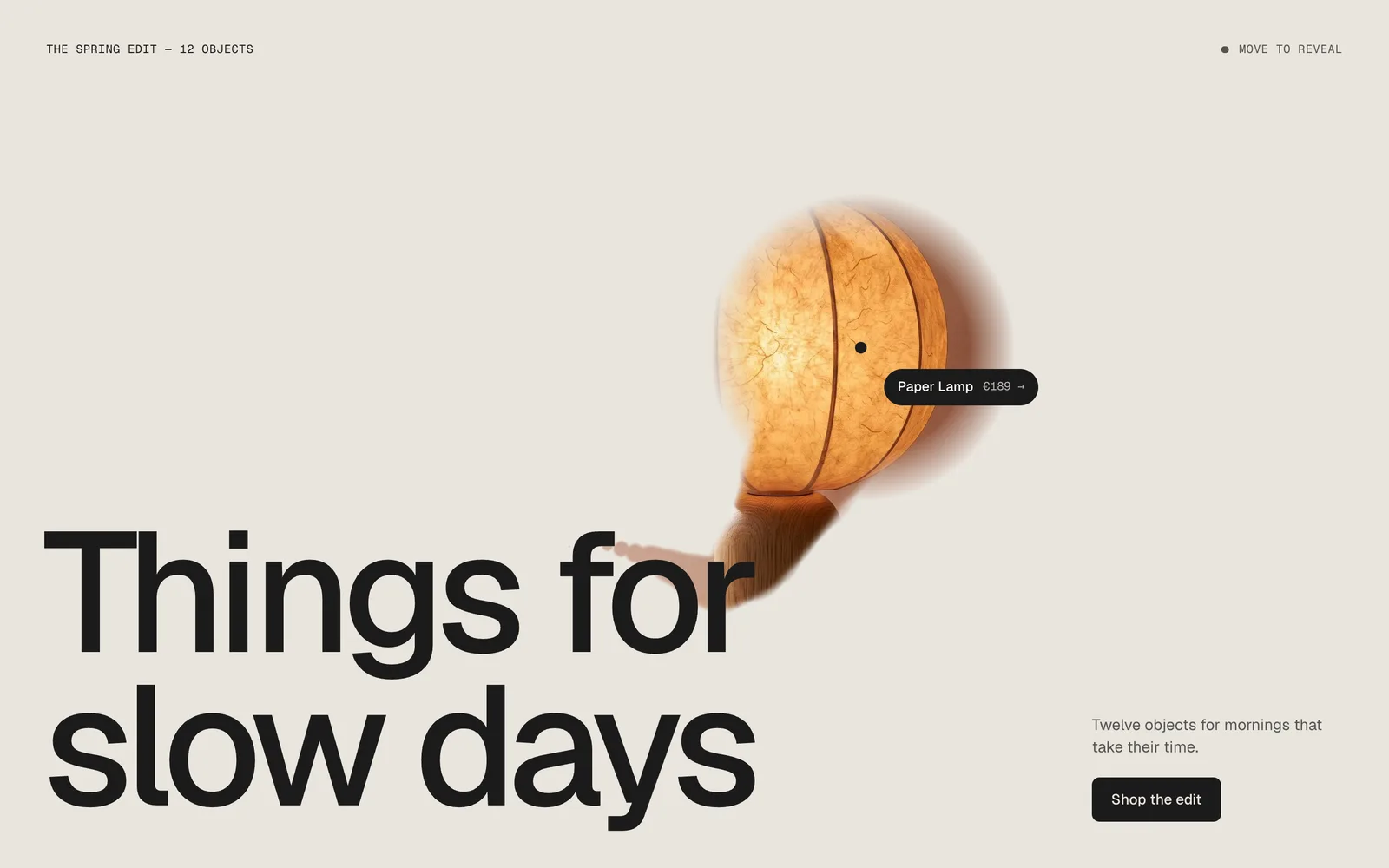
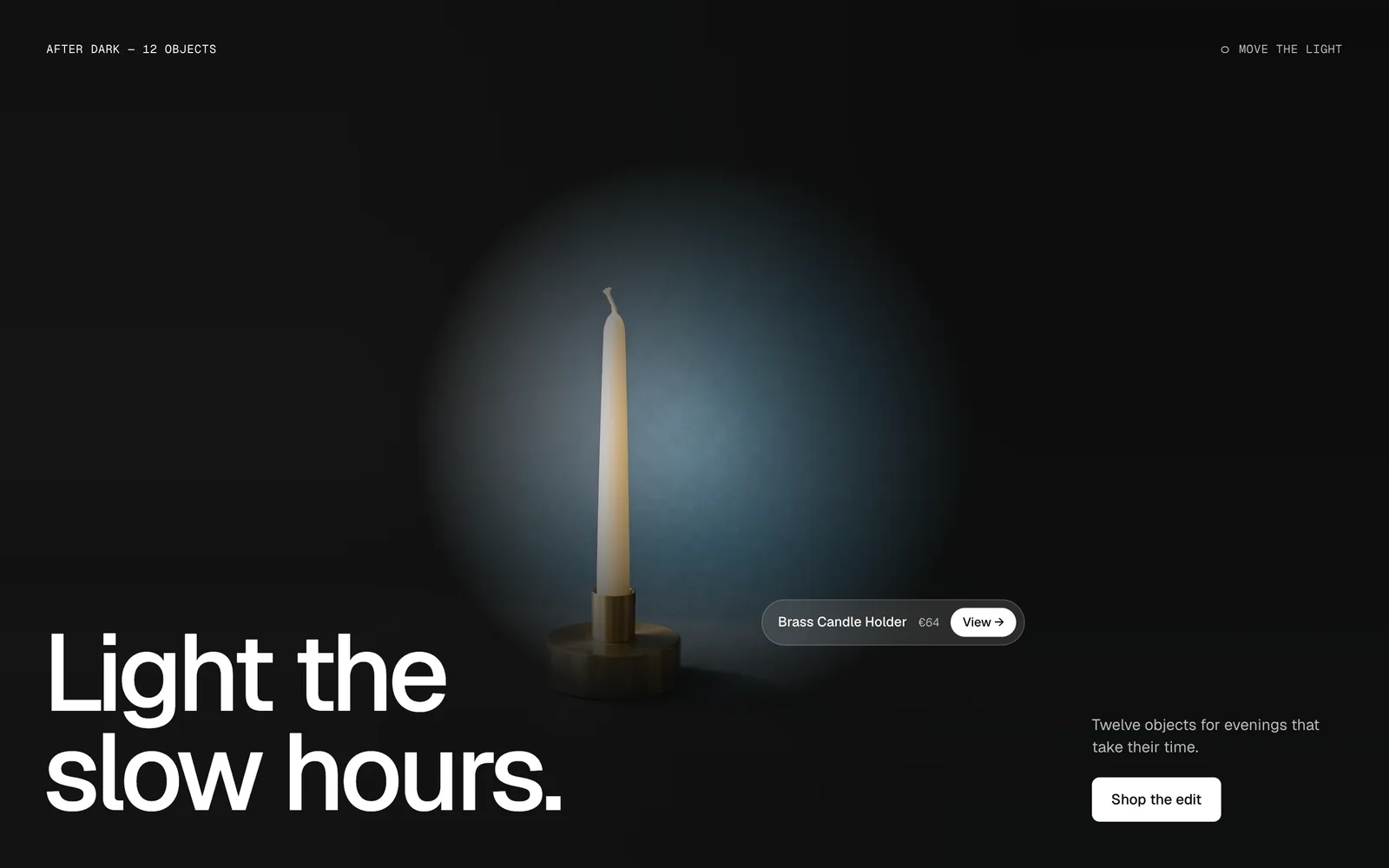
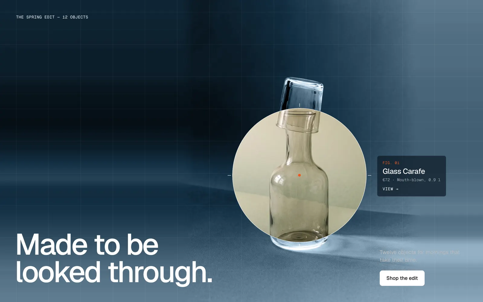
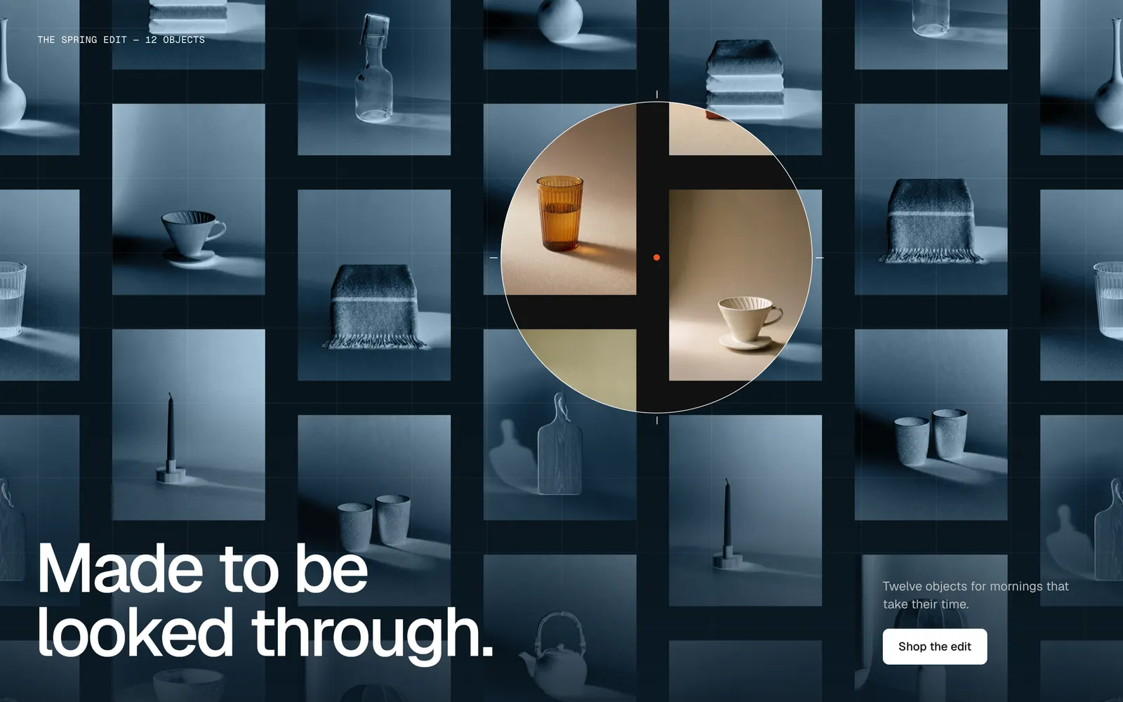
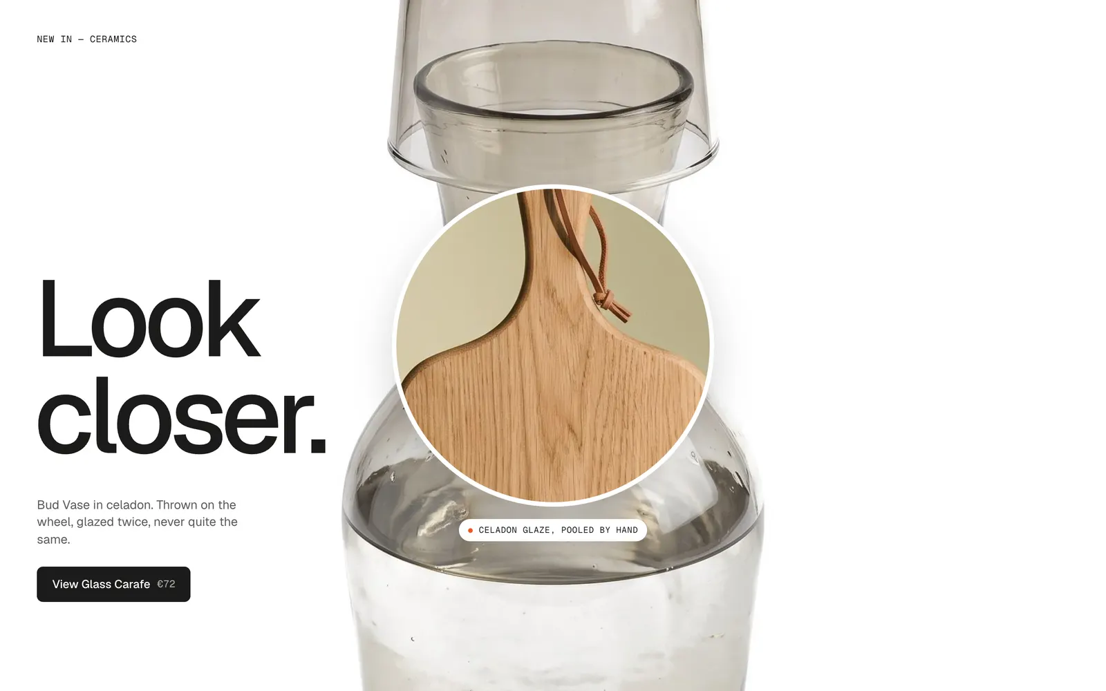
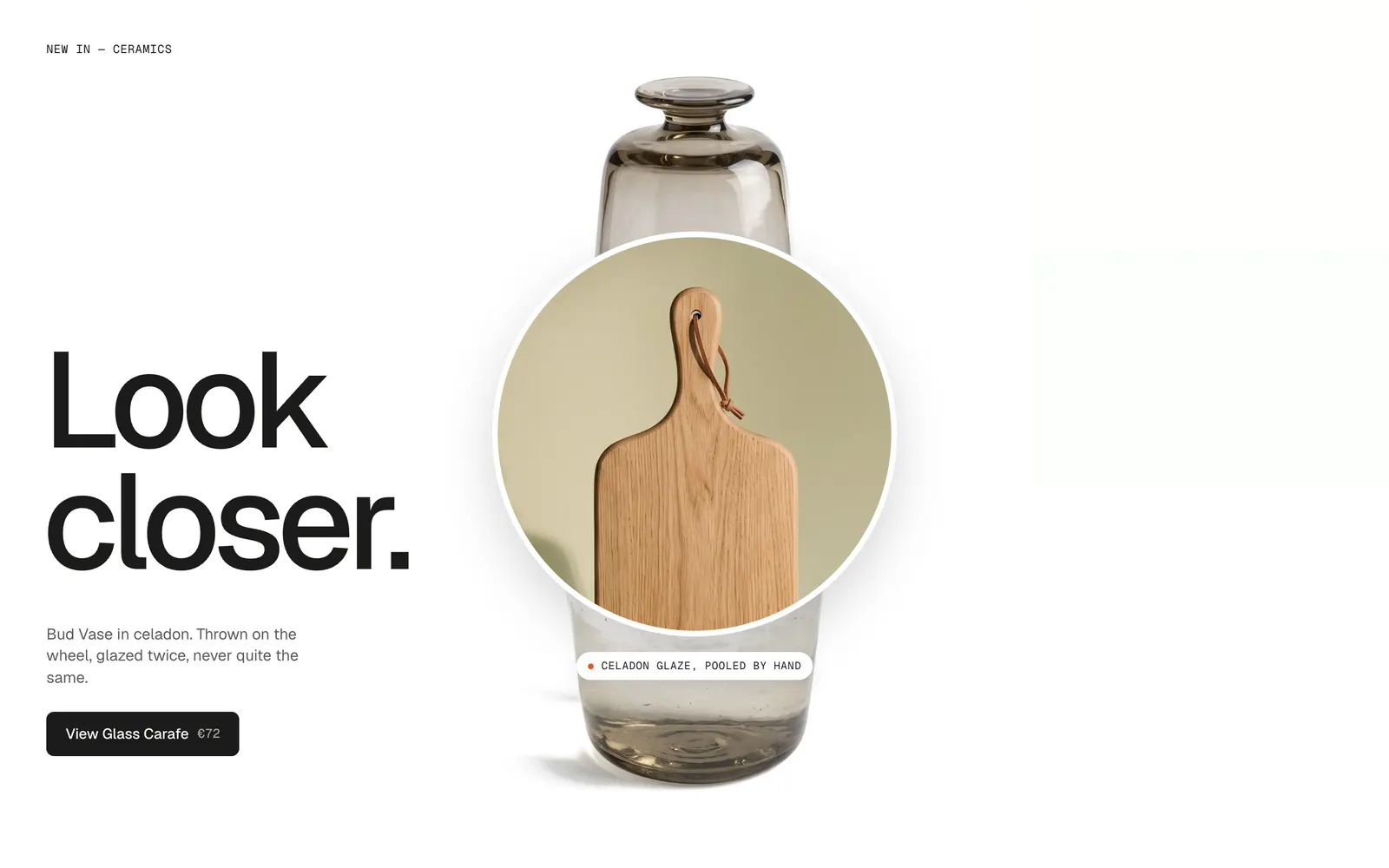
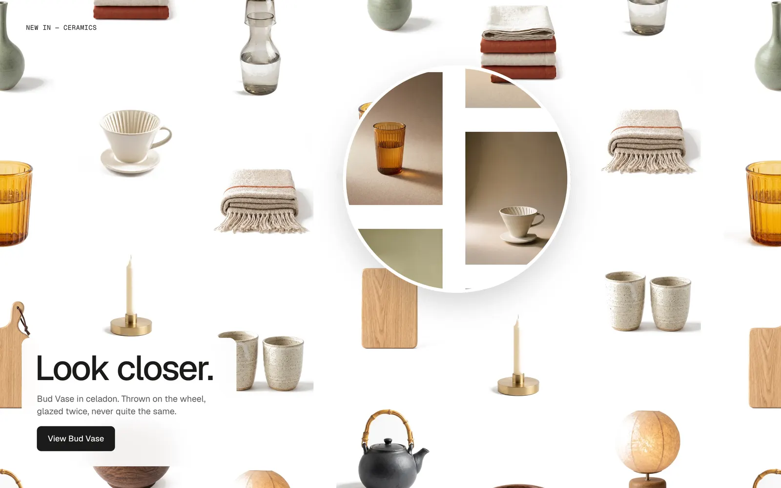
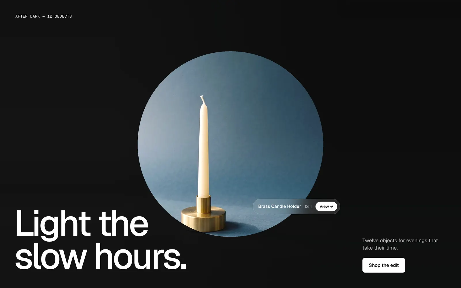
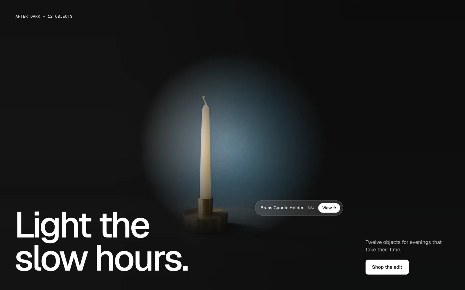
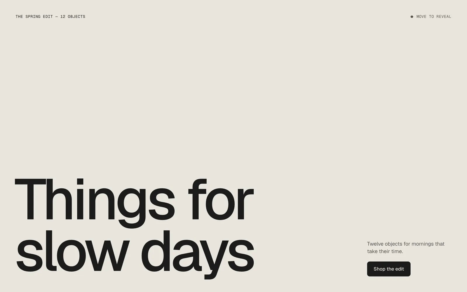
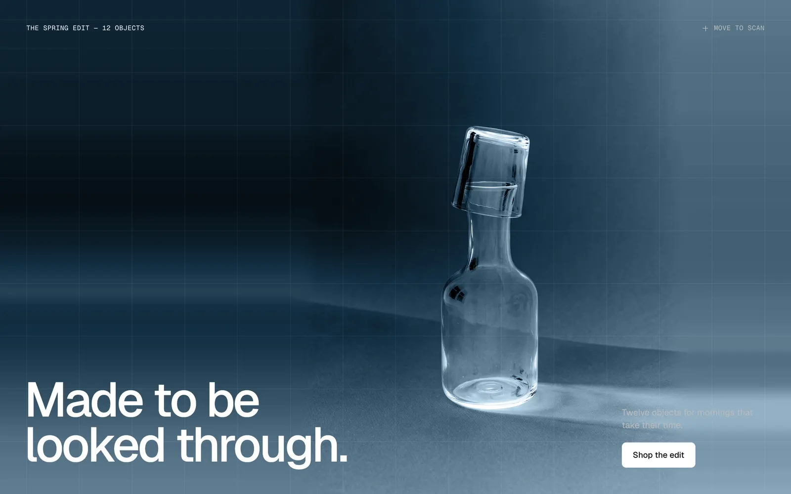
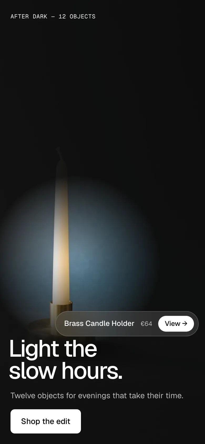
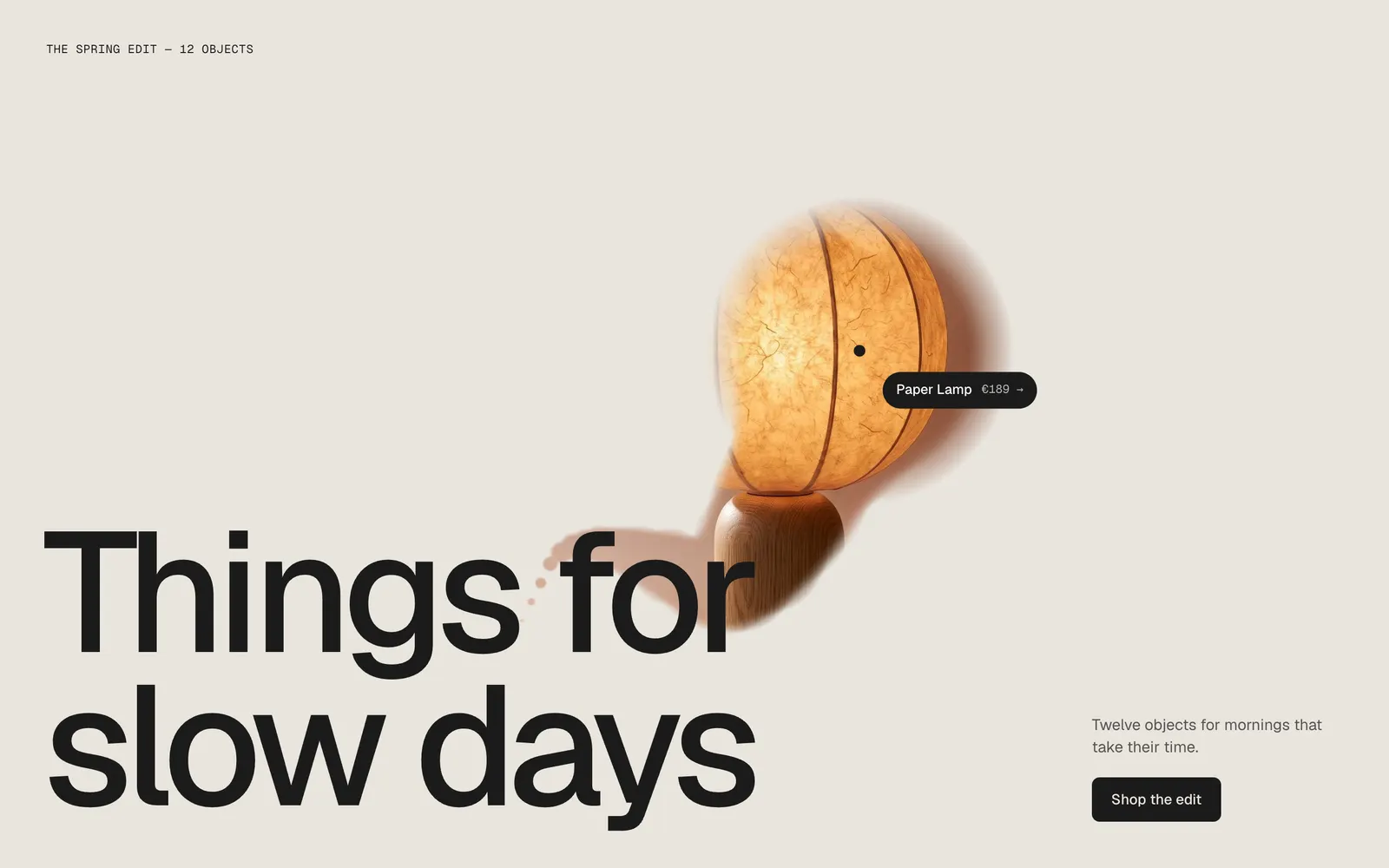
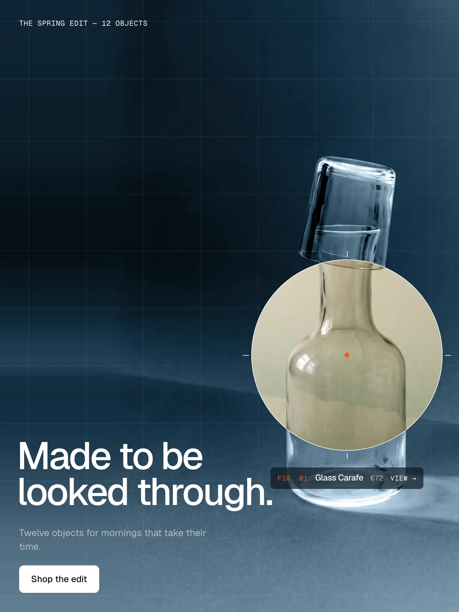
Visitors see a calm surface with your headline. Wherever the cursor goes, the real picture shows through – as a drying ink trail (Ink), a scan lens over an X-ray of the same photo (X-Ray), a second picture under the lens (Inside) or a soft light in the dark (Spotlight). Reveal one product or a whole collection as a field of products; a label names whatever is under the lens, a click opens it. On phones the lens moves by itself.
In your theme code editor (Online Store → ⋯ → Edit code), click the sections folder, then “New File”, name it and hit Enter.
02
Paste the code
In the file that just opened, paste the code below. Then hit Save (top right corner).
Note: Shopify shows no confirmation when a section saves – that’s normal.
03
Add it in the theme editor
Saved? Then reload the theme editor – otherwise the new section sometimes doesn’t show up. After that: Edit theme → Add section → . Everything else is in the sidebar – the Docs below explain every setting.
Code
One file. Copy it, paste it, done.
sections/werk-cursor-reveal.liquid
Locked
{%- comment -%} werk · Cursor Reveal · v1.4.0 · werk.build/license – do not remove {%- endcomment -%}{%- liquid assign s = section.settings assign look = s.look | default: 'ink' # Demo pictures and fonts load from the werk demo store's Files (Shopify CDN), so the section looks the same in any store. assign werk_cdn = 'https://cdn.shopify.com/s/files/1/0954/8303/5932/files/' assign sans_url = werk_cdn | append: 'werk-geist.woff2' assign mono_url = werk_cdn | append: 'werk-geist-mono.woff2' if s.font_url != blank assign sans_url = s.font_url endif if s.mono_font_url != blank
2312 lines · Liquid, CSS & vanilla JS
Free – just add your email
Every section is free during launch. Enter your email once and copy any code you like.
Edit theme → open the page → Add section → – Ink, – X-Ray, – Inside or – Spotlight. Each preset brings its own colours and demo texts.
2
Pick what is revealed
Section settings → Source. One product shows its picture big; a collection fills the stage with its products. Until you pick one, our demo objects show.
3
Write the texts
Kicker, Heading, Text and Button. Save, then move your mouse over the section.
InkInk
X-RayX-Ray
InsideInside
SpotlightSpotlight
Look
Default · Ink – a trail that dries back
Each look has its own preset with matching colors under “Add section”.
InkThe cursor leaves a soft ink trail that shows the picture and slowly dries back. A fast stroke leaves a long trail and the odd drop.
X-RayThe picture lies under its own X-ray: greyscale, inverted, tinted, with a fine grid. The lens shows it in colour, with a readout next to it.
InsideThe cover is the product picture itself. The lens shows a second picture in the same place – the material, the detail, the product in use.
SpotlightA dark stage where the picture only shows as a hint. The cursor is a soft light, the price tag hangs on it.
One productA collection
Source
Default · One product – a big picture
One product shows one big picture. A collection fills the stage with a field of its products – the lens reveals each one.
One product – a big picture
A collection – a field of products
Product
Default · Empty
Name, price and link come from the product. Its first picture is revealed – in Inside the first picture is the cover and the second one shows in the lens.
Picture
Default · Empty
A wide photo of the product in a scene is the best fit for a full-screen hero. The focal point you set on the image in Shopify is where the lens rests.
Inside picture
Default · Empty
Only for Inside. A close-up of the material, the inside of a bag, the product in use.
Only visible in the Inside look
Picture fit
Default · Fill – crop to the stage
Fill crops the picture to the stage. Fit keeps it whole and continues its own background to the edges – made for tall packshots on a plain background.
Fill – crop to the stage
Fit – whole picture, its background continued
FillFit
Label detail
Default · Empty
X-Ray: a line under the name, e.g. the material. Inside: the caption under the lens. Empty: name and price.
Only visible in the X-Ray and Inside looks
Collection
Default · Empty
The products sit in seven staggered columns that always fill the stage – twelve products repeat, so the field never runs out. It leans a little towards the lens.
Products
Default · 12
Only with a collection. How many of its products go into the field, from 4 to 24. Fewer products simply repeat more often, so the field always stays full.
Product
Pick products one by one instead of a collection, in your order. In Inside each can have its own picture for the lens.
SettingWhat it does
Product–
Inside pictureInside look: shows in the lens. Empty: the product's second picture. Only in Inside
AI labelFor an AI-generated picture (EU AI Act). Text and look: AI label in the section settings.
Inside with a collection: every product shows its second picture under the lens
Show label at the lens
Default · On
Name and price of the product under the lens.
Lens size
Default · 160px
The radius at 1440 px. On tablets the lens is 80 % of it, on phones 56 %. The presets: Ink 160, X-Ray 200, Inside 210, Spotlight 290.
Soft edge
Default · 30%
0 is a sharp circle (X-Ray, Inside), 30 the soft ink edge, 90 a light that fades out (Spotlight).
Soft edge 0Soft edge 90
Follow
Default · Smooth
TightRight on the cursor.
SmoothA short, soft delay.
LazyDrifts after the cursor.
Trail length
Default · 1.2s
Only for Ink. How long the trail stays before it has dried back.
Only visible in the Ink look
Ambient
Default · 10%
Only for Spotlight. 0 is pitch dark, 30 shows the picture clearly in the dark.
Only visible in the Spotlight look
No mouse yetX-Ray at rest
The lens travels over the product on its own and keeps clear of your text
Touch screens: lens speed
Default · Normal
Without a mouse the lens moves by itself. A tap moves it, a tap on the lens opens the product.
SlowOne round in about 13 seconds.
NormalAbout 9 seconds.
FastAbout 6 seconds.
It lingers on the product
The path slows down near the product (the focal point of your picture), so visitors see it longest.
It keeps clear of your text
The lens only travels in the space between the edge and your heading, so the text stays readable.
Tap to steer
A tap beside the lens sends it there; after four seconds it travels on. A tap on the lens opens the product.
Scrolling stays free
The section never holds on to the finger – swiping up and down scrolls the page as usual.
Kicker
Default · The spring edit — 12 objects
The small mono line above the heading, e.g. the name of the edit.
Heading
Default · Things for
slow days
A line break stays a line break. A long heading gets smaller until it fits three lines (four on phones).
Text
Default · Twelve objects for mornings that take …
A short paragraph under the heading. Bold, italic and links work.
Button label
Default · Shop the edit
[title] becomes the product name, e.g. “View [title]” → “View Bud Vase” – then the button also shows the price.
Button link
Default · Empty
Empty: the product, or the collection.
Show hint
Default · On
Only visitors with a mouse see it, and it fades after their first move.
Hint
Default · Move to reveal
The words next to the dot, e.g. Move to reveal. Leave it empty to hide the hint.
Height
Default · Full screen
Full screen fills the visitor's screen. 16:9 and 3:2 become a tall 390 × 800 frame on phones.
Full screen
16:9
3:2
Fonts
Default · Design fonts
Geist for headings and text, Geist Mono for kicker, hint and labels – from werk's CDN, or Use theme fonts. Self-hosted font URL replaces Geist with your own file. Use theme fonts swaps every font at once. Or swap each one with its own URL – Self-hosted font URL replaces Geist; Label font URL replaces Geist Mono (the small labels and numbers). Empty keeps werk’s font.
Colors
Default · Design colors
Background (also Ink's cover), text, accent, label background and label text – or Use theme colors, which takes text and background from the page around the section. Button and Button text give the buttons their own colours – empty keeps the design.
X-Ray tint
Default · #6FA3C7
Only for X-Ray. The colour of the X-ray.
Only visible in the X-Ray look
Buttons
Default · Clean
Use theme buttons gives the button your theme's style. Button style sets how it reacts on hover.
Hover them – click a button for loading → added
Read moreCleanGrows a touch, the underline runs out and backRead moreDot to arrowThe dot grows into an arrowRead moreRolling textThe label rolls up, a copy followsRead moreFillColour wipes in from the leftRead moreShineA band of light passes over
Animations & easing
Default · On · werk Signature
Easing sets how the lens opens and closes. With Animations off – and for visitors who turned on “reduce motion” – the lens follows without delay, Ink leaves no trail, and on phones the lens stays open on the product instead of travelling.
werk SignatureSlow start, soft landing
SmoothEven and quiet
BounceA small overshoot
SnapQuick start, gentle stop
GlideSlow in, slow out
Side padding
Default · Match theme
Match theme (the default) lines the section up with your theme's page margin – in Horizon the same edge as header and footer. Themes without one, like Dawn, keep the werk edge. werk default always uses the werk edge, Custom takes your own values in px (desktop and tablets / phones), None runs the content to the edge.
Desktop · Ink
Tablet · X-Ray
Phone · Spotlight, the light on its own path
DesktopTablet & phone
Heading & textHeading left, text and button rightOne column at the bottom (Inside: at the top)
LensLens size80 % / 56 % of it
Lens movementFollows the mouseMoves by itself on touch screens
X-Ray readoutNext to the lensOne row under the lens
Clicks always reach the product
The cover and the lens don't catch clicks – whatever is under the lens is a real link.
Nothing hidden without JavaScript
Without scripts the picture simply shows, uncovered. The links and texts are always there.
Keyboard and screen readers
Tab moves through the products; the lens jumps onto the one in focus. Every product link says its name and price.
Light on the page
The lens is a CSS mask (Ink: a small canvas) and only redraws while it moves and the section is on screen.
AI label
Using an AI-generated picture? Switch on AI label under that picture and pick a corner. The text and the look – pill, info dot or upright along the edge – are set once for the whole section, under AI label. With a collection, an own Inside picture gets its label under the lens.
Horizon4.2Tested
Dawn16TestedTheme switches checked
The lens sits next to the product.
Set the focal point on the picture in Shopify (Content → Files or the product's media) – the lens rests there and the phone path circles it.
My packshot is cut off.
Set Picture fit to Fit. The picture stays whole and its background continues to the edges.
Inside shows the same picture in the lens.
The product has only one picture. Add a second one to the product, or pick an Inside picture.
The label covers my heading.
Make the lens smaller, or move the product in the picture away from the bottom left.
1.4.012 Oct 2026
NewSide padding. Match theme (the default) lines the section up with your theme's page margin – in Horizon the same edge as header and footer. Themes without one, like Dawn, keep the werk edge. werk default always uses the werk edge, Custom takes your own values in px (desktop and tablets / phones), None runs the content to the edge.
1.3.011 Oct 2026
NewAI label per picture (EU AI Act). Under every own picture and video a switch with the corner; the text and the look – pill, info dot that opens on hover, or upright along the edge – are set once under AI label. Off by default, nothing changes until you switch it on. Product and collection pictures from Shopify never get one.
1.2.06 Oct 2026
NewLabel font URL (Fonts) – swap Geist Mono, the small labels and numbers, for your own .woff2. With Self-hosted font URL every font can now be swapped on its own; Use theme fonts still swaps all of them.
1.1.06 Oct 2026
NewButton and Button text colours (Colors). Empty = as designed – nothing changes until you pick one. Hidden while Use theme colors or Use theme buttons is on.
1.0.16 Oct 2026
NewTheme editor: Inside picture only shows while the look is Inside. Nothing you entered is lost when you switch.
1.0.04 Oct 2026
NewFirst stable release. Same code as 0.1.0, plus the docs, the videos and the showroom page.
* Built for Online Store 2.0 and tested in Shopify's Horizon and Dawn themes. Heavily customised or older themes can still clash with it – if something looks off, write us and we'll take a look.