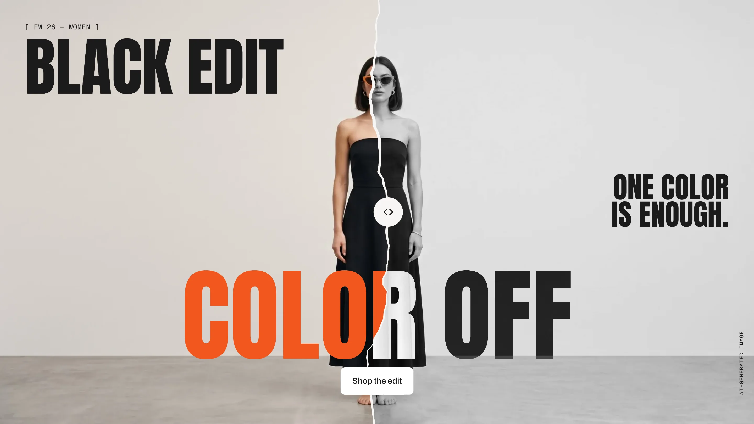
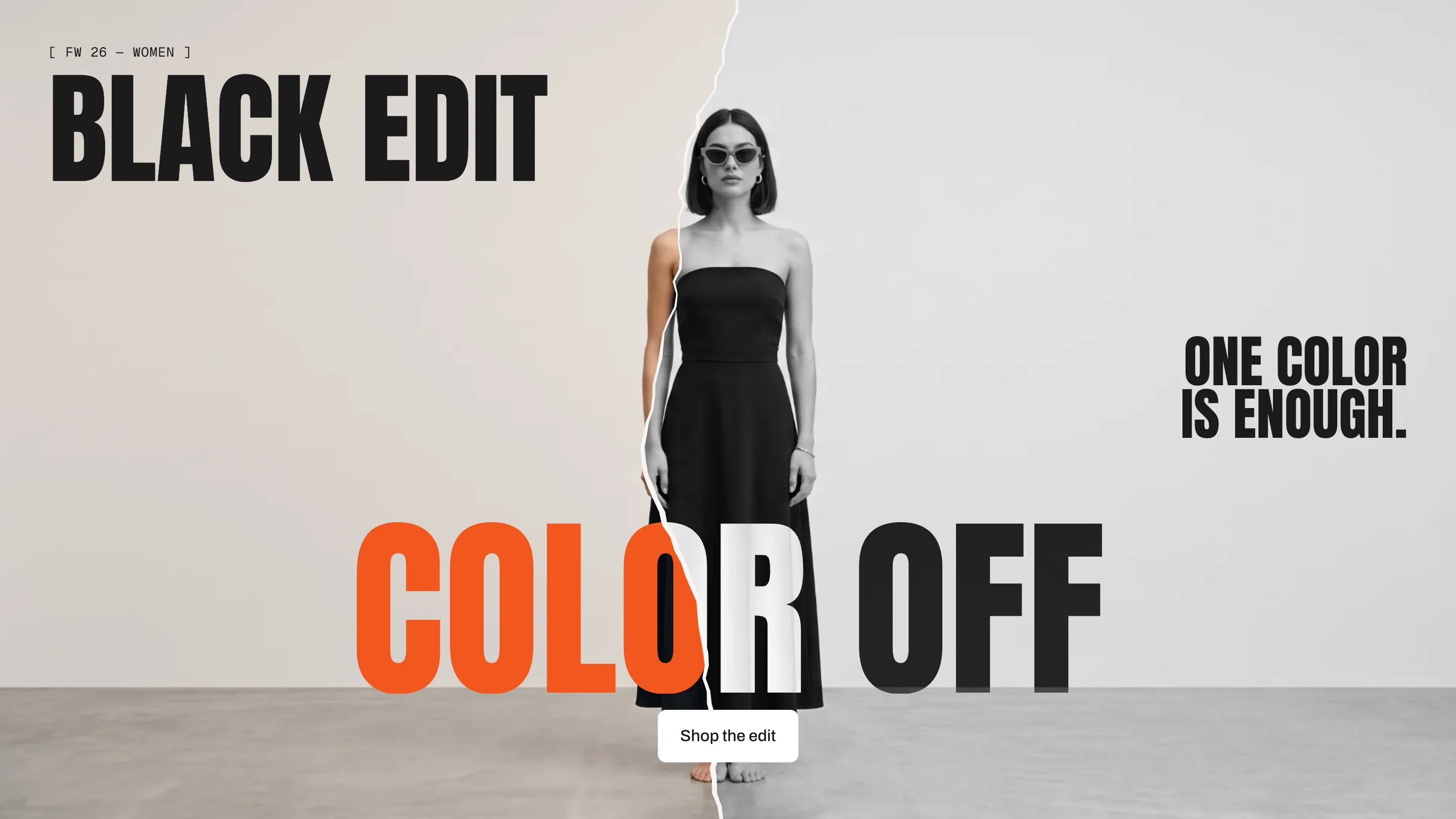
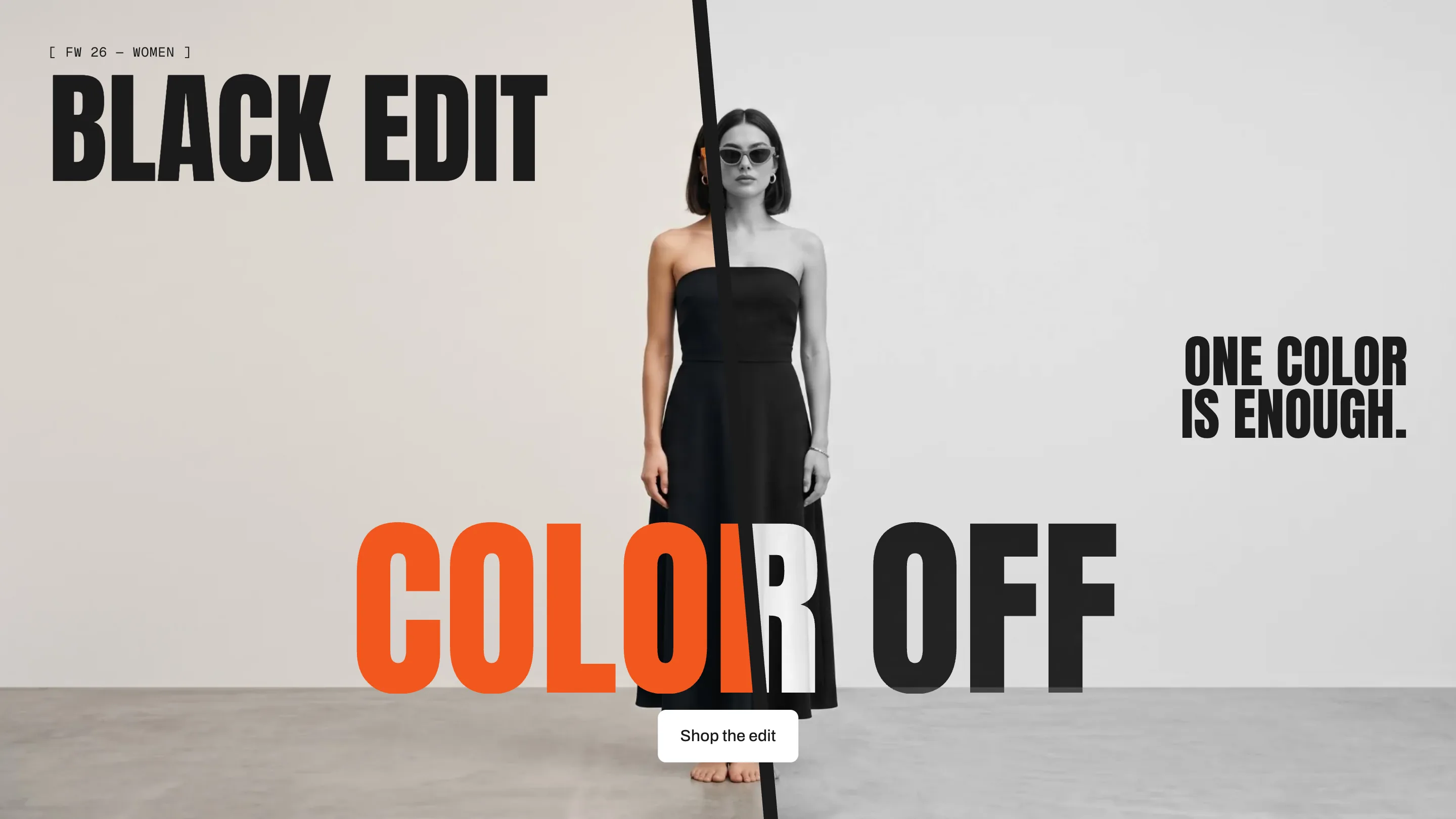
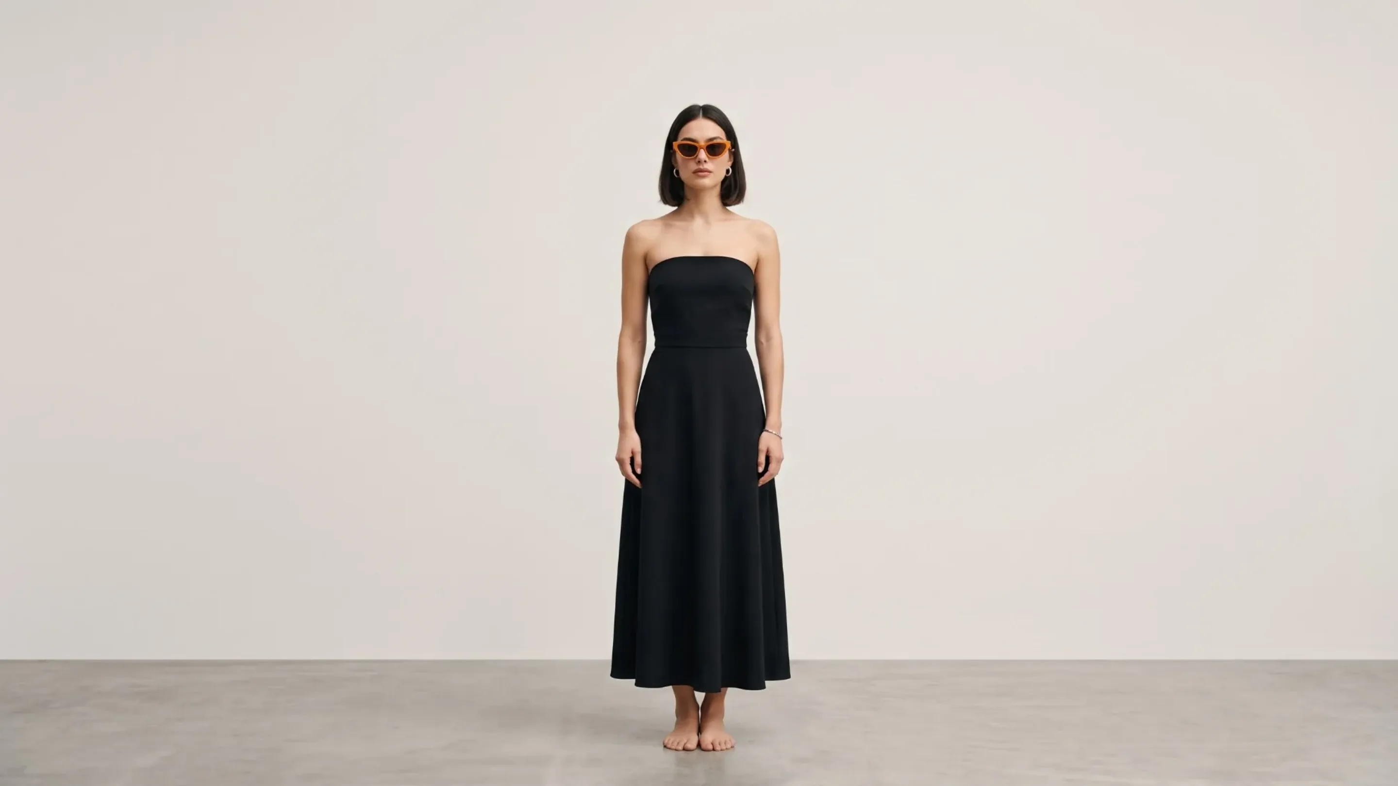
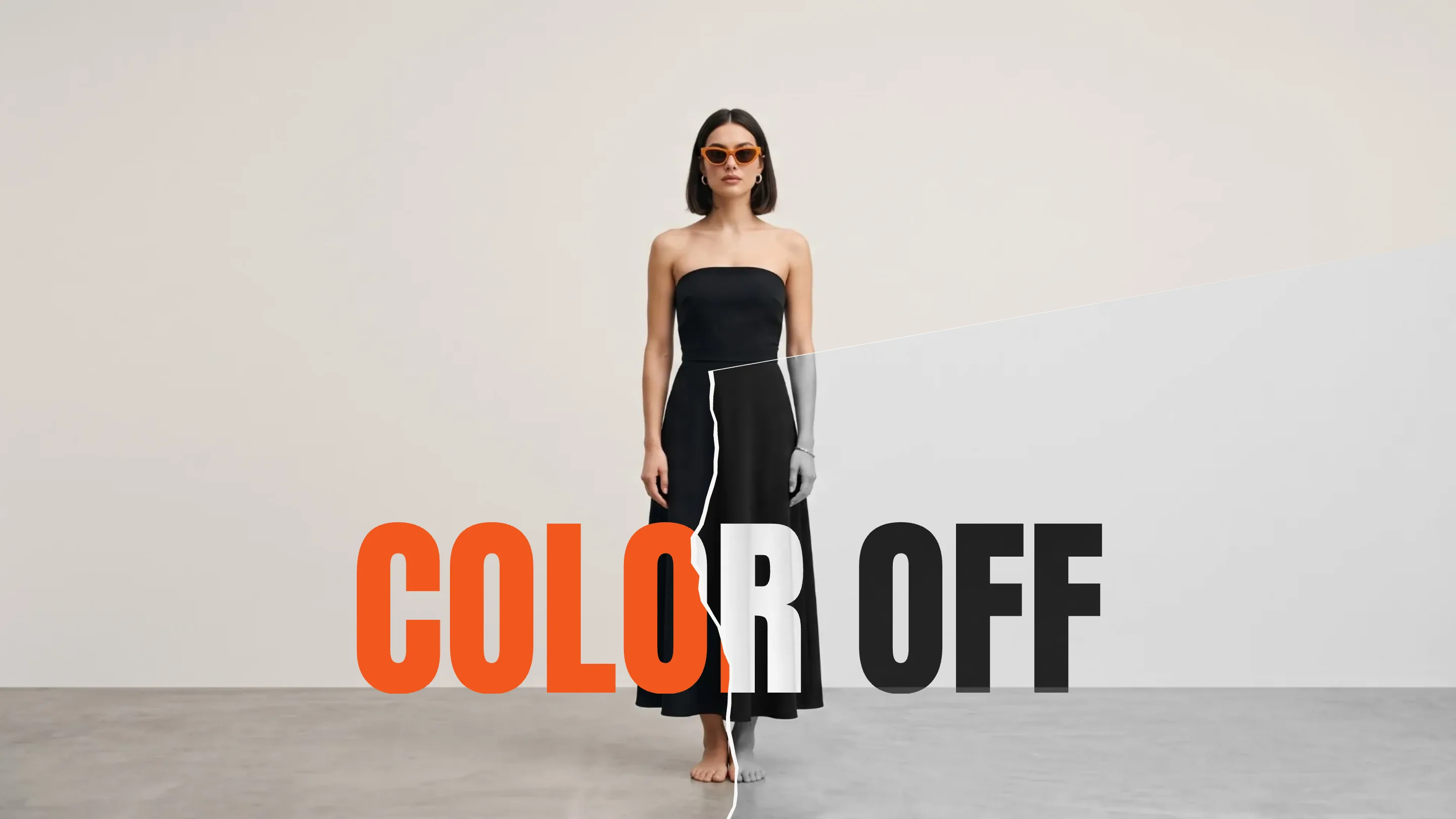
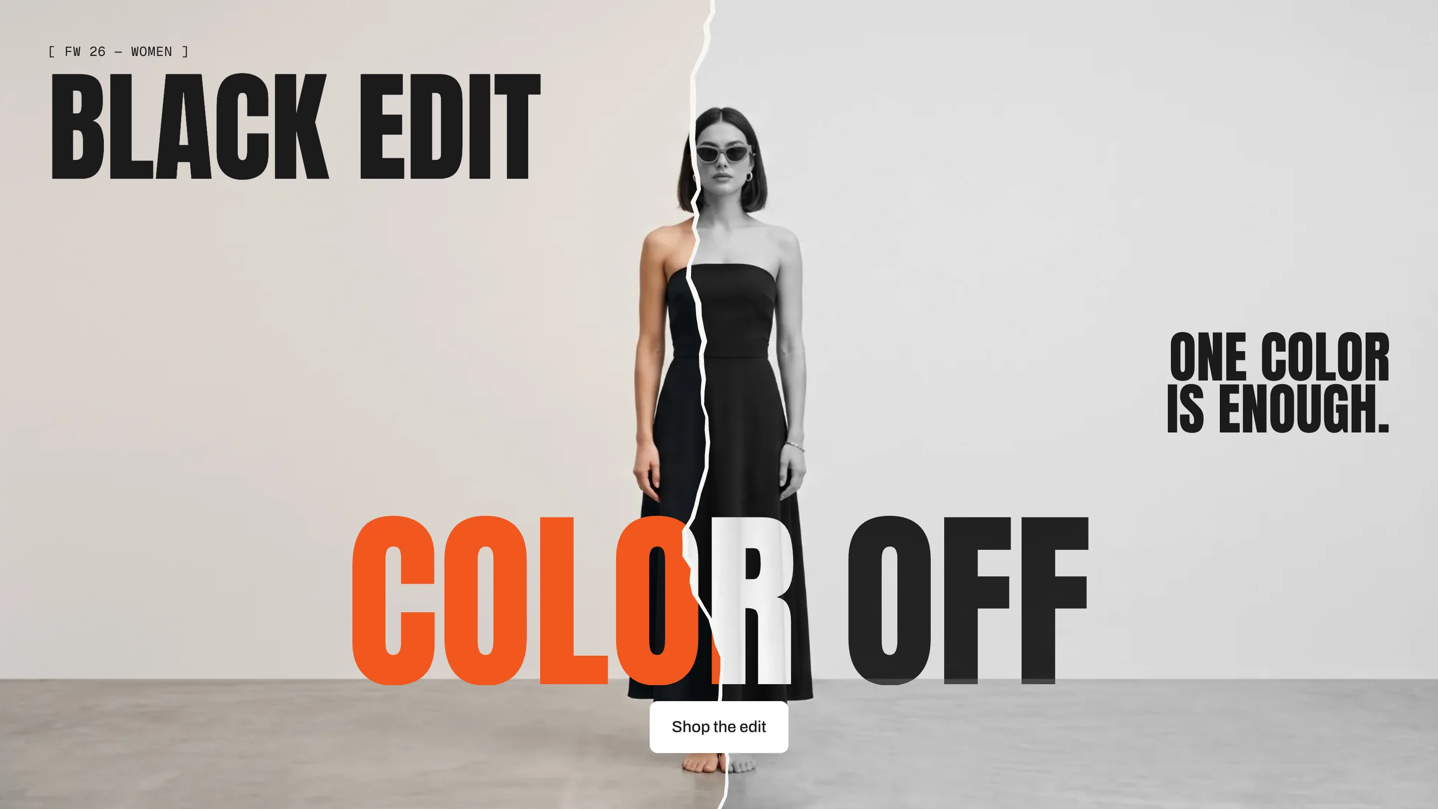
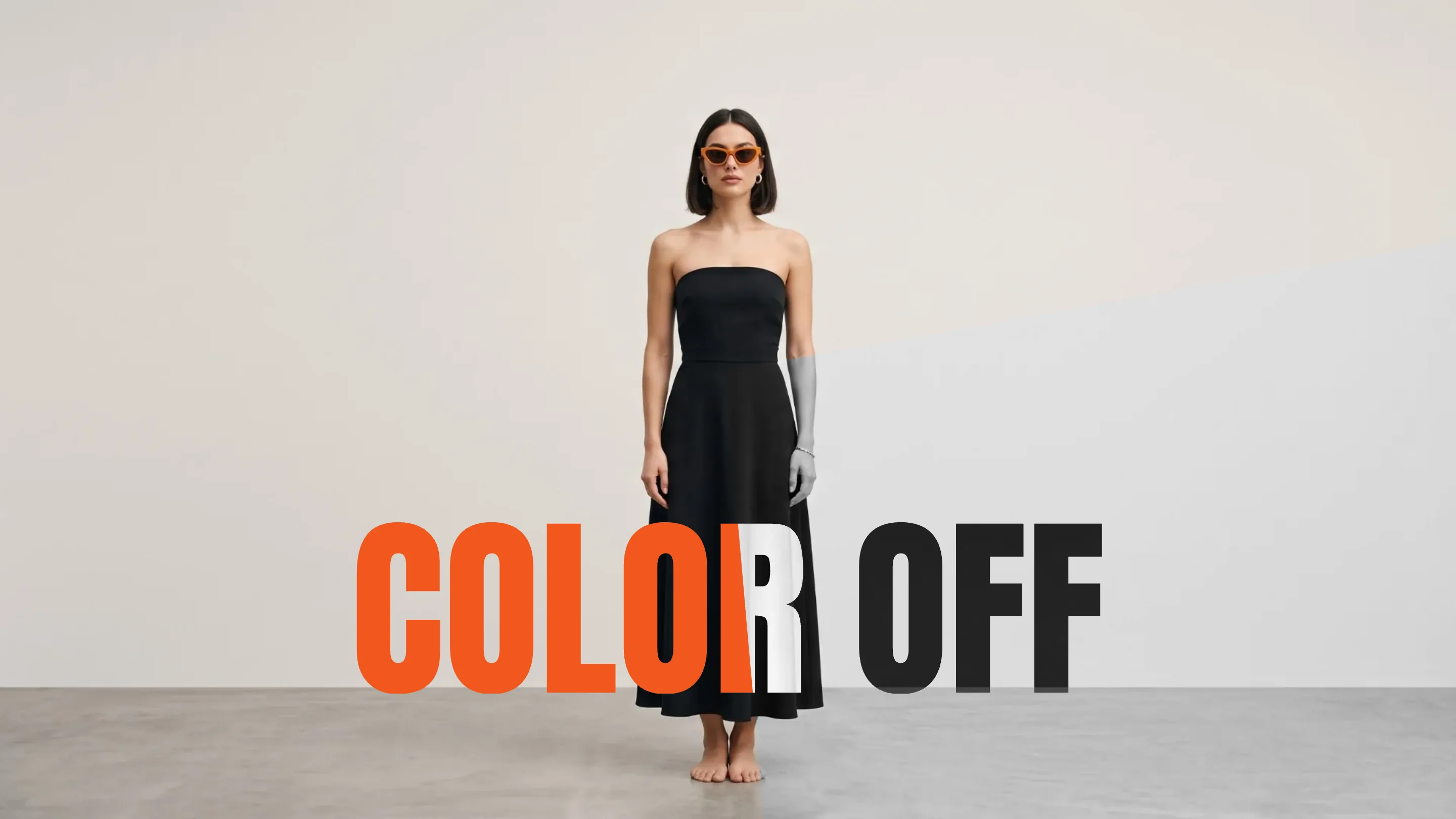
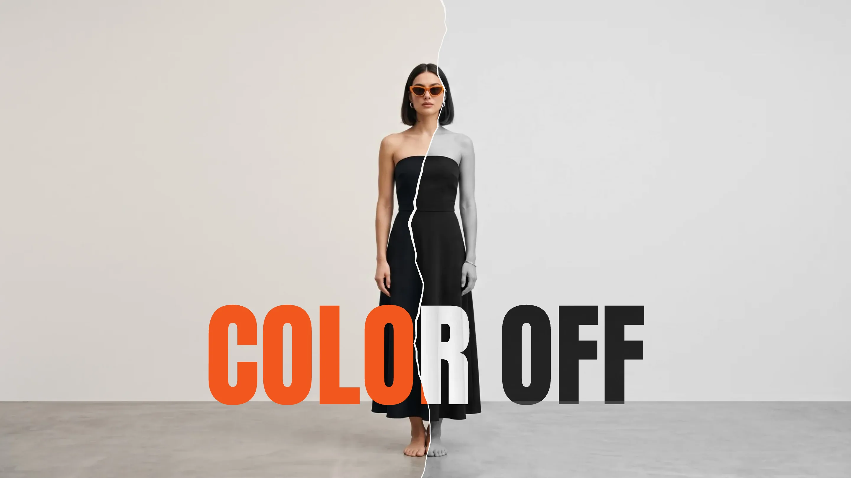
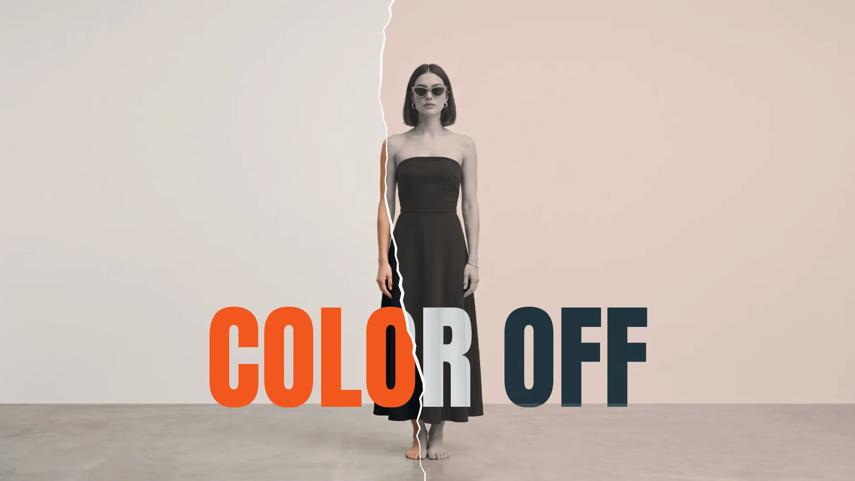
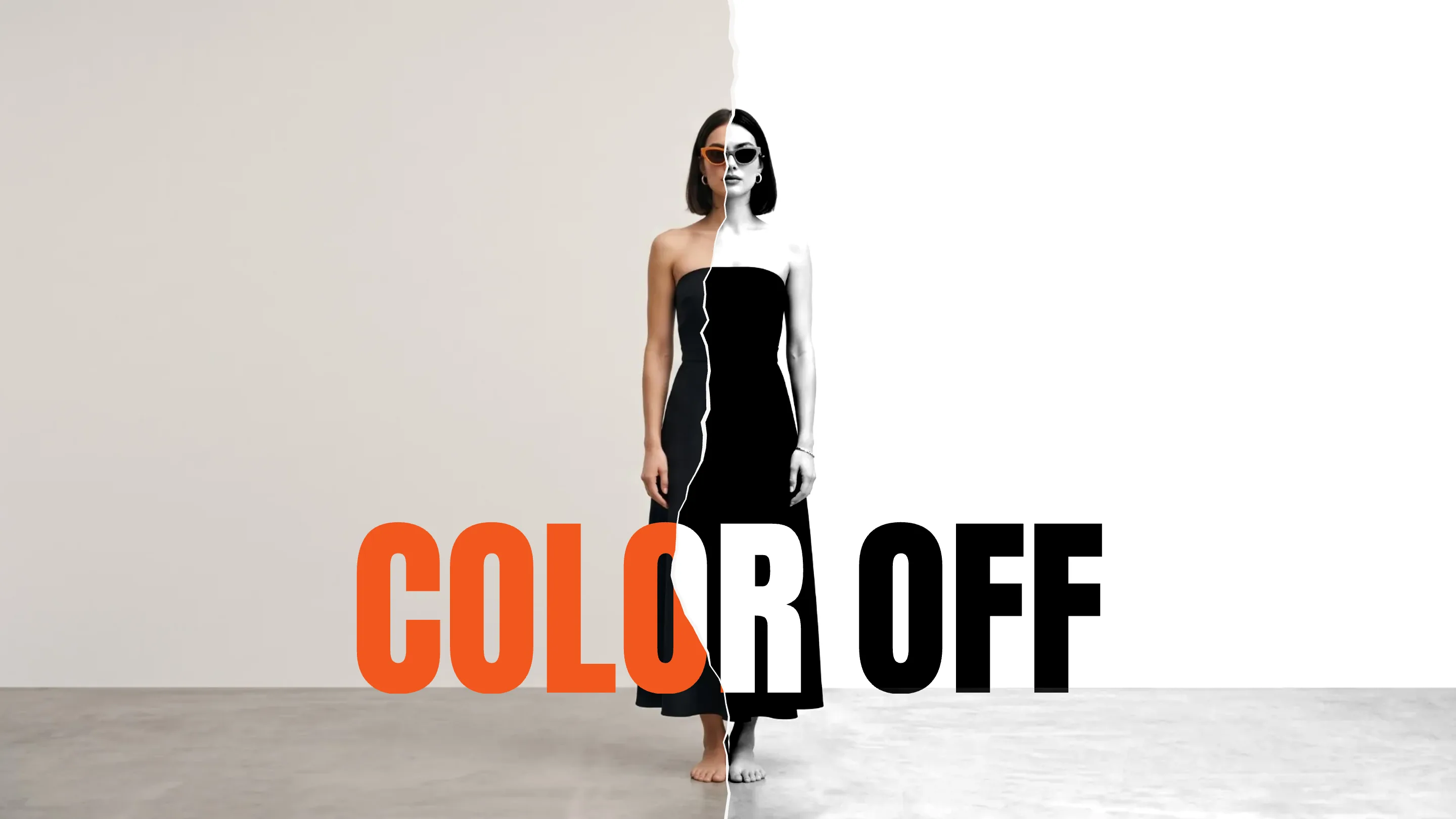
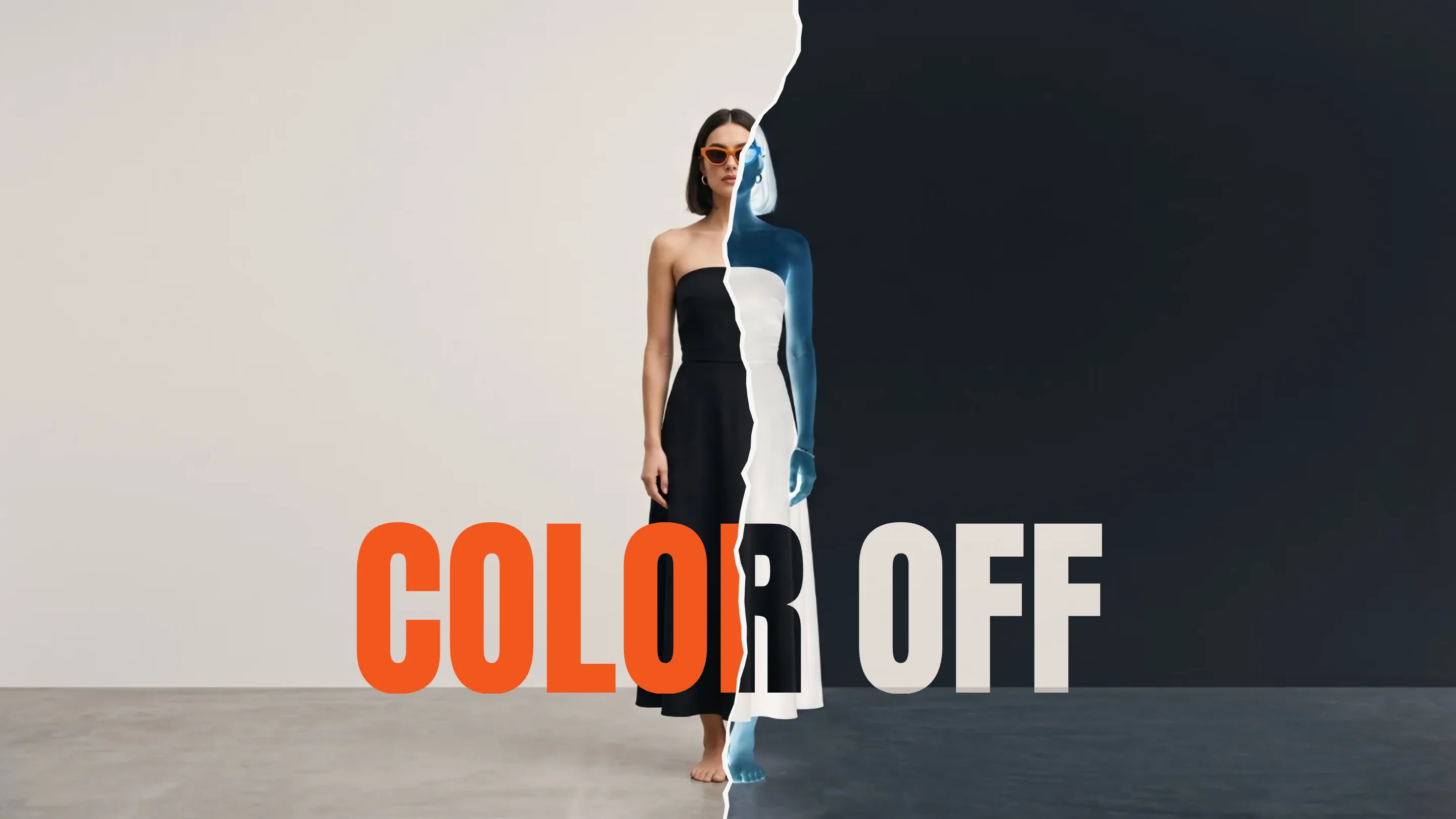
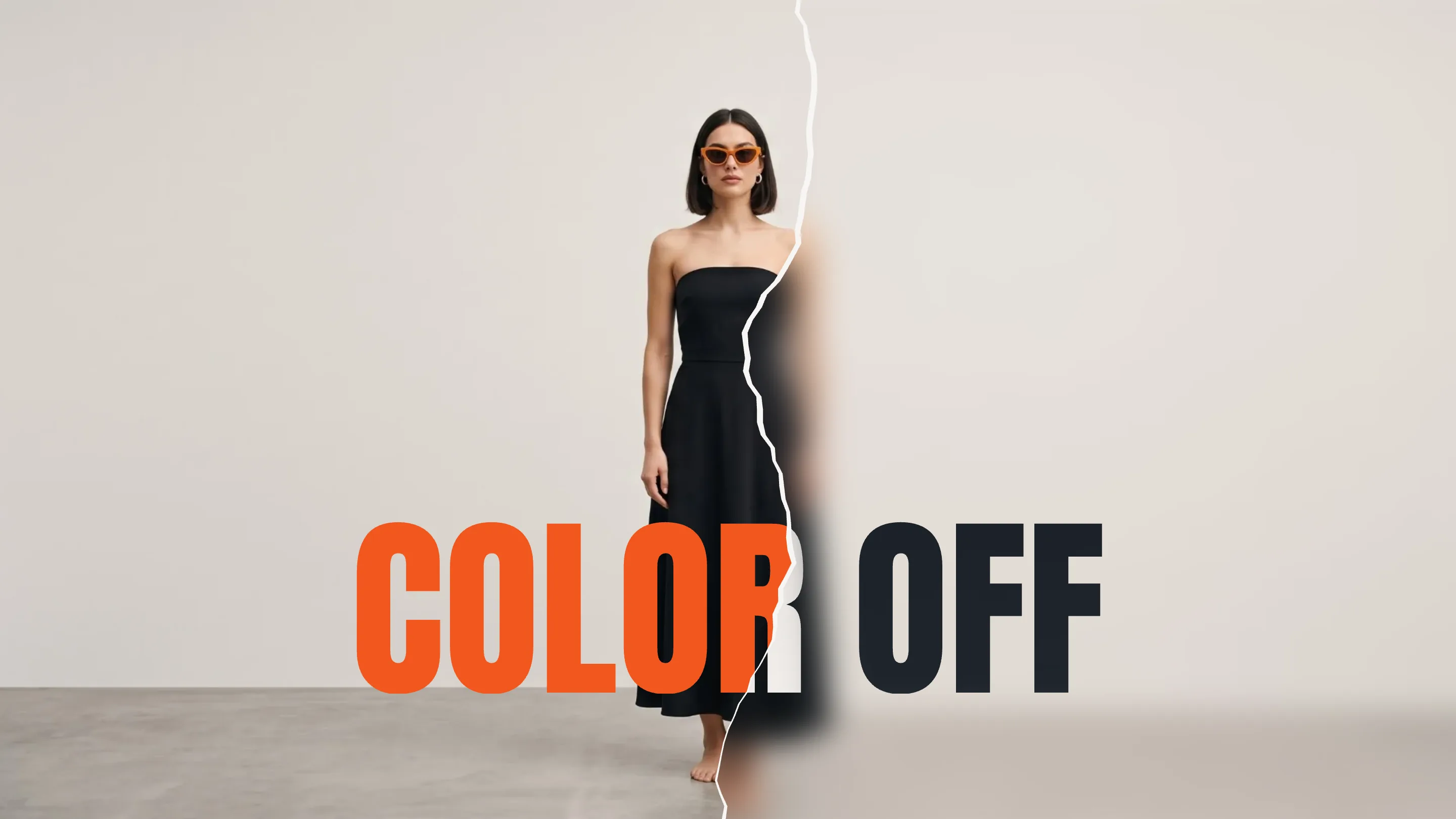
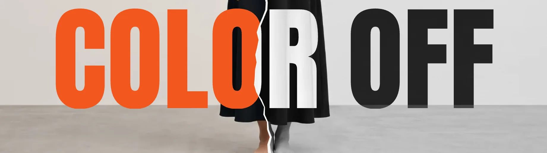
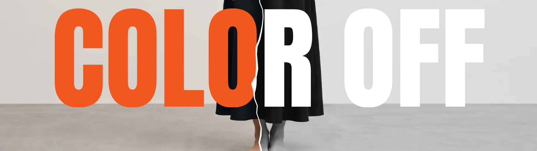
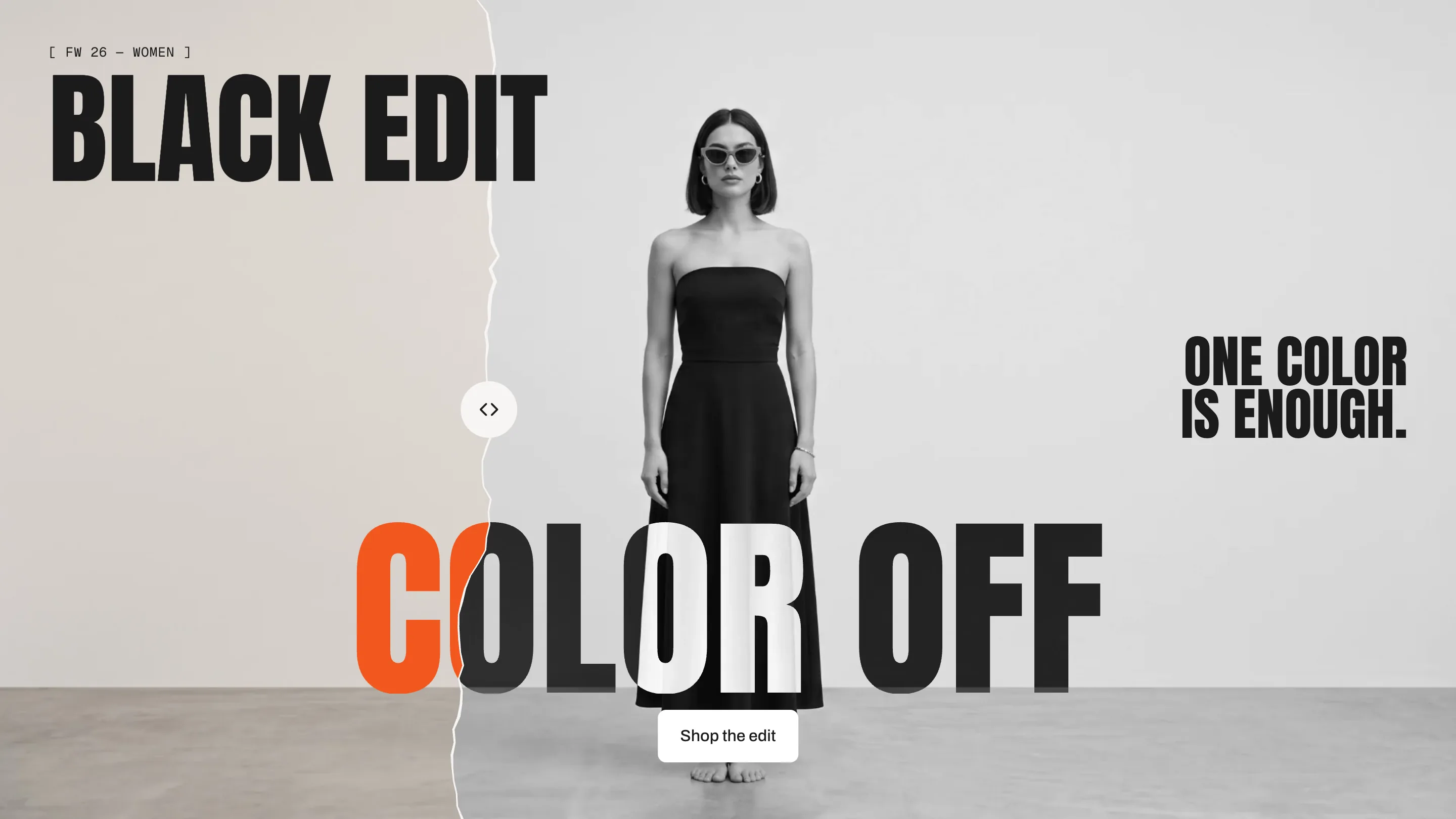
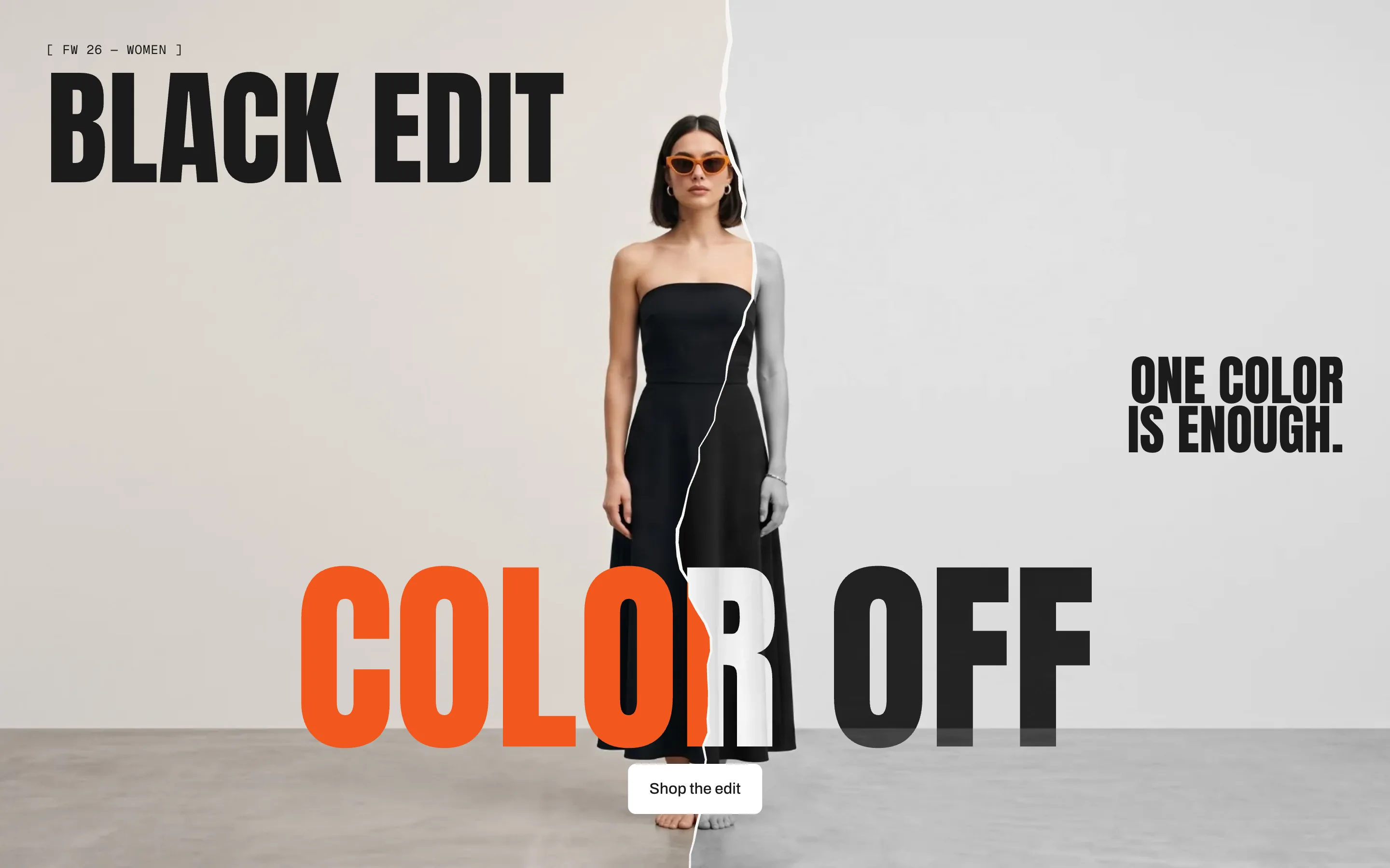
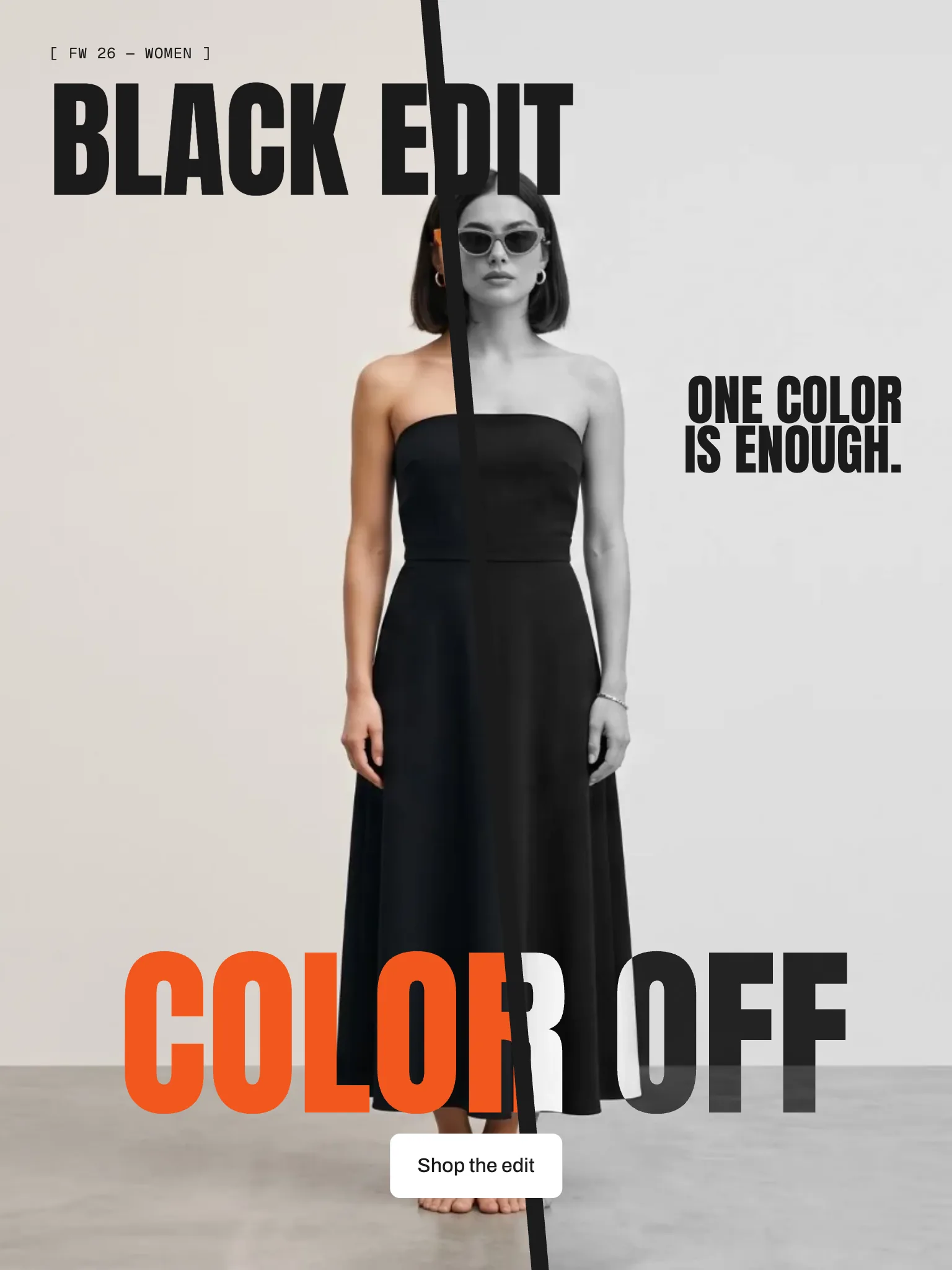
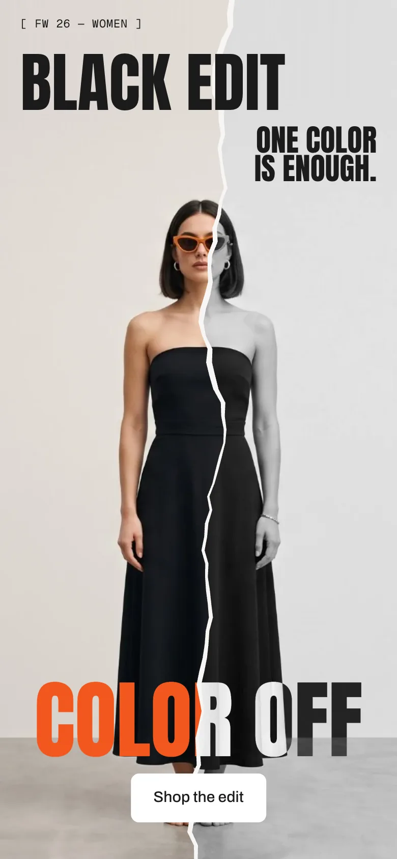
The page opens on your full-colour image, then a tear runs through it from bottom to top. Behind it the same picture turns grayscale, duotone, high contrast, negative or blurred, and the big title changes colour exactly on the tear. Torn looks like ripped paper with a light edge, Cut is a clean, slanted cut that slides apart. One image is all you upload; visitors can even drag the seam.
In your theme code editor (Online Store → ⋯ → Edit code), click the sections folder, then “New File”, name it and hit Enter.
02
Paste the code
In the file that just opened, paste the code below. Then hit Save (top right corner).
Note: Shopify shows no confirmation when a section saves – that’s normal.
03
Add it in the theme editor
Saved? Then reload the theme editor – otherwise the new section sometimes doesn’t show up. After that: Edit theme → Add section → . Everything else is in the sidebar – the Docs below explain every setting.
Code
One file. Copy it, paste it, done.
sections/werk-tear-reveal.liquid
Locked
{%- comment -%} werk · Tear Reveal · v1.3.0 · werk.build/license – do not remove {%- endcomment -%}{%- liquid assign s = section.settings # Demo image and fonts load from the werk demo store's Files (Shopify CDN), so the section looks the same in any store. assign werk_cdn = 'https://cdn.shopify.com/s/files/1/0954/8303/5932/files/' assign demo_img = werk_cdn | append: 'werk-tear-reveal-demo.jpg' assign demo_mobile = werk_cdn | append: 'werk-tear-reveal-demo-mobile.jpg' assign display_url = werk_cdn | append: 'werk-anton.woff2' assign font_url = werk_cdn | append: 'werk-archivo.woff2' assign mono_url = werk_cdn | append: 'werk-geist-mono.woff2' if s.font_url != blank assign display_url = s.font_url
1580 lines · Liquid, CSS & vanilla JS
Free – just add your email
Every section is free during launch. Enter your email once and copy any code you like.
Edit theme → open the page → Add section → – Torn or – Cut. Put it at the top of the page.
2
Pick your image
Section settings → Image. One picture is enough – the other side of the tear shows the same picture with the effect. For phones add a portrait version in Phone image.
3
Write the texts
Eyebrow, Headline left, Headline right, Title and Button. Save, then open the page in a new tab to watch the intro.
TornCut
Look
Default · Torn – a paper tear with a light edge
TornA paper tear runs through the image, with a light, frayed edge. Every page load tears a little differently.
CutA clean, slanted cut. When it's through, the effect side slides a few pixels away and leaves a gap in the background colour.
Load1 · The image in full colour, for the pause you set
Tearing2 · The tear runs, the title rises
Done3 · Eyebrow, headlines and button come in
CutCut: a straight line instead of paper
Start
Default · On page load
On page loadFor the hero at the top. The tear starts as soon as the image has loaded (at most 4 seconds later).
When it scrolls into viewFor a section further down the page. It starts once a third of it is on the screen.
Pause before
Default · 0.4s
Only the colour image shows during the pause.
Tear duration
Default · 1.6s
How long the tear takes to run across the picture once it starts. Shorter feels like a quick rip, longer like slow peeling.
Tear runs
Default · Bottom to top
Where the tear starts: at the bottom edge and up, or at the top edge and down.
Bottom to top
Top to bottom
Effect on the other side
Default · Grayscale
GrayscaleThe classic: colour on one side, black and white on the other.
DuotoneShadows and lights in two colours of your choice.
High contrastHarder black and white, like a print.
NegativeEvery colour flipped.
BlurThe same picture, out of focus.
GrayscaleGrayscale
DuotoneDuotone · Ink and Orange soft
High contrastHigh contrast
NegativeNegative
BlurBlur
Duotone shadows
Default · #1C1B1A
Only for Duotone. The colour of the dark parts of the picture.
Duotone lights
Default · #FDE6DC
Only for Duotone. The colour of the light parts of the picture.
Tear position
Default · 50%
Measured from the left. The title splits wherever the tear runs through it – try a spot between two words.
Roughness
Default · 50
Only for Torn. The tear is drawn new on every page load, so it never looks the same twice.
Only visible in the Torn look
Cut angle
Default · 5°
Only for Cut. 0 is straight up.
Only visible in the Cut look
Gap after the cut
Default · 14px
Only for Cut. The gap shows the Background colour.
Only visible in the Cut look
Difference onDifference off
Title
Default · Color off
It stays on one line: a long title gets smaller until it fits.
How the title changes colour
The picture and the title are there twice, one over the other: the colour version below, the effect version on top. The tear cuts the top one – left of it you see the colour title, right of it the effect title. So a word the tear runs through really is two colours, and nothing has to be measured.
Title, colour side
Default · #F2571F
The title colour over the colour half of the picture.
Title, effect side
Default · #FFFFFF
The title colour over the effect half.
Effect side title: difference
Default · On
On: the effect title mixes with the picture pixel by pixel (blend mode Difference) – light over the dark parts, dark over the light ones, even within one letter. Works best with white as the effect title colour; other colours turn into their opposite over the picture. Over mid-grey areas the title turns grey too and gets faint – there, turn it off. Off: always the colour above.
The handle sits on the tear. Drag it, or drag anywhere on the picture
Interactive seam
Default · Off
Drag the handle, or anywhere on the picture except the button. On phones a sideways swipe moves the tear, an up or down swipe scrolls the page as usual. With the keyboard: Tab to the handle, then ← and → (2 %), with Shift 10 %, Home and End for the edges.
Handle label (screen readers)
Default · Move the tear
Not visible – screen readers read it out on the handle. Say what it does, in your store's language.
Eyebrow
Default · [ FW 26 — Women ]
A small line above the headlines, e.g. the season. Leave it empty to hide it.
Headline left
Default · Black edit
Up to two lines.
Headline right
Default · One color
is enough.
Right-aligned, your line breaks are kept. On phones it moves under the left headline.
Button label
Default · Shop the edit
Empty: no button.
Button link
Default · Empty
Empty: all products.
Image
Default · Empty
Calm backgrounds with the subject in the middle work best: the headlines sit left and right, the tear runs through the middle. The focal point you set on the image in Shopify stays in view.
Phone image (optional)
Default · Empty
A landscape image gets cropped on a phone. A portrait version with some space above the subject leaves room for the headlines.
Height
Default · Fit screen
On phones 16:9 and 21:9 become 4:5.
Fit screen
16:9
21:9
Fonts
Default · Design fonts
Anton for the headlines and the title, Archivo for the button and Geist Mono for the eyebrow – from werk's CDN. Use theme fonts swaps every font at once. Or swap each one with its own URL – Self-hosted font URL replaces Anton; Text font URL replaces Archivo (eyebrow, text and button); Label font URL replaces Geist Mono (the small labels and numbers). Empty keeps werk’s font.
Colors
Default · Design colors
Background, the colour of eyebrow and headlines, the two title colours, the paper edge and handle, and the button – or Use theme colors, which takes text and background from the page around the section.
Paper edge and handle
Default · #F6F5F3
The torn paper edge along the tear and the handle on it.
Buttons
Default · Clean
Use theme buttons gives the button your theme's style. Button style sets how it reacts on hover.
Hover them – click a button for loading → added
Read moreCleanGrows a touch, the underline runs out and backRead moreDot to arrowThe dot grows into an arrowRead moreRolling textThe label rolls up, a copy followsRead moreFillColour wipes in from the leftRead moreShineA band of light passes over
Animations & easing
Default · On · werk Signature
Easing sets how the tear speeds up and slows down.
werk SignatureSlow start, soft landing
SmoothEven and quiet
BounceA small overshoot
SnapQuick start, gentle stop
GlideSlow in, slow out
Side padding
Default · Match theme
Match theme (the default) lines the section up with your theme's page margin – in Horizon the same edge as header and footer. Themes without one, like Dawn, keep the werk edge. werk default always uses the werk edge, Custom takes your own values in px (desktop and tablets / phones), None runs the content to the edge.
Desktop · Torn
Tablet · Cut
Phone · right headline under the left one
Desktop & tabletPhone
Headline rightIts own spot on the rightUnder the left headline
Height 16:9 and 21:9As set4:5
Handle56 px48 px
One image, one download
Both halves use the same picture, so the browser loads it once. The colour image is the first thing visitors see.
Nothing jumps
The section has its height before the image arrives, and only the tear moves. No layout shift.
Works without JavaScript
Without scripts the section shows a straight seam at the position you set – every text readable.
Two on one page
Each section tears on its own. With “When it scrolls into view” the second one waits until it's visible.
AI label
Using an AI-generated picture? Switch on AI label under that picture and pick a corner. The text and the look – pill, info dot or upright along the edge – are set once for the whole section, under AI label. Also covers the phone image. The old single note (Old: one note for the section) only shows in the editor while it is still on.
Horizon4.2Tested
Dawn16TestedPaper edge and theme buttons checked
I don't see the intro.
The theme editor always shows the finished tear. Open the page in a new tab. If it's still finished right away: Animations is off, or your device has “reduce motion” turned on.
The headlines run over the face.
Pick an image with the subject in the middle and calm space left and right – or add a portrait Phone image with room above the subject.
The title on the effect side is hard to read.
Turn on Effect side title: difference, or pick a colour that stands out on the effect.
The tear looks different every time.
That's on purpose with Torn. For a calmer tear set Roughness lower, or use Cut.
1.3.012 Oct 2026
NewSide padding. Match theme (the default) lines the section up with your theme's page margin – in Horizon the same edge as header and footer. Themes without one, like Dawn, keep the werk edge. werk default always uses the werk edge, Custom takes your own values in px (desktop and tablets / phones), None runs the content to the edge.
1.2.011 Oct 2026
NewAI label per picture (EU AI Act). Under every own picture and video a switch with the corner; the text and the look – pill, info dot that opens on hover, or upright along the edge – are set once under AI label. Off by default, nothing changes until you switch it on. Product and collection pictures from Shopify never get one.
NewThe old single note (Show AI label) is replaced by the labels per picture. Its setting stays, but only shows in the editor while it is on – turn it off and switch the label on at the picture. AI label is now the text of the labels.
1.1.06 Oct 2026
NewText font URL and Label font URL (Fonts) – swap Archivo (eyebrow, text, button) and Geist Mono (labels) for your own .woff2. With Self-hosted font URL every font can now be swapped on its own; Use theme fonts still swaps all of them.
1.0.04 Oct 2026
NewFirst stable release. Same code as 0.1.0, plus the docs, the videos and the showroom page.
* Built for Online Store 2.0 and tested in Shopify's Horizon and Dawn themes. Heavily customised or older themes can still clash with it – if something looks off, write us and we'll take a look.