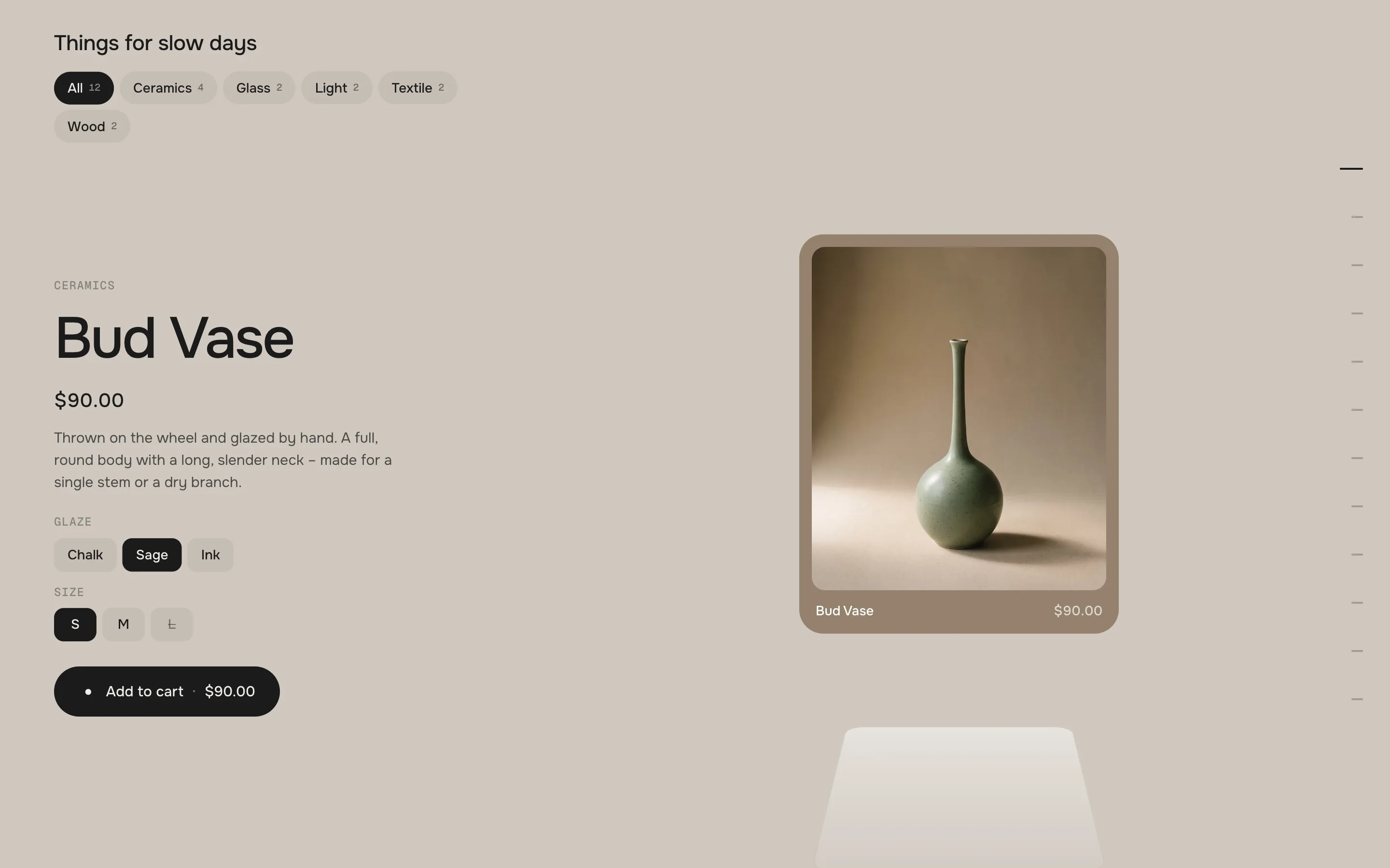
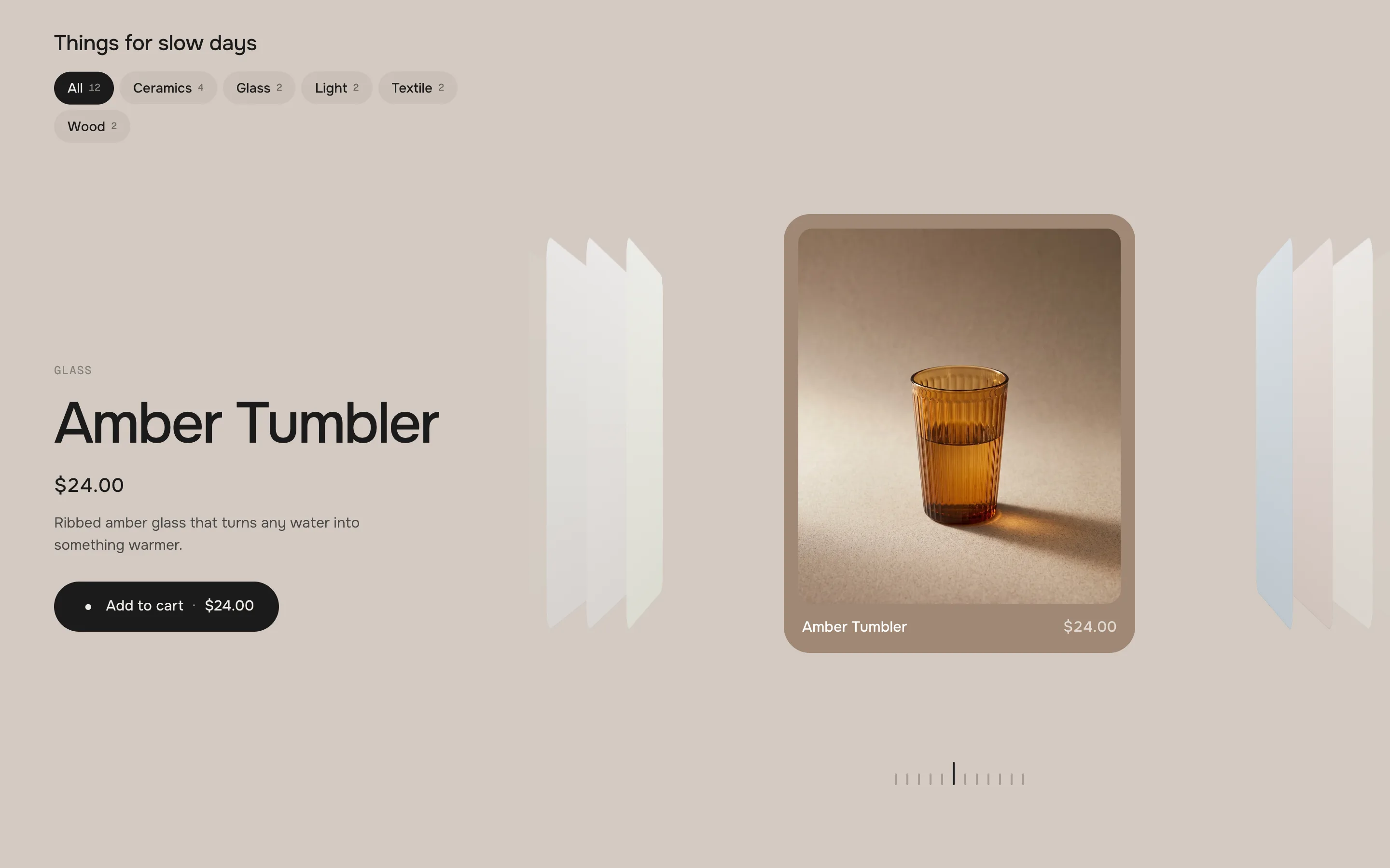
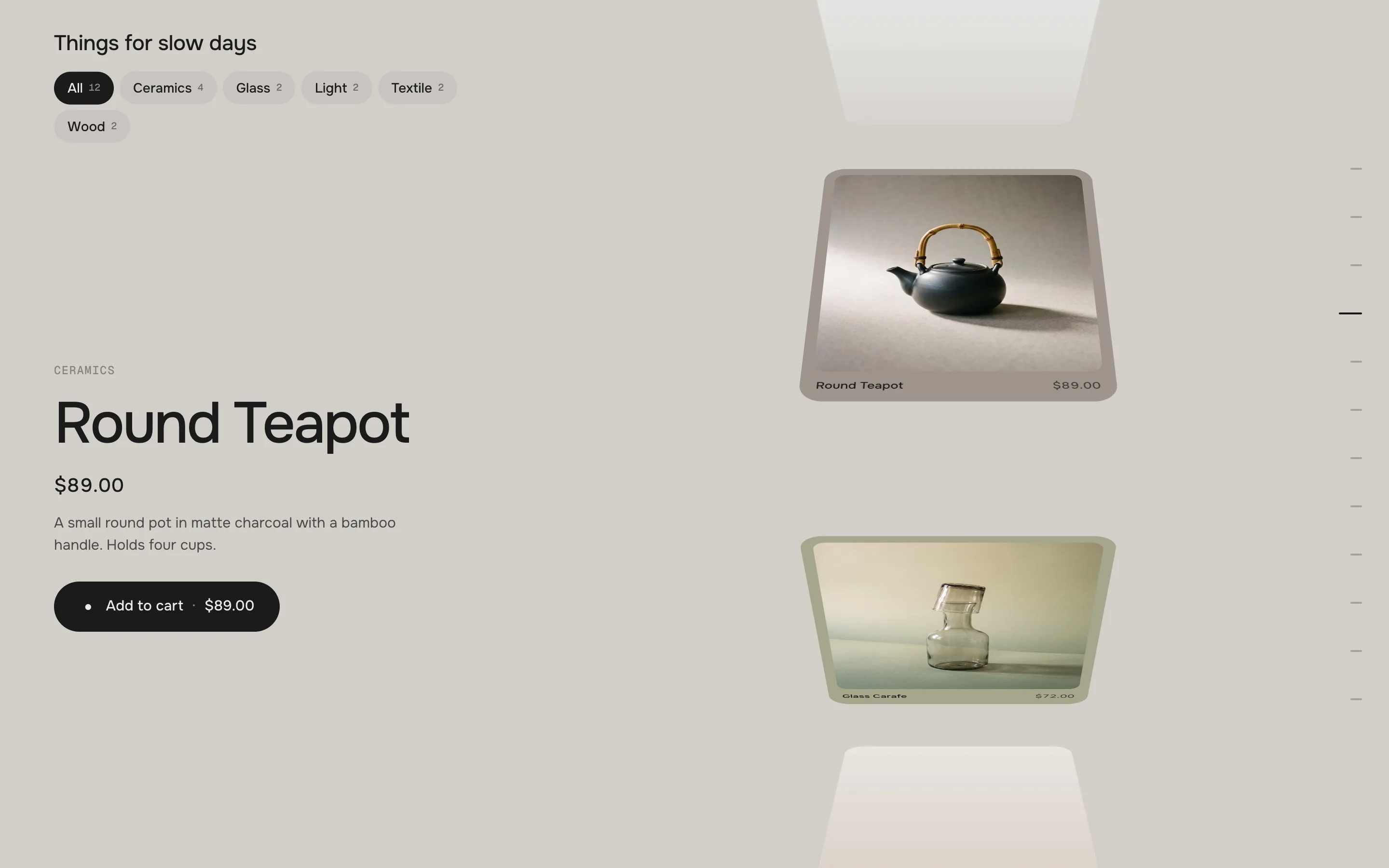
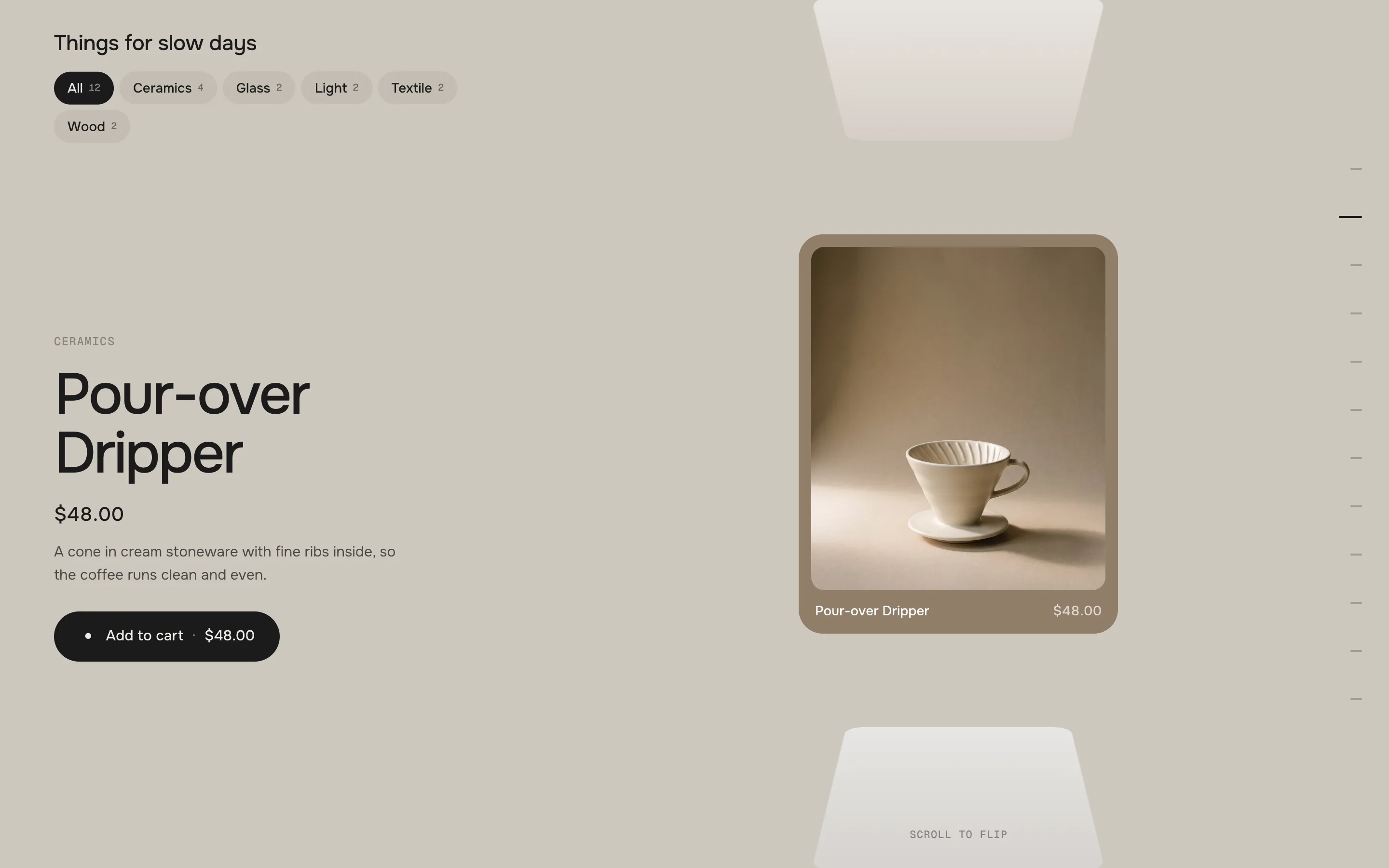
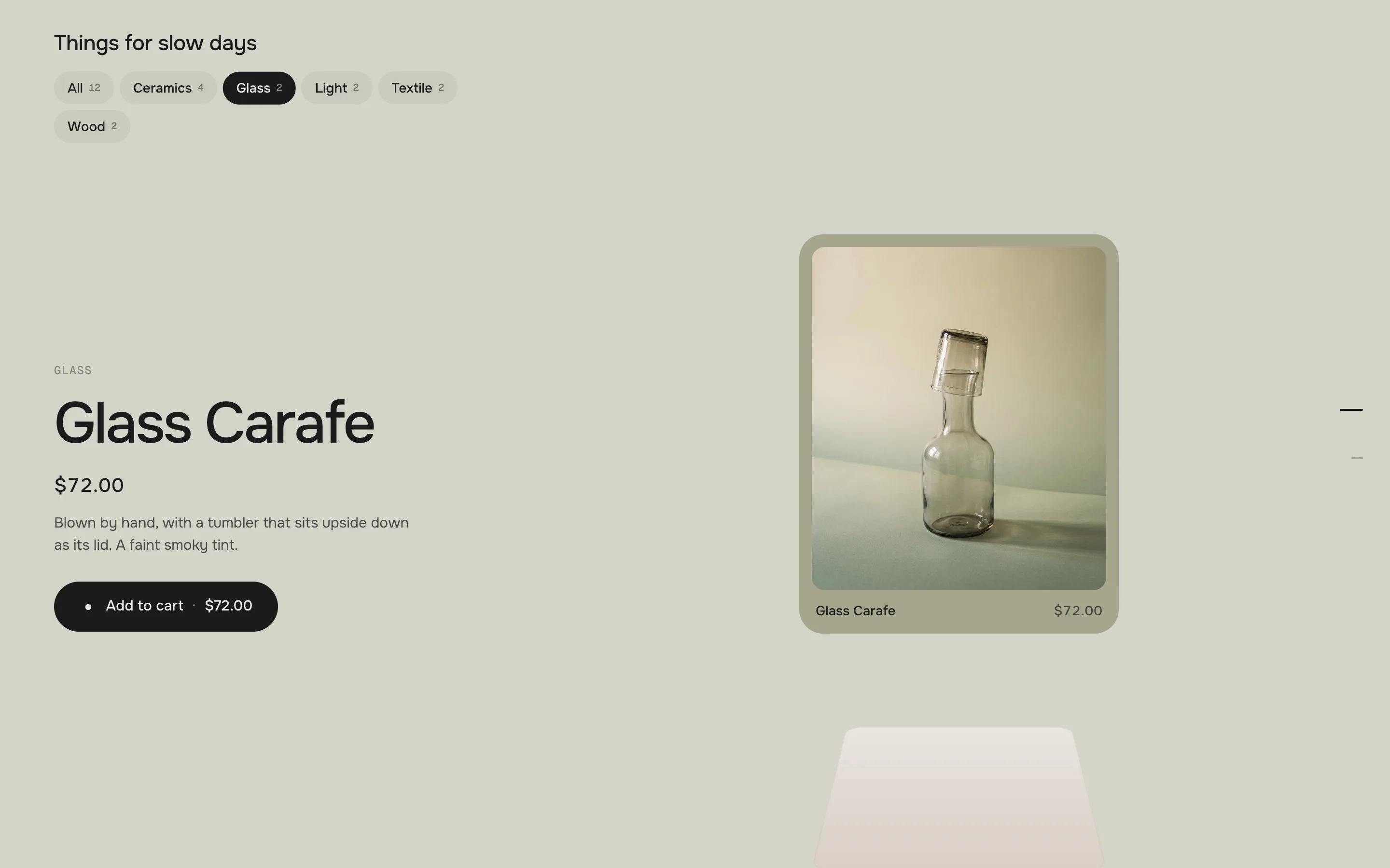
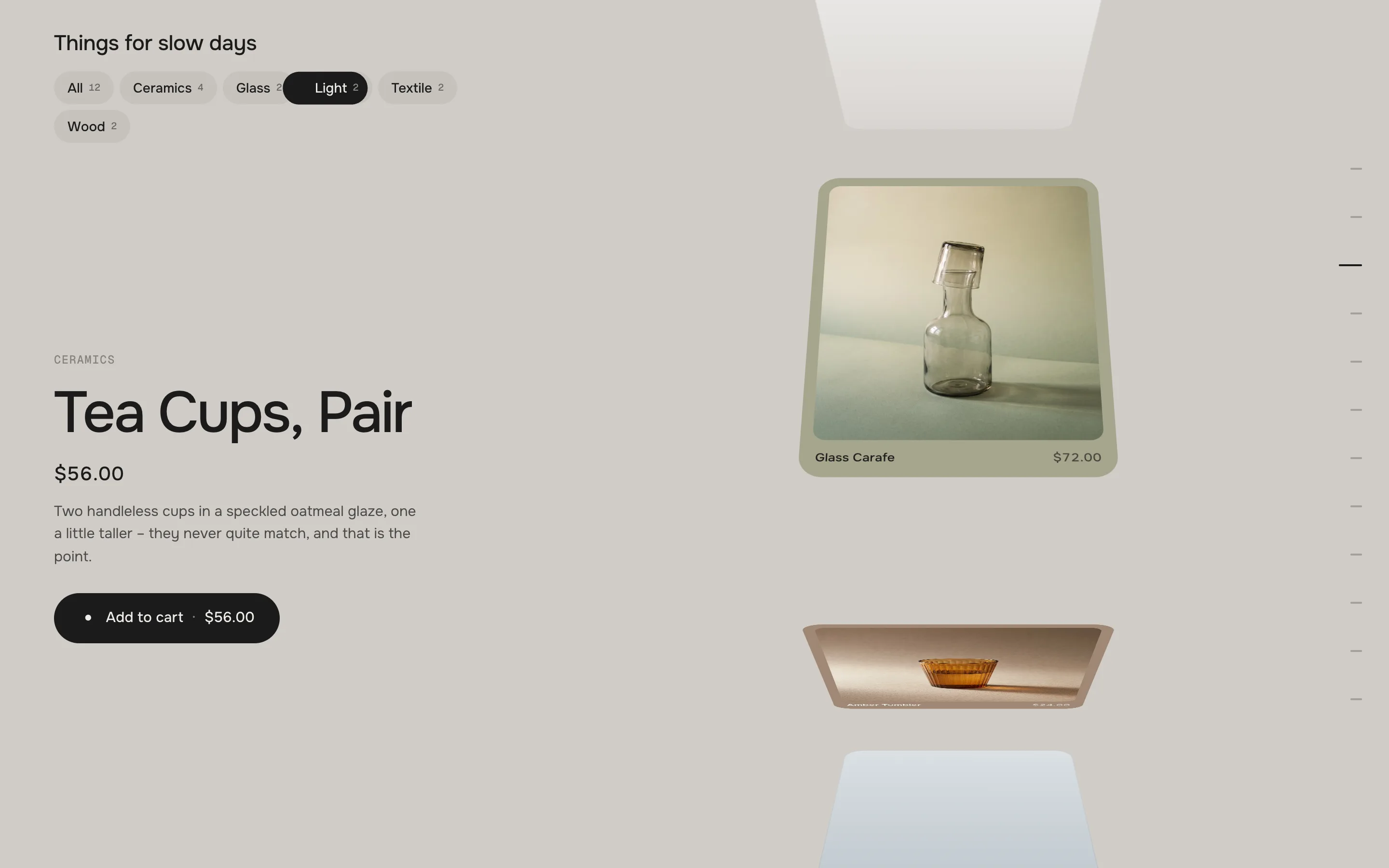
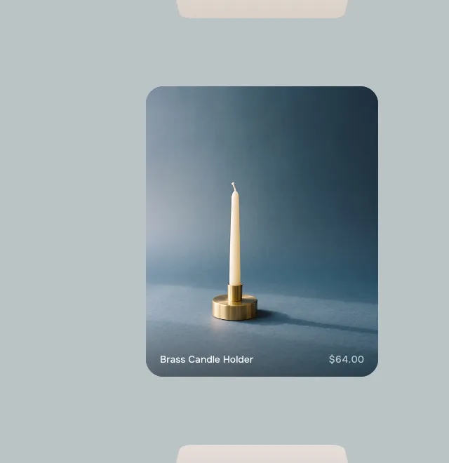
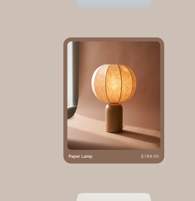
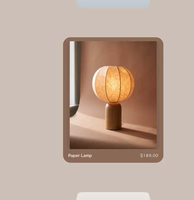
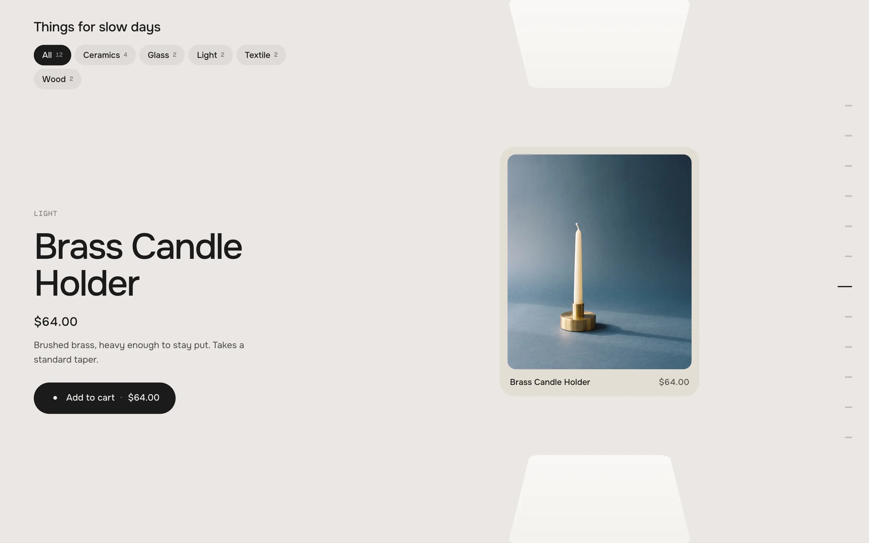
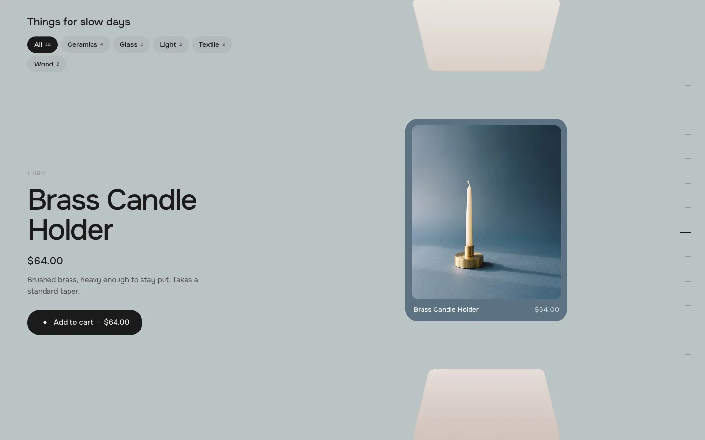
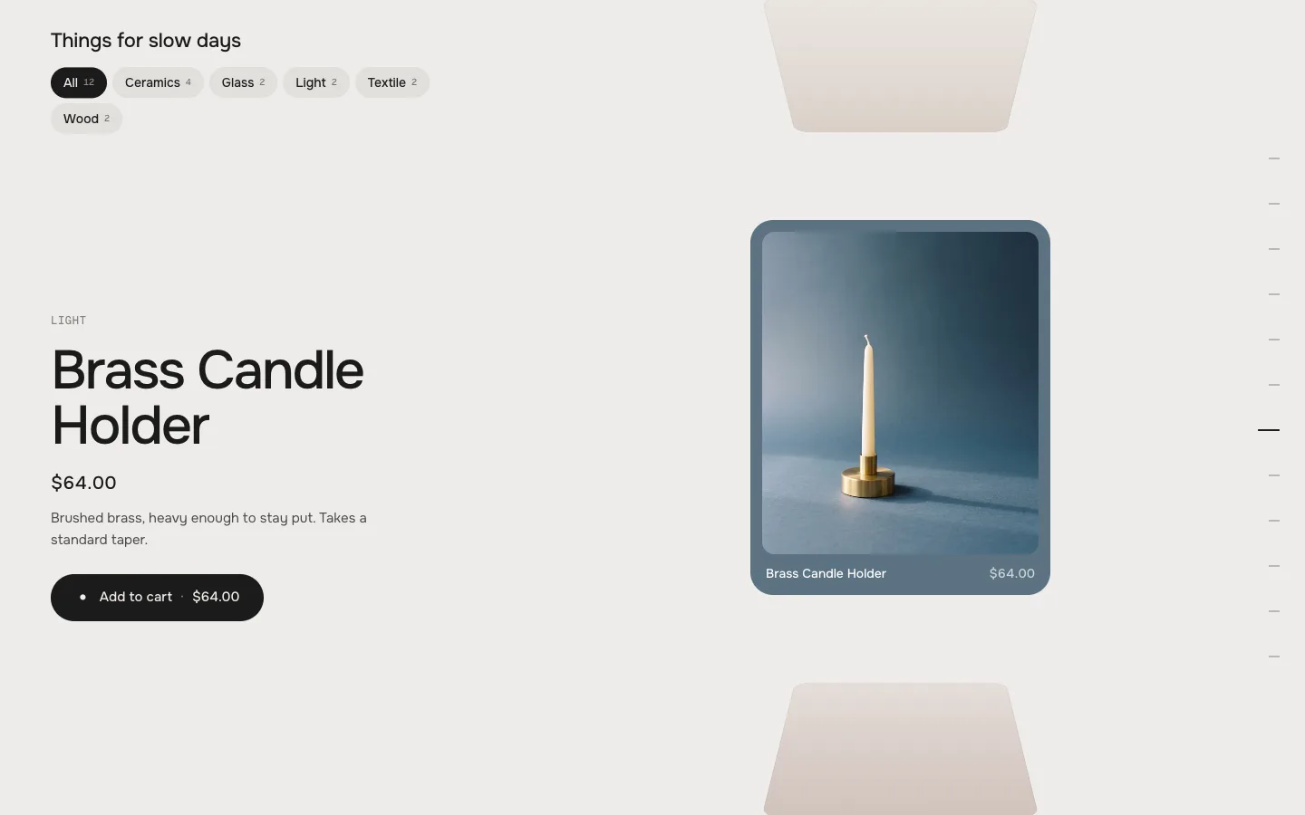
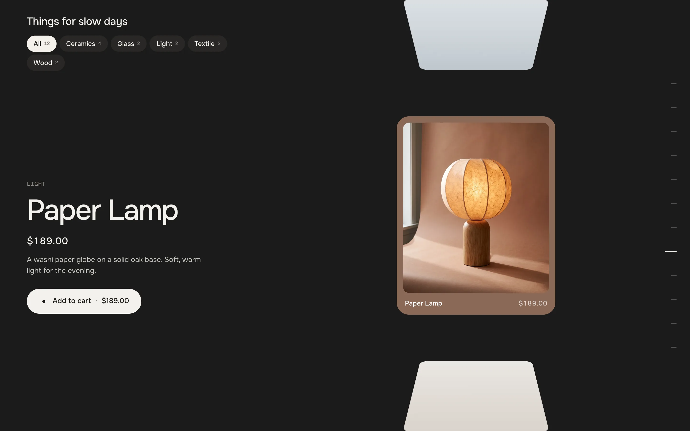
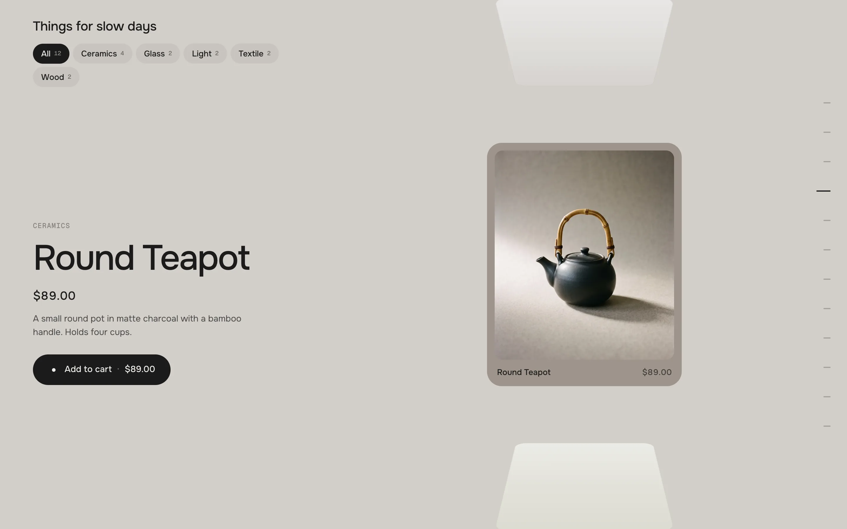
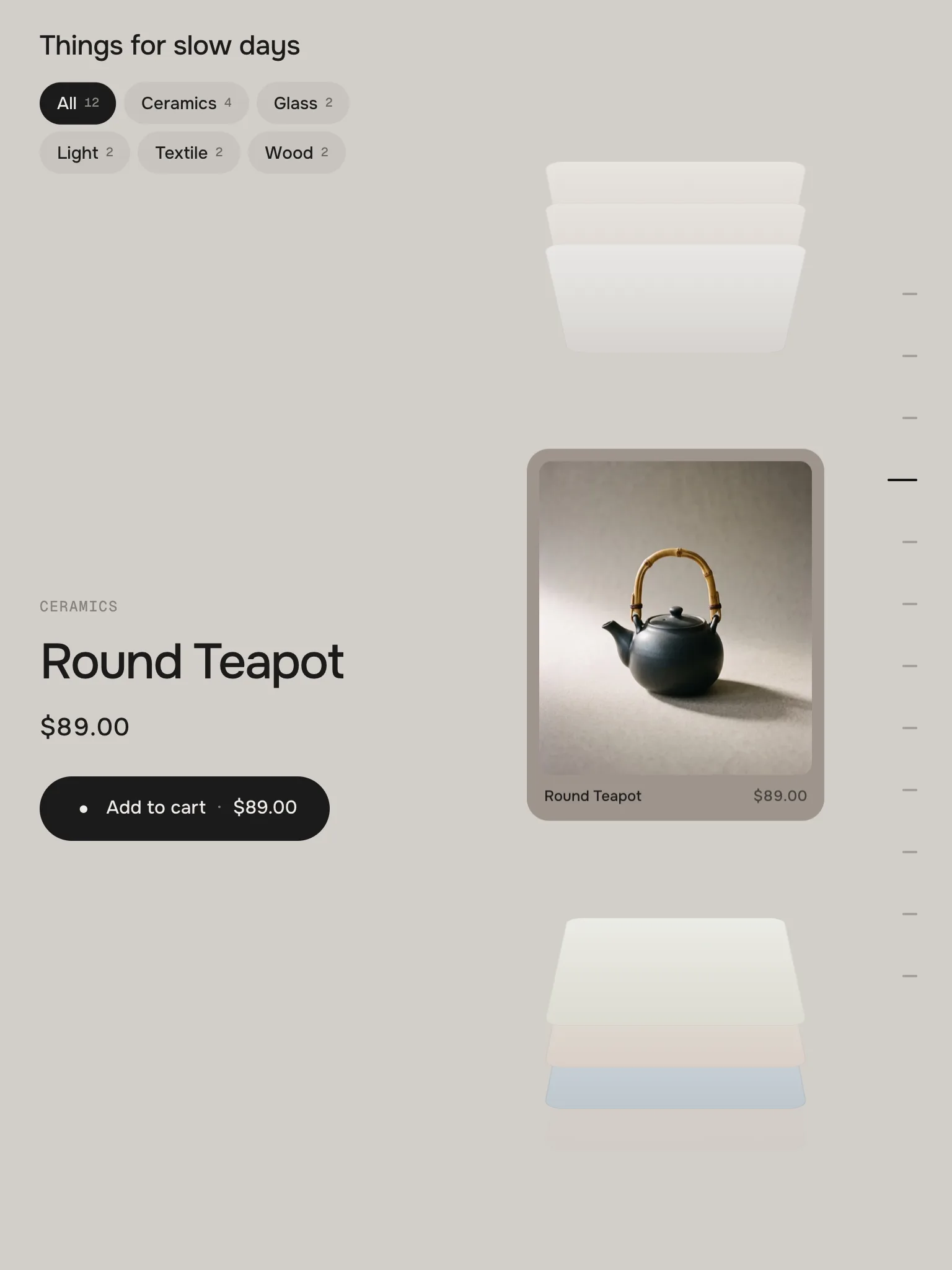
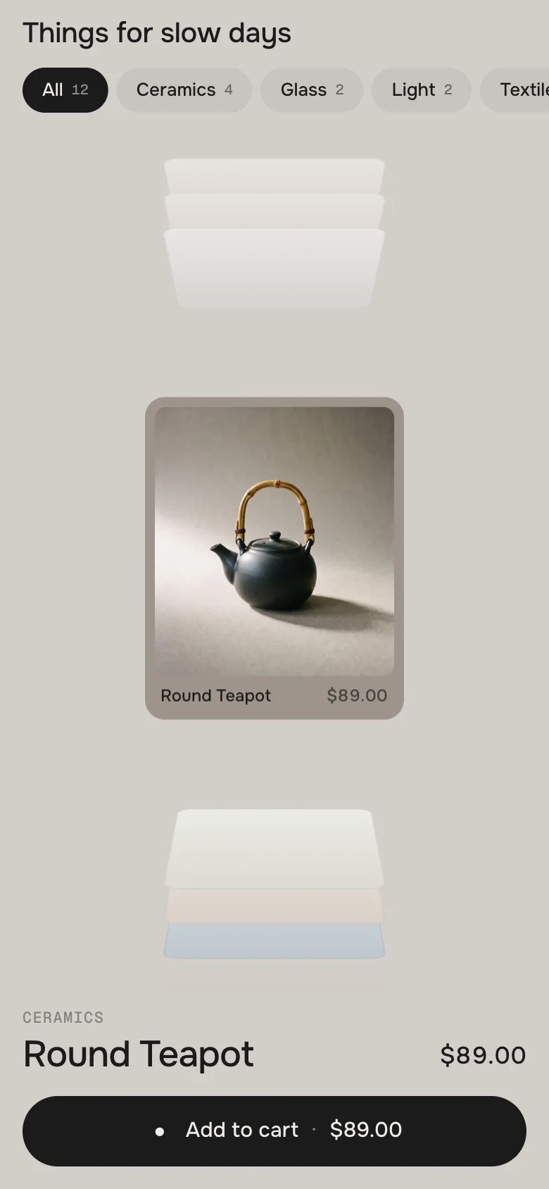
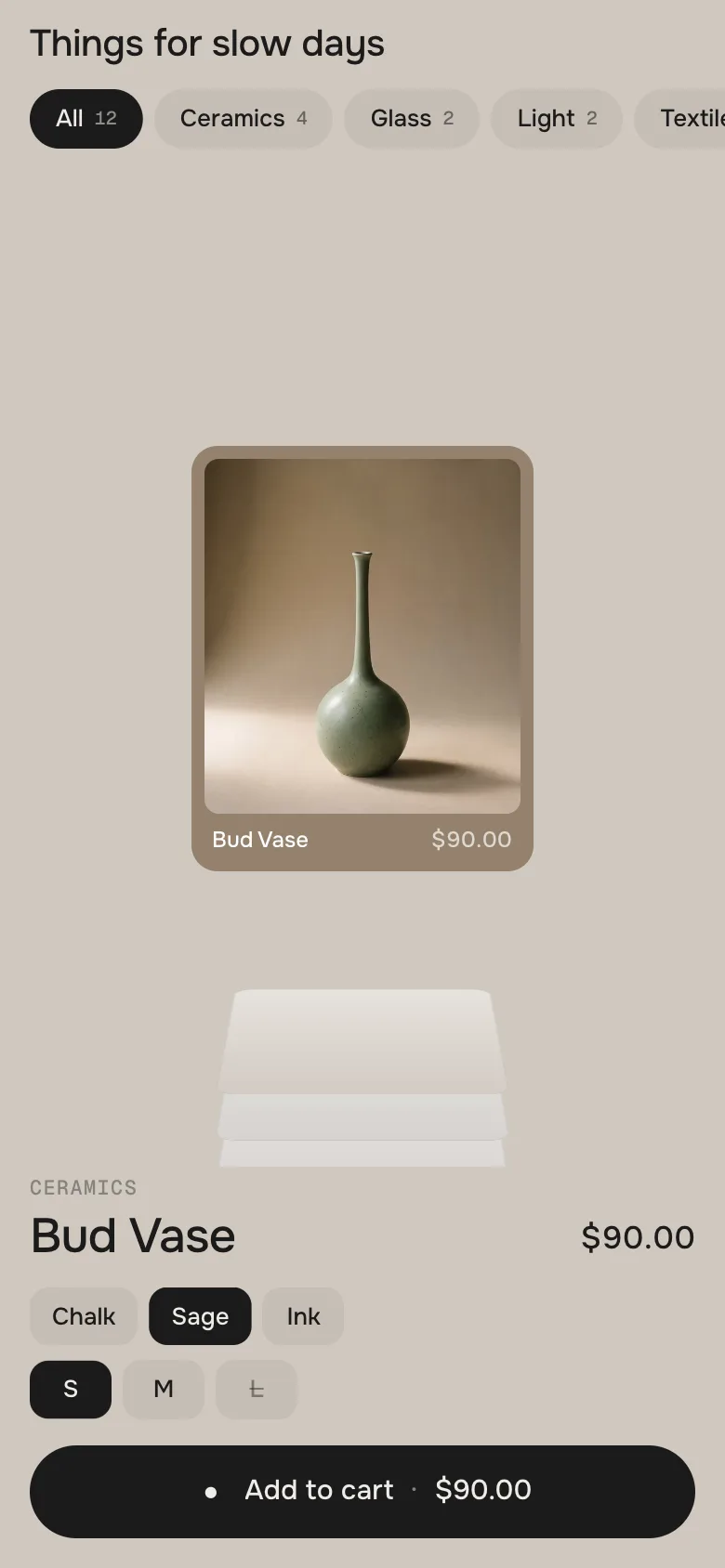
Your products lie stacked like cards in a Rolodex. While visitors scroll, the next card flips forward and settles; the info beside it changes with it – name, price, options and add to cart. Chips switch between collections, the background takes the colour of the card, and an added card flies into the cart. Vertical or horizontal.
In your theme code editor (Online Store → ⋯ → Edit code), click the sections folder, then “New File”, name it and hit Enter.
02
Paste the code
In the file that just opened, paste the code below. Then hit Save (top right corner).
Note: Shopify shows no confirmation when a section saves – that’s normal.
03
Add it in the theme editor
Saved? Then reload the theme editor – otherwise the new section sometimes doesn’t show up. After that: Edit theme → Add section → . Everything else is in the sidebar – the Docs below explain every setting.
Code
One file. Copy it, paste it, done.
sections/werk-product-deck.liquid
Locked
{%- comment -%} werk · Product Deck · v1.2.3 · werk.build/license – do not remove {%- endcomment -%}{%- liquid assign s = section.settings # Demo pictures and fonts load from the werk demo store's Files (Shopify CDN), so the section looks the same in any store. # The demo reuses the twelve objects of Product Canvas (“Things for slow days”), on their tone backdrop (-b). assign werk_cdn = 'https://cdn.shopify.com/s/files/1/0954/8303/5932/files/' assign font_url = werk_cdn | append: 'werk-onest.woff2' assign mono_url = werk_cdn | append: 'werk-geist-mono.woff2' if s.font_url != blank assign font_url = s.font_url endif if s.mono_font_url != blank
3230 lines · Liquid, CSS & vanilla JS
Free – just add your email
Every section is free during launch. Enter your email once and copy any code you like.
Edit theme → open the page → Add section → (or ). It comes with twelve demo objects in five chips, so you see the whole deck right away.
2
Pick your products
Choose a Collection – or add Chip blocks, one per collection, to get the chips on top. Product blocks below a chip come first in that chip.
3
Set how many cards
Cards per chip takes 2 to 50. Six to twelve feel best: every card adds a stretch of scrolling.
4
Scroll it
Preview the page and scroll through the section: card after card flips forward, the info beside it follows.
Halfway: the front card tips back onto the stack, the next one comes up
The front card
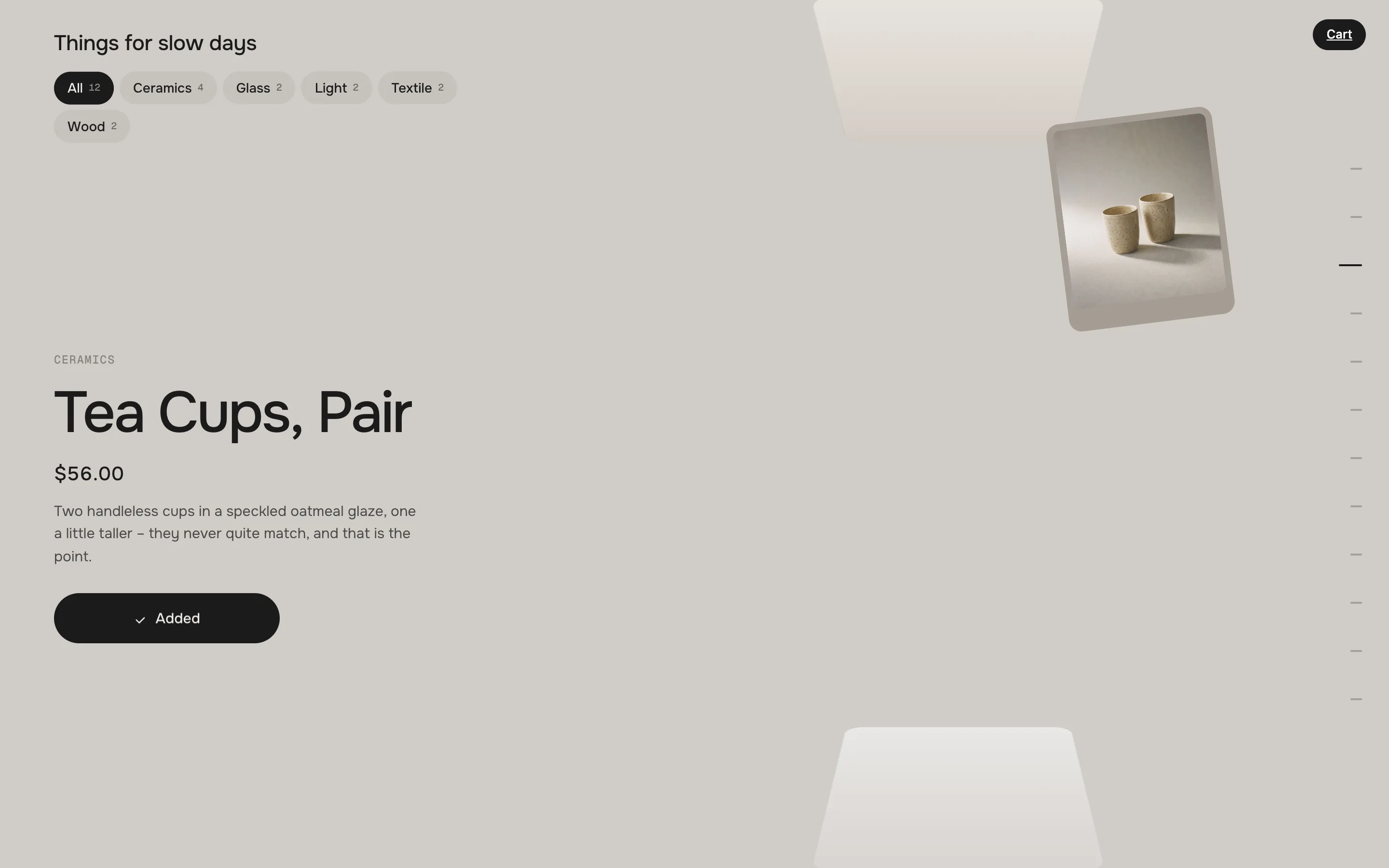
The section is one screen high and stays put while the page scrolls through it. The card at the front faces the visitor; the cards already seen lie tilted on the stack above it, the ones still to come below it (Horizontal: left and right). Every bit of scrolling turns them a little further – when visitors stop, the deck settles on the nearest card.
The info beside it
Name, price, options and add to cart of the front card. The name slips out word by word and the next one rises in, the rest follows.
Getting around
•Scroll – the deck follows every pixel and settles on a card. With Control: Drag, visitors drag the cards instead (see Scrolling & motion).
•Click a card on the stack or a mark in the index – the page scrolls until it is at the front.
•Click the front card – it opens the product.
•Keyboard – ← and → move one card. ↑ ↓ and Page keys scroll the page as always.
The idle hint
When nobody scrolls for a few seconds, the next card lifts a little, twice, and “Scroll to flip” fades in below the deck – so visitors know there is more. Any scroll, click or key and it is gone.
The next card lifts a little, the hint shows below the deck
Collection (without chips)
Default · Empty
For a deck without chips: the products of this collection, in its order. As soon as there are Chip blocks it is ignored – every chip brings its own collection. Until you pick one (or add blocks), the section shows our demo objects.
Cards per chip
Default · 12
How many cards one chip shows, product blocks included. The section grows with every card – see Scroll per card.
“All” chip
Default · On
With two or more chips, “All” comes first: every product of every chip, each once.
Heading
Default · Things for slow days
The line above the chips. Bold, italic and links work. Empty: no heading.
The chip Glass – the deck shows its two products
Switching chips
The old deck riffles away, the new one flips in from below and the page goes back to the start of the section. The info column keeps the old product until the new front card replaces it.
Right after a click on a chip: the cards riffle through
Theme editor
Product Deck
Chip: Ceramics
Product: Paper Lamp
Chip: Gifts
Product: Wool Throw
Product: Oak Board
Chip
One chip on top of the deck. Up to 8. A chip without products doesn't show.
SettingWhat it doesDefault
LabelThe text of the chip. Empty takes the collection's title.Ceramics
CollectionThe products of this chip, after its product blocks.Empty
Product
A hand-picked card. It belongs to the chip above it and comes first there – before the chip's collection, a product that is in both shows once. Without chips, product blocks come before the section's collection. Blocks above the first chip don't show.
SettingWhat it doesDefault
ProductThe product for this card.Empty
Card pictureReplaces the product's first picture on the card – e.g. a mood shot instead of the packshot.Empty
AI labelMarks an AI-generated card picture – off or a corner.Off
Card colorReplaces the colour taken from the picture.Empty
Look
Default · Vertical
Vertical: the cards flip forward from below. Horizontal: they turn in from the side.
VerticalThe cards flip forward from below, the stack lies above and below the front card.
HorizontalThe cards turn in from the side, the stack stands left and right, the index runs along the bottom.
Info side
Default · Left
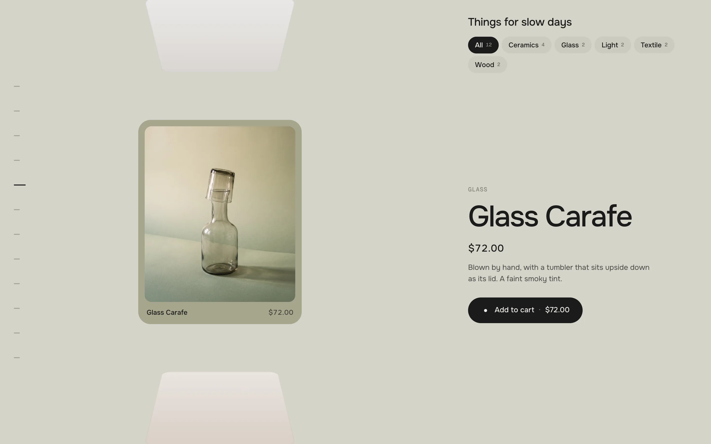
The info column left or right of the deck on wide screens. Phones always show it below the cards.
Left
Right
Info side: Right – the deck moves to the left, the index with it
Card style
Default · Frame
Frame puts the picture into the card with the name and price below it; Full bleed fills the card, name and price sit on the picture.
Frame
Full bleed
FrameFull bleed
Pictures
Default · Fill the card
Fill the card crops the picture to the card; Show whole picture fits it in – best for cut-outs.
Fill the card
Show whole picture
Fill the cardShow whole picture
Index
Default · Thumbnails on hover
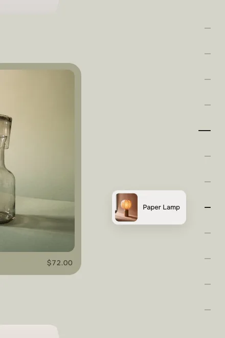
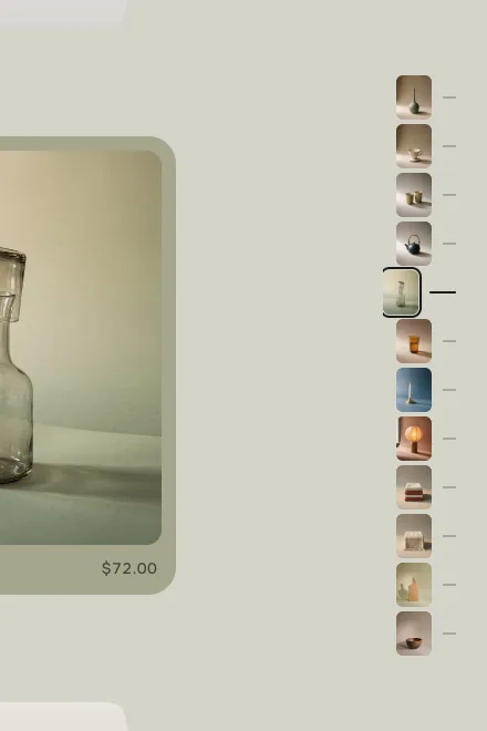
One mark per card beside the deck, the front card's mark longer. Click a mark to bring its card to the front.
With many cards the index scrolls along with the front card. Phones don't show it.
Ticks
Thumbnails on hover
Thumbnails
TicksTicks – marks only
Thumbnails on hoverThumbnails on hover – the card under the pointer shows with its name
ThumbnailsThumbnails – a small picture per card
Short description
Default · On
The first lines of the product description, cut after 40 words. Wide screens only – when the column runs out of room, it steps aside first.
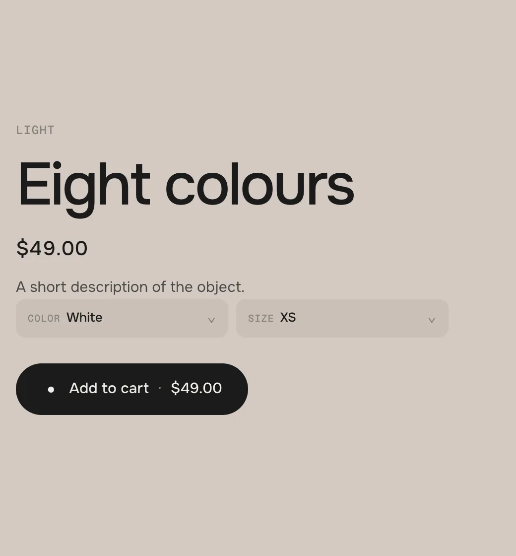
Options
Default · On
Every option of the product as a line of chips. A product with more than two options, more than seven values or very long values gets dropdowns.
Control
Default · Scroll – the section stays
Scroll: the section stays in place while the page scrolls, every card flips forward. Drag: the section scrolls with the page, visitors drag and throw the cards.
Scroll – the section staysthe section is one screen that stays in place while the page scrolls through it; every bit of scrolling turns the cards.
Drag – visitors drag the cardsthe section scrolls with the page like any other. Visitors drag the deck with the mouse or a finger (up and down in Vertical, sideways in Horizontal); let go with a flick and it carries on, then settles on a card. Past the first or the last card it pulls back like a rubber band. Index, chips, keys and the theme editor glide the deck to their card. The mouse wheel keeps scrolling the page.
Scroll per card
Default · 55vh
How far visitors scroll from one card to the next, in screen heights (55 = 55 % of the screen). The section is one screen plus this stretch per card: twelve cards at 55 are a little over seven screens of scrolling.
Snap to each card
Default · On
On: when visitors stop scrolling, the deck settles on the nearest card. Off: it stays wherever they stop, a card may hang halfway.
After add to cart
Default · Card flies to the cart, next card
Card flies to the cart, next carda copy of the card flies into your theme's cart, then the next card comes to the front.
Card flies to the cart, stayit flies, the card stays at the front.
No flightonly the button confirms.
The card on its way to the cart icon in the header
Idle hint
Default · On
The lift of the next card and the line “Scroll to flip” (Drag: “Drag to flip”) after a few seconds without scrolling. See How it works.
Type, name and price
Above the name: the product type. The name wraps and steps down in size when it is long – it is never cut. The price follows the chosen variant.
Options
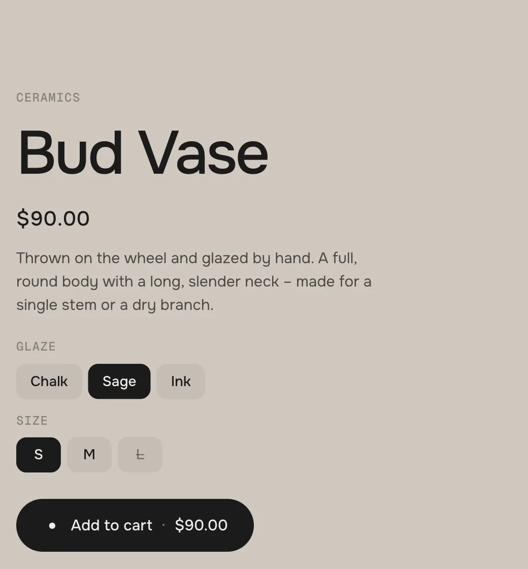
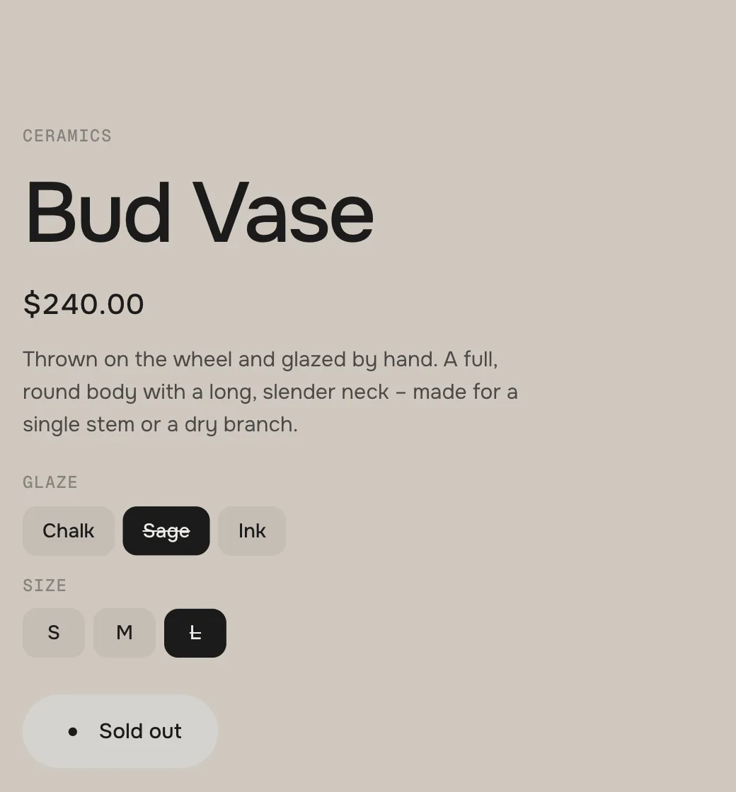
The dark choice glides from one value to the next. A value that can't be bought with the other choices is crossed out. The choice is kept per product while the deck moves on.
ChipsChips – the price follows the variant
Sold outA combination that can't be bought: crossed out, Sold out
DropdownsMany values become dropdowns
Add to cart
The price stands in the button. After the click it confirms, your theme's cart count goes up – and, with After add to cart, the card flies there.
Little room
On a small laptop with long texts the column steps down on its own: first the description goes, then the chips run in one swipeable line, then the options become dropdowns and the name gets smaller.
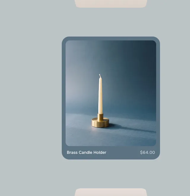
Card color
Default · From the picture
From the picture: every card takes the colour of its picture's edge – the demo objects each on their own backdrop. One colour: the same card for all. A Card color on a Product block wins over both. On dark cards name and price turn white.
From the picture
One color
Card color: One color
Tint the background
Default · On
The background takes a little of the front card's colour and changes with it.
OnOff
Fonts
Default · Design fonts
Onest and Geist Mono from werk's CDN. Use theme fonts swaps every font at once. Or swap each one with its own URL – Self-hosted font URL replaces Onest; Label font URL replaces Geist Mono (the product type, the option labels and the idle hint). Empty keeps werk's font.
1Background#EDECE9The whole stage (tinted by the front card)
2Text#1C1B1AHeading, names, prices, chips, the button
3Small text#85827CProduct type and option labels
6Accent#F2571FThe dot in the button, the hover of the button styles Dot to arrow and Fill
Use theme colors takes the text and background colour of the page around the section. Button and Button text give the button its own colours – empty keeps the design: the text colour with the background colour on it.
Background, text and small text changed – the button follows
Buttons
Default · Dot to arrow
Use theme buttons gives Add to cart your theme's style. Button style sets how it reacts on hover.
Hover them – click a button for loading → added
View productCleanGrows a touch, the underline runs out and backView productDot to arrowThe dot grows into an arrowView productRolling textThe label rolls up, a copy followsView productFillColour wipes in from the leftView productShineA band of light passes over
Easing
Default · werk Signature
How the deck settles on a card, how the chips switch and how the info comes in.
werk Signature
Smooth
Bounce
Snap
Glide
werk SignatureSlow start, soft landing
SmoothEven and quiet
BounceA little past the card and back
SnapQuick start, gentle stop
GlideSlow in, slow out
Animations
Default · On
Off: the cards change without flipping, no flight to the cart, no riffle, no idle hint – the deck still follows the scrolling. Visitors who turned on “reduce motion” on their device always get this.
“All” chipAllThe first chip with every product
Add to cartAdd to cartThe button – the price follows by itself
AddedAddedThe button after a successful add
Sold outSold outThe button and the dropdown for variants that can't be bought
Choose an optionChoose [option]The button when the chosen combination doesn't exist – [option] becomes the option's name
ErrorCouldn't add it to the cart. [message]Under the button when the shop refuses – [message] is the shop's reason
View productView productThe button of subscription-only products
Idle hintScroll to flipBelow the deck after a few seconds without scrolling
Idle hint (Drag)Drag to flipThe same with Control: Drag
Screen reader: deckProduct deckName of the section for screen readers
Screen reader: chipsCategoryName of the chip row
Screen reader: indexAll cardsName of the index
Screen reader: show productShow [product]Label of the cards on the stack
Side padding
Default · Match theme
Match theme (the default) lines the section up with your theme's page margin – in Horizon the same edge as header and footer. Themes without one, like Dawn, keep the werk edge. werk default always uses the werk edge, Custom takes your own values in px (desktop and tablets / phones), None runs the content to the edge.
Desktop · info beside the deck
Tablet · narrower info, no description
Phone · chips on top, info below
Name and price in one line, options as chips, the full-width button
DesktopTabletPhone
InfoLeft or right of the deckLeft or right, narrowerBelow the deck
ChipsWrapWrapOne swipeable line
DescriptionShownHiddenHidden
OptionsChips or dropdownsChips or dropdownsChips or dropdowns
IndexTicks or thumbnailsTicks or thumbnailsHidden
A header over the top of the screen or a bar docked at the bottom is measured – the deck keeps clear of it.
The editor follows you
Click a Chip block in the theme editor and the deck switches to it; click a Product block and its card comes to the front.
The cart stays your theme's
Add to cart tells your theme, so the cart count in the header updates without a reload. The card flies to your theme's cart icon.
Nothing loads on the way
Names, prices and variants of every card come with the page – a card that flips forward never waits for the network. Pictures load when their card comes near.
Light on the page
One loop, and only while the section is on screen and something moves. No libraries.
AI label
Using an AI-generated card picture? Switch on AI label under that picture and pick a corner. The text and the look – pill, info dot or upright along the edge – are set once for the whole section, under Texts. Only for own card pictures – product pictures never get one.
Horizon4.2TestedAdd to cart with options (cart count updates, the card flies to the cart in the nav dock), chips, theme fonts, colours and buttons
Dawn16TestedAdd to cart with options (cart bubble updates, the card flies to the cart icon), chips, theme fonts, colours and buttons
The section shows demo objects.
No collection is picked and there are no Chip or Product blocks. Pick a Collection or add blocks.
A chip is missing.
It has no products: its collection is empty and there are no Product blocks below it. Or its products are drafts.
A product block doesn't show.
It sits above the first Chip block – move it below the chip it belongs to.
A product is missing.
It is a draft or not published in the online store – or the chip has more products than Cards per chip. Raise the number (up to 50).
The cards have odd colours.
They take the colour of the picture's edge. Set Card color to One color, or give a Product block its own Card color.
A picture is cut in the wrong place.
Only when Pictures fills the card. Set a focal point on the picture in Shopify (Products → the product → click the picture → Edit) – the card keeps that spot in view. Or switch Pictures to Show whole picture.
The page feels very long.
Every card adds a stretch of scrolling. Show fewer cards or lower Scroll per card.
The cards don't flip, they just change.
Animations is off – or your device asks for reduced motion (on a Mac: System Settings → Accessibility → Display → Reduce motion).
A product has a View product button instead of Add to cart.
It can only be bought with a subscription. Visitors pick their plan on the product page.
1.2.317 Oct 2026
FixedFix: in the horizontal look the idle hint (“Scroll to flip”) sat inside the index marks – it now sits above the index row, with marks and with thumbnails.
1.2.216 Oct 2026
NewCounters gone: no more “02 / 12” above the product name and no “01 / 12” at the index – the product type stays above the name.
1.2.113 Oct 2026
NewThe section's collection is now called “Collection (without chips)” and says when it counts: only without chip blocks – with chips, each chip brings its own collection. Same setting, nothing to redo.
1.2.012 Oct 2026
NewControl – Scroll (the section stays and scrolling turns the cards, as before) or Drag (the section scrolls with the page, visitors drag and throw the cards with mouse or finger; a flick carries on and settles on a card, a rubber band at both ends). Index, chips, keys and the theme editor glide the deck in both. New text: Idle hint (Drag), “Drag to flip”.
FixedFix: a click on a card on the stack brings it to the front again (it hit the plate instead of the card since 1.0.0).
1.1.012 Oct 2026
NewSide padding. Match theme (the default) lines the section up with your theme's page margin – in Horizon the same edge as header and footer. Themes without one, like Dawn, keep the werk edge. werk default always uses the werk edge, Custom takes your own values in px (desktop and tablets / phones), None runs the content to the edge.
1.0.012 Oct 2026
NewFirst stable release. Same code as 0.1.0 plus: the info column steps down on small screens (no description → chips in one swipeable line → dropdowns and a smaller name), thumbnails on hover float beside the index instead of unfolding it (nothing moves under the pointer), stacked cards always show as plain plates, empty chips stay hidden, the card text colour reads hex colours right.
NewTested: stress test (200 checks: 9 cases × 2 looks × 4 screen sizes), real clicks and taps, Horizon and Dawn with real products (options, add to cart, cart count, flight to the cart icon, chips), theme fonts, colours and buttons.
* Built for Online Store 2.0 and tested in Shopify's Horizon and Dawn themes. Heavily customised or older themes can still clash with it – if something looks off, write us and we'll take a look.