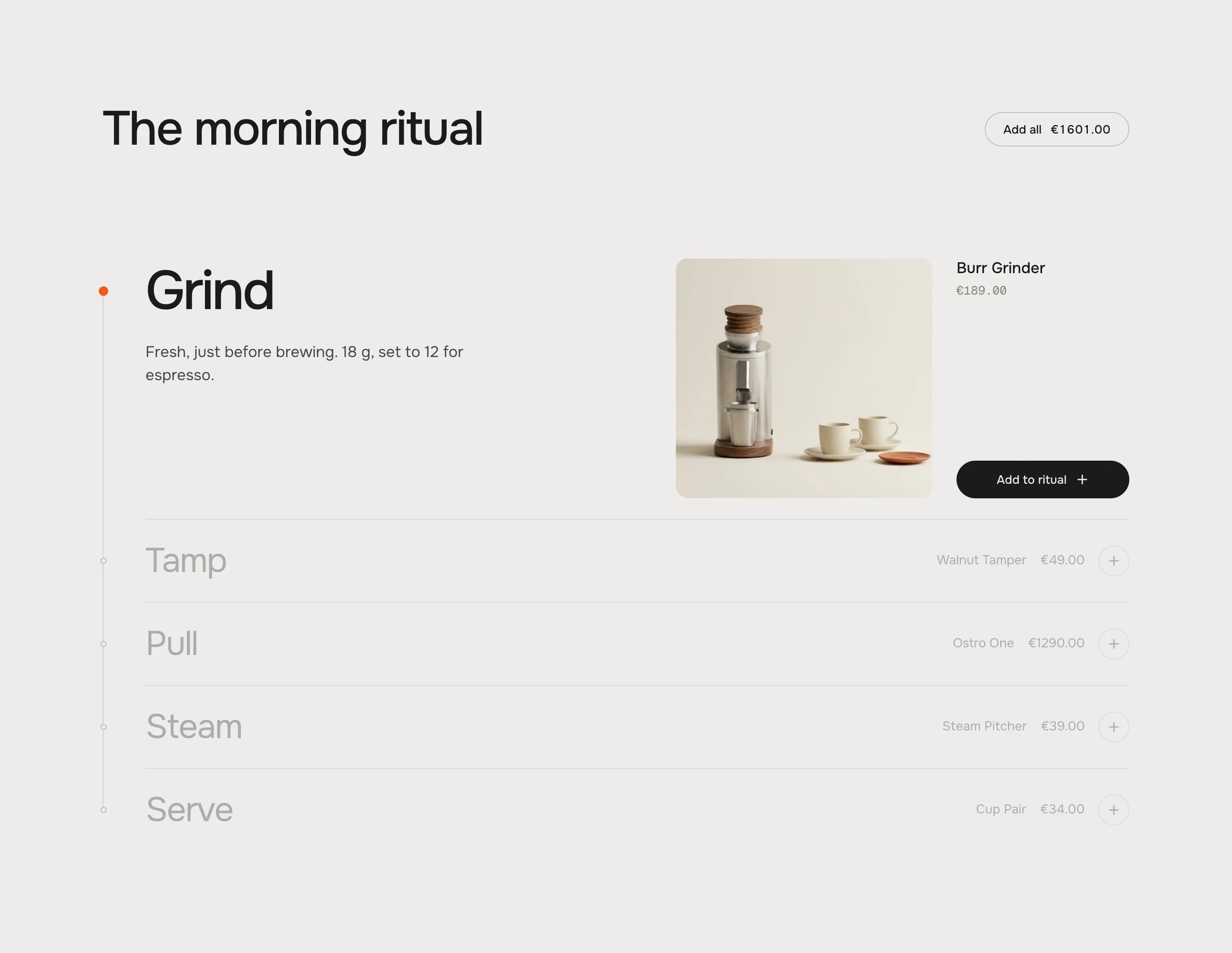
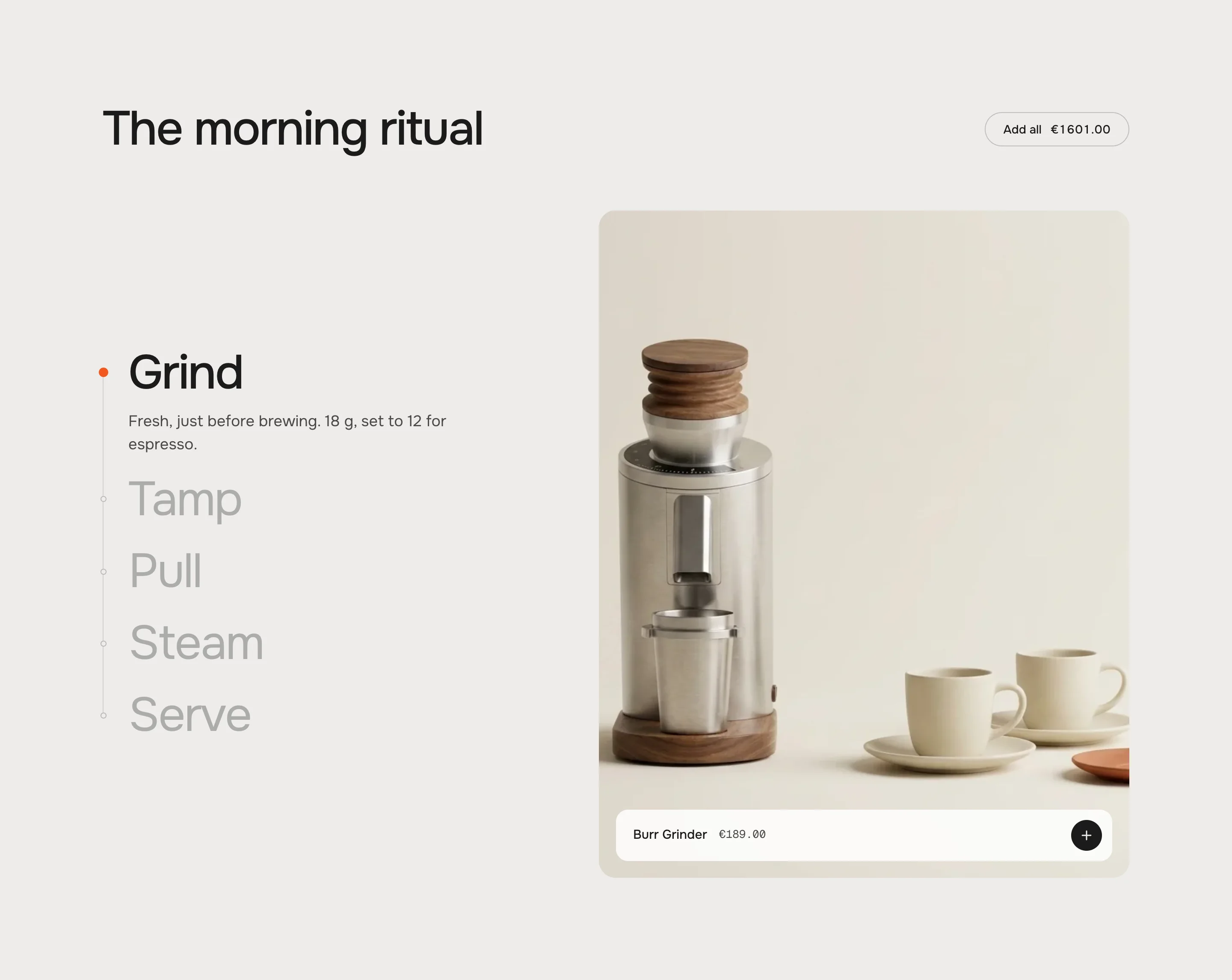
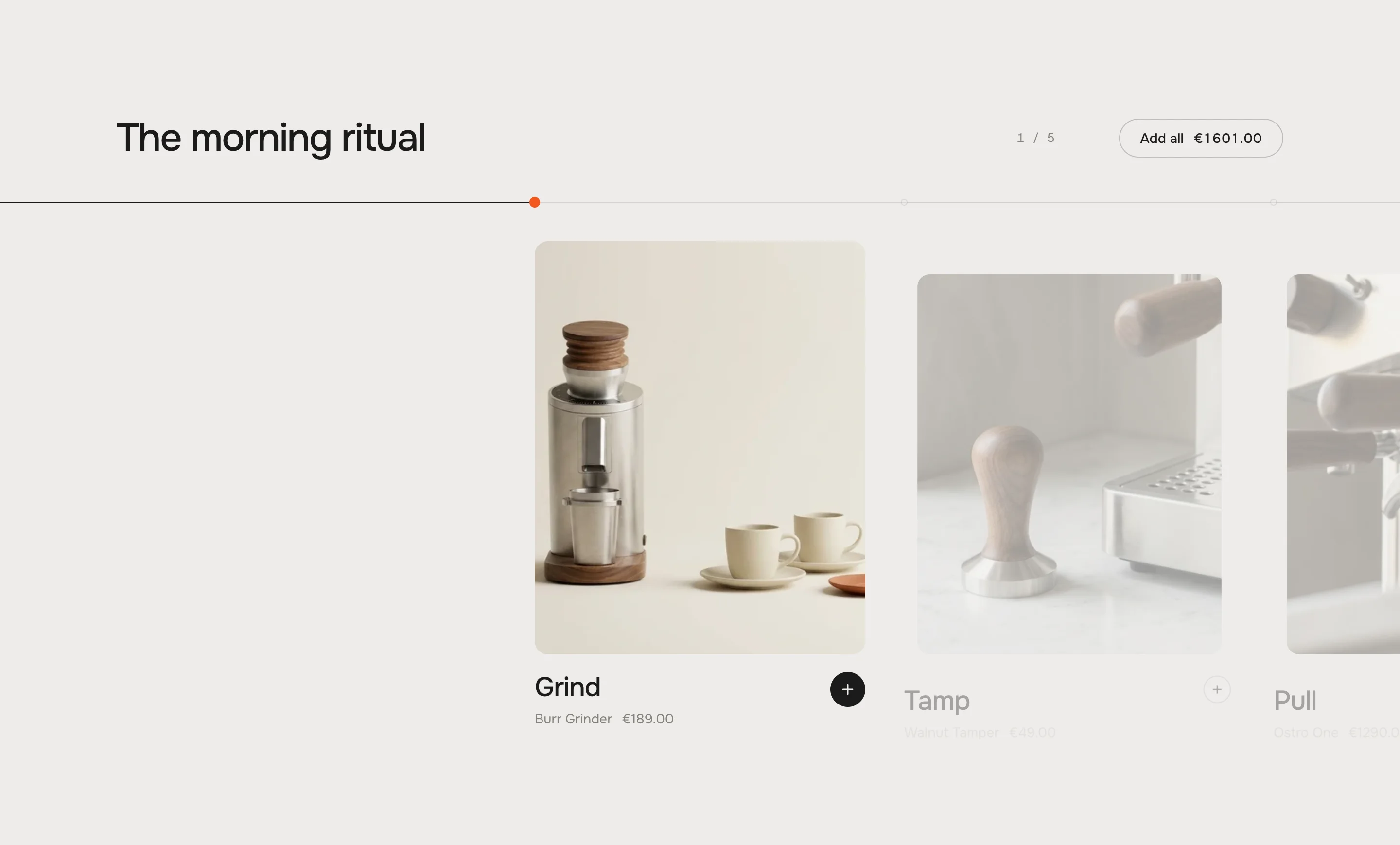
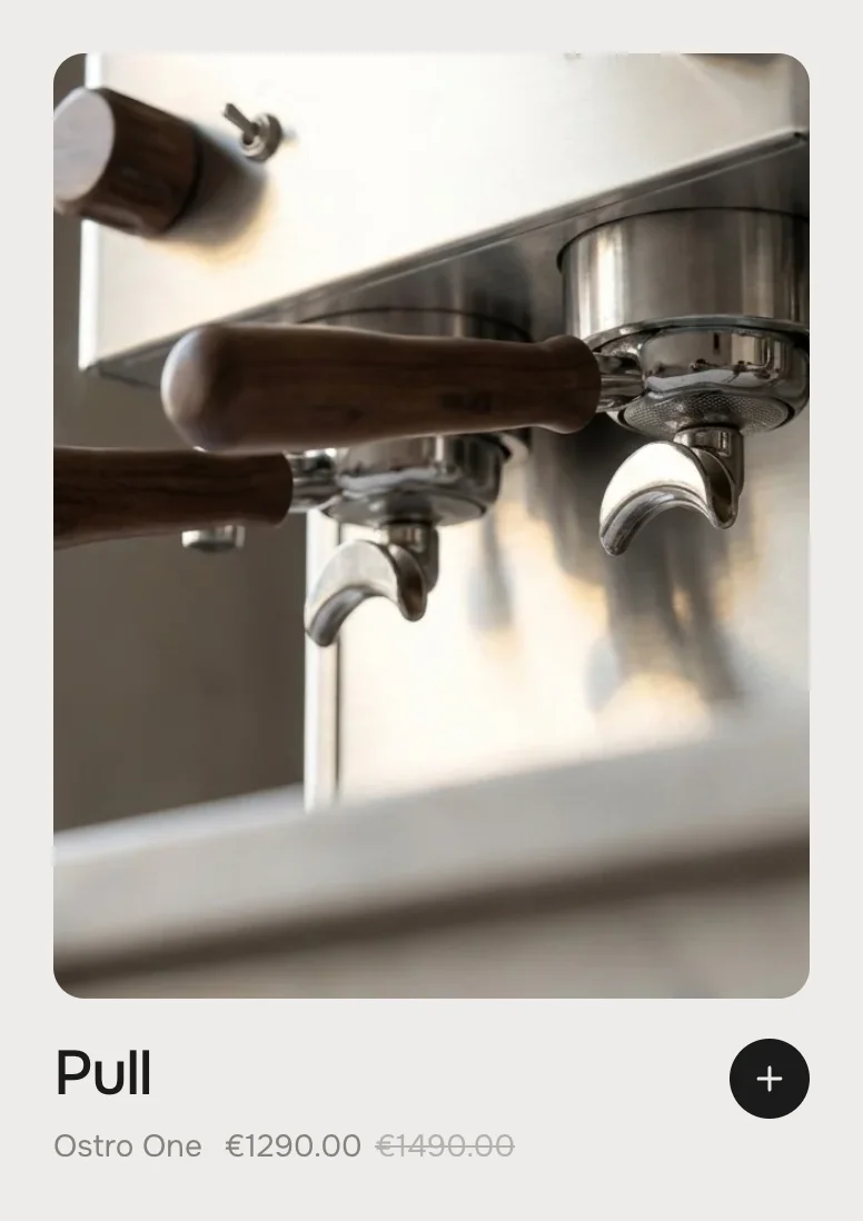
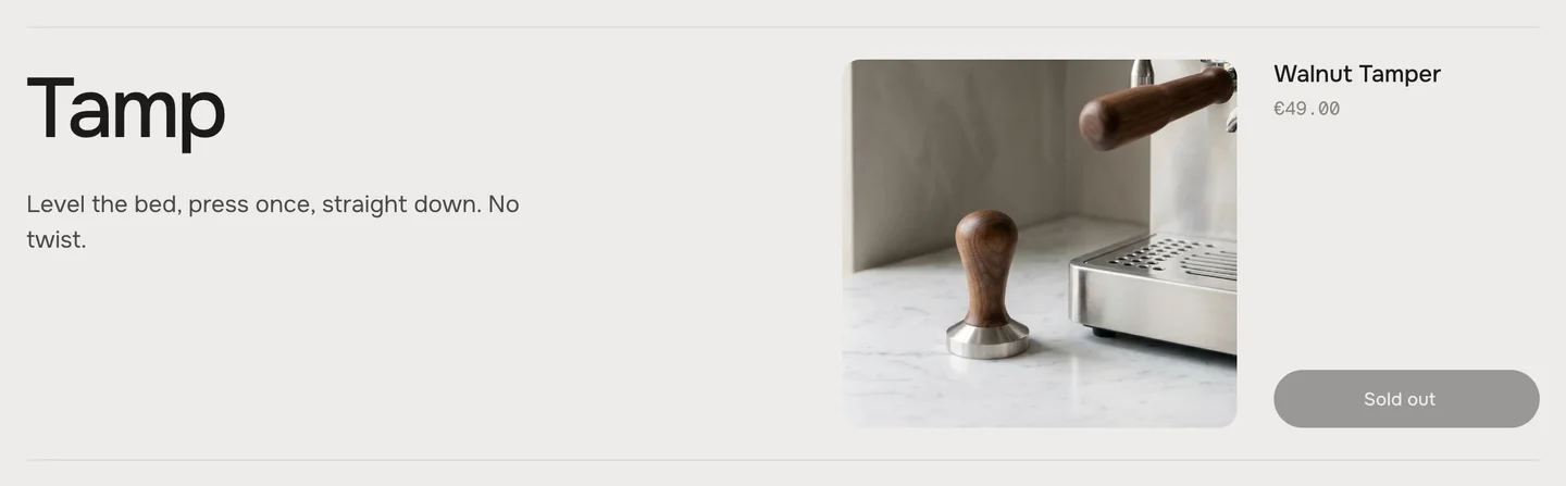
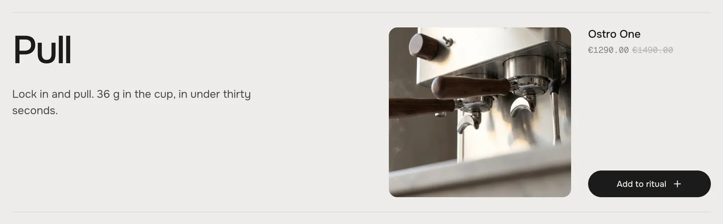
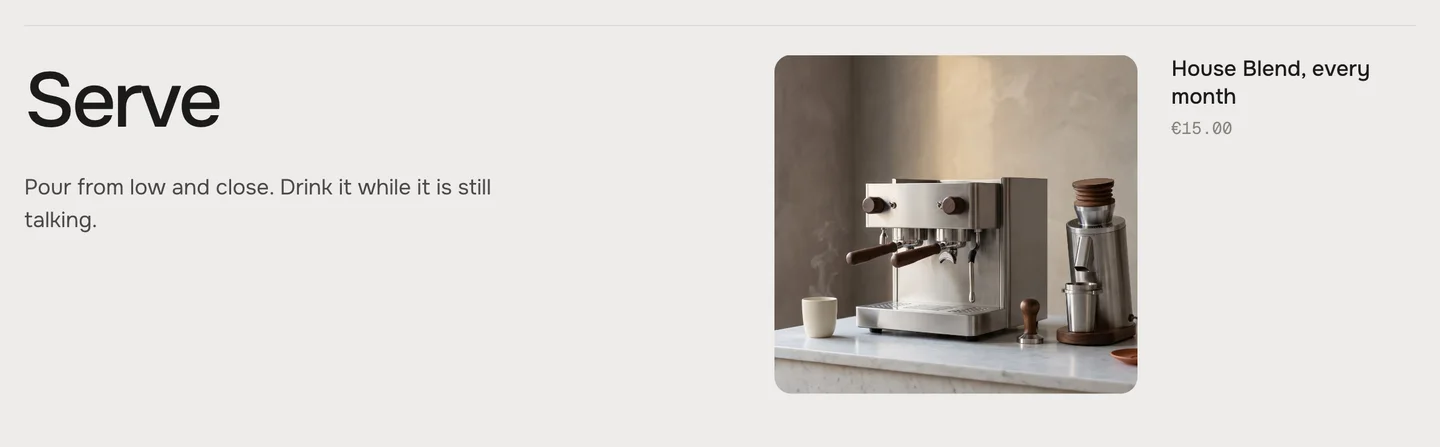
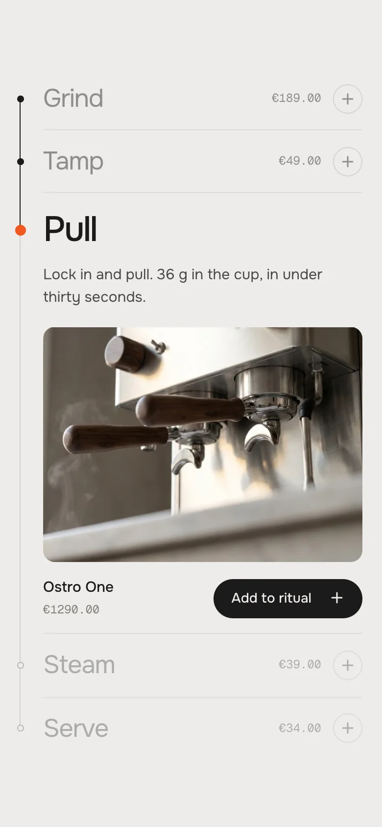
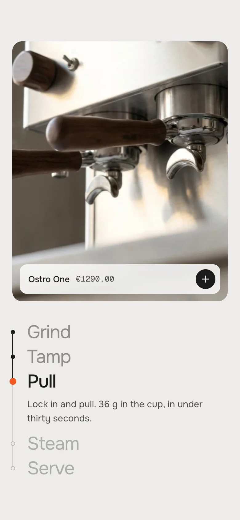
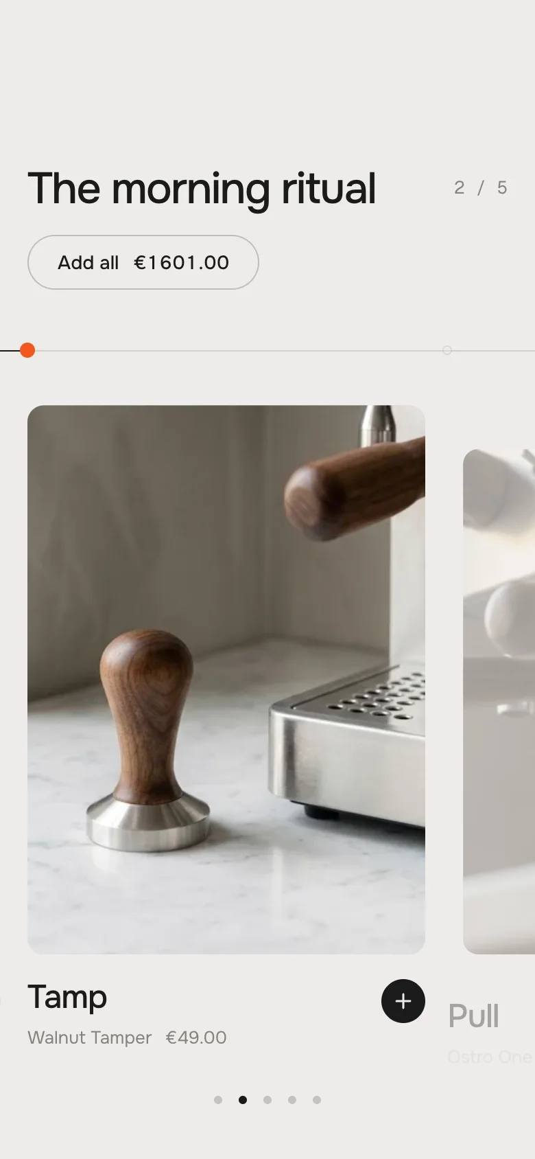
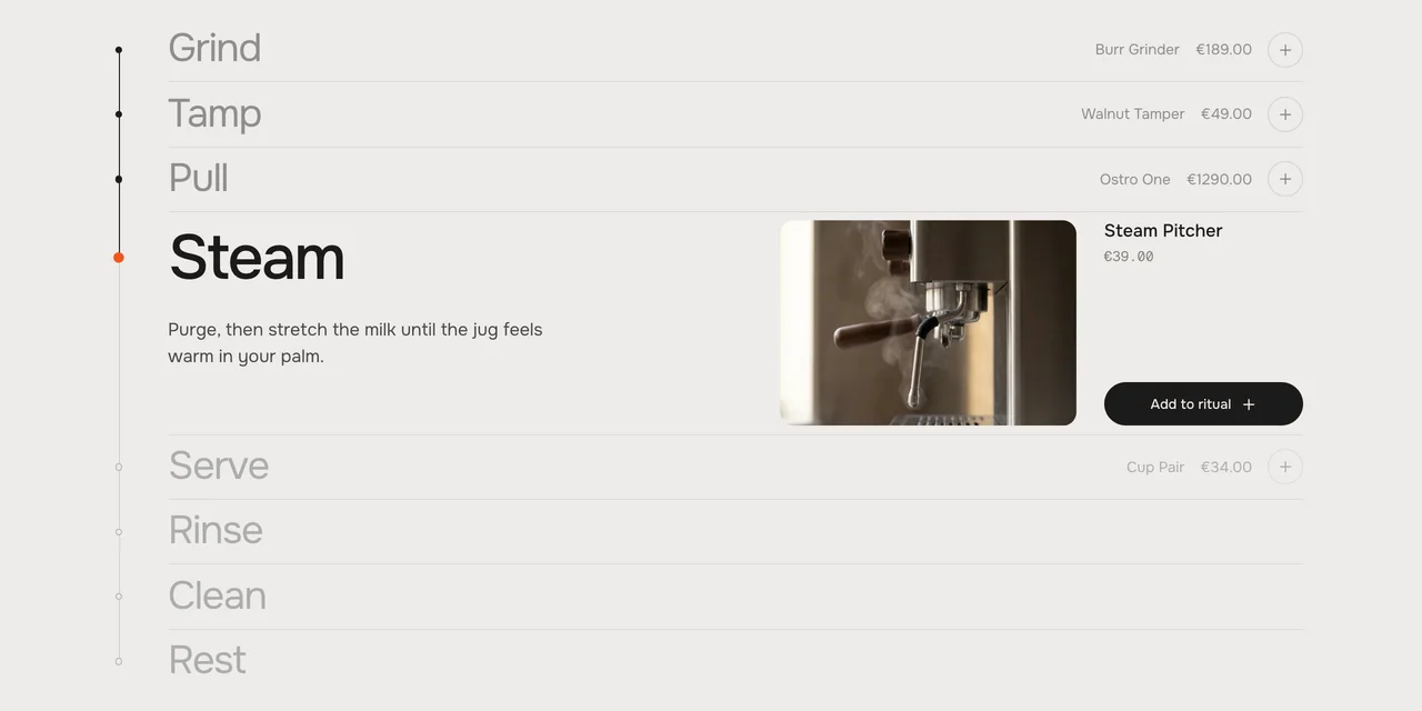
Turn a routine into a story that sells. The timeline holds still while visitors scroll, the line fills from step to step and the current one opens with its picture, a short text and the product that belongs to it. Add one piece, or the whole ritual with one button – with the total. Three looks – a quiet list, a stage with a big picture, a sideways reel.
In your theme code editor (Online Store → ⋯ → Edit code), click the sections folder, then “New File”, name it and hit Enter.
02
Paste the code
In the file that just opened, paste the code below. Then hit Save (top right corner).
Note: Shopify shows no confirmation when a section saves – that’s normal.
03
Add it in the theme editor
Saved? Then reload the theme editor – otherwise the new section sometimes doesn’t show up. After that: Edit theme → Add section → . Everything else is in the sidebar – the Docs below explain every setting.
Code
One file. Copy it, paste it, done.
sections/werk-ritual-timeline.liquid
Locked
{%- comment -%} werk · Ritual Timeline · v1.2.0 · werk.build/license – do not remove {%- endcomment -%}{%- liquid assign s = section.settings assign look = s.look assign n = section.blocks.size # Demo images and fonts load from the werk demo store's Files (Shopify CDN), so the section looks the same in any store. # The demo is the morning ritual of Ostro Coffee Works – the espresso pictures of Hotspot Index, one per step. assign werk_cdn = 'https://cdn.shopify.com/s/files/1/0954/8303/5932/files/' assign demo_base = werk_cdn | append: 'werk-hotspot-index-' assign demo_imgs = 'products,tamper,group-head,steam-wand,hero' | split: ',' assign demo_w = '1200,1200,1376,1376,2000' | split: ',' assign demo_h = '896,896,768,768,1116' | split: ','
2458 lines · Liquid, CSS & vanilla JS
Free – just add your email
Every section is free during launch. Enter your email once and copy any code you like.
Edit theme → open the page → Add section → – Spine, – Stage or – Reel.
2
Write your steps
Every Step block is one step: a short Title and one or two sentences of Text. Add, remove and drag them – up to 8.
3
Pick a product per step
Step → Product. The step then shows the product's name, price and picture. A step without something to sell: turn Show product off.
4
Write the heading
Section settings → Heading. Check the “Add all” button and its total, then save.
Step 1The section scrolls in, step 1 is open
Step 3It holds still – the line fills, step 3 opens
Step 5After the last step the page scrolls on
It holds still
When the timeline reaches the middle of the screen, it stays there. The visitor keeps scrolling as usual, and instead of the page the timeline moves: the line fills from marker to marker and the next step becomes the current one. After the last step the page scrolls on. Scrolling back up runs it backwards.
The heading and the “Add all” button sit above the timeline – they scroll away while the steps hold still.
The current step
One step is always the current one: its marker is orange, the steps before it get a dark marker, the ones after it wait in grey. How the current step shows depends on the look – it opens (Spine), brings its picture (Stage) or steps forward (Reel).
Jumping to a step
A click on a step's name scrolls there. In Reel on a desktop, a click on a neighbouring card does the same; on tablets and phones the dots under the row do.
In the middle of the screen
The timeline centres itself in the free part of the screen: below a header that stays at the top, above a bar that is docked at the bottom (a floating nav, a chat or cookie bar). You set nothing for that.
Look
Default · Spine
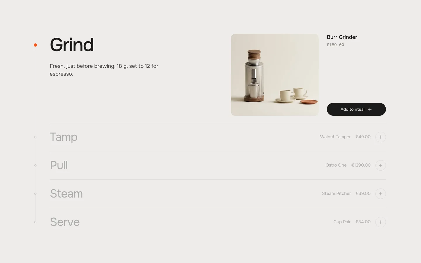
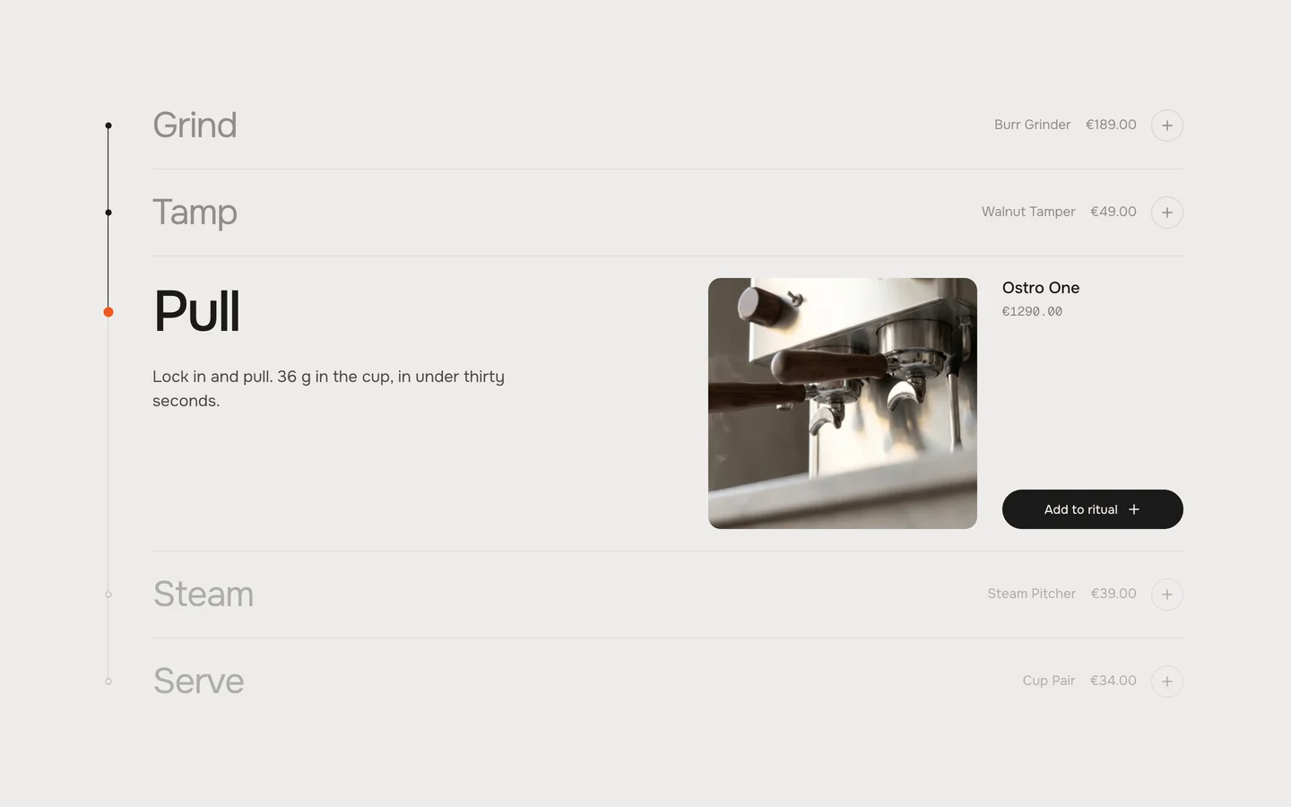
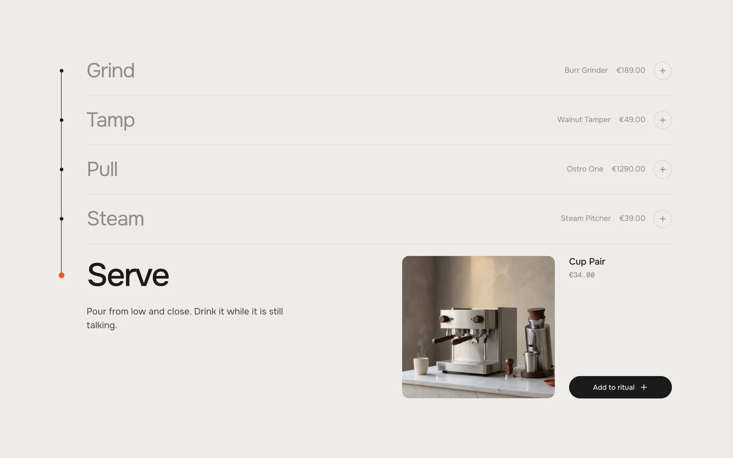
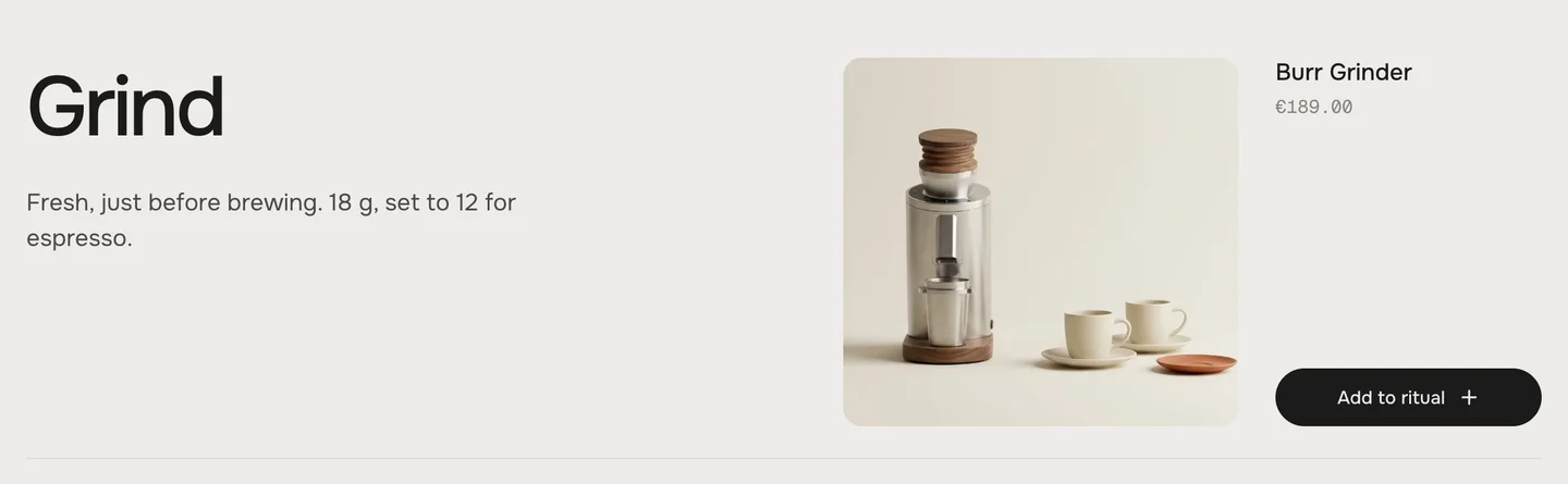
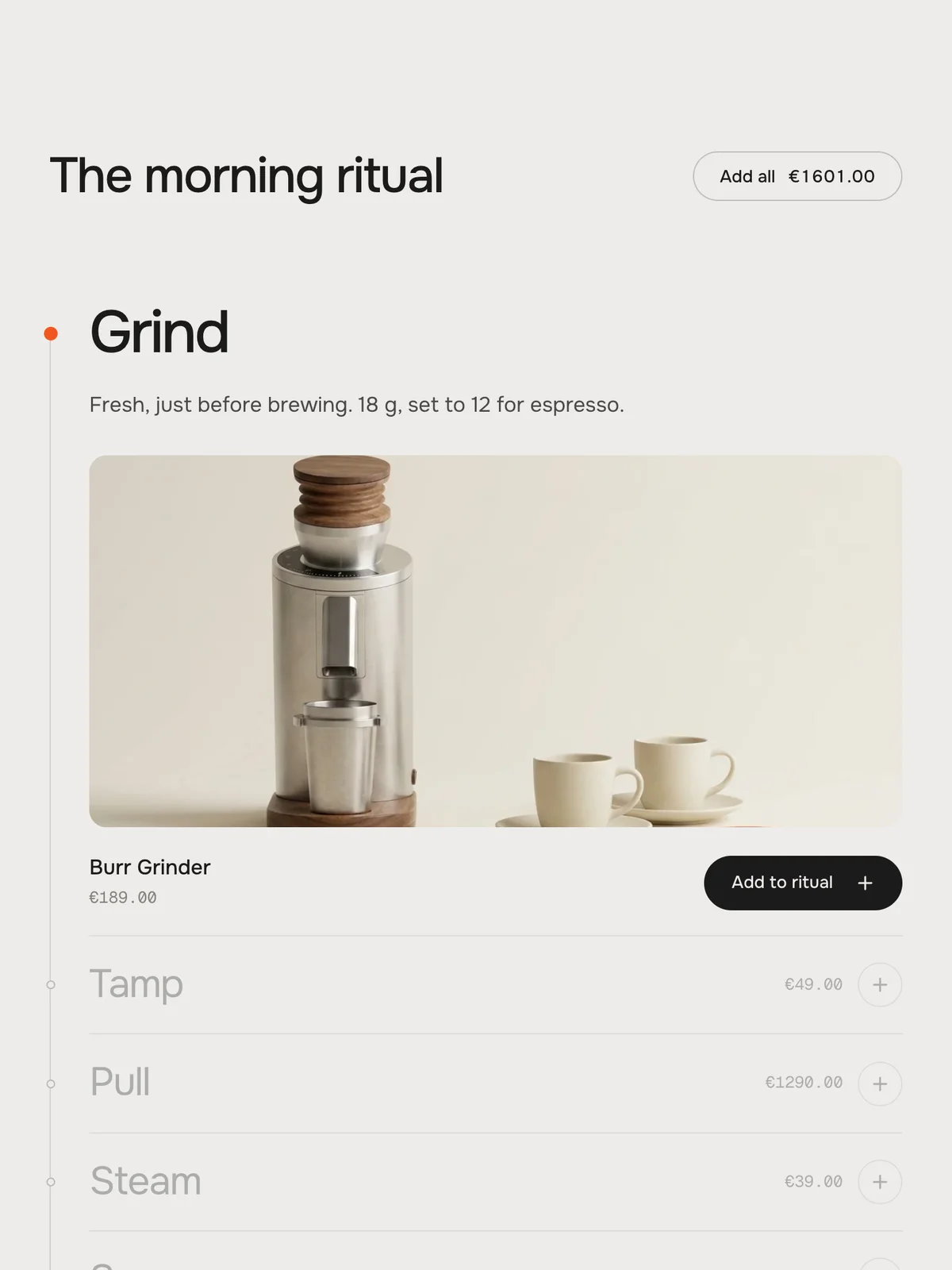
SpineA calm list. The current step opens with its text, picture, product and “Add to ritual”; the other steps show the price and a round add button. See The three looks.
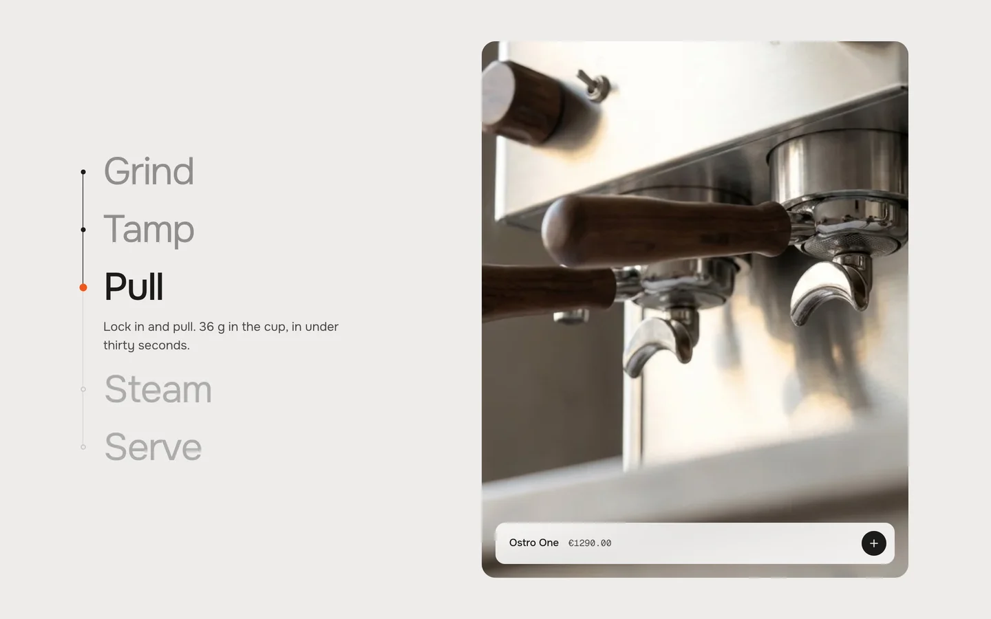
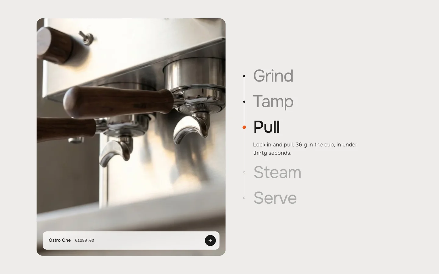
StageThe step names beside one big picture. The next picture wipes in from the direction of the scroll; a glass bar on the picture holds the product.
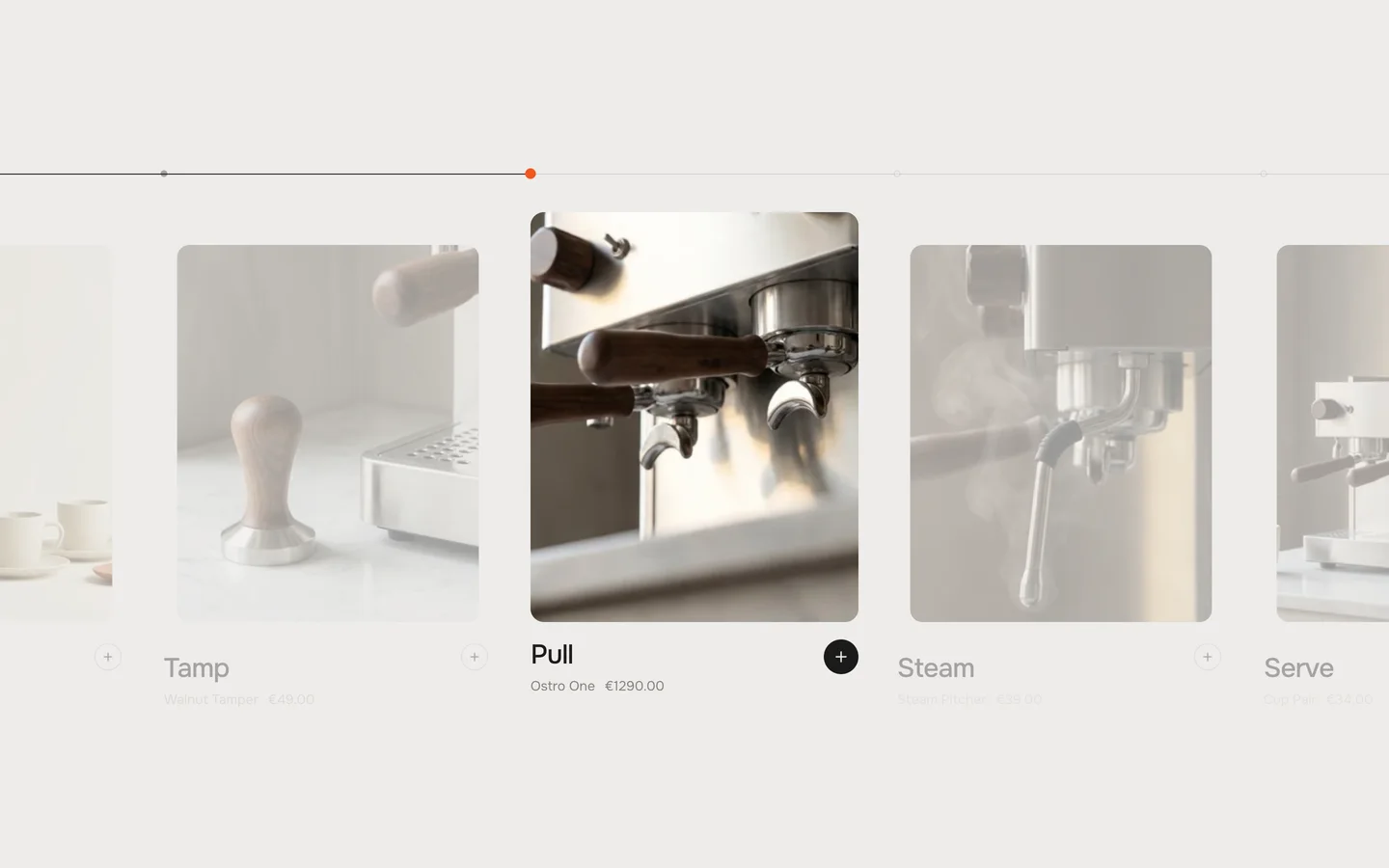
ReelCards in a row that slide sideways while the page scrolls. On tablets and phones the row is swiped.
The three looks
SpineSpine – the current step opens in the list
StageStage – names beside a big picture
ReelReel – the current card steps forward
Spine. The old step closes while the new one opens – at the same time, so the list keeps its height and only the rows between the two move. Every step is as tall open as the tallest one; a step with a shorter text has a little air below it.
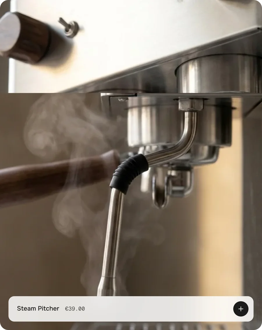
Stage. Every step has its own picture. The next one wipes over the old one – from below on the way down, from above on the way up – and settles from a slight zoom. Only the current step shows its text.
Stage: the next picture wipes in from the scroll direction
Reel. The current card stands at full size and full colour, with its add button filled; the others step back. The line runs across the whole width and ends at the current card. Reel shows the step's title and product, but not its Text.
Heading
Default · The morning ritual
The heading above the timeline. Bold and italic work. Leave it empty to hide it – “Add all” then stands alone.
Step
Up to 8 per section. The order of the blocks is the order of the steps.
SettingWhat it doesDefault
TitleThe name of the step – one or two words work best.Step
TextOne or two sentences. Shows while the step is the current one. Bold, italic and links work. Reel shows no text. Leave it empty to hide it.One or two short sentences about this step.
ImageThe step's own picture. Empty = the picture of the step's product. See Pictures.Empty
Show productOff: the step has no price and no add button – a step that only tells.On
ProductThe product this step sells: name, price and add button. See Products & Add all.Empty
Titles that fit
Short titles keep the big type on one line. Long titles wrap; in Stage, very long two-line titles on a short laptop screen can make the timeline taller than the screen – then its first steps sit partly above the screen while the last ones are current. Shorter titles or fewer steps fix it.
1
The step's own Image
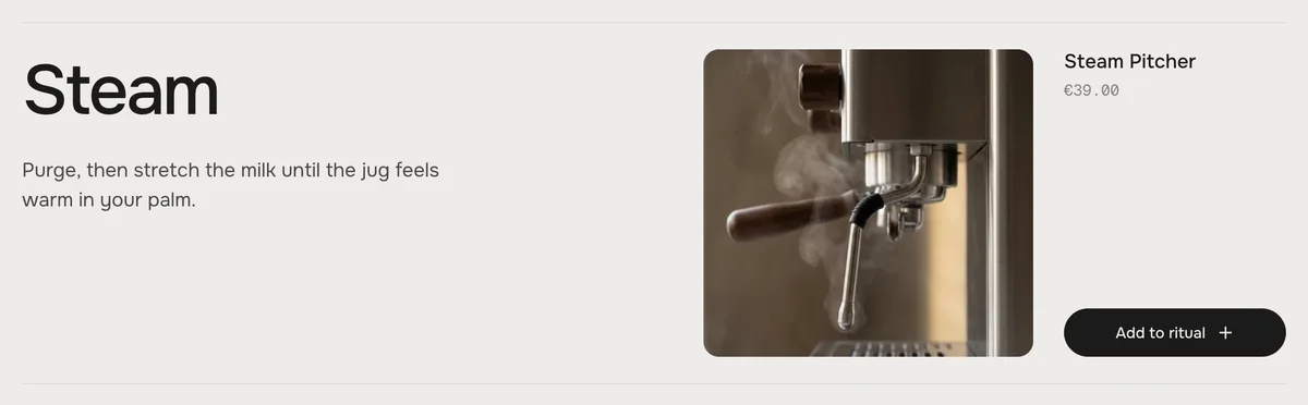
If you picked one, it shows.
2
The product's picture
Without an Image, the step shows the featured picture of its product.
3
Demo picture or placeholder
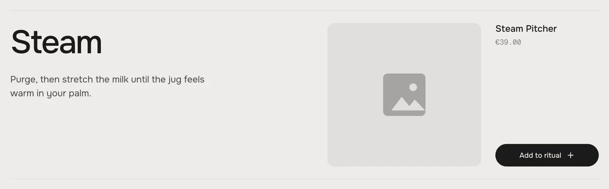
Without both: our demo picture – but only while no step in the section has a picture or product of its own. After that the step shows a neutral placeholder.
Demo picturePlaceholder
The placeholder is on purpose: once your products are in, an empty step no longer shows our espresso machine next to them. Pick an Image for that step – or give its product a picture.
Shape and crop
The pictures fill their frame and are cropped to it. The focal point you set on the picture in Shopify stays in view – see Troubleshooting for where to set it.
LookFrameGood pictures
SpineAbout square on a desktop, a wide frame on tablets and phonesThe subject in the middle, with some room around it
StagePortrait, about 4 : 5 – on tablets and phones a wide frame on topTall or square shots with the subject in the middle
ReelPortrait, 4 : 5Tall shots, one clear subject
Upload your own pictures for the best speed – the demo pictures load from werk's Shopify CDN.
One product per step
Pick it in the Step block. The step shows the product's name and price; the add button puts it in the cart without leaving the page.
SpineSpine – name, price and “Add to ritual” in the open step
StageStage – a glass bar on the picture
ReelReel – under the card, the add button beside the title
What a product can be
Sold outSold out – the button says “Sold out” and can't be clicked
On saleOn sale – the old price struck through beside the new one
Subscription onlySubscription only – name and price, no add button
The product is …What the step shows
AvailableName, price, add button
Sold outSpine: the button of the open step says “Sold out”. The round add buttons are greyed out and can't be clicked. Left out of “Add all”.
On saleThe old price struck through beside the new one – in the open Spine step, the Stage bar and the Reel card
Subscription only (can't be bought without a selling plan)Name and price, but no add button – Shopify refuses it without a plan. Left out of “Add all” and its total.
Not published to the Online StoreNothing – the theme never gets such a product. The step shows no price and no add button.
Empty, Show product onOur demo piece while no step has a product of its own. After that: no product.
Add all
One button above the timeline puts every piece in the cart at once – in one go, with the total in the button.
The total counts what the button really adds – here without the sold-out tamper and the subscription
Show “Add all” button
Default · On
The button shows when at least two different products can be bought right now. It adds every such piece once: sold-out and subscription-only pieces are left out, and a product that sits on two steps goes in once and counts once in the total.
What is already in the cart
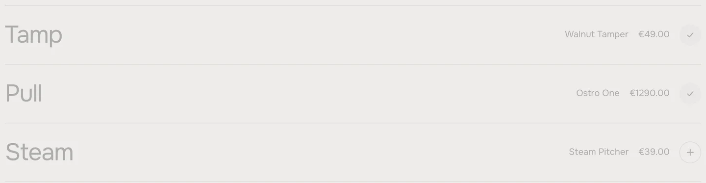
After adding, the button shows “Added” for a moment. A piece that is in the cart then shows a check on its round add button instead of the plus – also after a reload, and when it was added somewhere else in the store. In Spine the open step keeps its “Add to ritual” button; the check shows as soon as the step closes.
Tamp and Pull are in the cart, Steam is not
If Shopify can't add a piece – for example because the last one was just sold – its message shows under the timeline for a few seconds.
Picture
Default · Right
The big picture right or left of the step names. Desktop only – tablets and phones show the picture on top.
Right
Left
Only visible in the Stage look
RightLeft
Show step counter
Default · On
The small 3 / 5 next to the heading. It follows the current card – on a desktop while scrolling, on tablets and phones while swiping. With a single step it never shows.
Only visible in the Reel look
Scroll per step
Default · 60%
How far visitors scroll from one step to the next, in percent of the screen height. 60 % feels natural for most rituals. Lower moves faster through many steps; higher gives every step more time. In Reel it only counts on a desktop – tablets and phones swipe the row.
With five steps at 60 %, the timeline holds still for about two and a half screens of scrolling.
Snap to steps
Default · On
When visitors stop scrolling inside the timeline, it settles on the nearest step with the section's easing – the line never stops between two markers. A short, deliberate scroll already brings the next step; a tiny one falls back. As soon as the visitor scrolls, touches or presses a key again, the settling stops. Off: the timeline follows the scroll freely and stays wherever the visitor stops.
Padding top
Default · 120px
The space above the heading, in px.
Padding bottom
Default · 120px
The space below the timeline, in px.
Fonts
Default · Design fonts
Onest and Geist Mono from werk's CDN. Use theme fonts swaps every font at once: text takes your theme's body font, heading and step titles its heading font, prices and the counter the body font. Or swap each one with its own URL – Self-hosted font URL (.woff2) replaces Onest; Label font URL (.woff2) replaces Geist Mono, the font of the prices and the counter. Paste the file's URL from Content → Files. Empty keeps werk's font.
Colors
Default · Design colors
Background, text, muted text, the line, the current step and the buttons – or Use theme colors, which takes the text and background colour of the page around the section. With theme colours the line and the muted text are mixed from those two, and the current step's dot takes the text colour instead of orange.
1Background#EDECE9Section background
2Text#1C1B1AHeading, step titles, texts, product names, the markers of the other steps
3Text muted#85827CPrices, the counter
4Line#D2D1CDThe line behind the markers; the part already passed takes the text colour
5Current step#F2571FThe dot on the line, focus ring
6Button#1C1B1A“Add to ritual”, the add button on the Stage bar and on the current Reel card – empty = Text
7Button text#EDECE9The label and the plus on them – empty = Background
Button and Button text only show while Use theme colors and Use theme buttons are both off.
Buttons
Default · Clean
Use theme buttons gives “Add all” and the “Add to ritual” button of the open step your theme's button style – the round add buttons stay as designed. Button style sets how the two buttons react on hover.
Hover them – click a button for loading → added
Add allCleanGrows a touch, the underline runs out and backAdd allDot to arrowThe dot grows into an arrowAdd allRolling textThe label rolls up, a copy followsAdd allFillColour wipes in from the leftAdd allShineA band of light passes over
Animations & easing
Default · On · werk Signature
Steps open and close, the Stage picture wipes, the Reel's cards step forward, the line glides after the scroll. Animations off – or a visitor who turned on “reduce motion” on their device – keeps the timeline holding still and moving step by step, but nothing animates: steps and pictures simply change. Easing sets the feel of every movement, including the settling of Snap to steps.
werk SignatureSlow start, soft landing
SmoothEven and quiet
BounceA small overshoot
SnapQuick start, gentle stop
GlideSlow in, slow out
AddAdd to ritualThe button of the open step in Spine. On the round add buttons it is what screen readers read, with the product's name.
AddedAddedOn “Add to ritual” and “Add all” for a moment after adding
Sold outSold outInstead of Add when the product is sold out
Add allAdd allThe button above the timeline, followed by the total. Only shows while Show “Add all” button is on.
The heading, the step titles and texts are written in the section and its blocks. Product names and prices come from Shopify, in your store's currency format.
Side padding
Default · Match theme
Match theme (the default) lines the section up with your theme's page margin – in Horizon the same edge as header and footer. Themes without one, like Dawn, keep the werk edge. werk default always uses the werk edge, Custom takes your own values in px (desktop and tablets / phones), None runs the content to the edge.
Desktop · Spine
Tablet · picture below the text
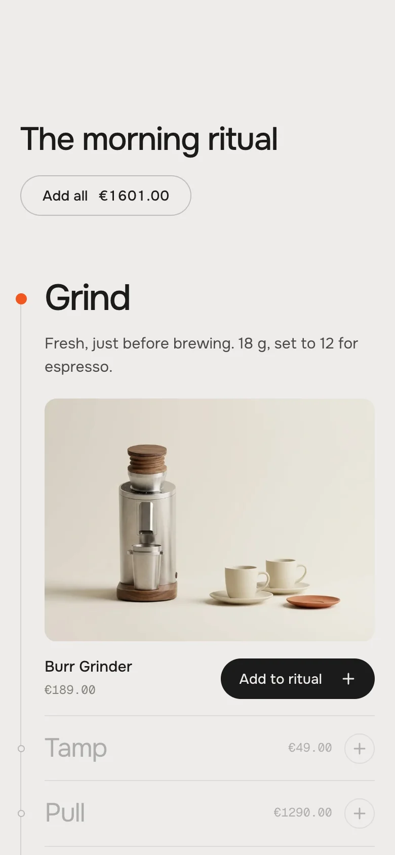
Phone · heading above Add all
DesktopTabletPhone
SpineText, picture and product side by sideStacked: text, picture, then product and button in one row. Closed steps show the price without the name.Like the tablet, smaller
StageStep names beside the picturePicture on top, names belowPicture on top, names below
ReelHolds still, the scroll slides the cardsA row to swipe, dots belowA row to swipe, dots below
Add allRight of the headingRight of the headingBelow the heading
Spine on a phoneSpine – the open step stacks
Stage on a phoneStage – picture on top
Reel on a phoneReel – swipe, dots and counter follow
Spine and Stage hold still on every screen size. Reel holds still when the section is at least 990 px wide; below that the page scrolls past it normally and visitors swipe through the cards. Snap to steps waits until the finger is off the screen.
Many steps on a short screen
In Spine, when the list is taller than the screen, the rows first move closer together, and only then the open picture gets smaller. Eight steps with products fit a 1440 × 900 screen, a 1280 × 640 laptop and a phone.
The cart updates live
After adding, the cart count in your header updates without a reload. Dawn-based themes refresh their cart bubble and drawer too.
Works without JavaScript
Every step is open with its text and picture (Spine, Stage), the Reel is a row to swipe. Nothing is hidden.
At the very top of a page
The timeline can be the first section of a page – step 1 is the current one at the top, and the timeline holds through the last step.
AI label
Using an AI-generated picture? Switch on AI label under that picture and pick a corner. The text and the look – pill, info dot or upright along the edge – are set once for the whole section, under AI label.
Eight steps at 1280 × 640: closer rows, a smaller picture
Horizon4.2TestedCart count updates live; theme fonts, colours and buttons
Dawn16TestedCart bubble and drawer update live; theme fonts, colours and buttons
A step shows no price and no add button.
Check three things: Show product is on, a Product is picked, and the product is published to the Online Store sales channel (Products → the product → Publishing). A product that isn't published never reaches the theme.
A step has a price but no add button.
The product can only be bought as a subscription. Shopify refuses it without a selling plan, so the timeline shows it without a button. Allow one-time purchases for it, or link visitors to the product page.
The picture is cut in the wrong place.
The pictures fill their frame. Set the focal point on the picture in Shopify: Content → Files → click the image → set the focal point. For a product picture: Products → the product → click the picture → Edit → focal point. The section keeps that spot in view.
A step shows a grey placeholder instead of a picture.
The step has no Image and its product has no picture. Our demo pictures only show while the whole section is still empty – pick an Image for the step.
The demo products are gone.
They stand in only while no step has a product of its own. As soon as you pick the first product, every other step shows only what you give it.
The “Add all” button is missing.
It needs at least two different products that can be bought right now – sold-out and subscription-only pieces don't count, and the same product on two steps counts once. And Show “Add all” button has to be on.
The total of “Add all” is lower than I expect.
It counts what the button really adds: no sold-out pieces, no subscription-only pieces, and a product that sits on two steps once. It uses the price of each product's first available variant.
The wrong variant lands in the cart.
The timeline adds the first available variant. Reorder the variants in Shopify so the one you want comes first, or use a product with a single variant.
The page seems to stand still.
That is the timeline holding while it moves through its steps. If it feels long, lower Scroll per step or use fewer steps.
The timeline jumps on to a step by itself.
That is Snap to steps settling on the nearest step. Turn it off for a free scroll.
A piece is in the cart but its step shows no check.
Reload the page – the timeline reads the cart again when it comes into view.
The cart count doesn't change after adding.
Horizon and Dawn-based themes update right away. Other themes may not listen to the cart event – the piece is in the cart, the count updates on the next page.
1.2.012 Oct 2026
NewSide padding. Match theme (the default) lines the section up with your theme's page margin – in Horizon the same edge as header and footer. Themes without one, like Dawn, keep the werk edge. werk default always uses the werk edge, Custom takes your own values in px (desktop and tablets / phones), None runs the content to the edge.
1.1.011 Oct 2026
NewAI label per picture (EU AI Act). Under every own picture and video a switch with the corner; the text and the look – pill, info dot that opens on hover, or upright along the edge – are set once under AI label. Off by default, nothing changes until you switch it on. Product and collection pictures from Shopify never get one.
1.0.111 Oct 2026
NewSpine: the list keeps its height while you scroll through the steps. The old step now closes while the new one opens – at the same time, on the same curve – and every step is as tall open as the tallest one. Before, the old step closed first and the whole list pulled up and dropped again, most visibly on phones.
1.0.010 Oct 2026
NewFirst stable release. Same code as the last 0.1.0 build: a step-by-step timeline that holds still while the page scrolls, a product per step, „Add all“ with the total, three looks (Spine, Stage, Reel). Stress-tested with every kind of product (sold out, on sale, subscription only, no picture, not published, the same product twice) in Horizon 4.2 and Dawn 16.
* Built for Online Store 2.0 and tested in Shopify's Horizon and Dawn themes. Heavily customised or older themes can still clash with it – if something looks off, write us and we'll take a look.