Lookbook
Shoppable Film
Your campaign film plays in chapters, upright like stories or wide like cinema. The product of the running chapter stands large beside the film – or slides in as a card – with its sizes and add to cart, and a click on a chapter jumps there. Captions, a pause button and muted autoplay are built in, and at the end the whole look goes into the cart in one go.
- Access
- Free
- Page types
- Home, Landing pages, Collection
- Compatibility
- All Shopify 2.0 themes*
- Styles
- 2
- Customise
- 58 settings · 1 block type
Installation
Takes about two minutes. No app needed.
- 01
Create a new section
In your theme code editor (Online Store → ⋯ → Edit code), click the sections folder, then “New File”, name it and hit Enter.
- 02
Paste the code
In the file that just opened, paste the code below. Then hit Save (top right corner).
Note: Shopify shows no confirmation when a section saves – that’s normal.
- 03
Add it in the theme editor
Saved? Then reload the theme editor – otherwise the new section sometimes doesn’t show up. After that: Edit theme → Add section → . Everything else is in the sidebar – the Docs below explain every setting.
Code
One file. Copy it, paste it, done.
Free – just add your email
Every section is free during launch. Enter your email once and copy any code you like.
Already signed up?
More like this
Docs
Every setting, what it does and where you see it. All in the theme editor, no code.
What you can change
Every numbered spot has its own chapter below.
- 1
Add the section
Edit theme → open the page → Add section → (or ). It comes with our demo film in four chapters, so you see it play right away. - 2
Pick your film
One film under Film – then give every chapter its start time. Or give each chapter a clip of its own (best for Reels). - 3
Add a product per chapter
Open a Chapter block and pick its Product. Title and captions are in the same block. - 4
Play it
Preview the page: the film plays muted, and while a chapter runs, its product is right beside it.
- 1
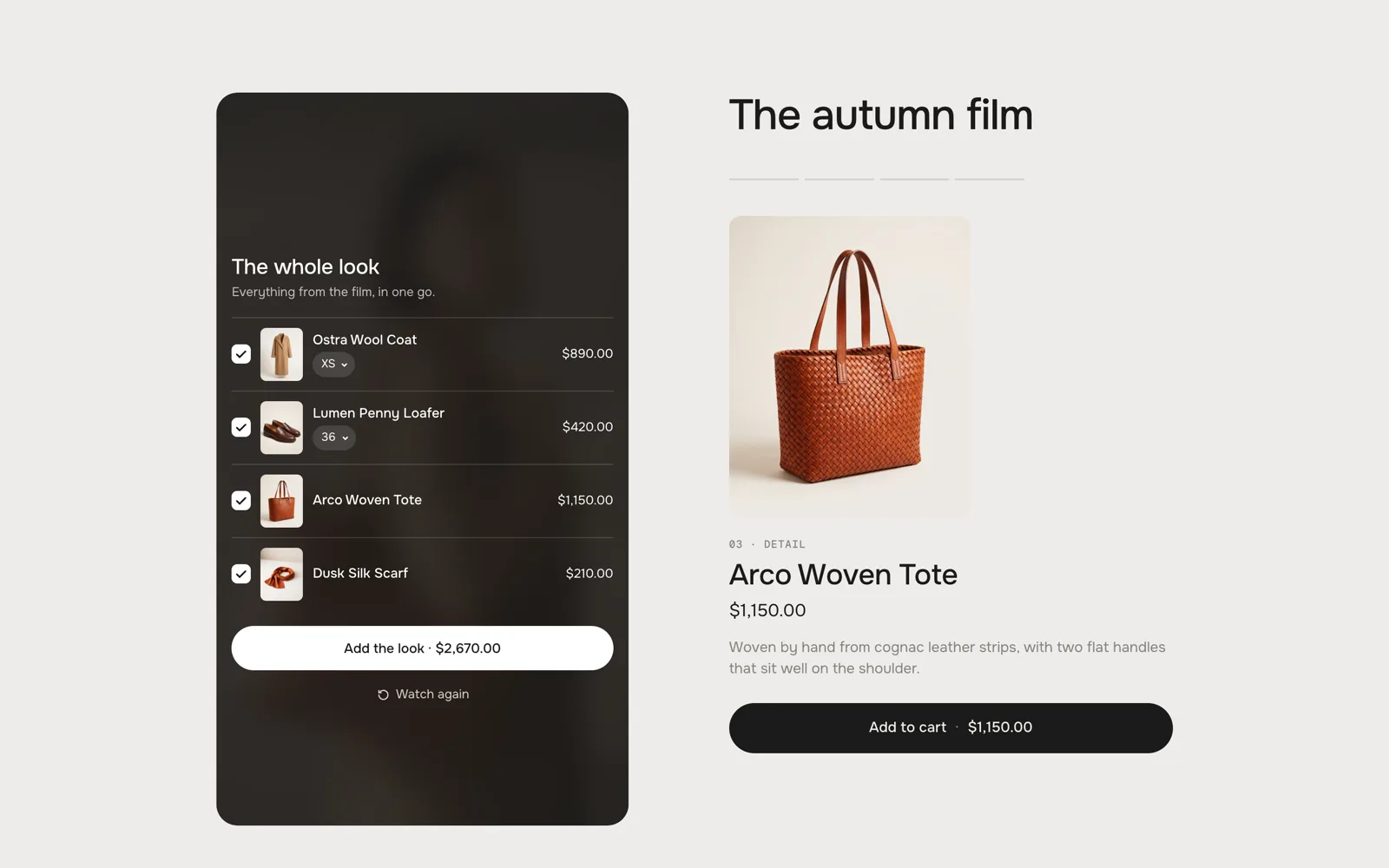
The end of the film: every product in one list, added together While it plays
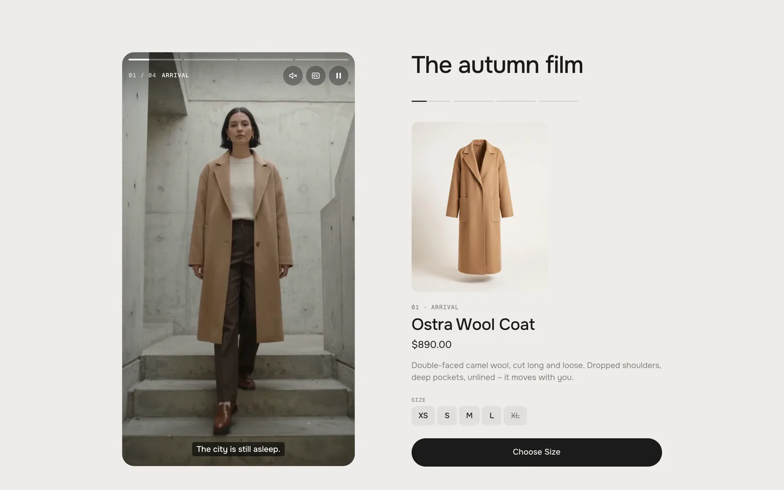
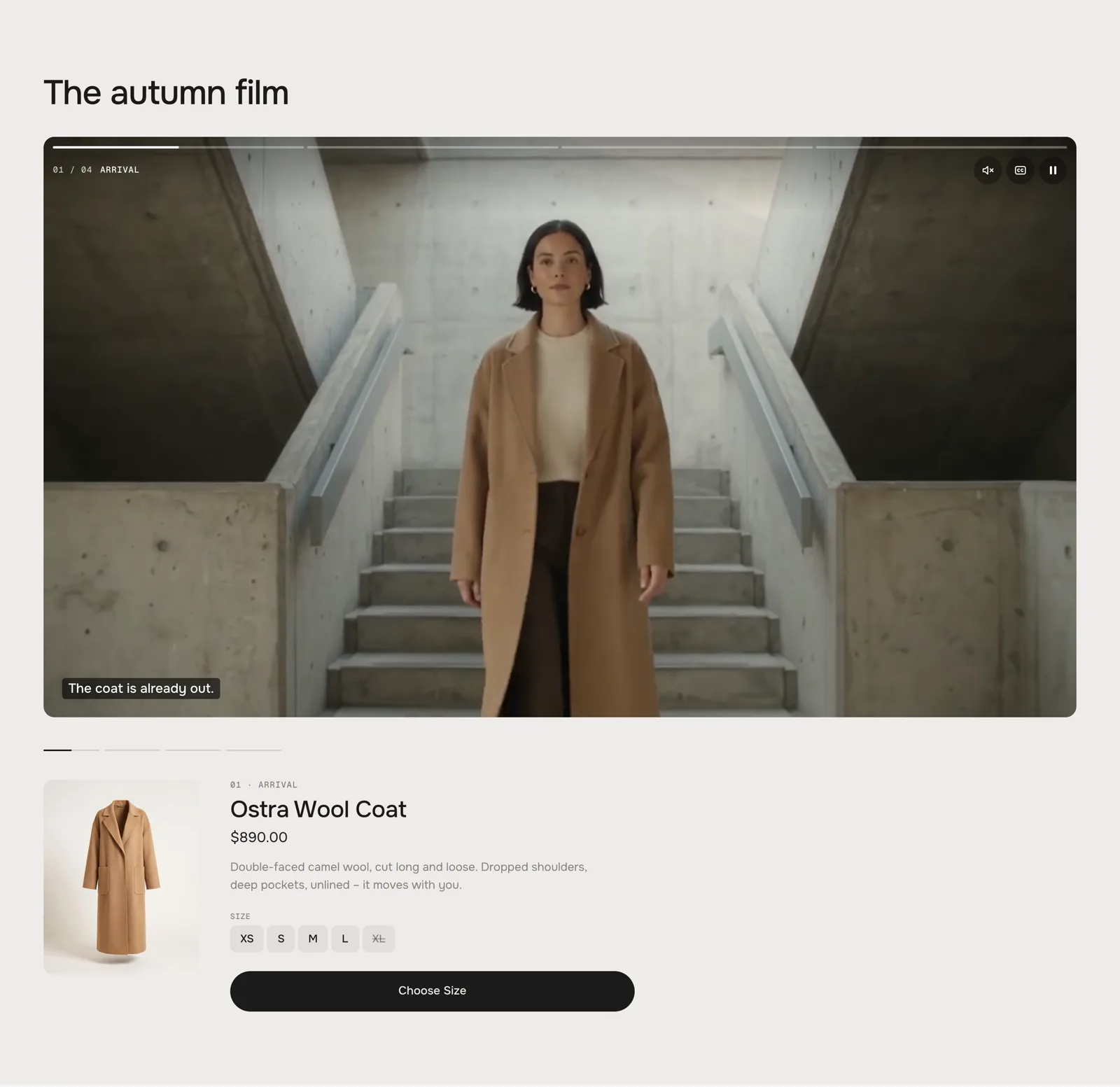
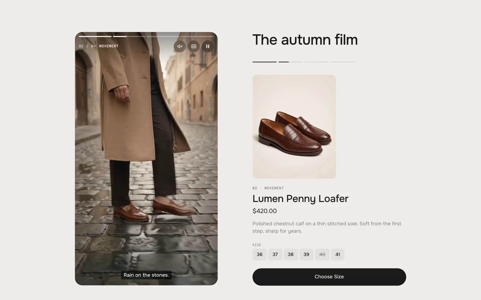
On top of the film one bar per chapter fills while it runs, with the chapter's number and title beside the buttons for sound, captions and pause. The product of the chapter is in the Product stage beside the film (Reels) or below it (Cinema) – or, with the other layouts, it slides into the film as a card after Product appears after.
Getting around
- Click a chapter – in the chapter list or one of the lines below the product – and the film jumps there.
- Reels: tap the left third of the player for the chapter before, the rest for the next. Press and hold to pause.
- Cinema: click the film to pause and play.
- Keyboard: with the player focused, Space or K pauses, ← and → change the chapter, M switches the sound, C the captions.
The film waits
While visitors are on the product card – choosing a size with the mouse, a tap or the keyboard – the film holds still, so the card never disappears under their hands. It plays on when they move away.
At the end
After the last chapter comes Shop the look: every product of the film with a tick and its size, one button adds them all. Watch again starts from the beginning. Or set At the end to Play again or Stop.
Film
Default · EmptyOne film for every chapter: each chapter starts at its own time and runs to the start of the next. A chapter with a clip of its own plays that instead – you can mix both. Until you pick a film or a clip, the section plays our demo campaign.
AI label
Default · OffMarks an AI-generated film – off or a corner of the player. Text and look: AI label under Texts.
Theme editor
Shoppable FilmChapter: ArrivalChapter: MovementChapter: DetailChapter
One chapter of the film, in the order of the blocks. Up to 8.
SettingWhat it doesDefaultTitleShown on the film, in the chapter list and above the product.ChapterProductComes in while the chapter plays. Without a product the chapter only plays.EmptyProduct appears afterSeconds into the chapter before the card slides into the film. The product stage changes right at the chapter start.1 sCaptionsOne line per beat – the lines share the chapter's time evenly.EmptyStory textBeside the film in the Story layout. Empty = the captions.EmptyStarts atWhere the chapter starts in the film, e.g. 0:13 (1:05 and 65 work too). Not used with a clip of its own.0:00Own clipPlays instead of the film – one upright clip per chapter suits Reels.EmptyAI labelMarks an AI-generated clip.OffLook
Default · ReelsReels: an upright 9:16 player beside the chapters, like stories. Cinema: a wide 16:9 film over the chapters.
Next to the film
Default · Product stageProduct stage and Story sit level with the top of the player, and the chapter lines stay above the content – nothing you click moves when the next chapter brings a longer text.
Product stageProduct stage – the default 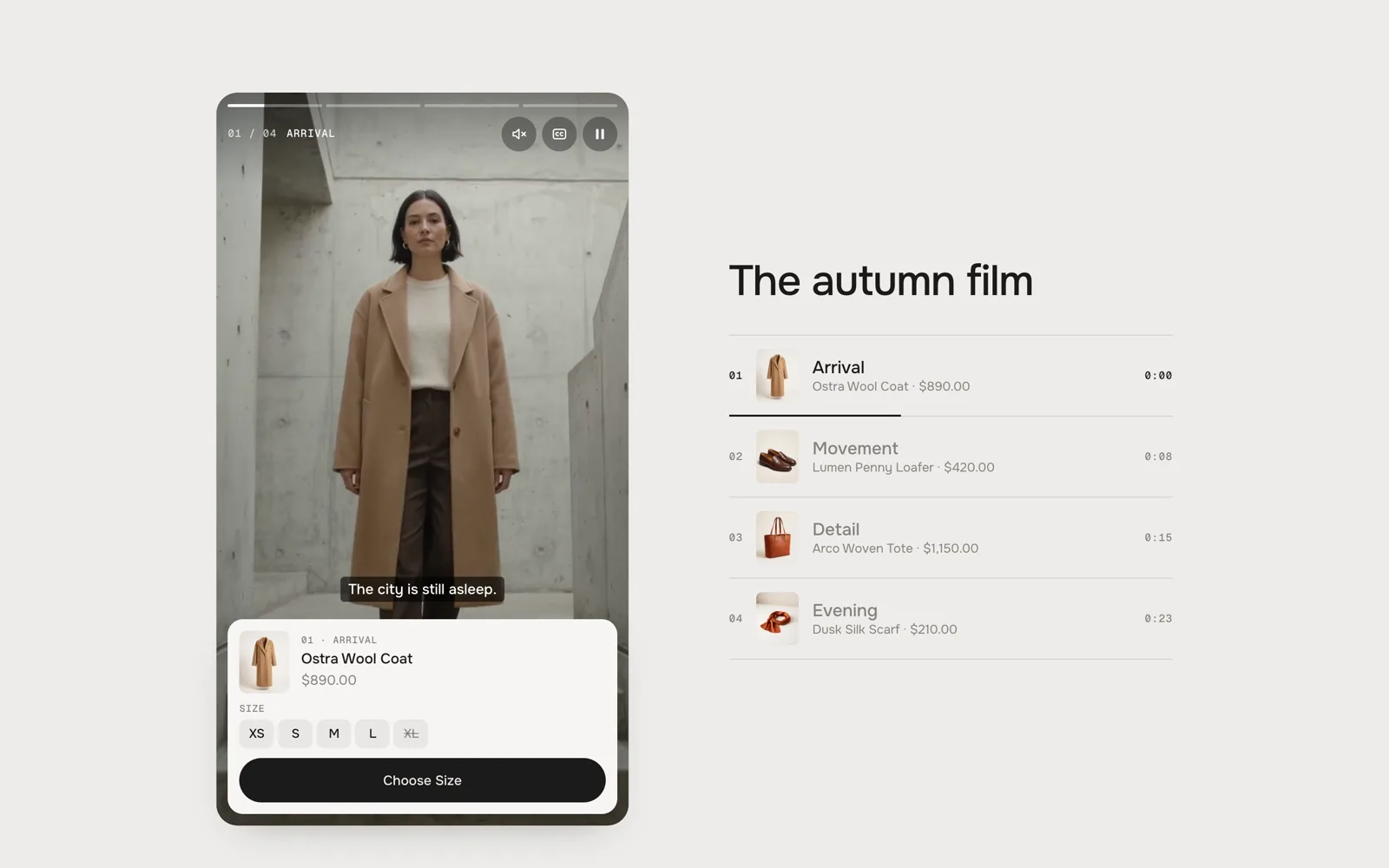
Chapter listChapter list 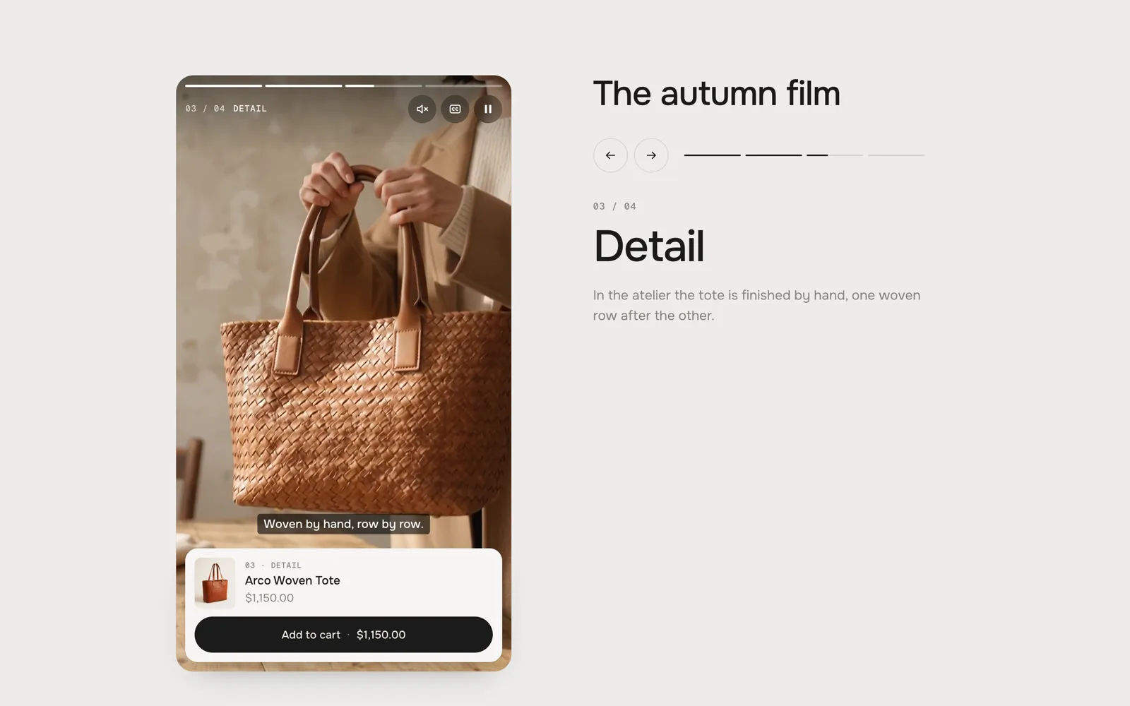
StoryStory 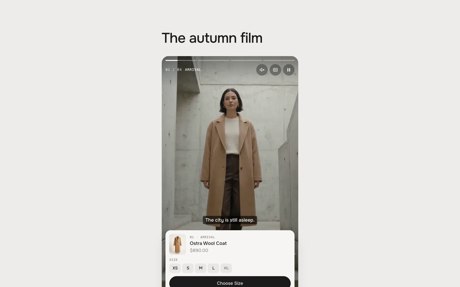
NothingNothing Heading
Default · The autumn filmThe line above the area beside the film (Reels) or above the film (Cinema). Bold, italic and links work. Empty: no heading.
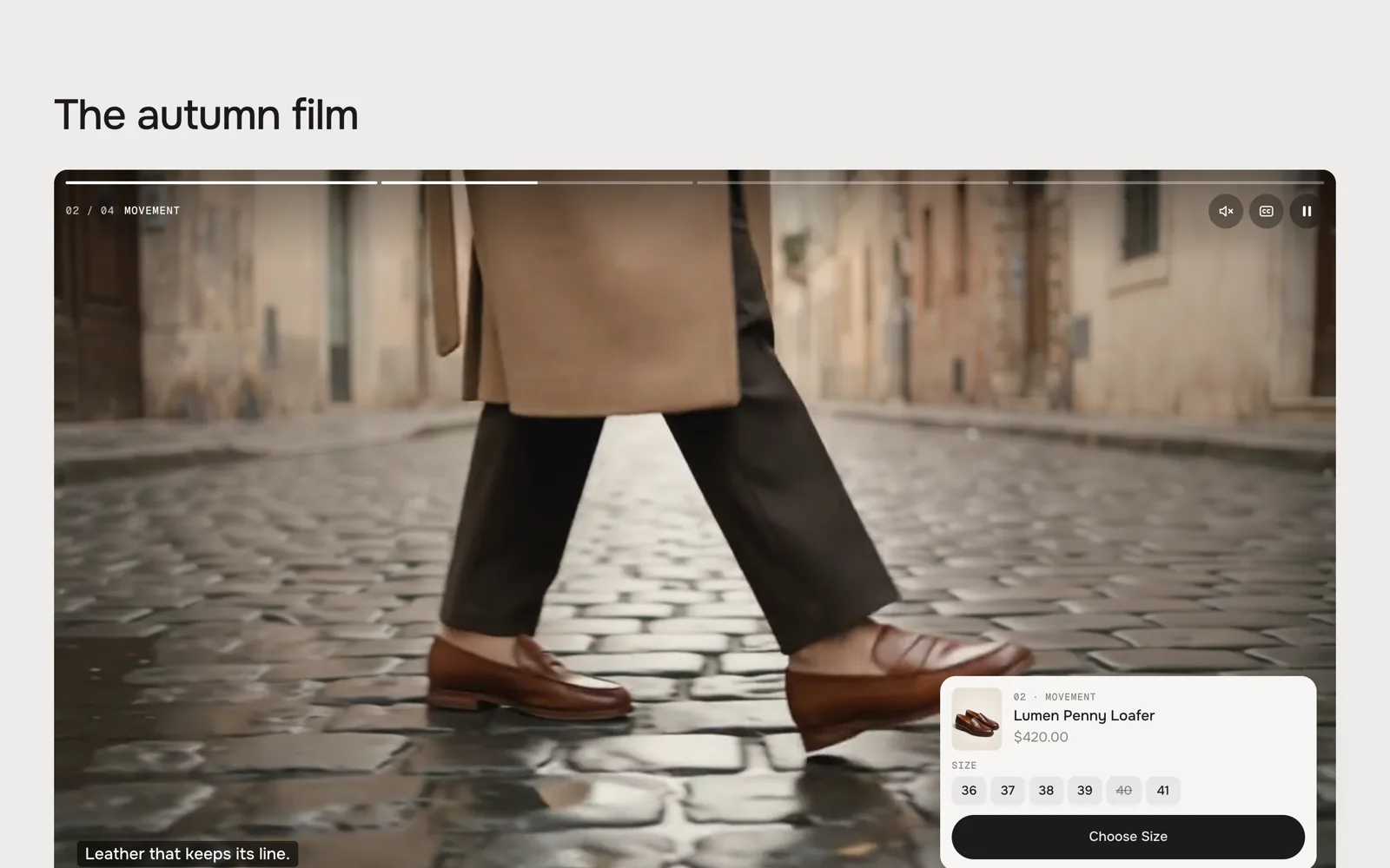
Cinema · Chapter list: the card sits in the corner of the film Name, price and sizes
Above the name: the chapter's number and title. The price follows the chosen size. Every option of the product is a row of chips; a product with more than two options or many values gets dropdowns. A value that can't be bought is crossed out.
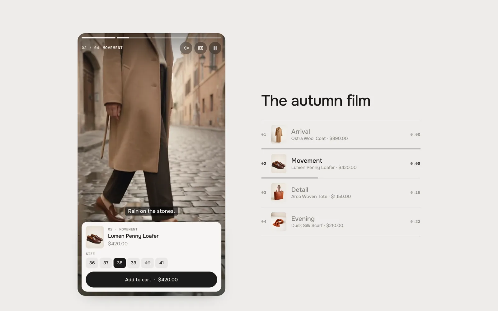
Card in the filmA card in the film – size 38 chosen, 40 crossed out 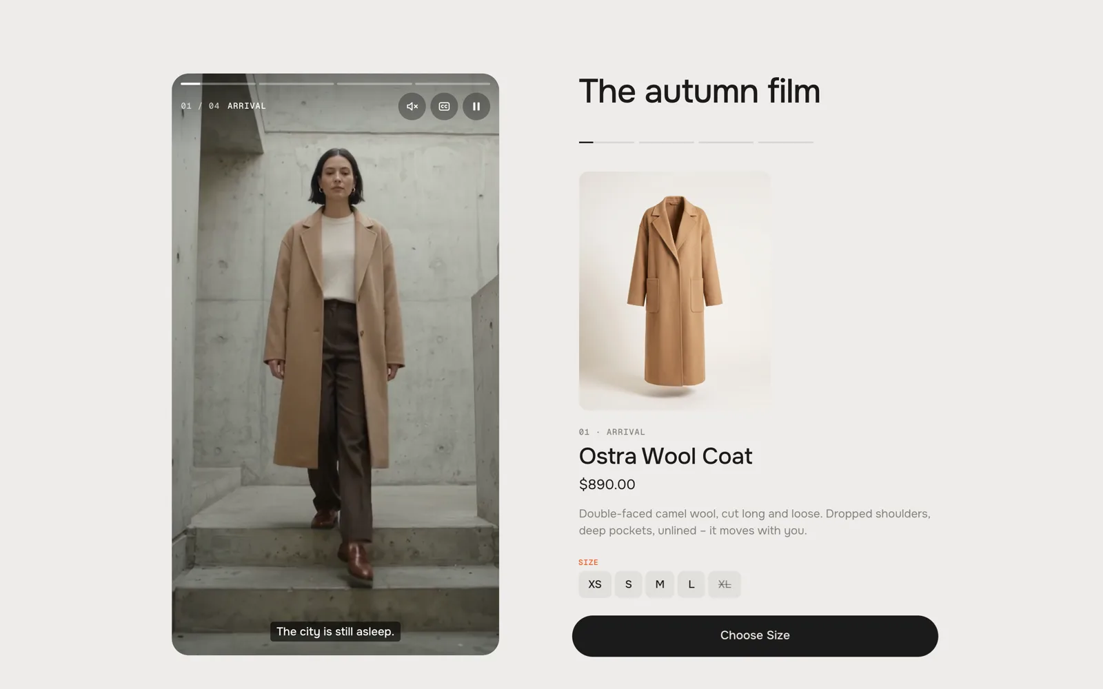
Choose SizeNothing chosen yet: the button asks for the size and the sizes shake 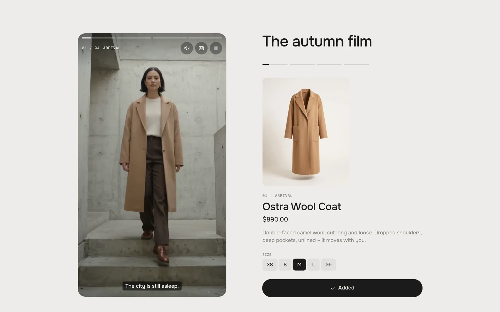
AddedAdded – the theme's cart count goes up Nothing chosen in advance
A product with sizes starts without a choice. The button says Choose Size; a click on it shakes the sizes and puts the focus on them. A product with only one variant can be added right away.
Add to cart
The price stands in the button. After the click it confirms, and your theme's cart (count, drawer) updates without a reload. Products that can only be bought with a subscription link to their product page instead.
Autoplay
Default · OnThe film starts on its own – always muted, and only while it is in view. It pauses when it leaves the screen or the tab, and plays on when it comes back. Off, or for visitors who prefer reduced motion: the poster with a play button.
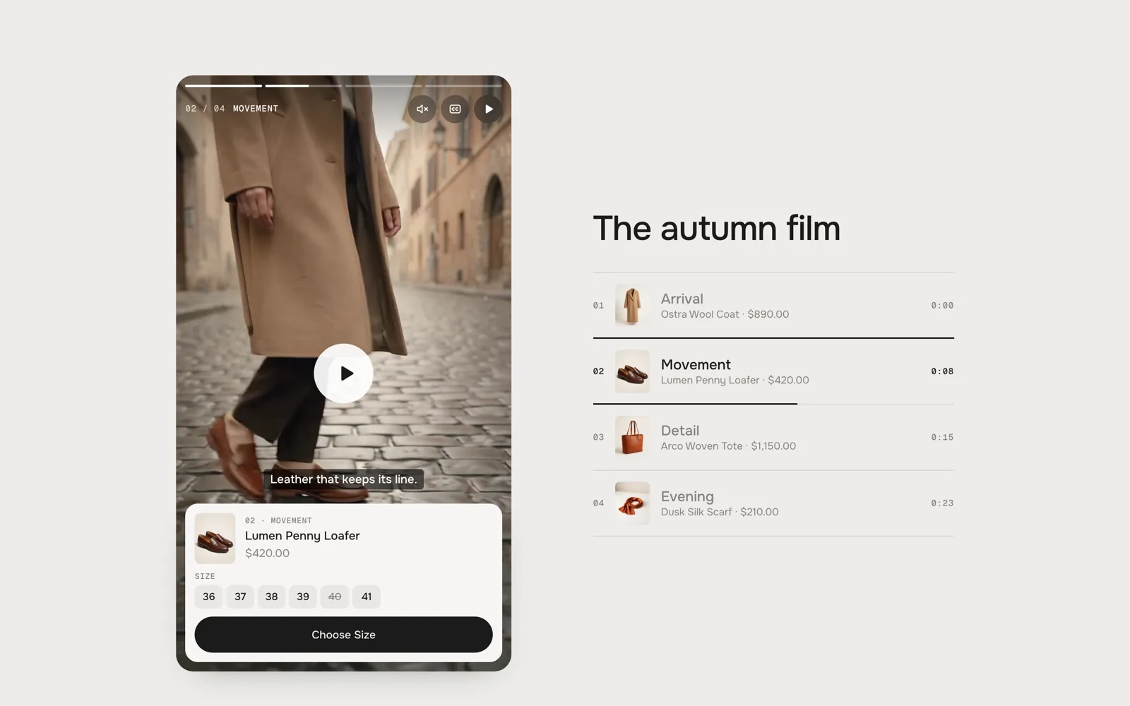
Paused: the play button in the middle, the chapter keeps its place Captions on at the start
Default · OnThe captions under the film, one line at a time, from the chapter's Captions. The CC button switches them off and on.
At the end
Default · Shop the lookShop the look: every product of the film in one list, added to the cart together.
Shop the look: heading
Default · The whole lookThe line on top of Shop the look.
Shop the look: text
Default · Everything from the film, in one go.The small line below it. Empty: none.
Shop the look: button
Default · Add the look · [price]The button. [price] becomes the total of the ticked products, [count] how many there are.
Shop the look: watch again
Default · Watch againThe link below the button that starts the film again.
Sound
The film is always muted at the start – browsers only allow muted autoplay. The sound button switches the sound on for the whole film.
Fonts
Default · Design fontsOnest and Geist Mono from werk's CDN. Use theme fonts swaps every font at once. Or swap each one with its own URL – Self-hosted font URL replaces Onest; Label font URL replaces Geist Mono (chapter numbers, times and option labels). Empty keeps werk's font.
Background#EDECE9The section around the filmText#1C1B1AHeading, names, prices, the buttonSmall text#85827CChapter list, prices and option labelsAccent#F2571FThe dot in the button, the hover of Dot to arrow and Fill, the hint on a missing sizeProduct card colours the card in the film (and the product stage on phones). Player is the colour behind the film while it loads and under Shop the look. Use theme colors takes the text and background colour of the page around the section. Button and Button text give the button its own colours – empty keeps the design.
Buttons
Default · CleanUse theme buttons gives Add to cart your theme's style. Button style sets how it reacts on hover.
Hover them – click a button for loading → added
View product CleanGrows a touch, the underline runs out and back View product Dot to arrowThe dot grows into an arrow View product Rolling textThe label rolls up, a copy follows View product FillColour wipes in from the left View product ShineA band of light passes over Easing
Default · werk SignatureHow the card slides into the film and the captions move out of its way.
werk SignatureSlow start, soft landing SmoothEven and quiet BounceA little past and back SnapQuick start, gentle stop GlideSlow in, slow out Animations
Default · OnOff: no autoplay (the poster with a play button), the card appears without sliding, chapters change without fading. Visitors who turned on “reduce motion” on their device always get this.
Side padding
Default · Match themeMatch theme (the default) lines the section up with your theme's page margin – in Horizon the same edge as header and footer. Themes without one, like Dawn, keep the werk edge. werk default always uses the werk edge, Custom takes your own values in px (desktop and tablets / phones), None runs the content to the edge.
Padding top
Default · 96pxSpace above the section. Tablets get two thirds, phones half.
Padding bottom
Default · 96pxSpace below the section. Tablets get two thirds, phones half.
- Add to cartAdd to cartThe button – the price follows by itselfAddedAddedThe button after a successful addSold outSold outThe button and the dropdowns for sizes that can't be boughtChoose an optionChoose [option]The button while no size is chosen – [option] becomes the option's nameErrorCouldn't add it to the cart. [message]Under the button when the shop refuses – [message] is the shop's reasonView productView productThe button of subscription-only productsAI label textAI-generatedOn a film or clip whose AI label is onScreen reader: playerShoppable filmName of the playerScreen reader: playPlayThe play buttonScreen reader: pausePauseThe pause buttonScreen reader: soundSoundThe sound buttonScreen reader: captionsCaptionsThe CC buttonScreen reader: chapterChapter [number]: [title]Every chapter buttonScreen reader: chaptersChaptersThe chapter linesScreen reader: previous chapterPrevious chapterThe arrow back in StoryScreen reader: next chapterNext chapterThe arrow forward in Story
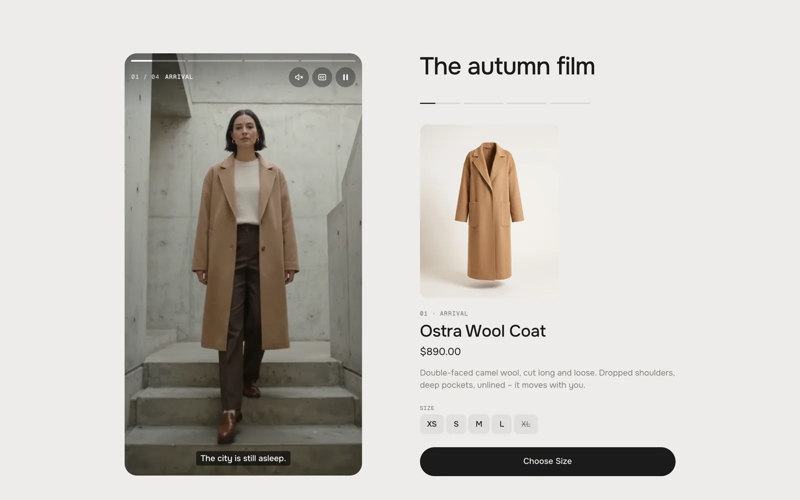
Desktop · product stage beside the player 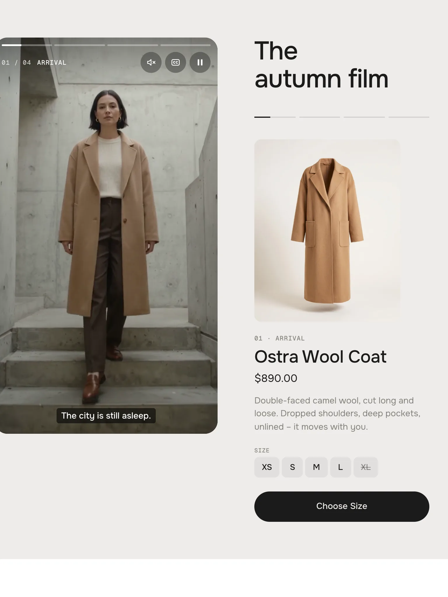
Tablet · the same, a little narrower 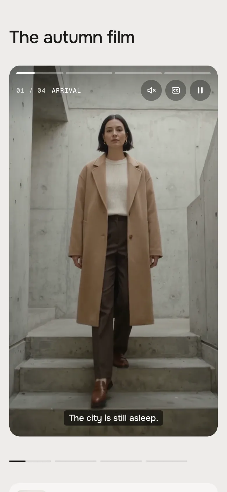
Phone · the product below the player 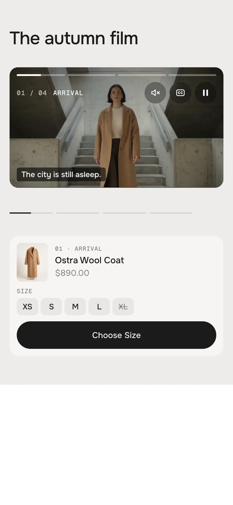
Cinema on a phone: the film over the full width, the product below it DesktopTabletPhoneReels playerBeside the areaBeside the areaFull width, uprightCinema filmFull widthFull widthFull widthProduct stageLarge, beside or belowLarge, beside or belowCompact card below the playerCard in the film (Cinema)In the cornerBelow the filmBelow the filmChapter listA column (Reels) or a row (Cinema)The sameOne swipeable lineGetting aroundClicks, keysClicks, tapsTaps left / right, hold to pauseLight on the page
Only the running chapter and the next one load – and only once the film comes into view. Progress, captions and the card follow the video frame by frame (requestVideoFrameCallback), so nothing runs while the film stands still. No libraries.
The cart stays your theme's
Add to cart tells your theme, so the cart count in the header updates without a reload. Shop the look adds every ticked product in one go.
The editor follows you
Click a Chapter block in the theme editor and the film jumps to it, shows its product and waits until you click elsewhere.
Accessible
Real buttons for pause, sound, captions and every chapter; the player works with the keyboard. Autoplay only muted and never with reduced motion – and the pause button is always there.
AI label
Using an AI-generated film or clip? Switch on AI label under it and pick a corner. The text and the look – pill, info dot or upright along the edge – are set once for the whole section, under Texts. Product pictures never get one.
Horizon4.2TestedFilm and clips, product stage and card, sizes, add to cart and Shop the look (cart count and drawer update), theme fonts, colours and buttonsDawn16TestedFilm and clips, product stage and card, add to cart (cart bubble updates), theme fonts, colours and buttonsThe section plays the demo film.
No Film is picked and no chapter has its own clip. Pick a film or add clips.
A chapter starts at the wrong moment.
Check Starts at: minutes and seconds with a colon (0:13), or seconds only (13). The chapters must be in the order of the film.
A chapter shows no product.
Its Product is empty, or the product is a draft or not published in the online store.
The film doesn't start on its own.
Autoplay or Animations is off, or the device asks for reduced motion (on a Mac: System Settings → Accessibility → Display → Reduce motion). Low power mode on iPhones blocks autoplay too – visitors get the play button.
There is no sound.
The film always starts muted. Visitors switch the sound on with the sound button. Check that the film has a sound track.
The film looks cut off.
The player fills its frame (9:16 in Reels, 16:9 in Cinema) and crops the rest. Shoot or export the film in that format – or give each chapter an upright clip for Reels.
A product has a View product button instead of Add to cart.
It can only be bought with a subscription. Visitors pick their plan on the product page.
- NewDemo: a fourth chapter, “Evening” – a silk scarf at golden hour on a rooftop (clip, product and a new four-chapter film for Cinema). Copies of earlier versions keep their three-chapter demo film.
- NewDemo: studio product pictures for the coat, the loafers and the tote instead of stills from the film.
- FixedFix: the round corners of the player could turn square for a moment while a clip faded in (Chrome draws videos on their own layer) – the video area is now clipped with clip-path. The focus ring of the player sits inside its edge.
- NewFirst stable release. A campaign film in chapters, looks Reels (upright 9:16 player) and Cinema (wide 16:9 film). One film with a start time per chapter or a clip per chapter, mixed as you like. Next to the film: Product stage (default), Chapter list, Story or Nothing. Product card with sizes (nothing chosen in advance – “Choose Size” shakes the sizes), add to cart, the film waits while visitors choose. Progress per chapter, captions, sound and pause; muted autoplay only while in view, none with reduced motion. Shop the look at the end (or play again / stop).
- NewTested: stress test (7 cases × 4 layouts × 2 looks × 4 screen sizes), real clicks and taps, Horizon and Dawn with real products (sizes, add to cart, Shop the look, cart count and drawer), theme fonts, colours and buttons.
* Built for Online Store 2.0 and tested in Shopify's Horizon and Dawn themes. Heavily customised or older themes can still clash with it – if something looks off, write us and we'll take a look.