Reviews
Testimonial Orbit
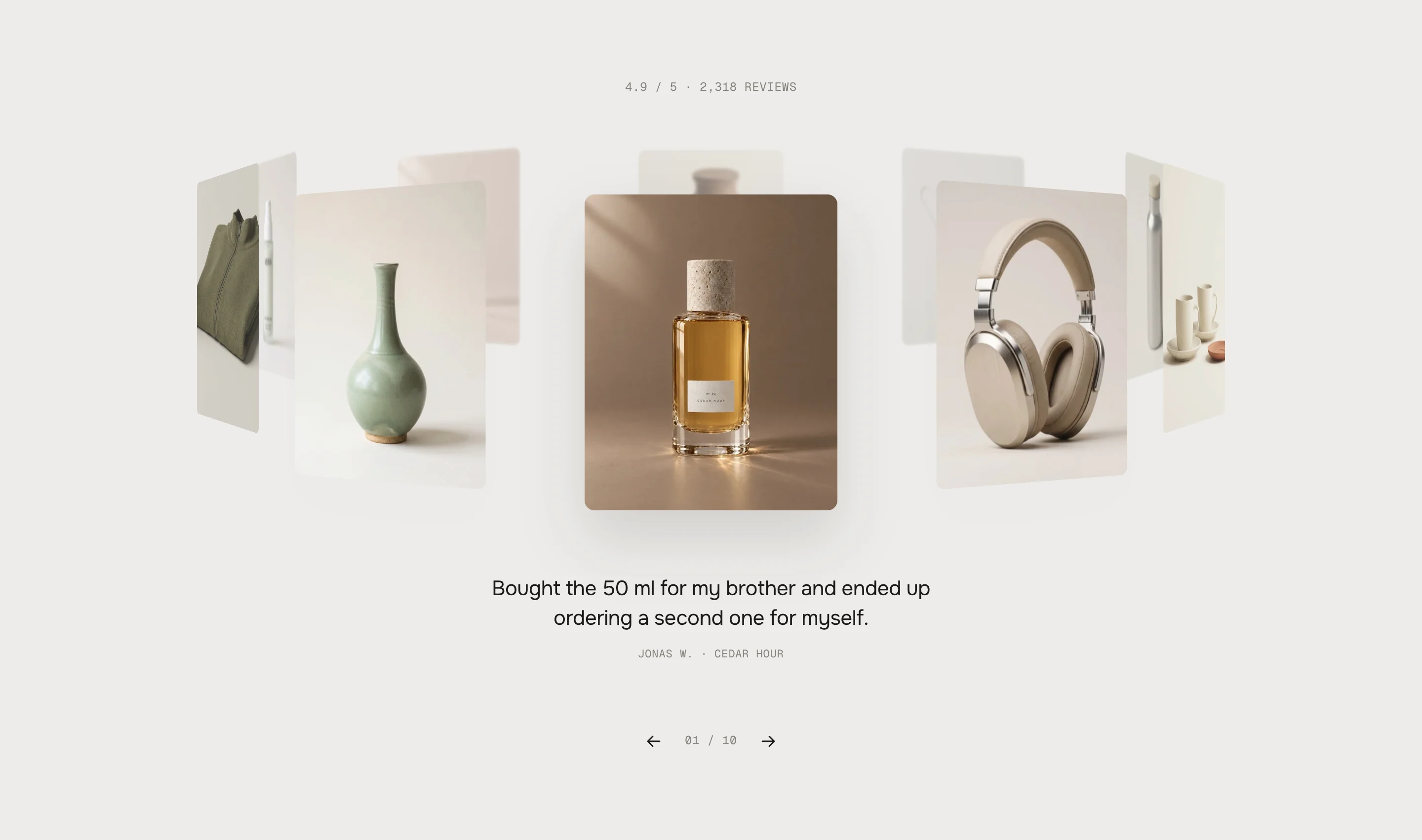
Your reviews as a 3D ring of pictures that turns by itself, follows a drag and stops on the nearest card. The quote of the front card stands below it; a click lets the card grow into the full review – name, stars, verified mark and the product with add to cart. On phones it opens as a sheet.
- Access
- Free
- Page types
- Home, Product, Landing pages
- Compatibility
- All Shopify 2.0 themes*
- Styles
- 1
- Customise
- 59 settings · 1 block type
Installation
Takes about two minutes. No app needed.
- 01
Create a new section
In your theme code editor (Online Store → ⋯ → Edit code), click the sections folder, then “New File”, name it and hit Enter.
- 02
Paste the code
In the file that just opened, paste the code below. Then hit Save (top right corner).
Note: Shopify shows no confirmation when a section saves – that’s normal.
- 03
Add it in the theme editor
Saved? Then reload the theme editor – otherwise the new section sometimes doesn’t show up. After that: Edit theme → Add section → . Everything else is in the sidebar – the Docs below explain every setting.
Code
One file. Copy it, paste it, done.
Free – just add your email
Every section is free during launch. Enter your email once and copy any code you like.
Already signed up?
More like this
Docs
Every setting, what it does and where you see it. Plus how the ring turns and how a card grows into the whole review.
What you can change
Every numbered spot has its own chapter below.
- 1
Add the section
Edit theme → open the page → Add section → . It comes with ten demo reviews. - 2
Write your reviews
Open each Review block: the whole text, the name, the stars. A short version for under the ring is optional – without one, the first sentence is used. - 3
Add pictures or products
Pick a picture, or a product – then the review shows the product's picture and a row with the product and a plus. Save.
- 1
The ring
The ring has room for ten cards (eight on phones). Cards at the back get smaller, fade into the background and blur a little. With fewer than ten reviews, they are repeated until the ring is full; with more, the extra ones wait at the back and come round as the ring turns.
Turning
By itself, one card every 5 seconds – it pauses while the mouse is over the ring, the quote or the arrows, while a review is open, while the section is out of view and while the tab is in the background. Visitors can drag or throw the ring (it stops on the nearest card), swipe sideways on a trackpad or a phone, or use the arrows and ← →. Scrolling down always stays with the page.
Opening a review
A click on the front card opens it – a click on a card beside it turns it to the front first. On desktop and tablet the card grows into the review in two steps: the picture moves to its place on the left, then the white part opens to the right and the words come in line by line. The ring gets smaller and moves up, the card's place stays outlined.
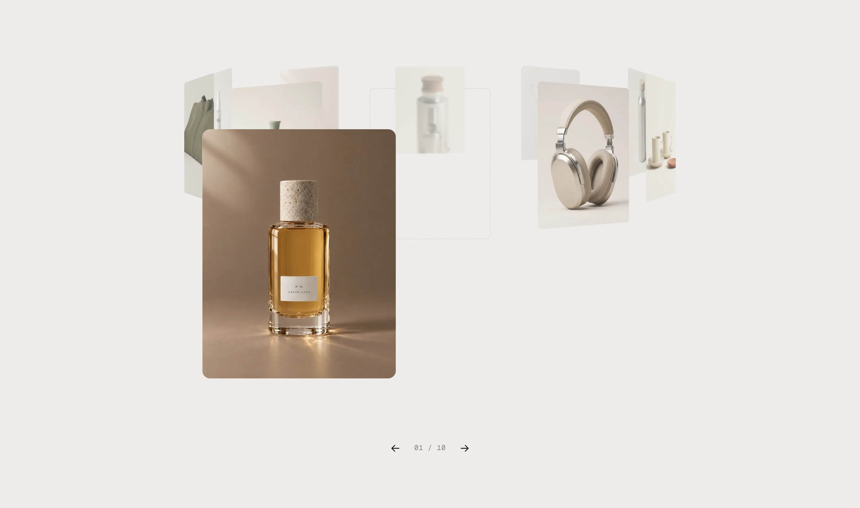
The picture lands1 · The picture moves to its place 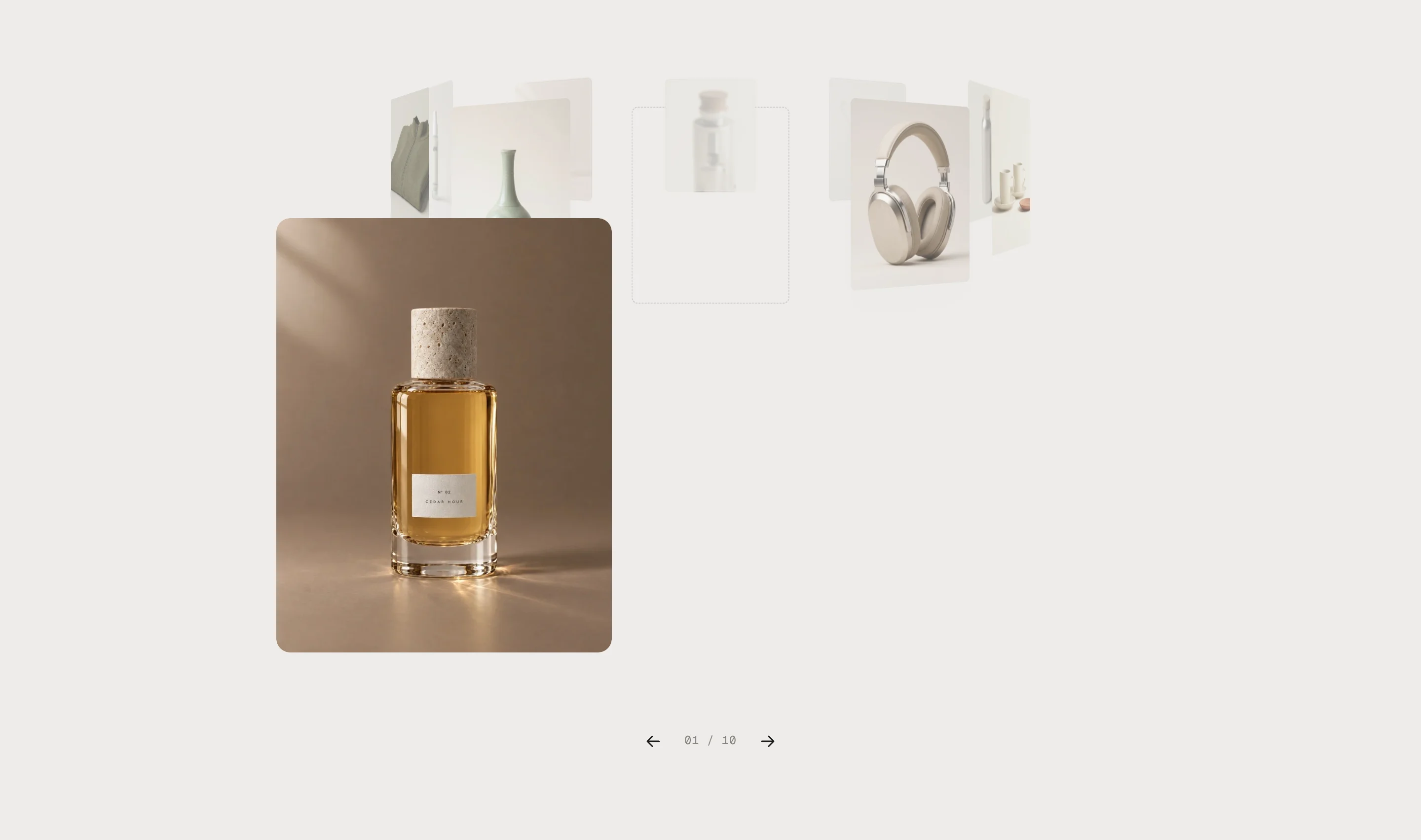
The white part opens2 · The white part opens to the right 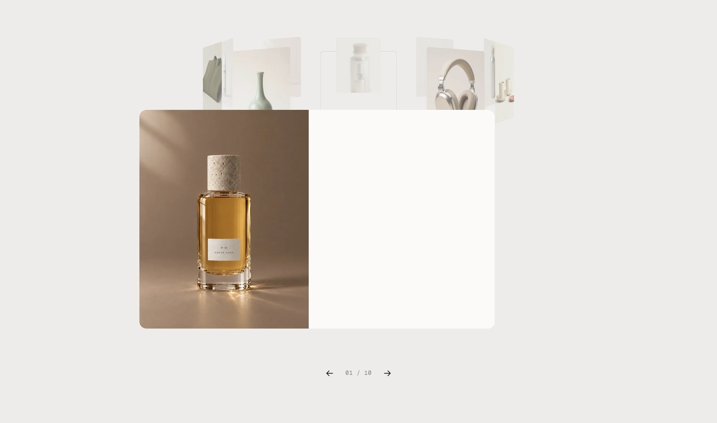
The words come in3 · The words come in, line by line The arrows page through the reviews while one is open – the ring turns along. ×, Esc or a click beside it closes the review; it shrinks back into the ring the same way.
On phones
A tap opens the review as a sheet from below, with the picture on top. Pull it down, tap × or tap beside it to close.
Review
SettingWhat it doesReviewThe whole text, shown in the open review. A new line starts a new lineShort versionUnder the front card. Empty: the first sentence of the reviewNameUnder the quote and in the reviewDetailA city or a date, after Verified buyerVerifiedSeal at the name and Verified buyer below itStars0–5. 0 shows no starsPictureThe card's picture, also in the open reviewAI labelFor an AI-generated pictureProductThe product row in the open reviewPictures
Each card takes its own picture first, then the picture of its product. A review with neither shows the reviewer's initials on a card in the review card color.
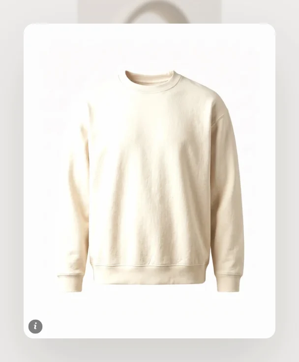
Own pictureOwn picture – here with the AI label 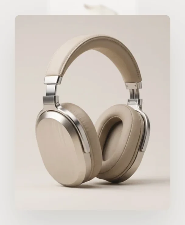
Product pictureNo picture, a product – the product's picture 
InitialsNeither – the initials The demo pictures and demo products show until the first review gets its own picture or product. From then on, the others show their initials until you fill them, too.
Upright pictures work best – the cards are 4:5 (or square, see Card shape). Where the picture is cut, the focal point you set in Shopify decides what stays: Content → Files, or the product's picture → edit.
Turn by itself
Default · OnPauses on hover, keyboard focus, an open review and while the section is out of view.
Seconds per card
Default · 5sHow long each card stays in front. The turn itself takes a little over a second, in the section's easing.
Drag to spin
Default · OnOff: the ring only turns by itself, with the arrows, the keys and a sideways trackpad swipe.
View from above
Default · 50%How far you look down onto the ring.
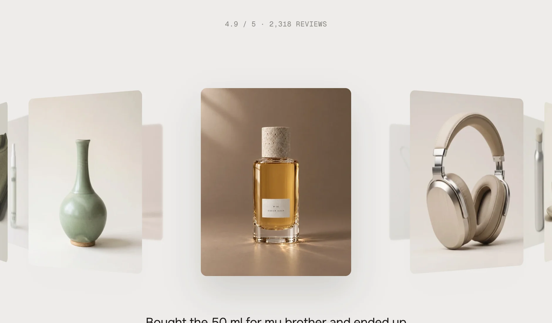
0 %0 % – the cards stand in one line 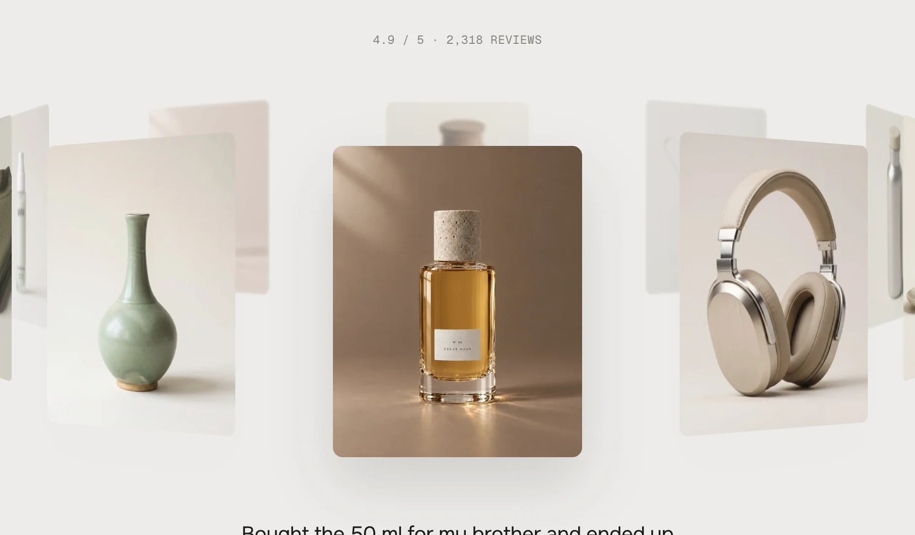
50 %50 % – the default 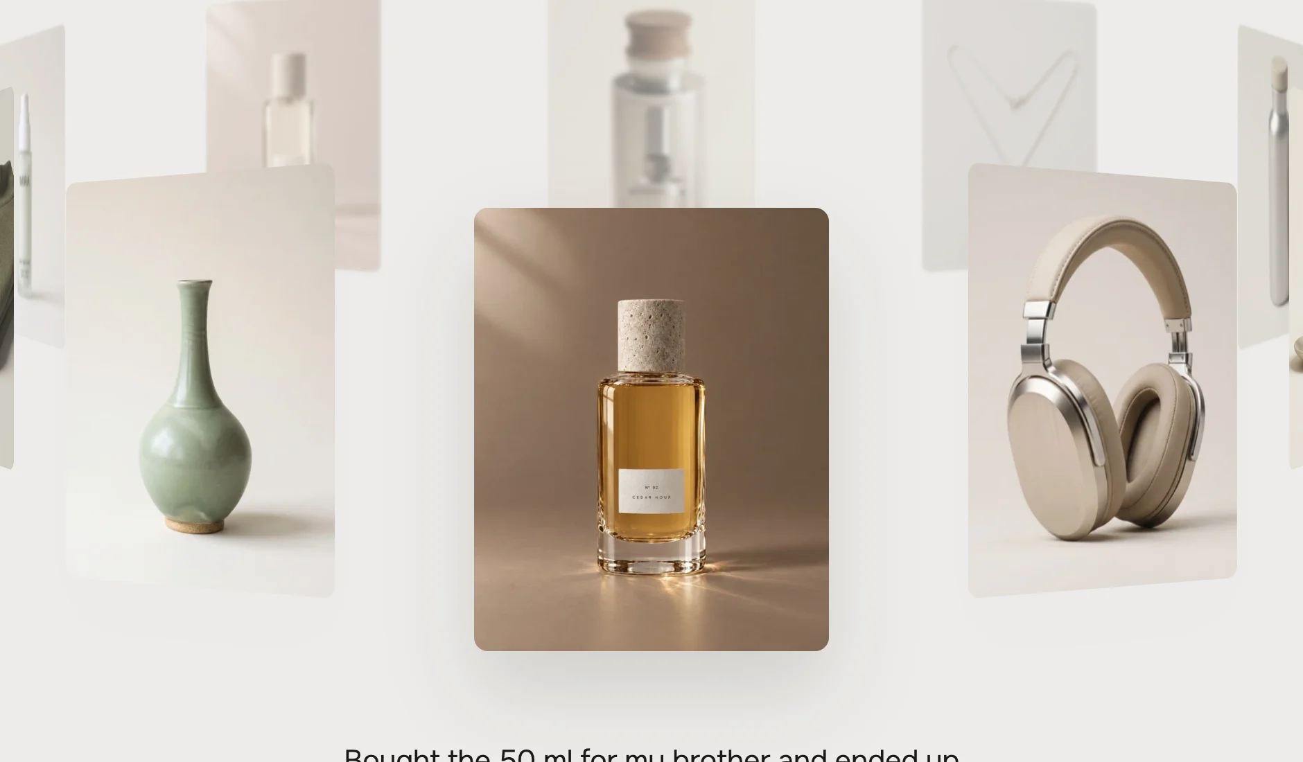
100 %100 % – clearly from above Lean towards the pointer
Default · OffThe ring leans up to 4° towards the mouse. Never on touch screens, never with Animations off.
Card shape
Default · Portrait (4:5)PortraitPortrait (4:5) – the default 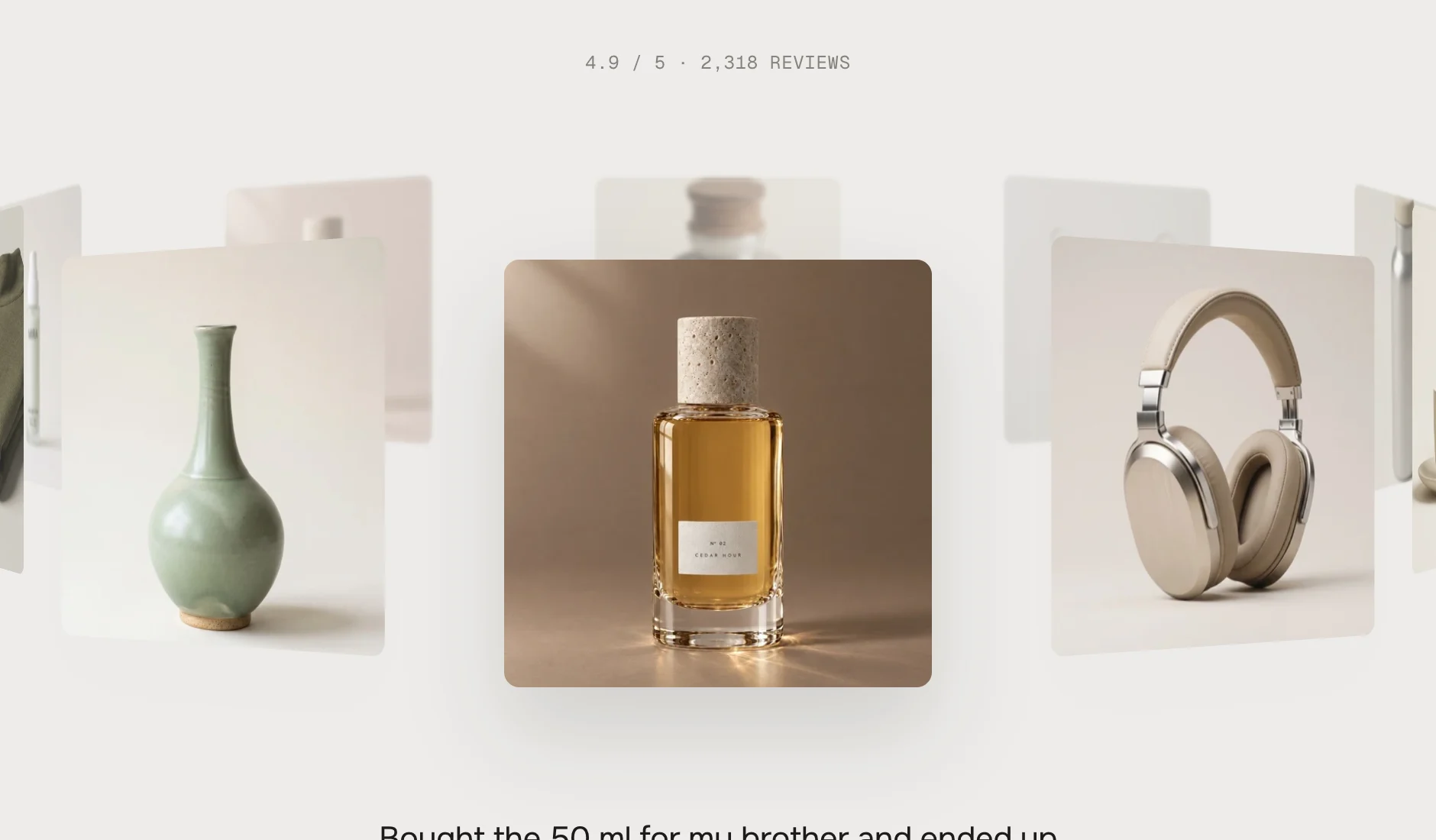
SquareSquare (1:1) Blur cards at the back
Default · OnOn iPhone and iPad the cards at the back are only faded – blur in a moving ring costs too much there.
Quote under the front card
Default · OnThe short version of the front card's review, with the name and the product. It changes with the ring: the old quote fades, the new one comes in line by line.
Arrows and counter
Default · OnPrevious, the counter (01 / 10) and next, under the quote. Off: keys and swiping keep working.
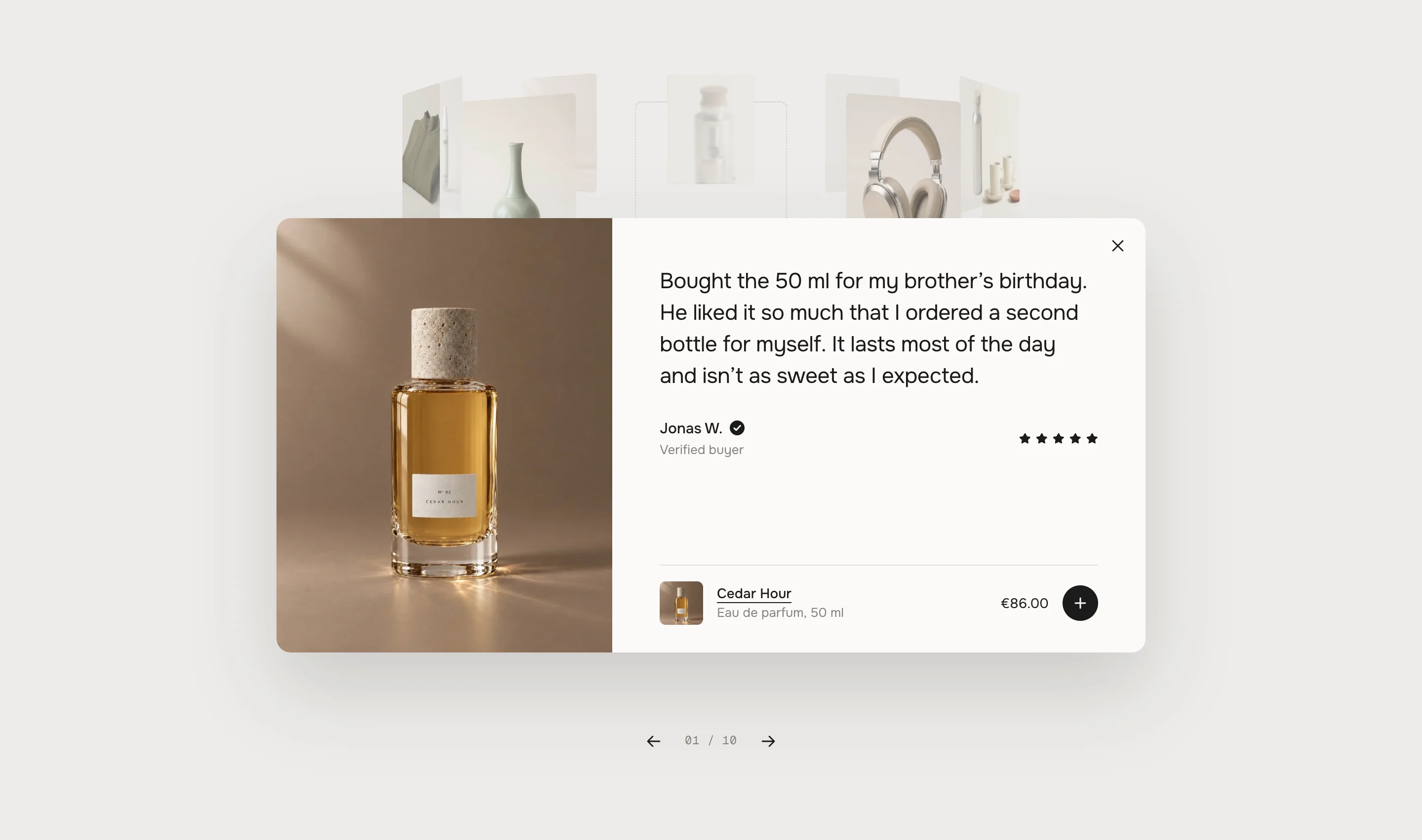
The whole review with the verified mark, the stars and the product row Stars
Default · OnVerified mark
Default · OnThe seal at the name and the Verified buyer line – only on reviews with Verified on.
Product row
Default · OnOnly on reviews with a product. The row shows the product's picture, name, type and price.
Add to cart button
Default · OnOff: the row only links to the product.
The product row
What the row offers depends on the product:

PlusOne variant – the plus adds it to the cart 
AddedAdded – the tick draws, the price says Added for 2 seconds 
OptionsOptions – the round arrow leads to the product page, the price starts with from when variants cost different 
Sold outSold out – no button, the name still links Subscription-only products link to their page like products with options. After adding, your theme's cart count updates – in Horizon and in Dawn and the themes built on it, without a reload.
Long reviews
The card grows up to the room above the arrows. A longer review scrolls inside the card – the last line fades out while there's more – and the name, the stars and the product row stay in place.
Rating line
Default · 4.9 / 5 · 2,318 reviewsThe line above the ring. Empty = hidden.
Rating from a product
Default · EmptyReview apps like Judge.me, Yotpo, Okendo or Shopify's Product Reviews can fill the product's rating in Shopify (the reviews.rating metafield). Pick a product here and the line shows its rating and the number of reviews – live, without typing. Without values the text above stays.
Rating line with a product
Default · [rating] / [max] · [count] reviews[rating], [max] and [count] become the product's values.
- [name]The reviewer, for screen readersRead the review by [name]Read the review by Jonas W.[price]The lowest price of a product with optionsfrom [price]from €95.00[message]Shopify's reason when the cart says noCouldn’t add it to the cart. [message][rating] [max] [count]The product's rating values[rating] / [max] · [count] reviews4.7 / 5 · 127 reviews
Fonts
Default · Design fontsOnest and Geist Mono from werk's CDN – or Use theme fonts, which swaps both at once. Or swap each one with its own URL: Self-hosted font URL replaces Onest, Label font URL replaces Geist Mono (the rating line, the name under the quote and the counter). Empty keeps werk's font.
Colors
Default · Design colorsBackground, text, small text and review card – the review card colour is also the phone sheet and the card of a review without picture. Use theme colors takes the text and background of the page around the section; the review card follows from them. Button and Button text give the round plus its own colours – empty keeps the design (text colour on review card).
Buttons
Default · CleanButton style sets how the product name in the review reacts on hover – Clean, Dot to arrow, Rolling text, Fill or Shine. The round plus and the round arrow are the same in every style.
Animations & easing
Default · On · werk SignatureThe turning ring, the card growing into the review, the words coming in, the plus. With Animations off – or for visitors who turned on “reduce motion” – the ring doesn't turn by itself and every change only fades. Dragging works either way. Easing sets the feel of every movement.
werk SignatureSlow start, soft landing SmoothEven and quiet BounceA small overshoot SnapQuick start, gentle stop GlideSlow in, slow out Padding top
Default · 80pxSide padding
Default · Match themeMatch theme (the default) lines the open review up with your theme's page margin – in Horizon the same edge as header and footer. The ring always runs over the whole width. werk default uses the werk edge, Custom takes your own values in px (desktop and tablets / phones), None lets the review card use the whole width.
Desktop 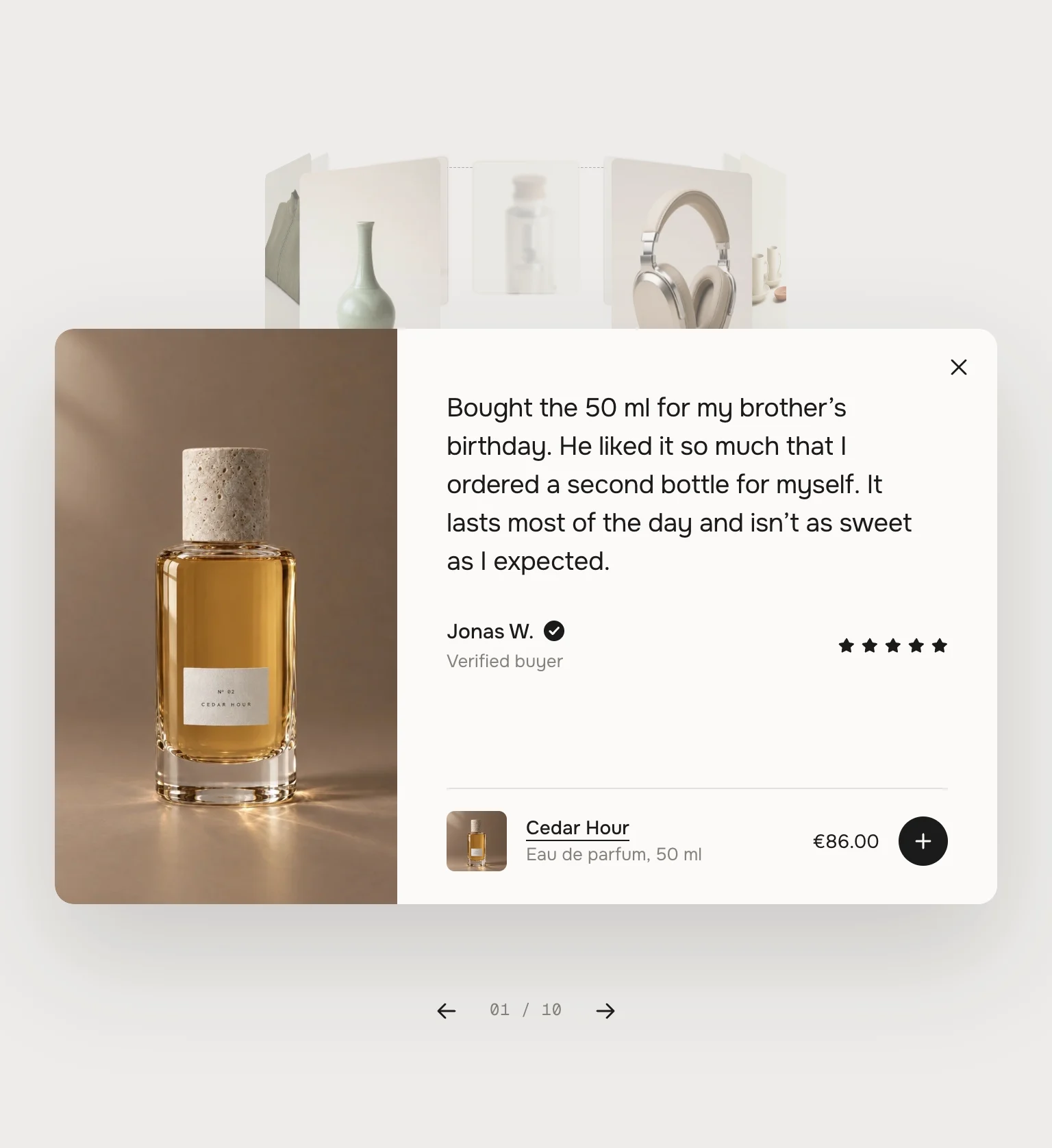
Tablet · open 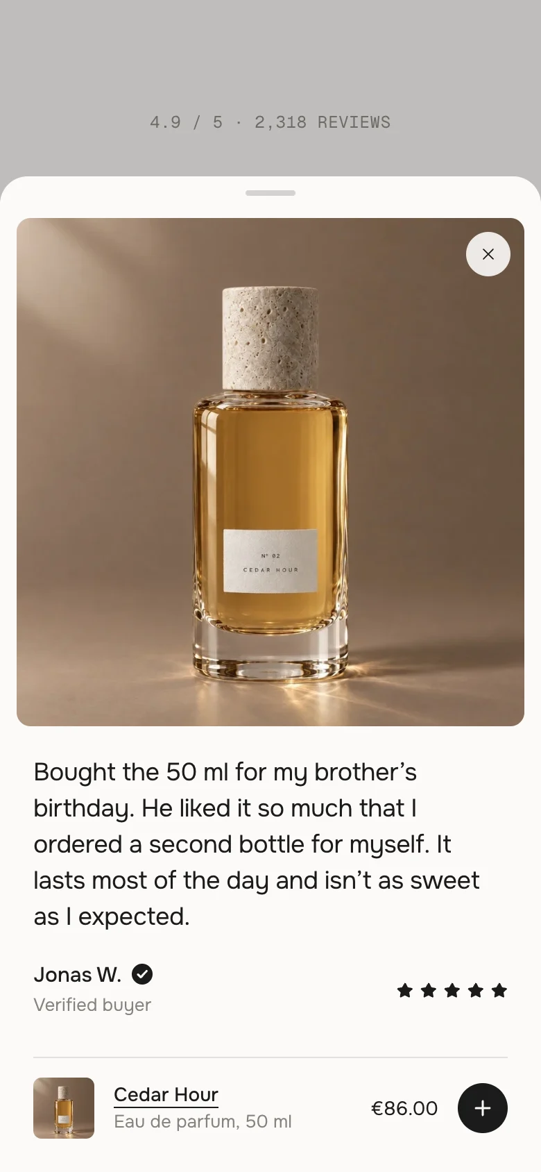
Phone · open DesktopTabletPhoneRingTen placesTen placesEight places, the side cards run past the edgeOpen reviewIn the section, picture leftIn the section, picture leftSheet from below, square picture on topClose×, Esc, click beside×, Esc, click beside×, pull down, tap besideLean towards the pointerWith a mouseWith a mouseNeverReviews are blocks
Shopify doesn't hand review texts to themes in one way – every review app stores them differently. So the reviews you show here are blocks you fill yourself: pick your best ones and copy them in. The rating line can still read your app's live rating.
Two rings on one page
Each section turns, opens and remembers its position on its own.
Without JavaScript
The cards stand as a row to swipe through, each with its short quote below.
AI label
Using an AI-generated picture? Switch on AI label under that picture and pick a corner. In the ring the cards are small, so it shows as the (i); in the open review it shows in full. The text and the look are set once for the whole section, under AI label.
Horizon4.2TestedShowroom and test page with real products in the demo storeDawn16TestedSame test page, cart count and drawer update after addingMy reviews show initials instead of pictures.
As soon as one review has its own picture or product, the demo pictures go. Give every review a picture or a product.
The plus is missing on a review.
The product has options, is subscription-only or is sold out – then the row links to the product page instead. Or Add to cart button is off under Review card.
The rating line still shows my text, not my app's rating.
Your review app has to write the rating into Shopify (the reviews.rating metafield) – most do it on, some only in a paid plan or after a setting. Check the product's metafields in Shopify.
The ring doesn't turn by itself.
It pauses while the mouse is over it and while a review is open, and it never turns for visitors who turned on reduce motion, or with Animations off.
A card shows the wrong part of the picture.
Set the focal point on the picture in Shopify (Content → Files, or the product's picture → edit). The card keeps that spot.
- NewFirst stable release. Same code as 0.1.0, plus the docs, the showroom page and the preview videos. Tested in Horizon and Dawn with real products (one variant, options, sold out, subscription, no picture) and the theme switches.
* Built for Online Store 2.0 and tested in Shopify's Horizon and Dawn themes. Heavily customised or older themes can still clash with it – if something looks off, write us and we'll take a look.