Up to six tabs, each with an image, a headline and a short text. A quiet timer moves through them and stops the moment a visitor picks one. Three looks – Segments with icons and a big number, Cards with the story on the picture, Highlights with a large stage, a glass dock and a video per tab.
In your theme code editor (Online Store → ⋯ → Edit code), click the sections folder, then “New File”, name it and hit Enter.
02
Paste the code
In the file that just opened, paste the code below. Then hit Save (top right corner).
Note: Shopify shows no confirmation when a section saves – that’s normal.
03
Add it in the theme editor
Saved? Then reload the theme editor – otherwise the new section sometimes doesn’t show up. After that: Edit theme → Add section → . Everything else is in the sidebar – the Docs below explain every setting.
Code
One file. Copy it, paste it, done.
sections/werk-advanced-tabs.liquid
Locked
{%- comment -%} werk · Advanced Tabs · v1.7.0 · werk.build/license – do not remove {%- endcomment -%}{%- liquid assign s = section.settings assign look = s.look assign n = section.blocks.size # Demo images and fonts load from the werk demo store's Files (Shopify CDN), so the section looks the same in any store. # The demo reuses the Halo Pro series of Product Comparison – one picture per tab, the order fits each look. assign werk_cdn = 'https://cdn.shopify.com/s/files/1/0954/8303/5932/files/' assign demo_base = werk_cdn | append: 'werk-product-comparison-' case look when 'cards' assign demo_list = 'max-sand,detail-cushion,detail-headband,detail-cup,pro-sand,basic-sand'
2527 lines · Liquid, CSS & vanilla JS
Free – just add your email
Every section is free during launch. Enter your email once and copy any code you like.
Edit theme → open the page → Add section → – Segments, – Cards or – Highlights. Each comes with four demo tabs.
2
Write your tabs
Every tab is a block. Click one to edit it – the section jumps to that tab and holds still while you work.
3
Pick your pictures
Image in each tab. Until you do, the tab shows our demo picture.
4
Check the timer
Autoplay is on with 6 seconds per tab. Change it in Autoplay – or turn it off.
Look
Default · Segments
How the tabs are shown.
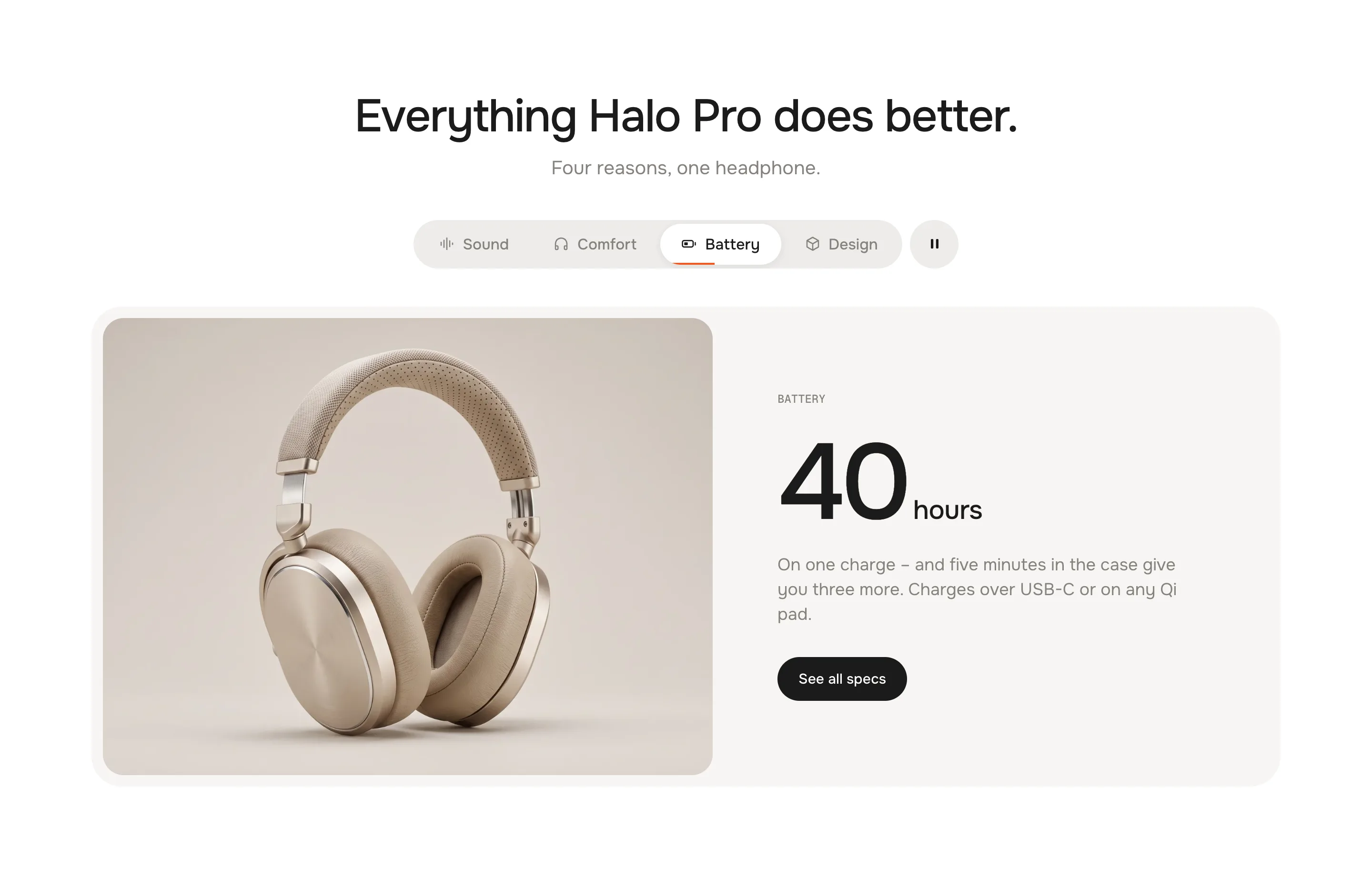
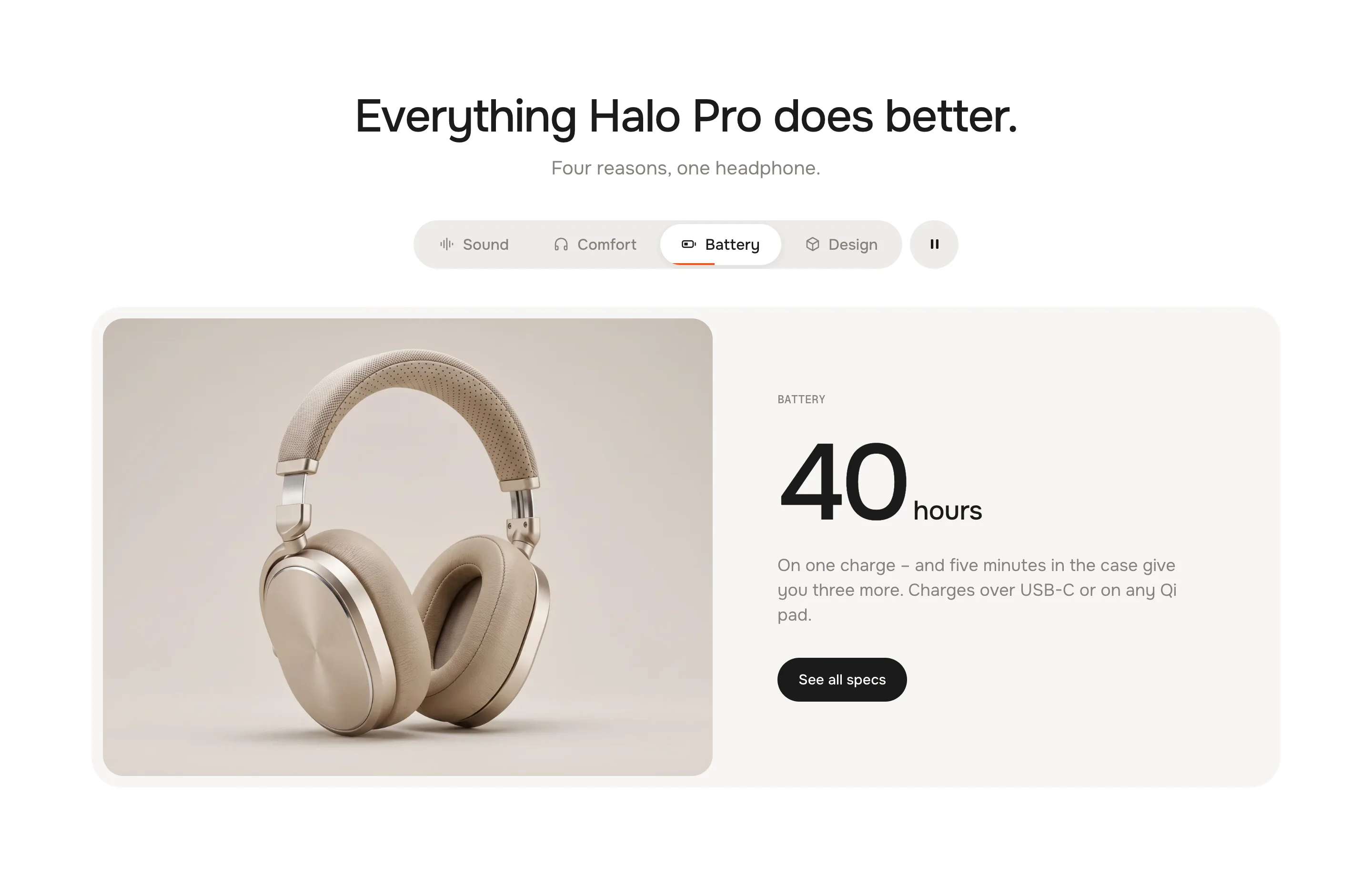
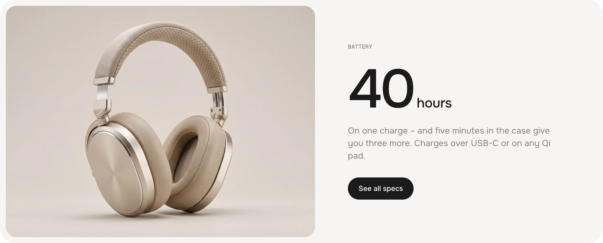
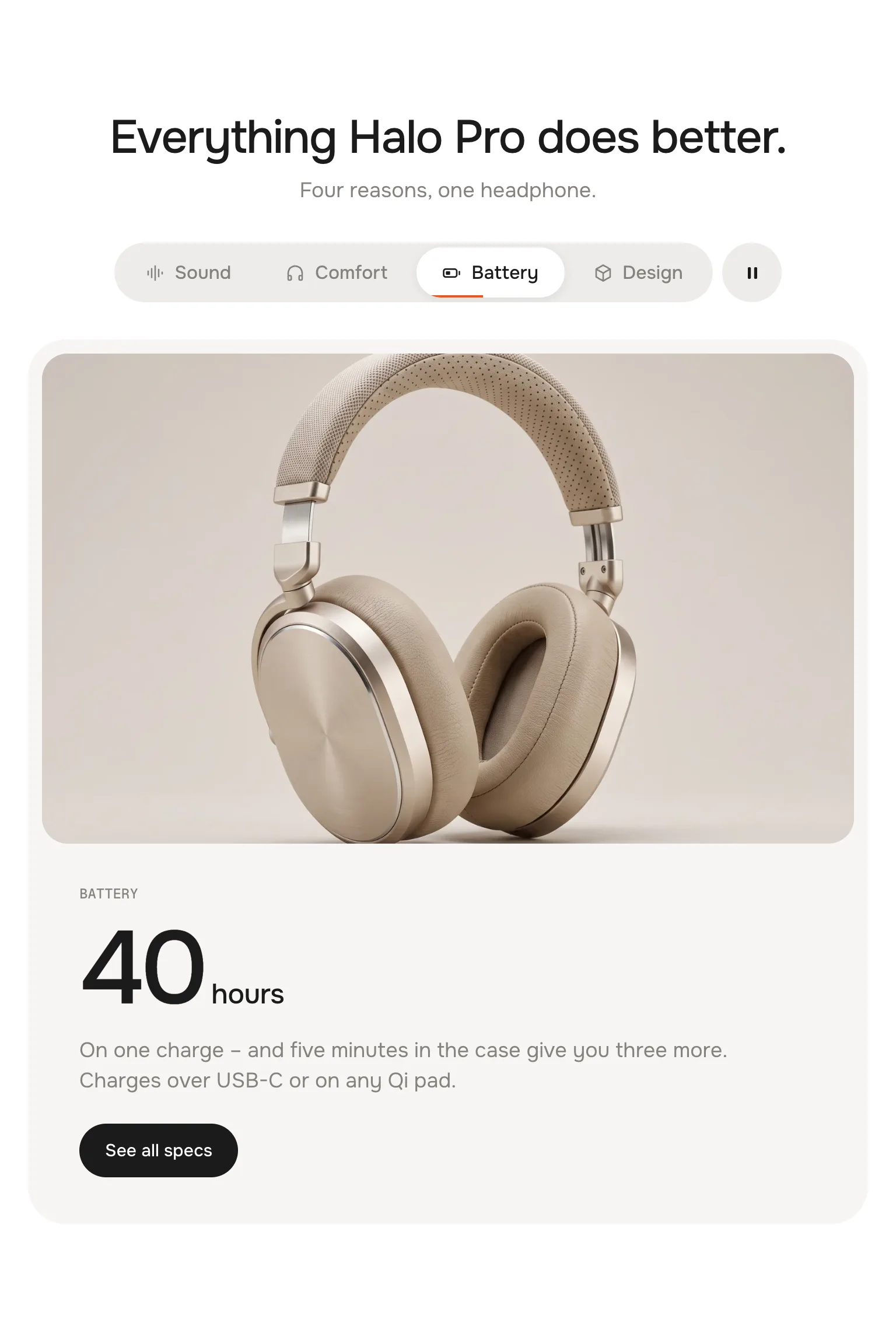
SegmentsA bar of pill tabs with icons. Below it a stage with the picture, a big number or a headline, the text and a button. For specs and categories – 3 to 5 short tabs.
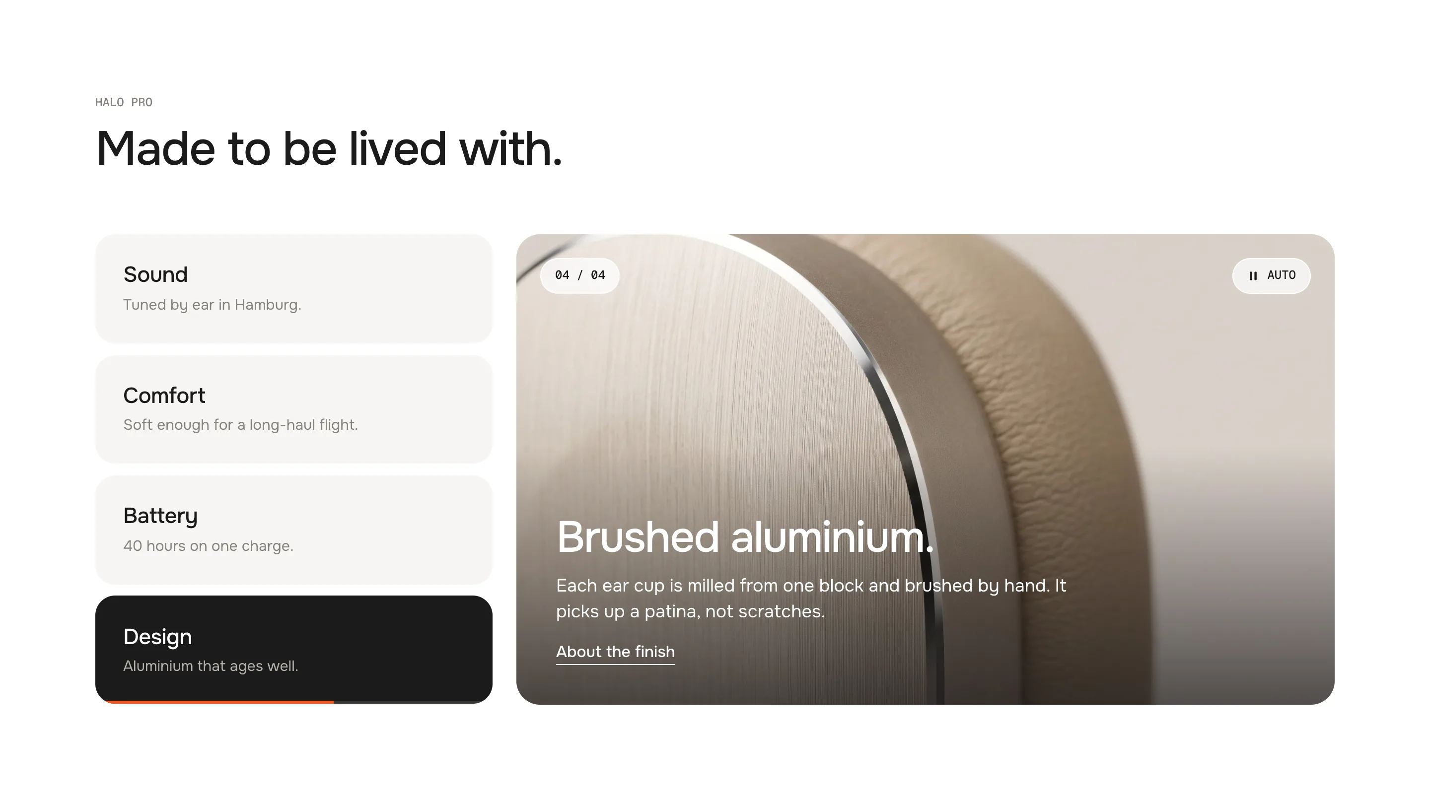
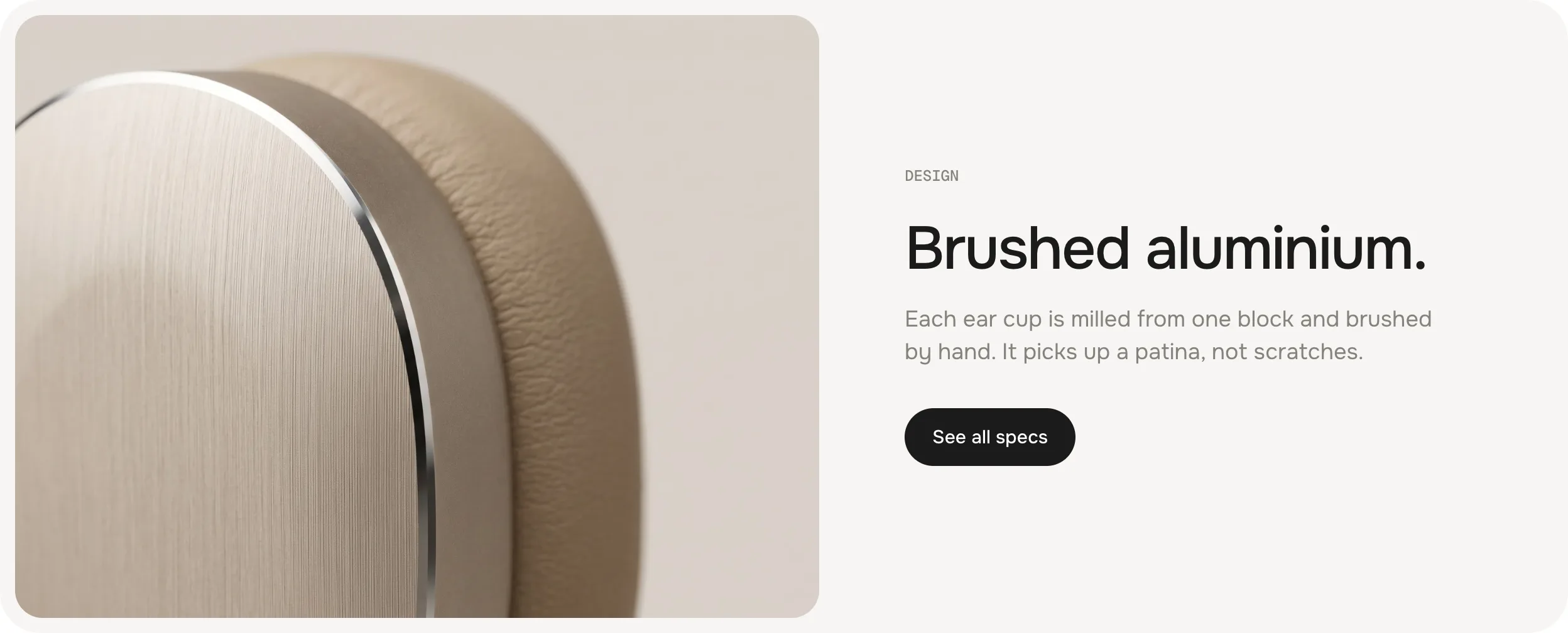
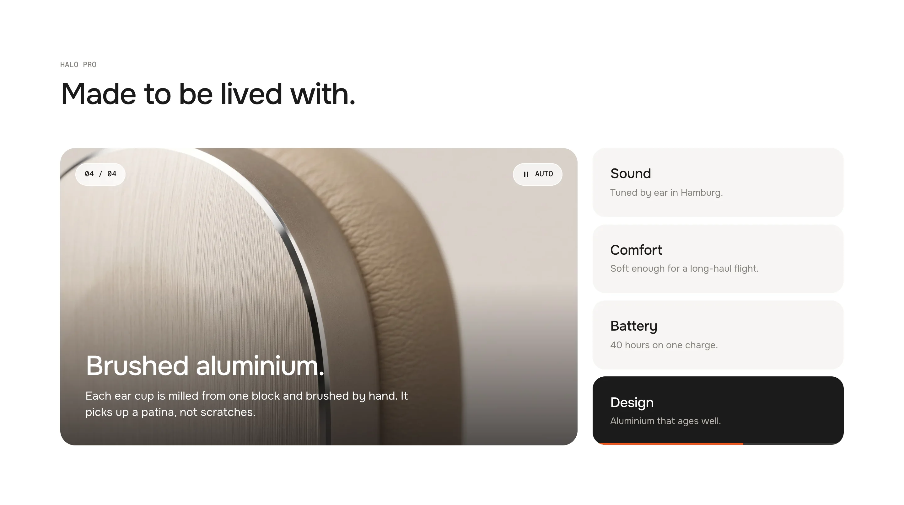
CardsCards as tabs on one side, the active one turns ink and carries the timer. With five or six tabs the short text only shows on the active card. The picture beside it tells the story with the headline, the text and an optional text link on it. For campaigns, materials, lookbooks.
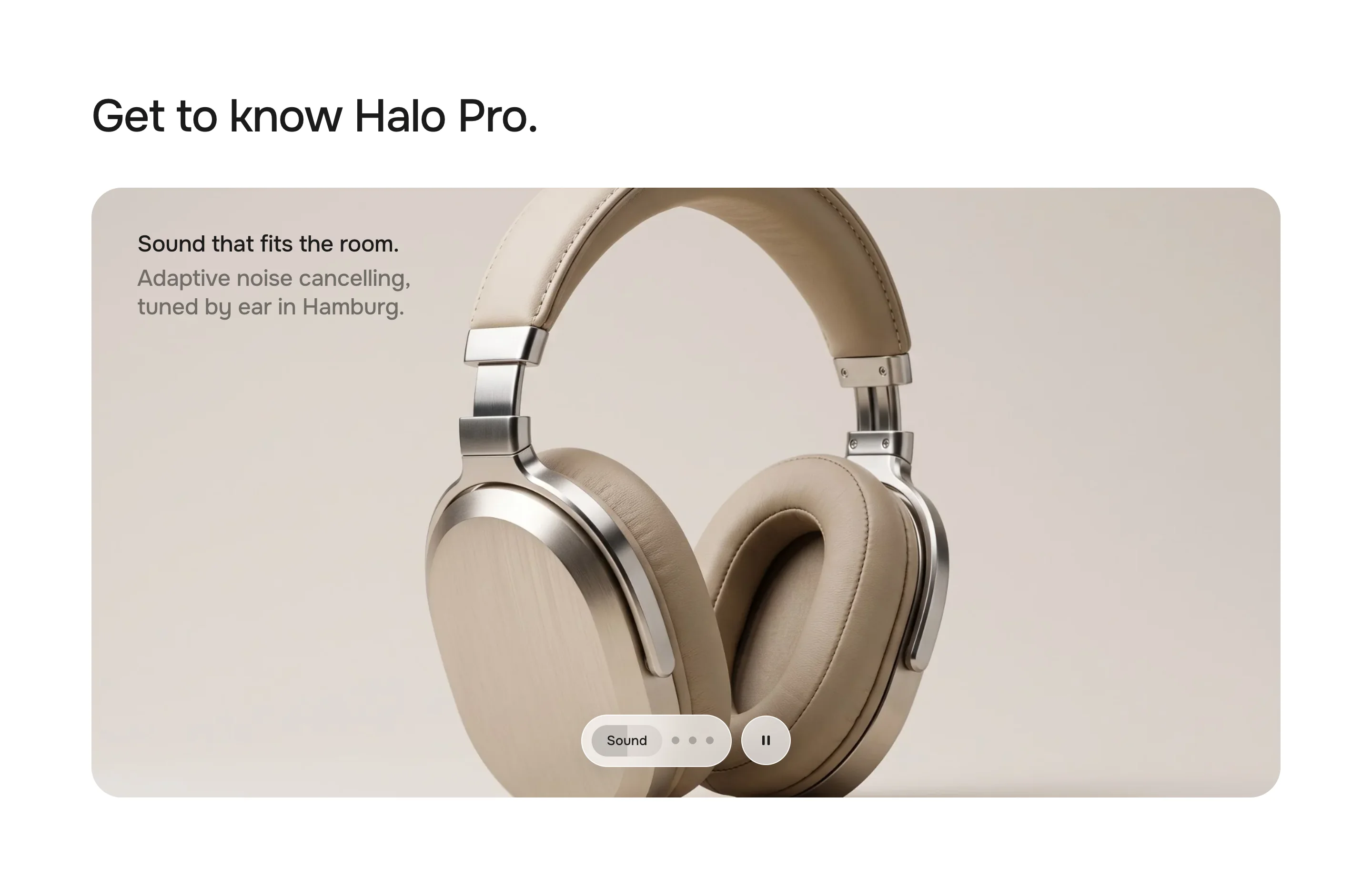
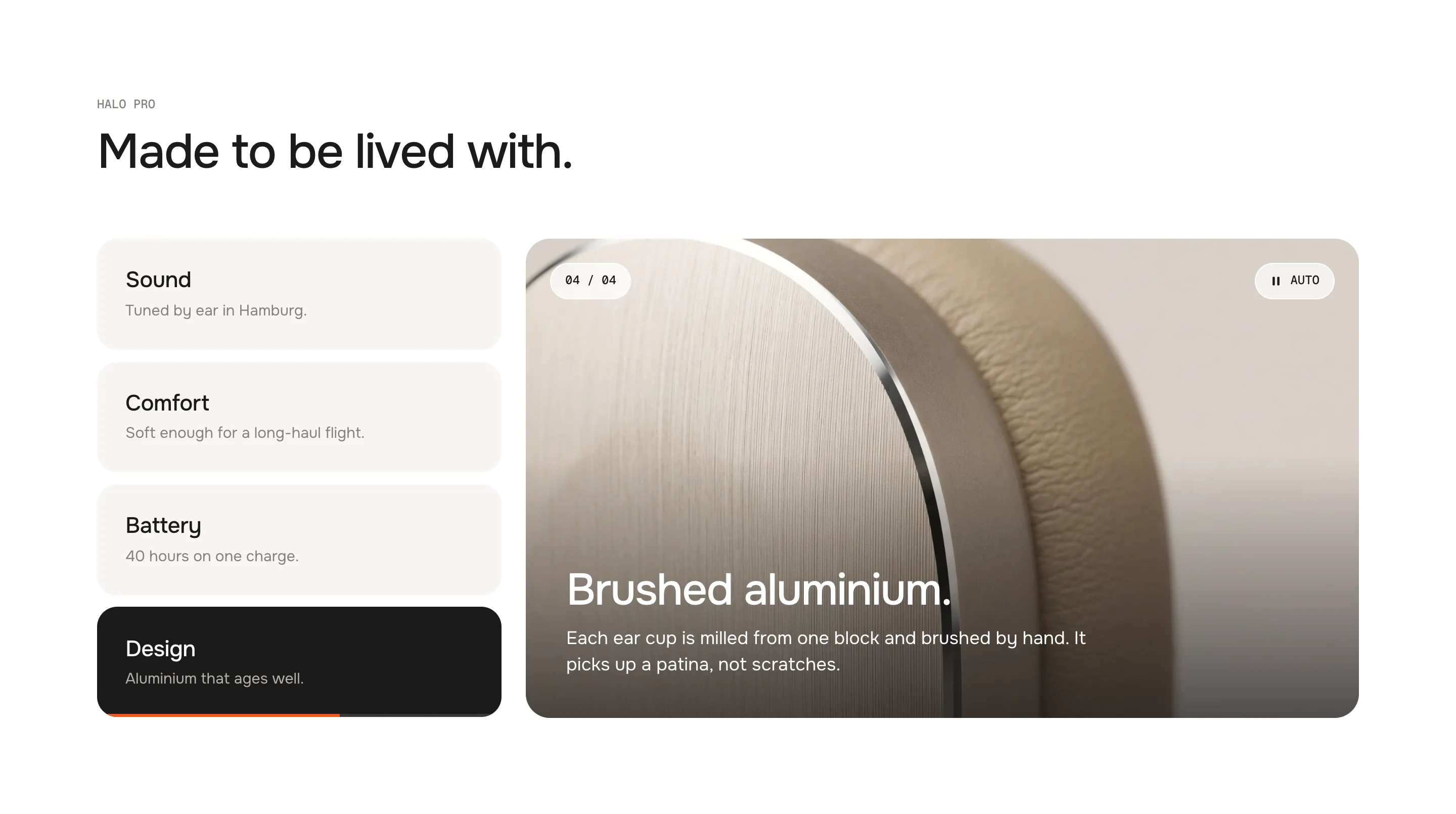
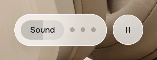
HighlightsA large stage with a short caption and a floating glass dock. The active dot stretches into a pill that fills while it plays. For product storytelling near the top of a page.
SegmentsSegments – pills, icons, a big number
CardsCards – the story on the picture
HighlightsHighlights – stage and glass dock
Heading
Default · Everything Halo Pro does better.
The main line. Bold and italic work.
Subheading
Default · Four reasons, one headphone.
A short line under the heading.
Only visible in the Segments look
Eyebrow
Default · Halo Pro
A small mono line above the heading, e.g. the product name.
Only visible in the Cards look
Theme editor
Advanced Tabs
Tab: Sound
Tab: Comfort
Tab: Battery
Tab: Design
Tab
One tab with its picture and text. Some fields belong to one look – in the theme editor they only show while that look is set.
SettingWhat it doesDefault
Tab titleThe label of the tab. In Highlights it is the label of the dock pill – keep it to about 14 characters.Sound
IconOne of eight icons in front of the title, or None. Only in SegmentsSound wave
Own iconYour own icon instead – a square SVG or PNG. Only in SegmentsEmpty
Short textThe second line on the card. With five or six tabs it only shows on the active card, so the column still fits next to the picture. Only in CardsTuned by ear in Hamburg.
ImageThe picture of the tab. Shows our demo picture until you pick your own.Demo picture
VideoA muted video that plays while the tab is active. The image is its poster. Only in HighlightsEmpty
EyebrowThe small line above the headline (Segments). Empty = the tab title. Only in SegmentsEmpty
HeadlineSegments: the large line when there is no number. Cards: the title on the picture. Highlights: the first sentence of the caption.Sound that fits the room.
TextSegments and Cards: the text under the headline. Highlights: the second, grey sentence – keep it short.Adaptive noise cancelling…
NumberA key figure like 40 – see Number or headline. Only in SegmentsEmpty
UnitThe word next to the number, e.g. hours. Only in SegmentsEmpty
Link labelThe button (Segments) or text link (Cards). Leave it empty to hide it. Only in Segments and CardsEmpty
LinkWhere it goes. Only in Segments and CardsEmpty
Icons
Eight icons, drawn for werk on a 24 px grid. Pick None for a tab without one.
Fill in Number and Unit, e.g. 40 and hours. Leave Number empty and the Headline takes its place, just as large. Without a headline the tab title is used. The small line above – 03 · BATTERY – is the tab's number and title and fills itself.
The orange line in the active pill is the timer
Play tabs automatically
Default · On
On: the tabs switch by themselves. Off: only a click, a swipe or the keyboard switches them – the timer line and the pause button disappear.
Time per tab
Default · 6s
How long each tab stays. A Highlights tab with a video stays as long as its video.
Stop when a visitor picks a tab
Default · On
On: once a visitor picks a tab, autoplay stops – they have taken over. Play starts it again from that tab. Off: the timer goes on from the tab they picked.
Show pause button
Default · On
The pause / play button next to the tabs (Segments), on the picture (Cards) or next to the dock (Highlights). Off: no button – visitors still stop the timer by picking a tab, and it holds while the mouse is on the tabs. Keep it on if you can: people who need more time to read can pause, and accessibility rules (WCAG 2.2.2) expect a way to pause anything that moves on its own.
When the timer waits
It pauses and goes on from where it was – it never starts the tab again:
MomentWhat happens
Mouse over the tabs or the pause buttonPauses until the mouse moves on – resting on the picture doesn't
Keyboard focus in the tabsPauses while someone tabs through
Section out of viewWaits – nobody misses the first tab
Browser tab in the backgroundWaits
A block selected in the theme editorShows that tab and holds still
Image
Default · Left
Segments and Cards on desktop: the picture on the left or the right. Tablets and phones always show it on top.
Left
Right
Only visible in the Segments and Cards looks
Show tab counter
Default · On
The 01 / 04 chip top left on the picture. Off: no counter – the cards already show which tab is on.
Only visible in the Cards look
Cards · picture rightCards · picture left
Image ratio
Default · Landscape 4:3
Segments: the shape of the picture on desktop and phones. On tablets it is a little wider.
Landscape 4:3
Landscape 3:2
Square
Only visible in the Segments look
Stage ratio · desktop
Default · Wide (as designed)
Highlights: the shape of the stage on desktop.
Wide (as designed)
16:9
3:2
Only visible in the Highlights look
Stage ratio · phone
Default · Tall (as designed)
Highlights: the shape of the stage on phones. Tablets use a nearly square stage.
Tall (as designed)
Portrait 4:5
Square
Only visible in the Highlights look
Padding top
Default · 96px
Space above the section.
Padding bottom
Default · 96px
Space below the section.
The active pill fills while it plays · pause next to it
Video per tab
Pick a video in the tab's Video setting. It fills the stage, plays muted and only while its tab is active; the tab's image is the poster until it plays. With autoplay the pill fills with the video and the next tab follows when it ends. Without autoplay the video repeats.
Fonts
Default · Design fonts
Onest and Geist Mono from werk's CDN. Use theme fonts swaps every font at once. Or swap each one with its own URL – Self-hosted font URL replaces Onest; Label font URL replaces Geist Mono (the small labels and numbers). Empty keeps werk’s font.
Colors
Default · Design colors
Background, text, muted text, stage and cards, tab bar, active card, timer and the button – or Use theme colors, which takes the colours of the page around the section. On Active card the text turns light or dark by itself.
1Background#FFFFFFSection background
2Text#1C1B1AHeading, active tab, number
3Text muted#85827CSubheading, tab titles, text
4Stage & card background#F6F5F3Stage (Segments), cards (Cards) · only in Segments and Cards
5Tab bar#EDECE9The pill bar (Segments) · only in Segments
6Active card#1C1B1AThe active card (Cards) · only in Cards
7Timer#F2571FTimer line, focus ring · only in Segments and Cards
8Button#1C1B1AThe button (Segments) – empty = Text · only in Segments
9Button text#FFFFFFThe label on it – empty = Background · only in Segments
Buttons
Default · Clean
Use theme buttons gives the Segments button your theme's style – otherwise Button and Button text in Colors set its colours. Button style sets how the button and the text link in Cards react on hover. Both only show when a tab has a Link label.
The pill and the ink card slide to the new tab, the picture comes in from the side the tab lies on, the text follows line by line. Visitors who turned on “reduce motion” on their device get a short crossfade. Easing sets the feel of every movement.
werk SignatureSlow start, soft landing
SmoothEven and quiet
BounceA small overshoot
SnapQuick start, gentle stop
GlideSlow in, slow out
Side padding
Default · Match theme
Match theme (the default) lines the section up with your theme's page margin – in Horizon the same edge as header and footer. Themes without one, like Dawn, keep the werk edge. werk default always uses the werk edge, Custom takes your own values in px (desktop and tablets / phones), None runs the content to the edge.
Desktop · picture beside the text
Tablet · picture on top
Phone · tabs scroll sideways
DesktopTabletPhone
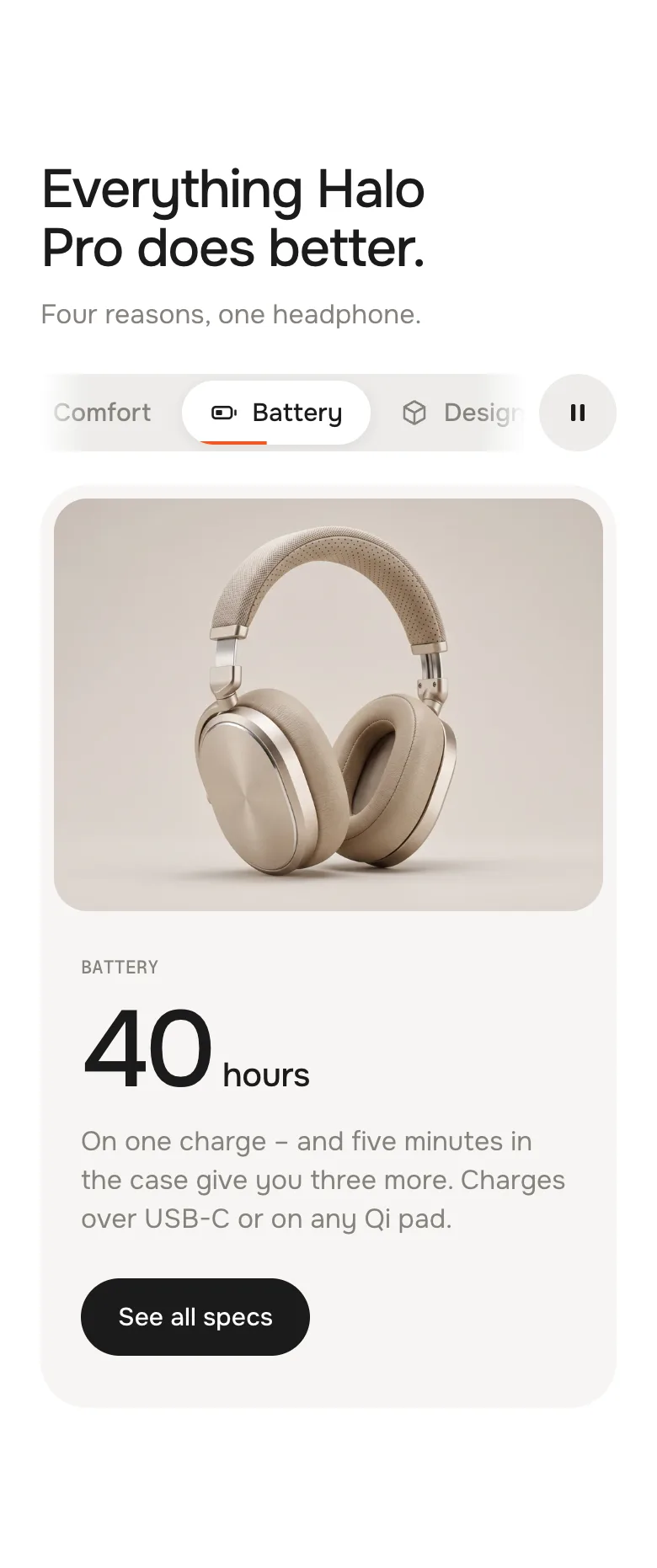
SegmentsPicture left or rightPicture on topPicture on top, tabs scroll sideways
CardsCards beside the picturePicture on top, cards 2 × 2Picture on top, cards stacked
HighlightsCaption on the stageCaption above the stageCaption above, dock a bit smaller
Tab to the tabs, then arrow keys, Home and End. The tabs are real ARIA tabs for screen readers.
No jumping
All tabs share one space, as high as the longest one – the page never jumps when a tab changes.
Pictures are ready
Once the section comes into view, the other tabs' pictures load too – no white flash when they switch.
Two on one page
Every Advanced Tabs section has its own timer and keyboard – put as many on a page as you like.
AI label
Using an AI-generated picture? Switch on AI label under that picture and pick a corner. The text and the look – pill, info dot or upright along the edge – are set once for the whole section, under AI label. In Highlights, a tab with a video uses the video's label.
Horizon4.2TestedTheme fonts, colours and buttons
Dawn16TestedTheme fonts, colours and buttons
The tabs don't switch by themselves.
Autoplay is off, a visitor already picked a tab, or the device asks for reduced motion. In the theme editor the timer also holds while a block is selected.
There are no tabs, only one picture.
The section has one tab. Add a second Tab block – tabs, timer and pause appear with two.
My tab title ends with “…”.
It is too long for one line. Shorten it, or use Cards, which allows two lines.
The video doesn't play.
It only plays in the Highlights look, while its tab is active and the section is in view – and never with reduced motion. iPhones in low power mode block it; the poster stays.
The picture is cropped.
Every tab uses the same shape. Set a focal point on the image in Shopify (Content → Files) to choose what stays in view.
1.7.012 Oct 2026
NewSide padding. Match theme (the default) lines the section up with your theme's page margin – in Horizon the same edge as header and footer. Themes without one, like Dawn, keep the werk edge. werk default always uses the werk edge, Custom takes your own values in px (desktop and tablets / phones), None runs the content to the edge.
1.6.011 Oct 2026
NewAI label per picture (EU AI Act). Under every own picture and video a switch with the corner; the text and the look – pill, info dot that opens on hover, or upright along the edge – are set once under AI label. Off by default, nothing changes until you switch it on. Product and collection pictures from Shopify never get one.
1.5.06 Oct 2026
NewShow tab counter (Layout, Cards) – turns off the 01 / 04 on the picture. On by default.
1.4.06 Oct 2026
NewLabel font URL (Fonts) – swap Geist Mono, the small labels and numbers, for your own .woff2. With Self-hosted font URL every font can now be swapped on its own; Use theme fonts still swaps all of them.
1.3.06 Oct 2026
NewEyebrow per tab (Segments) – the small line above the headline. Empty = the tab title, now without the number in front (before: "01 · SOUND", now "SOUND").
1.2.06 Oct 2026
NewShow pause button (Autoplay). On by default; off hides the pause / play button in every look.
NewCards with five or six tabs: the short text now stays on the active card – only the other cards hide it. Before, it disappeared from all cards.
* Built for Online Store 2.0 and tested in Shopify's Horizon and Dawn themes. Heavily customised or older themes can still clash with it – if something looks off, write us and we'll take a look.