Put a product next to its bigger or smaller sibling and show what really differs – numbers, meters, feature lists and images, grouped per model. Visitors switch between models, see each one in the chosen colour and add the right one to the cart without leaving the page.
In your theme code editor (Online Store → ⋯ → Edit code), click the sections folder, then “New File”, name it and hit Enter.
02
Paste the code
In the file that just opened, paste the code below. Then hit Save (top right corner).
Note: Shopify shows no confirmation when a section saves – that’s normal.
03
Add it in the theme editor
Saved? Then reload the theme editor – otherwise the new section sometimes doesn’t show up. After that: Edit theme → Add section → . Everything else is in the sidebar – the Docs below explain every setting.
Code
One file. Copy it, paste it, done.
sections/werk-product-comparison.liquid
Locked
{%- comment -%} werk · Product Comparison · v1.4.0 · werk.build/license – do not remove {%- endcomment -%}{%- liquid assign s = section.settings # Demo images and fonts load from the werk demo store's Files (Shopify CDN), so the section looks the same in any store. assign werk_cdn = 'https://cdn.shopify.com/s/files/1/0954/8303/5932/files/' assign demo_cdn = werk_cdn | append: 'werk-product-comparison-' assign demo_main_name = 'Halo Pro' assign demo_main_price = 34900 assign demo_names = 'Halo|Halo Max|Halo Mini|Halo Studio' | split: '|' assign demo_prices = '24900,54900,14900,69900' | split: ',' assign demo_keys = 'basic,max,basic,max' | split: ',' assign demo_colors = 'Sand:D9CBB5:sand,Graphite:3A3937:graphite,Sage:A7B3A0:sage|Sand:D9CBB5:sand,Graphite:3A3937:graphite,Silver:C9CACC:silver|Sand:D9CBB5:sand,Graphite:3A3937:graphite,Sage:A7B3A0:sage|Sand:D9CBB5:sand,Graphite:3A3937:graphite,Silver:C9CACC:silver' | split: '|'
4213 lines · Liquid, CSS & vanilla JS
Free – just add your email
Every section is free during launch. Enter your email once and copy any code you like.
Edit theme → Products → the template your product uses. On a landing page it works the same.
2
Add the section
Add section → . The preset brings the demo headphones: two Model blocks, each with its tiles.
3
Pick the main product
Main product → the product this page is about. On a product template that is usually the product itself.
4
One Model block per product to compare
Pick its product, then add the tiles below it – Stat, Meter, Feature list, Image, Icon, Statement. Every tile belongs to the Model block above it.
5
Fill the numbers
Values as plain numbers, the unit separately. Then save and switch through the models once on your phone.
Main product and models
The main product stays fixed – it is the one the visitor is looking at. Every Model block is a product to compare it with. Its tiles describe that pair: battery life here and there, what only one of them has, a detail worth a picture.
The switcher
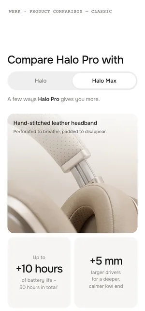
With two or more Model blocks a switcher appears next to the heading. Up to four models get a segmented control, from five a dropdown grouped into Step up and Step down. The heading, the tiles and the stage switch together; the old tiles fade out where they are while the new ones rise in.
Classic or Data
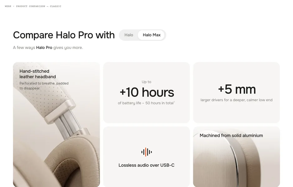
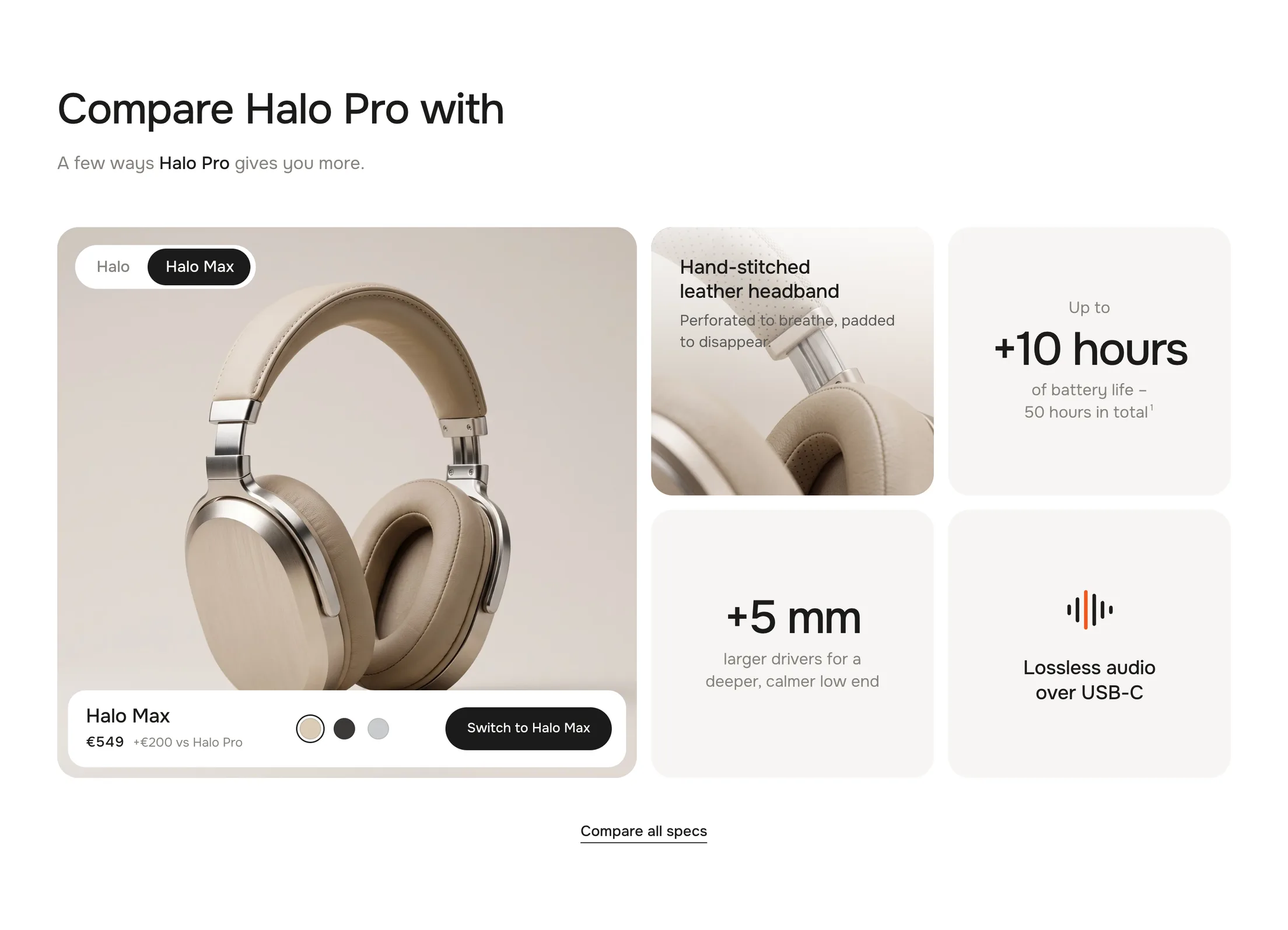
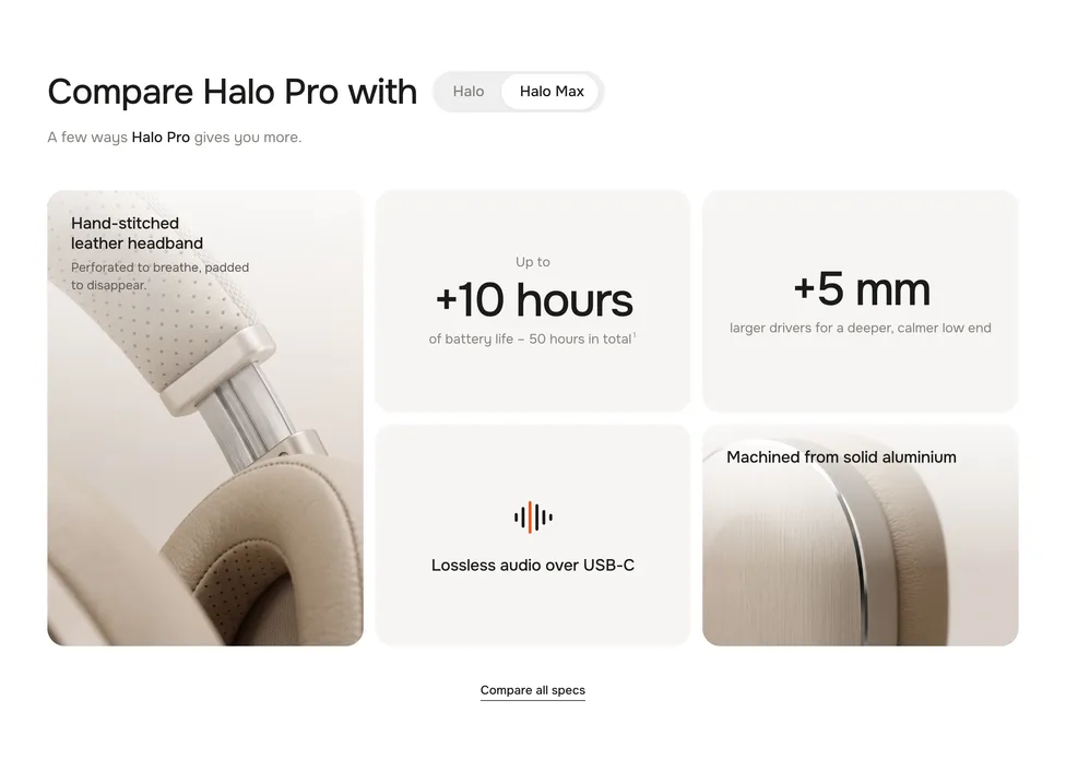
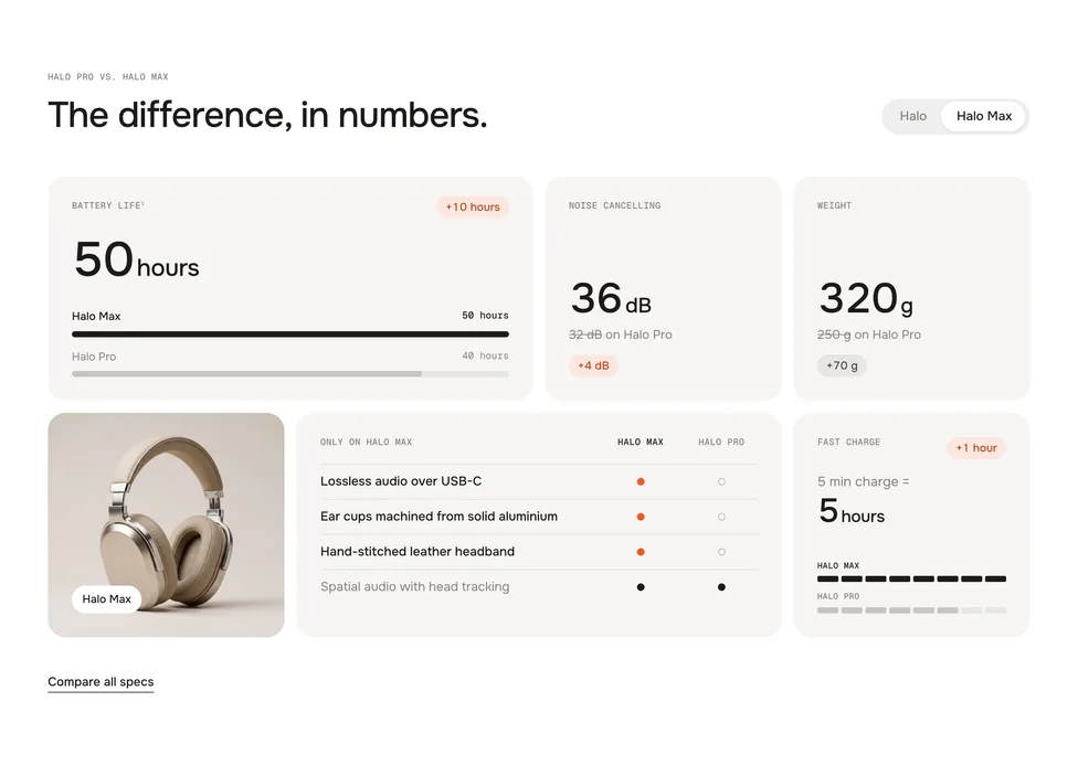
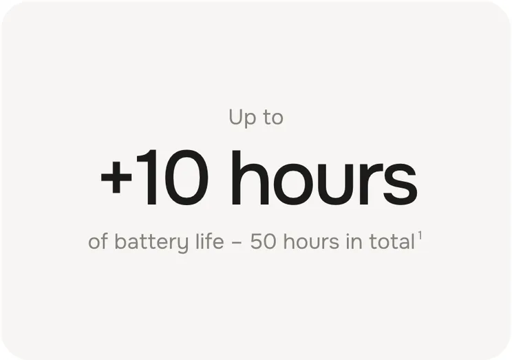
Classic shows one big difference per tile – “Up to +10 hours”. Data shows both values with bars and a delta chip. The blocks and their content stay the same – switching the look is one setting.
ClassicData
Only what differs
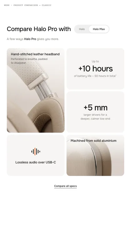
In Classic, tiles where both products have the same value disappear, so only real differences are left. Data keeps them and marks them with a “Same as” chip – a table needs every row.
Placeholders
Write them in headings and tile texts – they change with the switcher.
[this]Name of the main productCompare [this] with→Compare Halo Pro with
[other]Name of the selected model[this] or [other]?→Halo Pro or Halo Max?
[1] [2] [3]Footnote marker – the matching line in Footnotes50 hours in total[1]→50 hours in total¹
Good to know
Link straight to a model
Add #compare= and the switcher name to the product URL, spaces as hyphens. Handy for ads and emails.
Which model opens first
Next model up nudges towards the better model, Next model down towards the cheaper one – by price. First model takes the first Model block.
Tiles per model
Hero layouts show 5 tiles per model, Wide first and Even 6, with the stage 4. More are hidden – the theme editor says how many.
Cart counts
After adding, the section sends two cart events. Horizon listens and updates right away; in Dawn and the themes built on it the section refreshes the cart count and drawer itself. Other themes catch up on the next page.
shopify:cart:lines-update · cart:refresh
Look
Default · Classic
ClassicOne big difference per tile, e.g. “Up to +10 hours”. Equal values can hide.
DataThe real values of both products, with bars and a delta chip.
Layout
Default · Hero left
Hero left5 tiles, the first one is tall.
Hero rightThe same, the tall tile on the right.
Wide first6 tiles, the 1st and the 5th are wide.
Even6 tiles of the same size.
12345
Hero left5 tiles · 1st is tall
12345
Hero right5 tiles · tall one on the right
123456
Wide first6 tiles · 1st and 5th wide
123456
Even6 equal tiles
Show product stage
Default · Off
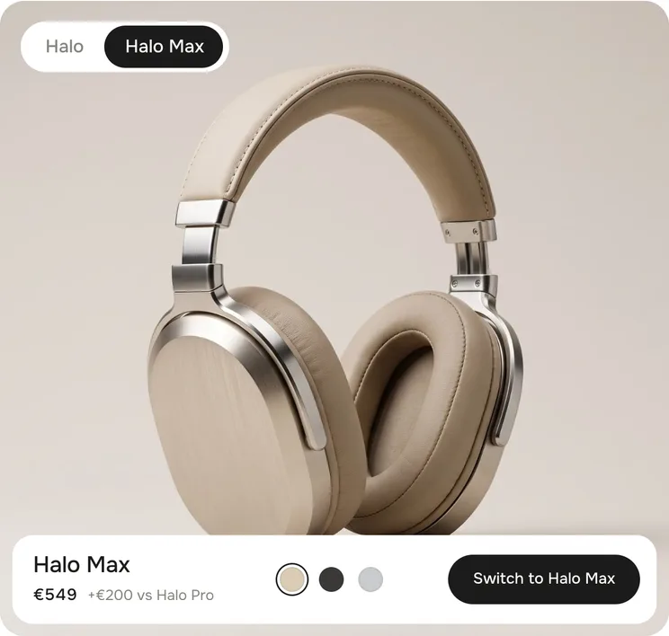
A large tile with the compared model in the chosen colour, its price and a button. Then 4 tiles fit next to it.
Stage offStage on
Main product
The product this page is about. Add a Model block for every product to compare it with.
Main product name
Optional. Replaces the product title, e.g. without a colour – “Halo Pro” instead of “Halo Pro – Sand”.
Selected on load
Default · Next model up
Next model upThe next pricier model. Nudges towards the better one.
Next model downThe next cheaper model.
First modelThe first Model block.
Switcher
Default · Auto
AutoSegmented for up to 4 models, a dropdown from 5.
SegmentedAlways the pill row.
DropdownAlways the dropdown.
Segmented · the selected model is dark
Eyebrow · Heading · Text
Default · Compare [this] with
The head of the section. The eyebrow shows in Data only. [this] and [other] change with the switcher. Classic puts the switcher right after the heading. With the stage on, try “[this] or [other]?”.
Hide tiles without a difference
Default · On
Data shows them with a “Same as” chip.
Only visible in the Classic look
Link label / Link
Default · Compare all specs
A text link under the tiles, e.g. to a full spec page. Shows when the link is set.
Footnotes
Small print under the tiles. Write [1], [2] or [3] in a tile to set the matching marker.
Model
A product to compare with. The tiles below this block belong to it.
SettingWhat it doesDefault
ProductPrice, colours and button come from here. Empty = demo content on the stage.Empty
NameReplaces the product title.Empty
Switcher labelA shorter name for the switcher.Empty
Heading / Text for this modelOverrides the section heading and text while this model is selected.Empty
Stat
A number compared between both products – the workhorse of the section.
SettingWhat it doesDefault
LabelSmall title of the tile.Battery life
Value · main product / this modelNumbers only, e.g. 40 or 12.5.40 / 30
Unithours, dB, g …hours
Better isHigher, Lower or Neither – decides if a difference is a gain (highlight chip) or not (grey).Higher
Say “Up to”Puts “Up to” above the number.Off
Line under the numberClassic. [this], [other] and [1] work here. Only in ClassicEmpty
Big text (Classic) / Chip text (Data)Replace the calculated difference, e.g. “2× quieter”.Empty
Meter
Two bars for one value – good for charging time or range.
SettingWhat it doesDefault
LabelSmall title of the tile.Fast charge
Line above the numberE.g. “5 min charge =”.5 min charge =
Value · main product / this modelNumbers only.4 / 2
Unithours
Better isHigher, Lower or Neither.Higher
Chip textOptional, e.g. “2× faster”.Empty
Line under the numberClassic. Only in ClassicEmpty
Feature list
What one product has and the other hasn’t.
SettingWhat it doesDefault
Title[this] and [other] work.Only on [this]
FeaturesOne per line: Feature | main product | this model – yes or no. Classic only shows what one side has and the other hasn’t.Adaptive noise cancelling | yes | no
Own iconReplaces the icon. Best: a square SVG or PNG with a transparent background.Empty
Colour the icon like the textFor single-colour icons. Off for full-colour icons or photos.On
EyebrowData only. Empty = “Only on …”. Only in DataEmpty
Title / TextSpatial audio with head tracking
Statement
One sentence in big type – for what numbers can’t say.
SettingWhat it doesDefault
EyebrowSmall line above.Empty
StatementThe big sentence.Built to be repaired, not replaced.
Text / ChipA line under it and an optional chip.Empty
DarkInk tile with white type.On
Stage button
Default · Link to the product
Link to the product“Switch to Halo Max” leads to the model’s page.
Add to cartAdds the model in the chosen colour. A spinner, then “Added”.
Stage · colours, price difference, button
Stage option
Name of the variant option the stage switches, e.g. Metal. Empty: colour swatches, otherwise the first option whose values have their own images.
Show stage options as
Default · Swatch, else name
Swatch, else nameThe colour or pattern from Shopify’s swatch field.
Variant imageA thumbnail of each variant’s own image; values without one keep their swatch.
NameThe value as text.
When a size is still missing
With Add to cart and more options than the colour – a size, for example – the button opens a small panel in the stage: Choose your size, the sizes with sold-out ones crossed out, then Add to cart. On phones it is a bottom sheet you can drag away. Products with only one variant per colour go straight into the cart.
Sticky switcher on mobile
Default · On
On phones a small pill with the switcher follows while the tiles are on screen.
Animations & easing
Default · On · werk Signature
Tiles rise in one after another as they scroll into view; switching models lifts the old tiles out and brings the new ones in. Off: everything switches without movement. Visitors who turned on “reduce motion” on their device get the same. Easing sets the feel of every movement.
Fonts
Default · Own fonts
Use theme fonts swaps every font at once – or leave it off and swap each one with its own URL. Empty keeps werk’s font.
Use theme fontsOff: Onest for text and headings, Geist Mono for labels. On: your theme’s heading and body fonts.
Self-hosted font URL (.woff2)Replaces Onest. Upload the file to Content → Files and paste its URL. Our font loads from werk’s Shopify CDN until then.
Label font URL (.woff2)Replaces Geist Mono – the small labels and numbers. Upload the file to Content → Files and paste its URL.
Colors
Default · Own colors
Use theme colors takes the text and background of the page around the section and hides most fields below. Highlight always keeps its own colour. Button and Button text give the buttons their own colours – empty keeps the design.
1Background#FFFFFFAround the tiles
2Text#1C1B1AHeading, numbers, titles · only in Classic
Use theme buttons gives the stage button your theme’s style – then only the text link follows the style below. Button style sets how buttons and text links react on hover.
Padding top / Padding bottom
Default · 96 px
Space above and below the section, 0–160 px. Scales down on smaller screens.
Compare withCompare withSwitcher label for screen readers and the dropdown
vsvs“+€200 vs Halo Pro”
Up toUp toAbove a number with Say “Up to”
onon“30 hours on Halo”
Same asSame asChip for equal values in Data
Only onOnly onEyebrow of icon tiles in Data
Switch toSwitch toStage button with Link to the product
ViewViewLink to the model’s page
Add to cart / Added / Sold outAdd to cart · Added · Sold outStage button
SaveSave“Save €100” for a cheaper model
Same priceSame pricePrice line when both cost the same
Step up / Step downStep up · Step downDropdown groups
Variant panel titleChoose your [option_lower]Panel when a size is missing – [option] = Size, [option_lower] = size
Variant panel buttonChoose a [option_lower]Button until everything is chosen
CloseClosePanel close button
Side padding
Default · Match theme
Match theme (the default) lines the section up with your theme's page margin – in Horizon the same edge as header and footer. Themes without one, like Dawn, keep the werk edge. werk default always uses the werk edge, Custom takes your own values in px (desktop and tablets / phones), None runs the content to the edge.
Desktop
Tablet
Phone
TabletBelow 990 px the tiles flow in two columns. A tile left alone in its row fills it.
PhoneOne column. The tiles rise in as they scroll into view.
SwitcherWith Sticky switcher on, a small pill follows on phones while the tiles are on screen.
Variant panelOpens as a bottom sheet – drag it down or tap outside to close.
AI label
Using an AI-generated picture? Switch on AI label under that picture and pick a corner. The text and the look – pill, info dot or upright along the edge – are set once for the whole section, under AI label.
The switcher is missing.
It needs at least two Model blocks – one model has nothing to switch to.
A tile doesn’t show up.
The layout is full: Hero shows 5 tiles per model, Wide first and Even 6, with the stage 4. Or, in Classic, both values are the same and Hide tiles without a difference is on.
The difference looks wrong.
Enter plain numbers in the value fields – the unit goes into Unit. Check Better is: for weight or price, lower is better.
The stage shows headphones instead of my product.
The Model block has no product yet – pick one.
The stage doesn’t switch colours.
Set Stage option to the name of the option in Shopify, e.g. Color or Metal, and give its values swatches or variant images.
The cart count doesn’t change after adding.
Horizon and Dawn-based themes update right away. Other themes may not listen to the cart event – the item is in the cart, the count updates on the next page.
1.4.012 Oct 2026
NewSide padding. Match theme (the default) lines the section up with your theme's page margin – in Horizon the same edge as header and footer. Themes without one, like Dawn, keep the werk edge. werk default always uses the werk edge, Custom takes your own values in px (desktop and tablets / phones), None runs the content to the edge.
1.3.011 Oct 2026
NewAI label per picture (EU AI Act). Under every own picture and video a switch with the corner; the text and the look – pill, info dot that opens on hover, or upright along the edge – are set once under AI label. Off by default, nothing changes until you switch it on. Product and collection pictures from Shopify never get one.
1.2.06 Oct 2026
NewLabel font URL (Fonts) – swap Geist Mono, the small labels and numbers, for your own .woff2. With Self-hosted font URL every font can now be swapped on its own; Use theme fonts still swaps all of them.
1.1.06 Oct 2026
NewButton and Button text colours (Colors). Empty = as designed – nothing changes until you pick one. Hidden while Use theme colors or Use theme buttons is on.
1.0.36 Oct 2026
NewTheme editor: fields follow the look – Eyebrow, chip text and the icon tile's eyebrow only in Data; Hide tiles without a difference, the lines under the numbers, big text and the image tile's text only in Classic. Nothing you entered is lost when you switch.
1.0.22 Oct 2026
NewDawn and the themes built on it: after Add to cart the cart count in the header and the cart drawer update right away (before, only after a reload). Nothing opens on its own.
* Built for Online Store 2.0 and tested in Shopify's Horizon and Dawn themes. Heavily customised or older themes can still clash with it – if something looks off, write us and we'll take a look.

 SettingWhat it doesDefaultLabelSmall title of the tile.Battery lifeValue · main product / this modelNumbers only, e.g. 40 or 12.5.40 / 30Unithours, dB, g …hoursBetter isHigher, Lower or Neither – decides if a difference is a gain (highlight chip) or not (grey).HigherSay “Up to”Puts “Up to” above the number.OffLine under the numberClassic. [this], [other] and [1] work here. Only in ClassicEmptyBig text (Classic) / Chip text (Data)Replace the calculated difference, e.g. “2× quieter”.Empty
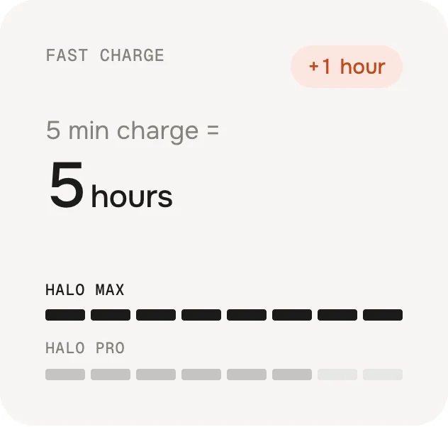 SettingWhat it doesDefaultLabelSmall title of the tile.Fast chargeLine above the numberE.g. “5 min charge =”.5 min charge =Value · main product / this modelNumbers only.4 / 2UnithoursBetter isHigher, Lower or Neither.HigherChip textOptional, e.g. “2× faster”.EmptyLine under the numberClassic. Only in ClassicEmpty
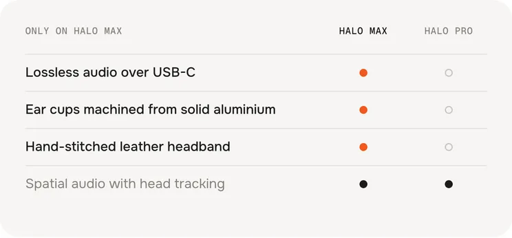 SettingWhat it doesDefaultTitle[this] and [other] work.Only on [this]FeaturesOne per line: Feature | main product | this model – yes or no. Classic only shows what one side has and the other hasn’t.Adaptive noise cancelling | yes | no
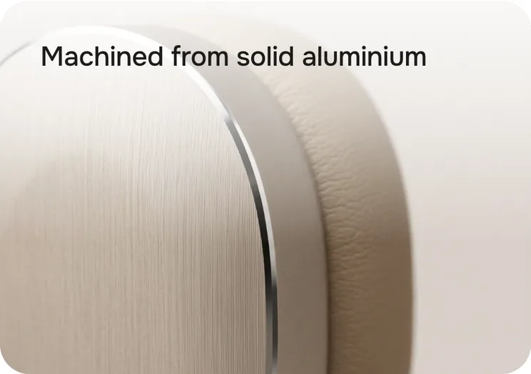 SettingWhat it doesDefaultImageYour picture. Empty = a demo image (Cushion, Ear cup, Headband, Headphones).EmptyTitleOn the image.Memory-foam cushionsTextClassic only. Only in ClassicEmpty
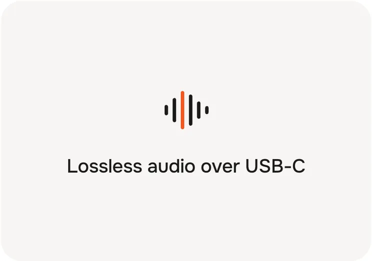 SettingWhat it doesDefaultIconBattery, Noise, Spatial, Sound wave, Charge, Weight …SpatialOwn iconReplaces the icon. Best: a square SVG or PNG with a transparent background.EmptyColour the icon like the textFor single-colour icons. Off for full-colour icons or photos.OnEyebrowData only. Empty = “Only on …”. Only in DataEmptyTitle / TextSpatial audio with head tracking