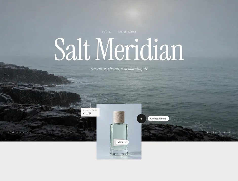
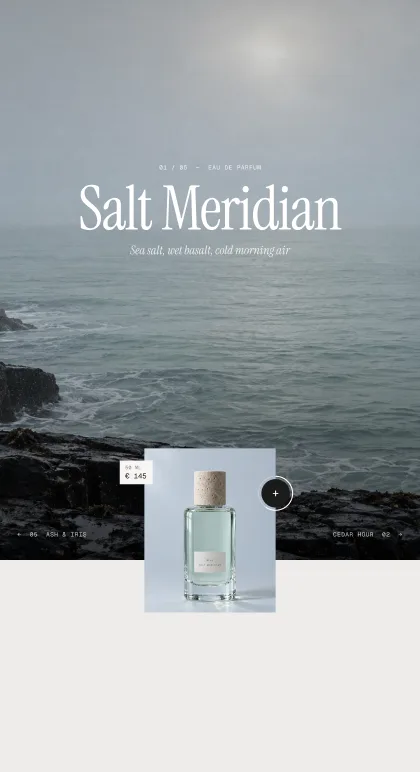
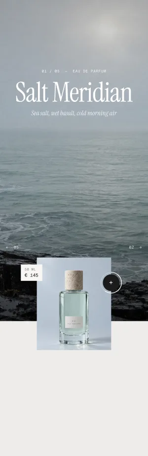
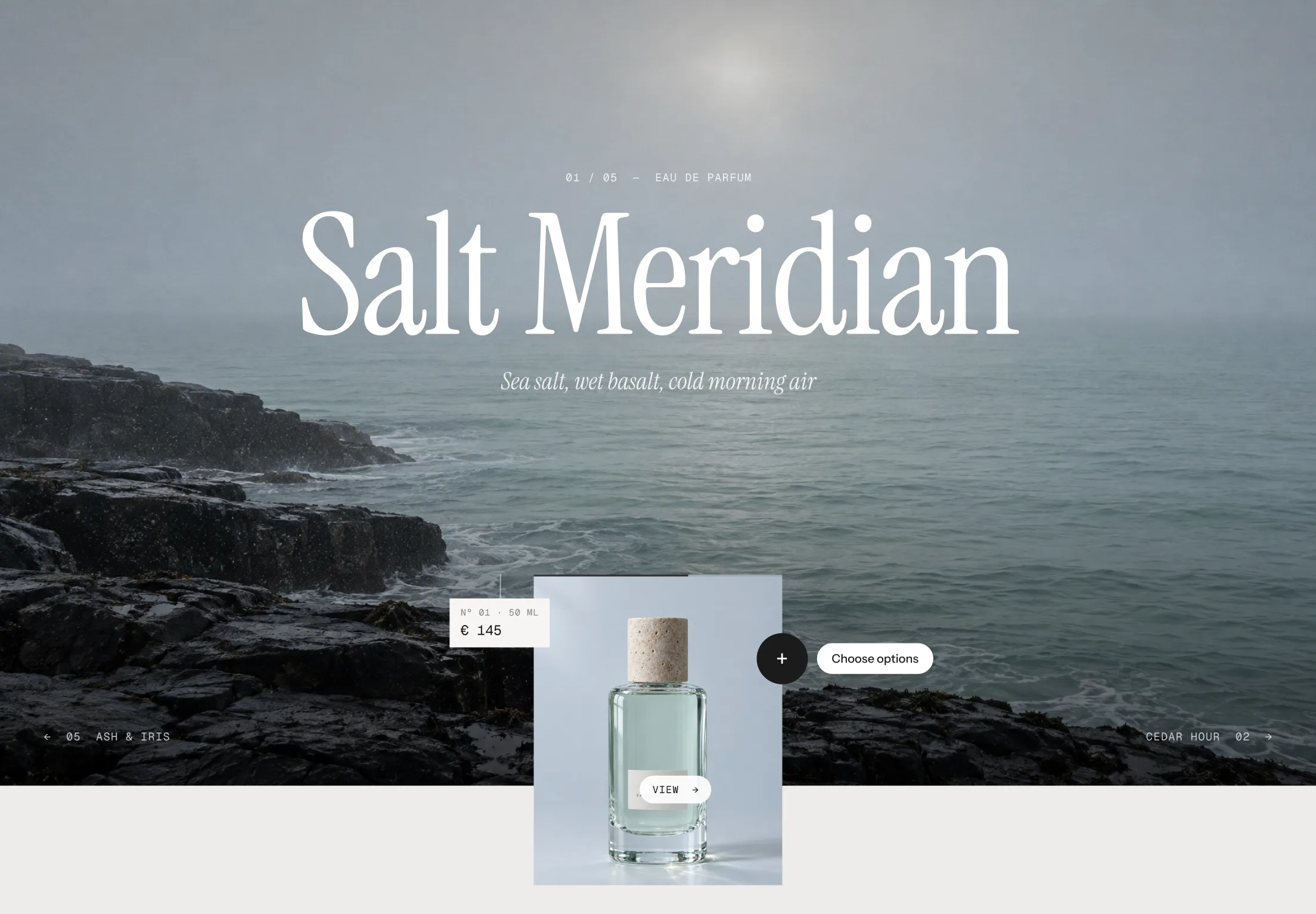
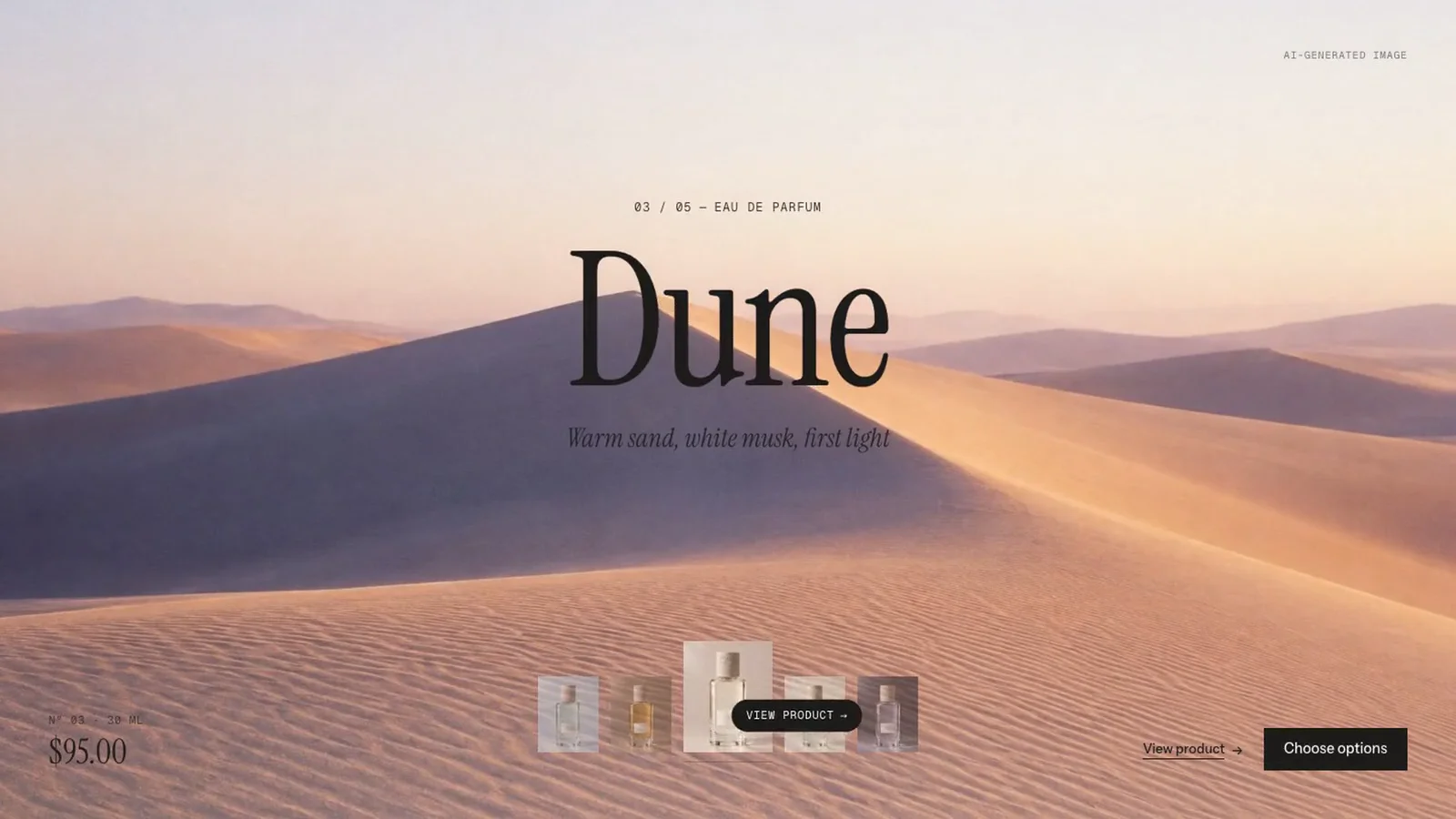
Each product gets the whole section – a large stage image, a big title and its packshot as a card or filmstrip. It moves on by itself with a visible timer, can be dragged, and visitors choose options and add to cart without leaving the stage.
In your theme code editor (Online Store → ⋯ → Edit code), click the sections folder, then “New File”, name it and hit Enter.
02
Paste the code
In the file that just opened, paste the code below. Then hit Save (top right corner).
Note: Shopify shows no confirmation when a section saves – that’s normal.
03
Add it in the theme editor
Saved? Then reload the theme editor – otherwise the new section sometimes doesn’t show up. After that: Edit theme → Add section → . Everything else is in the sidebar – the Docs below explain every setting.
Code
One file. Copy it, paste it, done.
sections/werk-product-stage.liquid
Locked
{%- comment -%} werk · Product Stage · v1.4.0 · werk.build/license – do not remove {%- endcomment -%}{%- liquid assign s = section.settings # Demo images and fonts load from the werk demo store's Files (Shopify CDN), so the section looks the same in any store. assign werk_cdn = 'https://cdn.shopify.com/s/files/1/0954/8303/5932/files/' assign demo_base = werk_cdn | append: 'werk-product-stage-' assign demo_titles = 'Salt Meridian|Cedar Hour|Dune|Fig Terrace|Ash & Iris' | split: '|' assign demo_notes = 'Sea salt, wet basalt, cold morning air|Cedar wood, amber, the last hour of sun|Warm sand, white musk, first light|Fig leaf, warm limestone, noon shade|Volcanic ash, iris, the blue hour' | split: '|' assign demo_tones = 'light,light,dark,dark,light' | split: ',' assign demo_eyebrow = 'Eau de parfum' assign demo_sizes = '30 ml,50 ml,100 ml' | split: ',' assign demo_prices = '9500,14500,21000' | split: ','
3503 lines · Liquid, CSS & vanilla JS
Free – just add your email
Every section is free during launch. Enter your email once and copy any code you like.
Edit theme → Home page, or the landing page template you want the stage on.
2
Add the section
Add section → . Pick the preset Portrait or Filmstrip – both bring five Product blocks that show the demo fragrance line until you pick products.
3
Pick your products
Click each Product block and choose a product. Or switch Products from to Collection and pick one – then the blocks are ignored.
4
Give every product a stage image
Stage image in the block – a wide mood picture, not the packshot. Without one the section takes the product’s second image.
5
Check the text colour
On bright images set Text color to Dark in the block. Then save and look at it once on your phone.
Two layouts, one stage
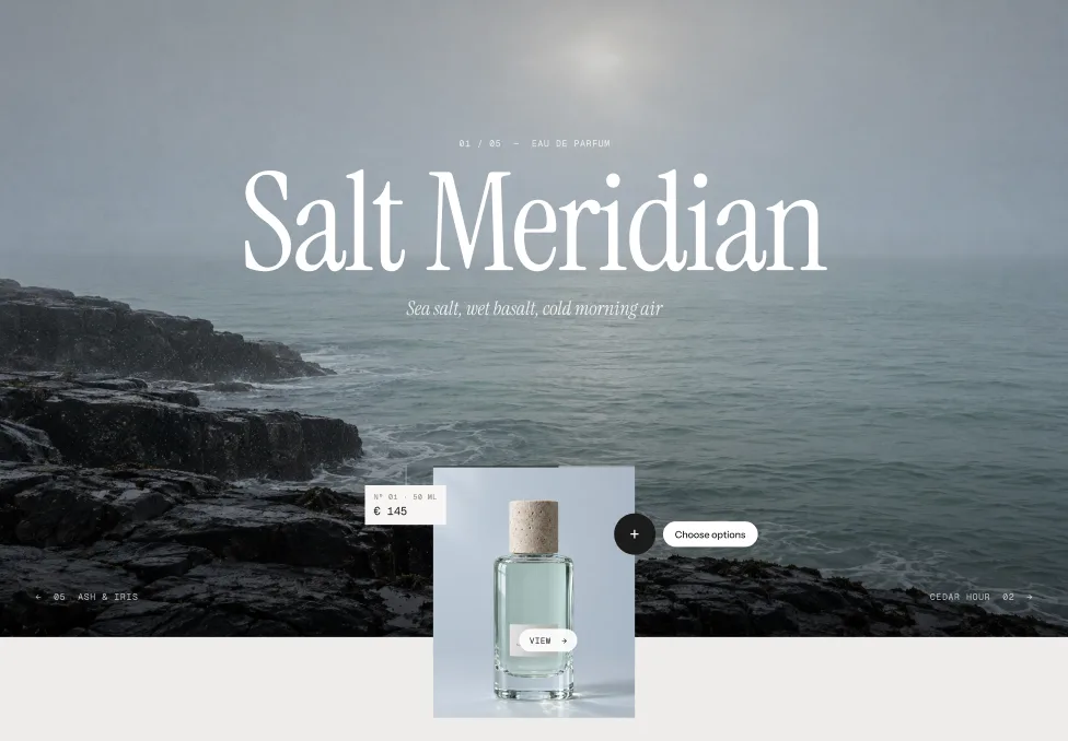
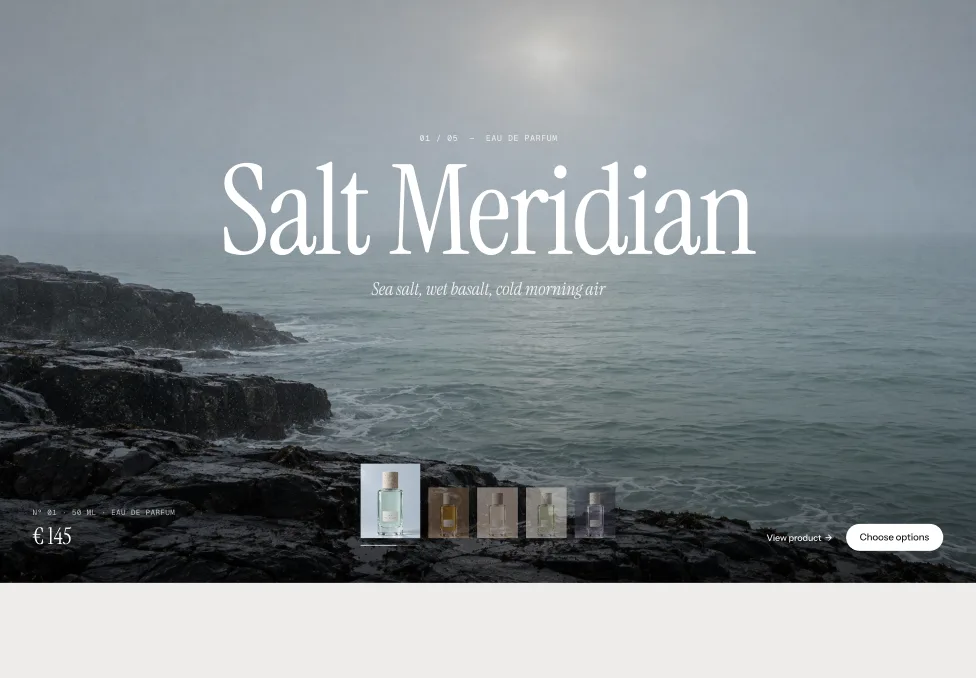
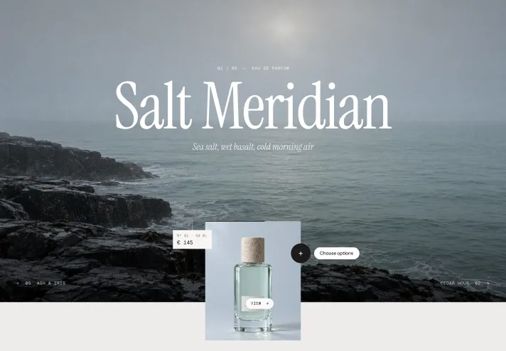
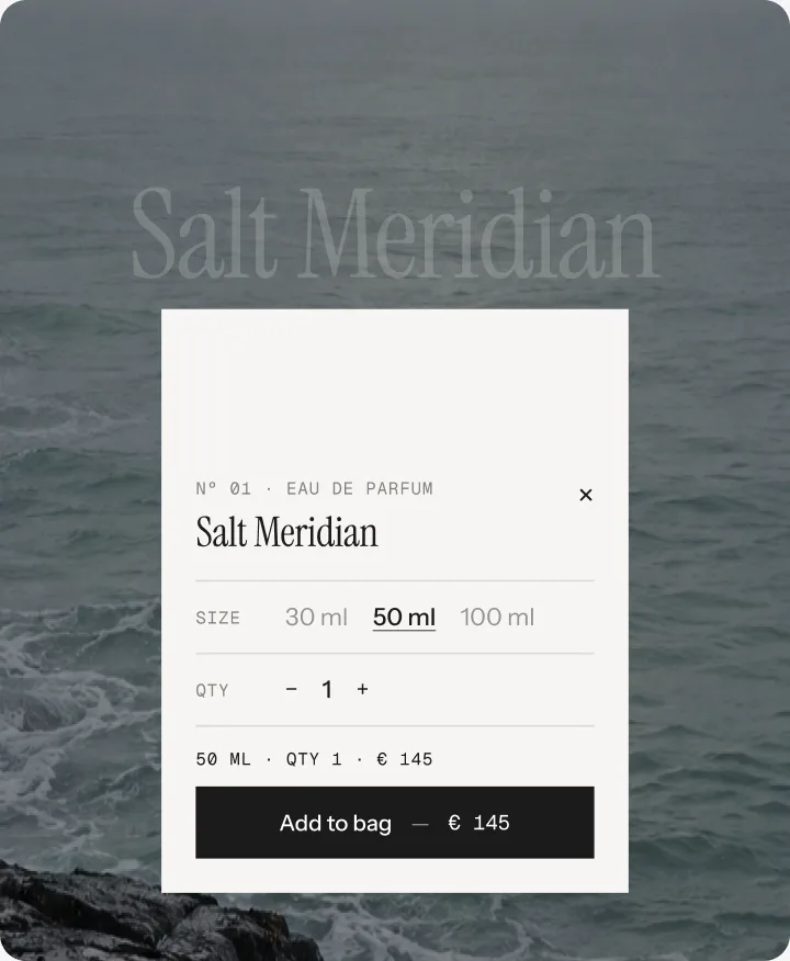
Portrait puts a card with the packshot over the bottom edge – it reaches below the section. Filmstrip lines up every packshot as a strip; hovering a thumbnail shows that product, a click opens its page.
PortraitFilmstrip
Options open where the product is
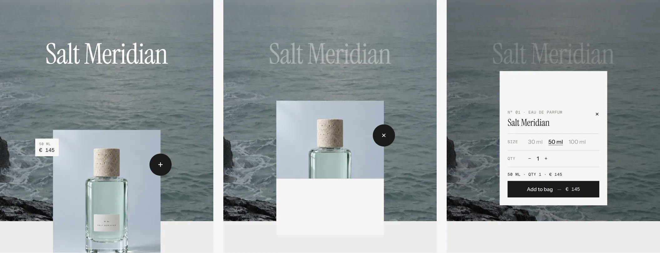
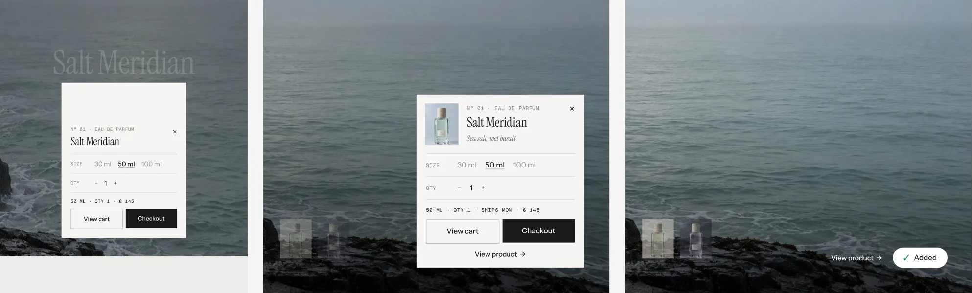
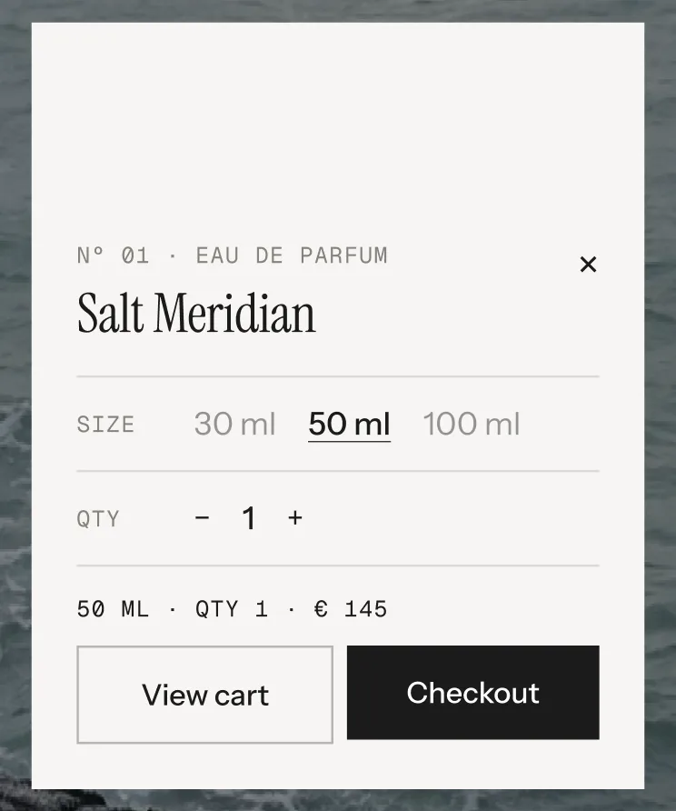
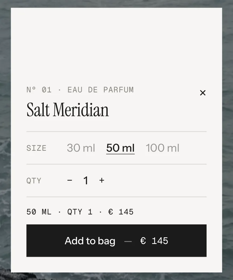
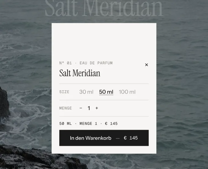
“Choose options” never leaves the stage. In Portrait the card rises fully into view and fills from its bottom edge with the options. In Filmstrip the button stretches into a bar and grows into a card. On phones both become a bottom sheet – pull the grabber down or tap it to close. Products without options skip the card: the plus or the button adds them straight away.
Portrait: closed · the card rises and fills from its bottom edge · open
After “Add to bag”
A spinner, then a check that draws itself. With Split button after adding on, the button becomes View cart and Checkout. The card closes after a few seconds – never while the pointer is on it – and the price tag or pill shows “✓ Added” for two seconds. No cart drawer: the theme hears about the new item, so cart counts that listen update.
Words in brackets fill themselves. Use them in the text settings that list them.
[variant]The chosen options. Left out for products without options.[variant] · Qty [qty] · [price]→50 ml · Qty 1 · €145.00
[qty]QuantityQty [qty]→Qty 2
[price]Price of the chosen variant[price]→€145.00
[n] [total]Number of the product on show and how many there are[n] of [total]→3 of 5
Good to know
Only what’s needed loads
The first stage image and its two neighbours load with the page. Every other one loads when visitors get close to it.
Keyboard and screen readers
Focus the stage and use the arrow keys. Esc closes the options. Screen readers hear “3 of 5” and the product name on every change.
Demo products don’t go into the cart
Blocks without a product show the demo fragrance line. Its Add to bag plays the whole animation but adds nothing.
Collection mode reads metafields
Product metafields fill the stage per product – in blocks too, when the block field is empty. custom.stage_tone takes light or dark.
Products
Products from
Default · Blocks
BlocksOne Product block per product, sorted by hand. Up to 12.
CollectionThe first products of a collection, in its order. The blocks are ignored as long as the collection has products.
Collection
The collection for Products from: Collection. Empty or without products: the section shows the blocks again.
Products shown
Default · 6
How many products of the collection, 2–12. Only shows with Products from: Collection.
Number prefix
Default · Nº
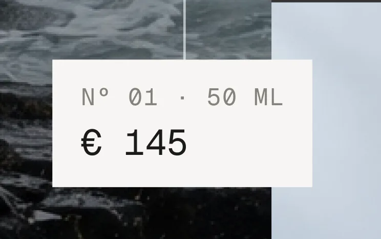
In front of the running number on the price tag and in the options card. Empty = number only.
Nº 01 · 50 ml
Product block
Product
One product on the stage. Every field is optional – an empty block shows a product of the demo line.
SettingWhat it doesDefault
ProductThe product. Empty = demo product.Empty
Stage imageThe big picture behind the title. Empty = metafield custom.stage_image, then the 2nd product image, then the first. Set the image’s focal point in the Shopify admin to steer the crop.Empty
Stage image (mobile)Optional portrait crop for screens below 750 px.Empty
PackshotThe picture in the card or thumbnail. Empty = the product’s main image.Empty
TitleEmpty = the product name.Empty
EyebrowAfter the counter: 01 / 05 — Eau de parfum. Empty = the product type.Empty
Notes lineThe italic line under the title. Empty = metafield custom.stage_notes.Empty
Text colorAuto, Light (for dark images) or Dark (for light images). Auto = metafield custom.stage_tone, else Light.Auto
Layout
Layout
Default · Portrait
PortraitA card with the packshot reaches over the bottom edge. Give the section room below it with Padding bottom.
FilmstripAll packshots as a strip at the bottom, price on the left, View product and Choose options on the right.
Portrait · Filmstrip
Price and button
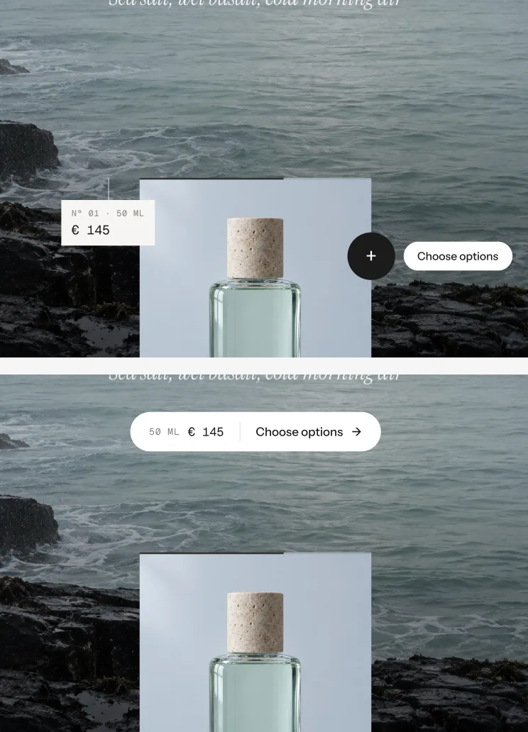
Default · Price tag and plus
Price tag and plusThe price hangs on the card, a round plus opens the options.
Pill under the titlePrice and Choose options as one pill below the title.
Only visible in the Portrait look
Price tag and plus · Pill under the title
Height
Default · Full screen
Full screenThe height of the screen.
90 % of the screenA glimpse of what comes next.
Wide (16:9)Follows the width: 16:9 on desktop, 3:4 on tablets, 9:16 on phones.
Title size
Default · 184 px
96–240 px at a 1440 px wide section. Scales with the section and shrinks further when a word would not fit.
Show counter line
Default · On
The line above the title: 01 / 05 — Eau de parfum. While the options are open it reads — Paused.
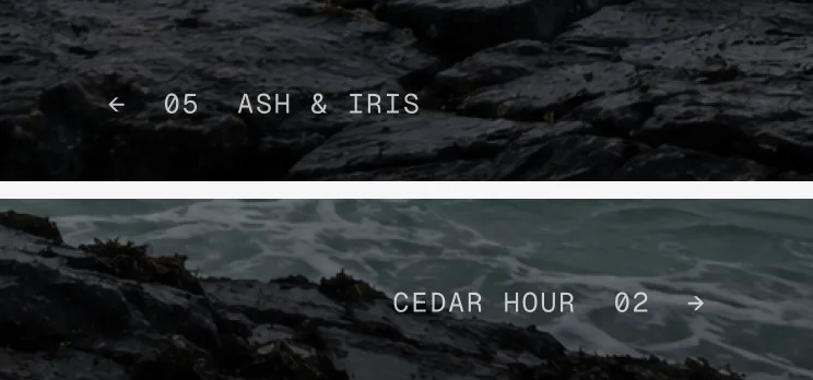
Show previous / next
Default · On
The neighbours’ names left and right of the card – they are the previous and next buttons. On phones only the numbers show.
Only visible in the Portrait look
← 05 Ash & Iris · Cedar Hour 02 →
Autoplay
Default · 6 s
Seconds per product, 0–12. 0 = off. Pauses while the pointer or focus is on the card, the neighbours or the strip, while the options are open, while dragging and when the stage is out of view. With one product it’s off.
Timer
Default · At the button
Shows how long until the next product.
At the buttonA ring around the plus, the pill filling up, or in Filmstrip a line under the active thumbnail.
Underline the next productA line under the next name (Portrait) or the next thumbnail (Filmstrip). In Portrait it needs Show previous / next – without it the timer sits at the button.
Ring around the plus · pill filling up · underline under the next product
Transition
Default · Aperture
How the next picture comes in. The title always rises letter by letter, the packshots stack like cards.
ApertureThe next picture opens out of the card or the thumbnail, the old one sinks back.
BlindsSix stripes wipe the next picture in.
DriftA slow crossfade with a little zoom and drift.
Aperture · Blinds · Drift – each halfway through
Drag and swipe
Default · On
Drag with the mouse or swipe on touch screens. The picture, title and card follow at different speeds and spring back below 70 px.
Custom cursor
Default · On
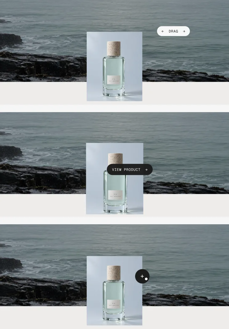
A pill that follows the mouse: “← Drag →” over the stage, “View product →” over the card and thumbnails, a small dot over buttons. Desktop only.
Drag · View product · dot
Preview on hover
Default · On
Resting on a thumbnail for a moment shows its product on the stage; it stays there. On touch screens the first tap shows it, the second opens the page.
Only visible in the Filmstrip look
Animations & easing
Default · On · werk Signature
Visitors who turned on “reduce motion” on their device get a plain crossfade. Easing sets the feel of every movement.
werk SignatureSlow start, soft landing
SmoothEven and quiet
BounceA small overshoot
SnapQuick start, gentle stop
GlideSlow in, slow out
Split button after adding
Default · On
After adding, Add to bag becomes View cart and Checkout. Off: the button goes back to Add to bag after 2 s.
Added → View cart / Checkout
Close options after adding
Default · 4 s
0–10 s. The card closes on its own – never while the pointer is on it. 0 = stays open.
Show quantity
Default · On
Minus, number, plus under the options.
Show receipt line
Default · On
Sums up the choice in mono above the button. Errors from the cart show here for a moment. Its text is in Wording.
50 ML · QTY 1 · €145 above the button
Show tax note
Default · On
A small line under the button. Required in Germany and many EU countries. Its text is in Wording.
Fonts
Default · Own fonts
Use theme fonts swaps every font at once – or leave it off and swap each one with its own URL. Empty keeps werk’s font.
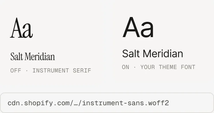
Use theme fontsOff: Instrument Serif for titles and the notes line, Instrument Sans for text, Geist Mono for labels. On: your theme’s heading and body fonts.
Font URLReplaces Instrument Sans. Upload a .woff2 file to Content → Files and paste its URL.
Heading font URL (.woff2)Replaces Instrument Serif – the headings and the italic lines. Upload the file to Content → Files and paste its URL.
Label font URL (.woff2)Replaces Geist Mono – the small labels and numbers. Upload the file to Content → Files and paste its URL.
Colors
Default · Own colors
Use theme colors gives the card and the buttons the text and background of the page around the section and hides the fields below. Text on image keeps its colour. Button and Button text give the buttons their own colours – empty keeps the design.
1Text on image#FFFFFFTitle, counter, notes, neighbours on dark pictures
2Ink#1C1B1AText in the card, buttons, text on light pictures
3Card#F6F5F3Card, price tag, options card
4Muted#85827CLabels, options not chosen
Image shade
Default · 35 %
0–60 %. Darkens the picture behind light text – or lightens it behind dark text – so the title stays readable.
Buttons
Default · Clean
Use theme buttons gives Add to bag and the split buttons your theme’s style – then only the text links follow the style below. The plus and the pills stay werk. Button style sets how buttons and text links react on hover.
Hover them – click a button for loading → added
View productCleanGrows a touch, the underline runs out and backView productDot to arrowThe dot grows into an arrowView productRolling textThe label rolls up, a copy followsView productFillColour wipes in from the leftView productShineA band of light passes over
Padding top / Padding bottom
Default · 0 px / 110 px
Space above and below the section, 0–200 px. Scales down on smaller screens. Portrait needs the bottom padding for the card that reaches over the edge – the Filmstrip preset sets it to 0.
DefaultTranslated · German
Choose optionsChoose optionsPill and Filmstrip button; plus and options card for screen readers
Add to cartAdd to bagButton in the options card; plus and pill for products without options
AddedAddedRight after adding, and on the price tag or pill afterwards
Sold outSold outButton when the product or variant is sold out
View cartView cartLeft half after the split
CheckoutCheckoutRight half after the split
View productView productCursor over the card, link in Filmstrip and in the options card
Cursor: dragDragCursor over the stage: “← Drag →”
PausedPausedCounter line while the options are open
QuantityQtyIn front of the quantity
Receipt line[variant] · Qty [qty] · [price]Above the button. [variant], [qty], [price] fill themselves
Tax noteIncl. VAT, plus shippingUnder the button
Screen reader: sectionFeatured productsScreen readers only
Screen reader: previousPrevious productScreen readers only
Screen reader: nextNext productScreen readers only
Screen reader: closeCloseScreen readers only – the × and the grabber
Screen reader: slide[n] of [total]Screen readers only, on every change
Side padding
Default · Match theme
Match theme (the default) lines the section up with your theme's page margin – in Horizon the same edge as header and footer. Themes without one, like Dawn, keep the werk edge. werk default always uses the werk edge, Custom takes your own values in px (desktop and tablets / phones), None runs the content to the edge.
Desktop · card over the edge
Tablet · smaller card
Phone · numbers only, sheet for options
TabletBelow 990 px the card gets smaller; in Filmstrip the strip sits above the row with price and buttons.
PhoneBelow 750 px the options open as a bottom sheet. In Portrait it covers the whole card.
NeighboursOn phones only the numbers show: ← 05 and 02 →.
FilmstripOn phones the View product link is left out – tap the active thumbnail. Many products: the strip shrinks, then scrolls.
TouchNo custom cursor. Tapping the card opens the product page.
AI label
Using an AI-generated picture? Switch on AI label under that picture and pick a corner. The text and the look – pill, info dot or upright along the edge – are set once for the whole section, under AI label. Also covers the mobile stage image.
The section shows perfumes instead of my products.
Those are the demo products: a block without a product, or no blocks at all. Pick a product in every block – or remove the blocks you don’t need.
I chose a collection, but I still see the blocks.
The collection is empty or not picked. The section falls back to the blocks until it has products.
The title is smaller than Title size.
It shrinks on purpose when a word is too wide or the screen too low, so it never runs into the card.
The title is hard to read.
Set Text color in the block to Dark for bright pictures, or raise Image shade.
The card overlaps the next section.
In Portrait the card reaches below the stage. Keep Padding bottom around 110 px.
The picture is cropped badly on phones.
Set the image’s focal point in the Shopify admin, or add a Stage image (mobile) in portrait format.
Autoplay doesn’t run.
Autoplay is 0, there is only one product, or the pointer rests on the card. In the theme editor it also stops while a Product block is selected.
The cart count doesn’t change after adding.
Horizon and Dawn-based themes update right away. Other themes may not listen to the cart event – the item is in the cart, the count updates on the next page. Demo products are never added.
1.4.012 Oct 2026
NewSide padding. Match theme (the default) lines the section up with your theme's page margin – in Horizon the same edge as header and footer. Themes without one, like Dawn, keep the werk edge. werk default always uses the werk edge, Custom takes your own values in px (desktop and tablets / phones), None runs the content to the edge.
1.3.011 Oct 2026
NewAI label per picture (EU AI Act). Under every own picture and video a switch with the corner; the text and the look – pill, info dot that opens on hover, or upright along the edge – are set once under AI label. Off by default, nothing changes until you switch it on. Product and collection pictures from Shopify never get one.
NewThe old single note (Show AI label) is replaced by the labels per picture. Its setting stays, but only shows in the editor while it is on – turn it off and switch the label on at the picture. AI label is now the text of the labels.
1.2.06 Oct 2026
NewHeading font URL and Label font URL (Fonts) – swap Instrument Serif (headings, italic lines) and Geist Mono (labels, numbers) for your own .woff2. With Self-hosted font URL every font can now be swapped on its own; Use theme fonts still swaps all of them.
1.1.06 Oct 2026
NewButton and Button text colours (Colors). Empty = as designed – nothing changes until you pick one. Hidden while Use theme colors or Use theme buttons is on.
1.0.22 Oct 2026
NewDawn and the themes built on it: after Add to cart the cart count in the header and the cart drawer update right away (before, only after a reload). Nothing opens on its own.
1.0.12 Oct 2026
NewDemo images and fonts load from the werk Shopify CDN (Files) instead of the theme's assets, so a copied section looks like the preview in any store.
* Built for Online Store 2.0 and tested in Shopify's Horizon and Dawn themes. Heavily customised or older themes can still clash with it – if something looks off, write us and we'll take a look.
 SettingWhat it doesDefaultProductThe product. Empty = demo product.EmptyStage imageThe big picture behind the title. Empty = metafield custom.stage_image, then the 2nd product image, then the first. Set the image’s focal point in the Shopify admin to steer the crop.EmptyStage image (mobile)Optional portrait crop for screens below 750 px.EmptyPackshotThe picture in the card or thumbnail. Empty = the product’s main image.EmptyTitleEmpty = the product name.EmptyEyebrowAfter the counter: 01 / 05 — Eau de parfum. Empty = the product type.EmptyNotes lineThe italic line under the title. Empty = metafield custom.stage_notes.EmptyText colorAuto, Light (for dark images) or Dark (for light images). Auto = metafield custom.stage_tone, else Light.AutoLayout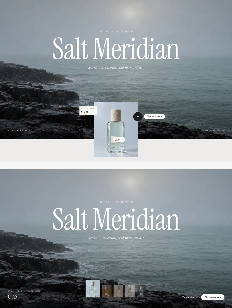


 Text on image#FFFFFFTitle, counter, notes, neighbours on dark picturesInk#1C1B1AText in the card, buttons, text on light picturesCard#F6F5F3Card, price tag, options cardMuted#85827CLabels, options not chosen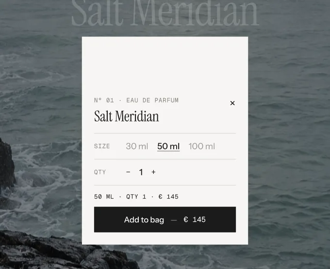
 Choose optionsChoose optionsPill and Filmstrip button; plus and options card for screen readersAdd to cartAdd to bagButton in the options card; plus and pill for products without optionsAddedAddedRight after adding, and on the price tag or pill afterwardsSold outSold outButton when the product or variant is sold outView cartView cartLeft half after the splitCheckoutCheckoutRight half after the splitView productView productCursor over the card, link in Filmstrip and in the options cardCursor: dragDragCursor over the stage: “← Drag →”PausedPausedCounter line while the options are openQuantityQtyIn front of the quantityReceipt line[variant] · Qty [qty] · [price]Above the button. [variant], [qty], [price] fill themselvesTax noteIncl. VAT, plus shippingUnder the buttonScreen reader: sectionFeatured productsScreen readers onlyScreen reader: previousPrevious productScreen readers onlyScreen reader: nextNext productScreen readers onlyScreen reader: closeCloseScreen readers only – the × and the grabberScreen reader: slide[n] of [total]Screen readers only, on every change