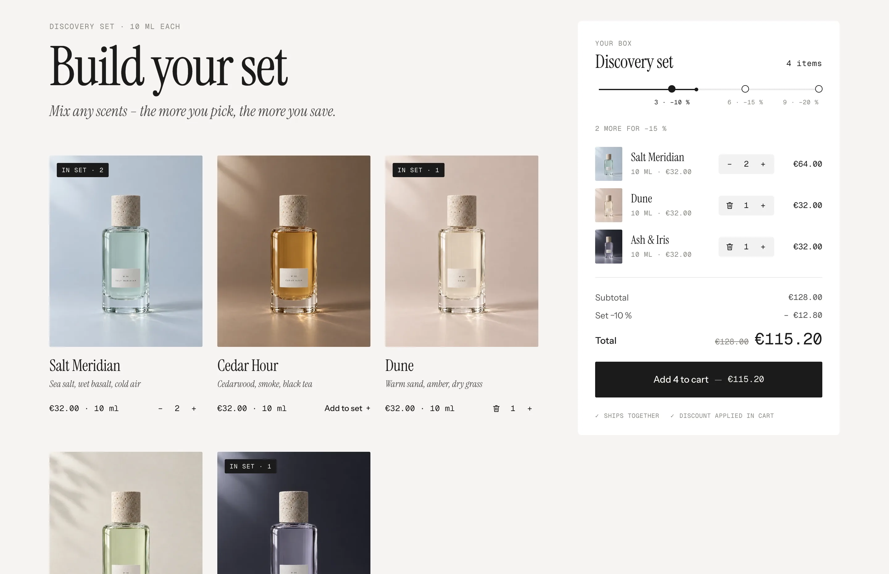
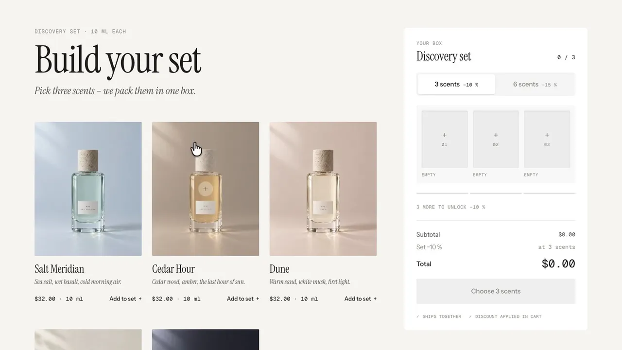
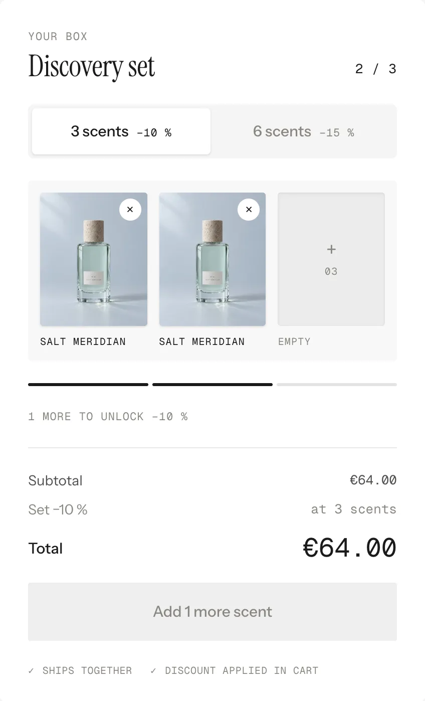
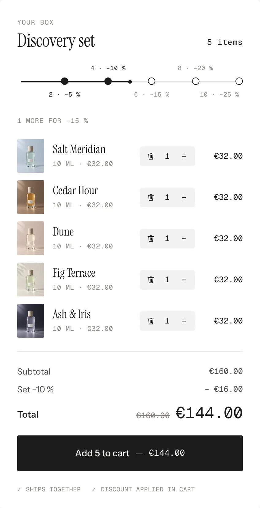
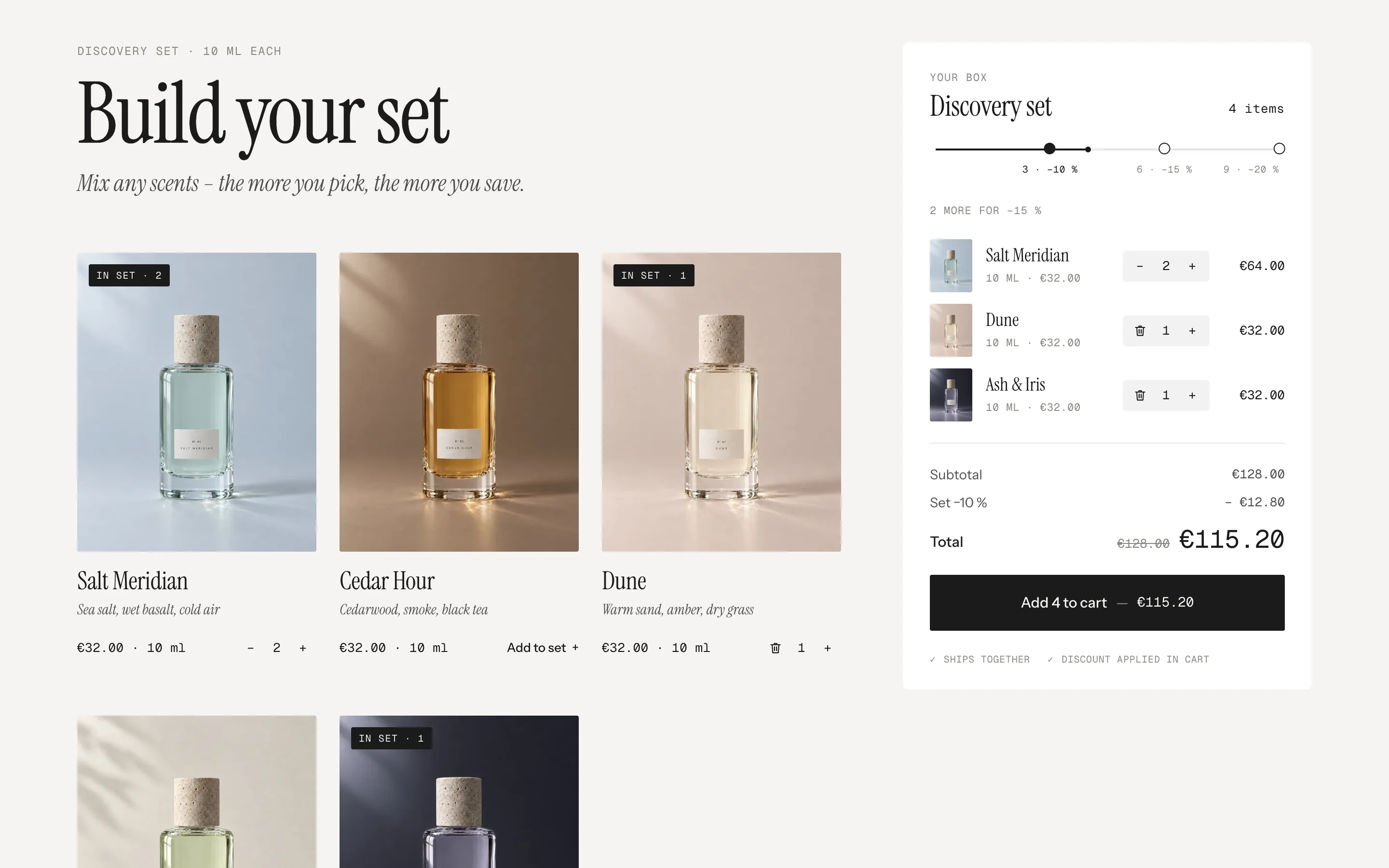
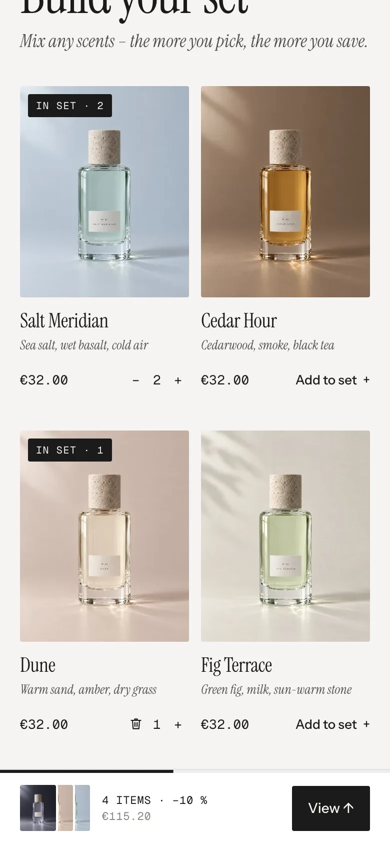
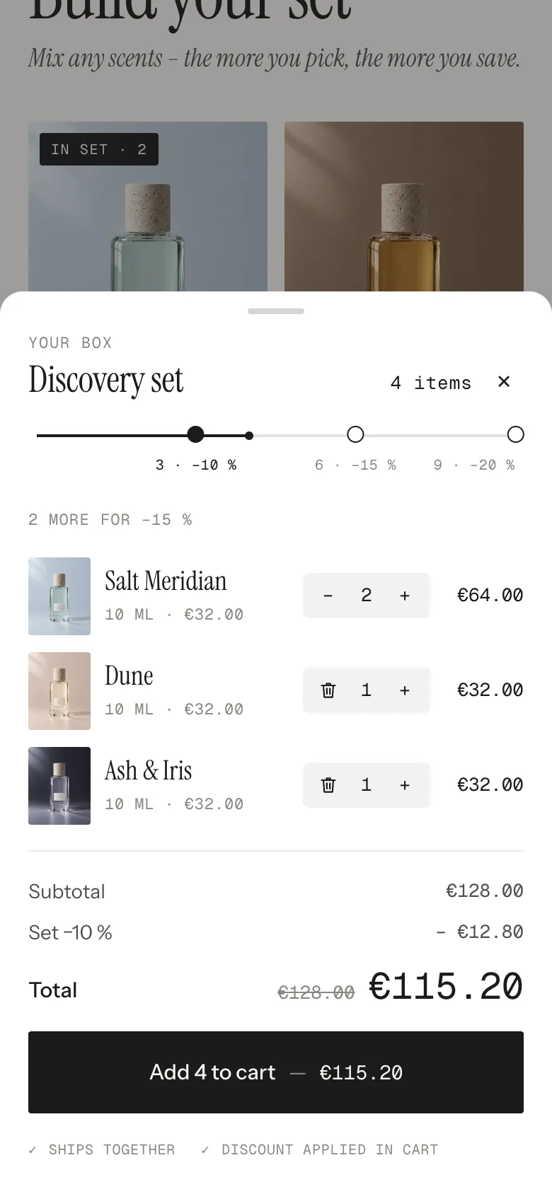
Products from one collection on the left, the box sticks on the right. Pick freely with discount steps (Classic) or fill a box of a set size with compartments (Fixed). One click adds the whole set to the cart, and Shopify's own automatic discounts do the maths.
In your theme code editor (Online Store → ⋯ → Edit code), click the sections folder, then “New File”, name it and hit Enter.
02
Paste the code
In the file that just opened, paste the code below. Then hit Save (top right corner).
Note: Shopify shows no confirmation when a section saves – that’s normal.
03
Add it in the theme editor
Saved? Then reload the theme editor – otherwise the new section sometimes doesn’t show up. After that: Edit theme → Add section → . Everything else is in the sidebar – the Docs below explain every setting.
Code
One file. Copy it, paste it, done.
sections/werk-build-a-box.liquid
Locked
{%- comment -%} werk · Build-a-Box · v1.3.0 · werk.build/license – do not remove {%- endcomment -%}{%- liquid assign s = section.settings # Demo images and fonts load from the werk demo store's Files (Shopify CDN), so the section looks the same in any store. # The demo reuses the five scents of Product Stage. assign werk_cdn = 'https://cdn.shopify.com/s/files/1/0954/8303/5932/files/' assign demo_base = werk_cdn | append: 'werk-product-stage-0' assign demo_titles = 'Salt Meridian|Cedar Hour|Dune|Fig Terrace|Ash & Iris' | split: '|' assign demo_notes = 'Sea salt, wet basalt, cold air|Cedarwood, smoke, black tea|Warm sand, amber, dry grass|Green fig, milk, sun-warm stone|Iris root, cold ash, violet' | split: '|' assign demo_price = 3200 assign demo_size = '10 ml' assign serif_url = werk_cdn | append: 'werk-instrument-serif.woff2'
2407 lines · Liquid, CSS & vanilla JS
Free – just add your email
Every section is free during launch. Enter your email once and copy any code you like.
Products → Collections → Create collection. Add only the products that belong in the box, e.g. your 10 ml samples. Why a collection of its own: see Set up the discount.
2
Add the section
Edit theme → open the page → Add section → – Classic or – Fixed.
3
Pick the collection
Section settings → Collection. Until you do, the section shows our demo scents.
4
Set the steps or box sizes
Classic: Steps, e.g. 3:10, 6:15. Fixed: Box sizes, e.g. 3:10, 6:15. Use the same numbers as your discounts.
5
Create the discounts
One automatic discount per step – see the next chapter. Without them the box still works, just without a discount.
One automatic discount per step
For steps 3:10, 6:15 and 9:20 you create three discounts. Repeat these steps for each one:
Find it here: Shopify admin›Discounts›Create discount›Amount off products›Automatic discount
Give it a title your customers will understand – it shows in the cart, e.g. “Discovery set · 10 % off”.
3
Set the value
Percentage, e.g. 10.
4
Applies to: Specific collections
Pick the collection of the box.
5
Minimum purchase requirements: Minimum quantity of items
e.g. 3. Only items from that collection count.
6
Combinations: leave all product discounts off
Then Shopify always gives the best step – with six items the customer gets 15 %, not 10 % plus 15 %.
7
Active dates
Start today, no end date. Save.
What happens in the cart
Every product of the set is its own line in the cart, so your stock counts per product. Each line carries a hidden note _set with a short id, so you can see in the order which items came as a set.
Items in the cartDiscount
2 from the collectionnone
4 from the collection10 % on those 4
6 from the collection15 % on those 6 – the best step wins
4 from the collection + 2 other products10 % on the 4, the others stay full price
Fixed boxes
The same as above, one discount per box size: e.g. minimum 3 → 10 %, minimum 6 → 15 %.
Without a discount
Leave the percent out – Steps “3, 6” or Box sizes “3” – and skip the discounts. The box works the same, the discount line disappears.
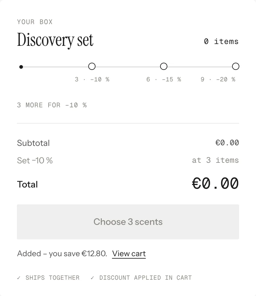
After adding · the box empties and shows what Shopify took off
ClassicFixed
Look
Default · Classic – any amount, discount steps
How the box is filled.
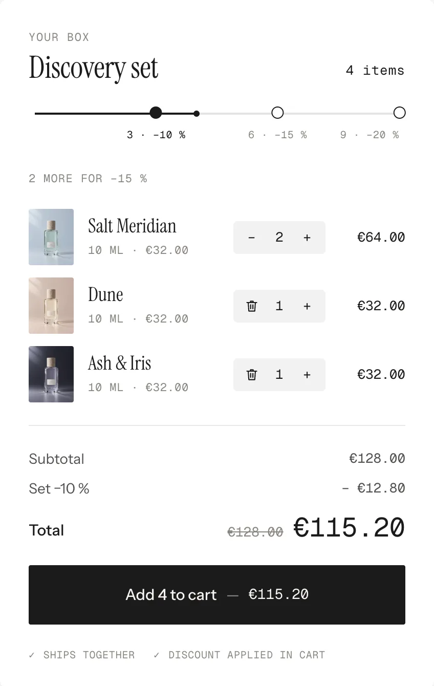
ClassicCustomers pick any amount. A track shows the steps, the box lists every product with a quantity stepper. The button unlocks at “Items before the button unlocks”.
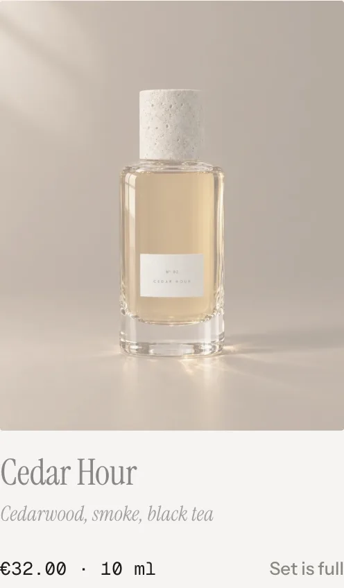
FixedA box of a set size with compartments. With more than one size, customers switch between them. The button unlocks when the box is full; the other cards fade and say “Set is full”.
Steps
Default · 3:10, 6:15, 9:20
Classic: items : percent. With four steps or more the labels take turns above and below the line. Leave the percent out for steps without a discount.
Only visible in the Classic look
Five steps: 2:5, 4:10, 6:15, 8:20, 10:25
Box sizes
Default · 3:10, 6:15
Fixed: size : percent. The first size is preselected; with two or more sizes a switch appears above the box.
Only visible in the Fixed look
Allow the same product more than once
Default · On
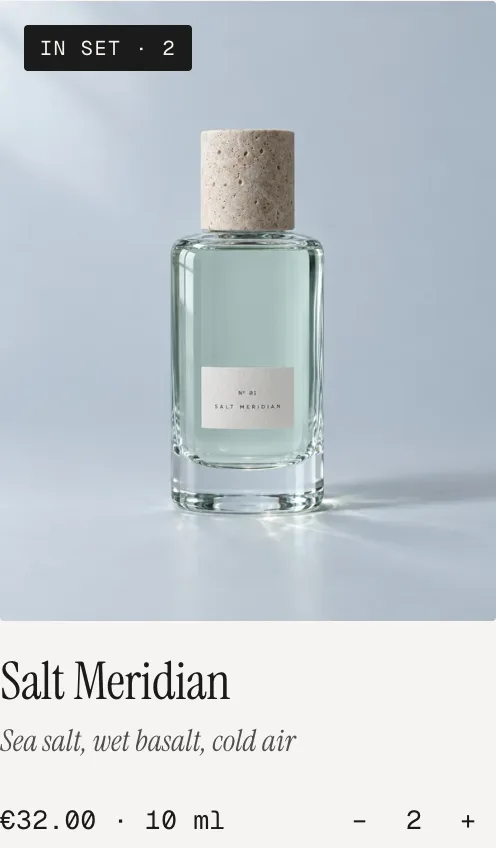
On: the card shows a stepper and “In set · 2”. With one left, the minus becomes a bin. Off: one of each.
In the set: stepper and bin
Collection
Default · Empty
Shows up to “Products shown” products in the collection’s order. Sold-out products stay visible and say Sold out.
Tap the image
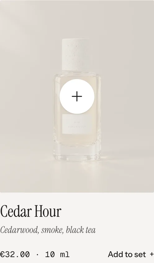
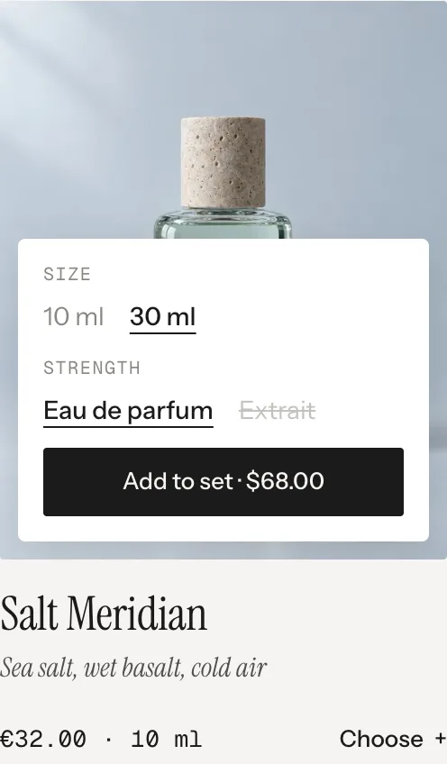
The whole image adds the product – on desktop it fades out and a plus says so. Products with variants open a small picker inside the card: one row per option, the price on the button, sold-out combinations crossed out.
HoverDesktop: fades, plus
VariantsOne row per option
In the setStepper and bin
Box fullFixed: “Set is full”
Line under the name
Default · Start of the description
The small italic line under the name: the start of the description, the vendor or the product type – or nothing.
None
Start of the description
Vendor
Product type
Image ratio
Default · 4:5
All cards use the same shape, images are cropped to fill it. Original takes the shape of the first product’s image.
4:5
3:4
1:1
Original (first product)
[n]A number: items in the box, items still needed or a box sizeAdd [n] more scents→Add 2 more scents
[pct]A discount, written with Discount format[n] more for [pct]→2 more for −15 %
[p]Only in Discount format: the percentage−[p] %→−10 %
[price]Lowest price of a product with different pricesFrom [price]→From €95.00
[amount]What the customer saves, read from the cartAdded – you save [amount].→Added – you save €38.00.
[message]Shopify’s reason when adding failsCouldn’t add the set. [message]→Couldn’t add the set. Dune is sold out.
Fonts
Default · Design fonts
Instrument Serif, Instrument Sans and Geist Mono from werk’s CDN. Use theme fonts swaps every font at once. Or swap each one with its own URL – Self-hosted font URL replaces Instrument Sans; Heading font URL replaces Instrument Serif (the headings and the italic lines); Label font URL replaces Geist Mono (the small labels and numbers). Empty keeps werk’s font.
Colors
Default · Design colors
Background, text, muted text, the box and the image background – or Use theme colors, which takes the colours of the page around the section. Button and Button text give the buttons their own colours – empty keeps the design.
Buttons
Default · Clean
Use theme buttons gives the button your theme’s style. Button style sets how it reacts on hover.
Hover them – click a button for loading → added
View cartCleanGrows a touch, the underline runs out and backView cartDot to arrowThe dot grows into an arrowView cartRolling textThe label rolls up, a copy followsView cartFillColour wipes in from the leftView cartShineA band of light passes over
Animations & easing
Default · On · werk Signature
When something goes in, its image flies into the box. Visitors who turned on “reduce motion” on their device see the box fill without the flight. Easing sets the feel of every movement.
werk SignatureSlow start, soft landing
SmoothEven and quiet
BounceA small overshoot
SnapQuick start, gentle stop
GlideSlow in, slow out
Box distance from the top
Default · 24px
The box sticks while you scroll. If your header is sticky too and covers the box, raise this to the header’s height.
Side padding
Default · Match theme
Match theme (the default) lines the section up with your theme's page margin – in Horizon the same edge as header and footer. Themes without one, like Dawn, keep the werk edge. werk default always uses the werk edge, Custom takes your own values in px (desktop and tablets / phones), None runs the content to the edge.
Desktop · box on the right
Tablet · 3 columns, bar
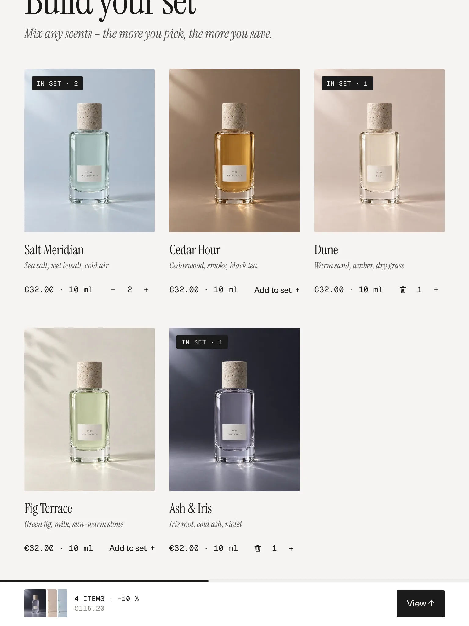
Phone · 2 columns, bar
DesktopTablet & phone
Products2–4 columns (setting)3 columns, phone 2
BoxSticks on the rightBar at the bottom: last picks, count, total
Open the box–View → opens as a sheet; drag the handle down or tap it to close
The sheet: the whole box, drag the handle down to close
The cart updates live
The cart count in your header updates without a reload. Dawn and its siblings refresh their cart bubble too.
Sets in your orders
Every line of a set carries the hidden property _set with the same short id – in the order you see what came together.
_set: A7F2
One request
The whole set goes to the cart in one request, so a box never ends up half in the cart.
Horizon4.2TestedCart count updates live
Dawn16TestedCart bubble updates live
A picture is cut in the wrong place.
The cards show every product in the same shape. Set a focal point on the product picture in Shopify (Products → the product → click the picture → Edit) – the card keeps that spot in view.
The box shows a discount, the cart doesn’t.
The automatic discount is missing or set up differently – check collection, minimum quantity and that it’s active. The steps in the section only control the display.
The cart shows 10 % plus 15 %.
The discounts are set to combine with other product discounts. Turn that off in each discount.
Customers get the discount without the box.
The discount follows the collection. Give the box a collection of its own.
The box hides under my header.
Raise “Box distance from the top”.
“Couldn’t add the set.”
Shopify said no – usually a variant sold out in the meantime. The message after it says which.
1.3.012 Oct 2026
NewSide padding. Match theme (the default) lines the section up with your theme's page margin – in Horizon the same edge as header and footer. Themes without one, like Dawn, keep the werk edge. werk default always uses the werk edge, Custom takes your own values in px (desktop and tablets / phones), None runs the content to the edge.
1.2.16 Oct 2026
NewCropped pictures keep the focal point you set on the image in Shopify (Content → Files or the product media) in view – the product pictures on the cards. Before, they were always cut around the centre.
1.2.06 Oct 2026
NewHeading font URL and Label font URL (Fonts) – swap Instrument Serif (headings, italic lines) and Geist Mono (labels, numbers) for your own .woff2. With Self-hosted font URL every font can now be swapped on its own; Use theme fonts still swaps all of them.
1.1.06 Oct 2026
NewButton and Button text colours (Colors). Empty = as designed – nothing changes until you pick one. Hidden while Use theme colors or Use theme buttons is on.
1.0.13 Oct 2026
New“Added – you save …” (and an error message) disappears as soon as the box changes – a new pick, a removal or another box size. Before, it stayed while the next box was being filled.
1.0.03 Oct 2026
NewFirst stable release. Same code as 0.1.0, plus the docs.
* Built for Online Store 2.0 and tested in Shopify's Horizon and Dawn themes. Heavily customised or older themes can still clash with it – if something looks off, write us and we'll take a look.