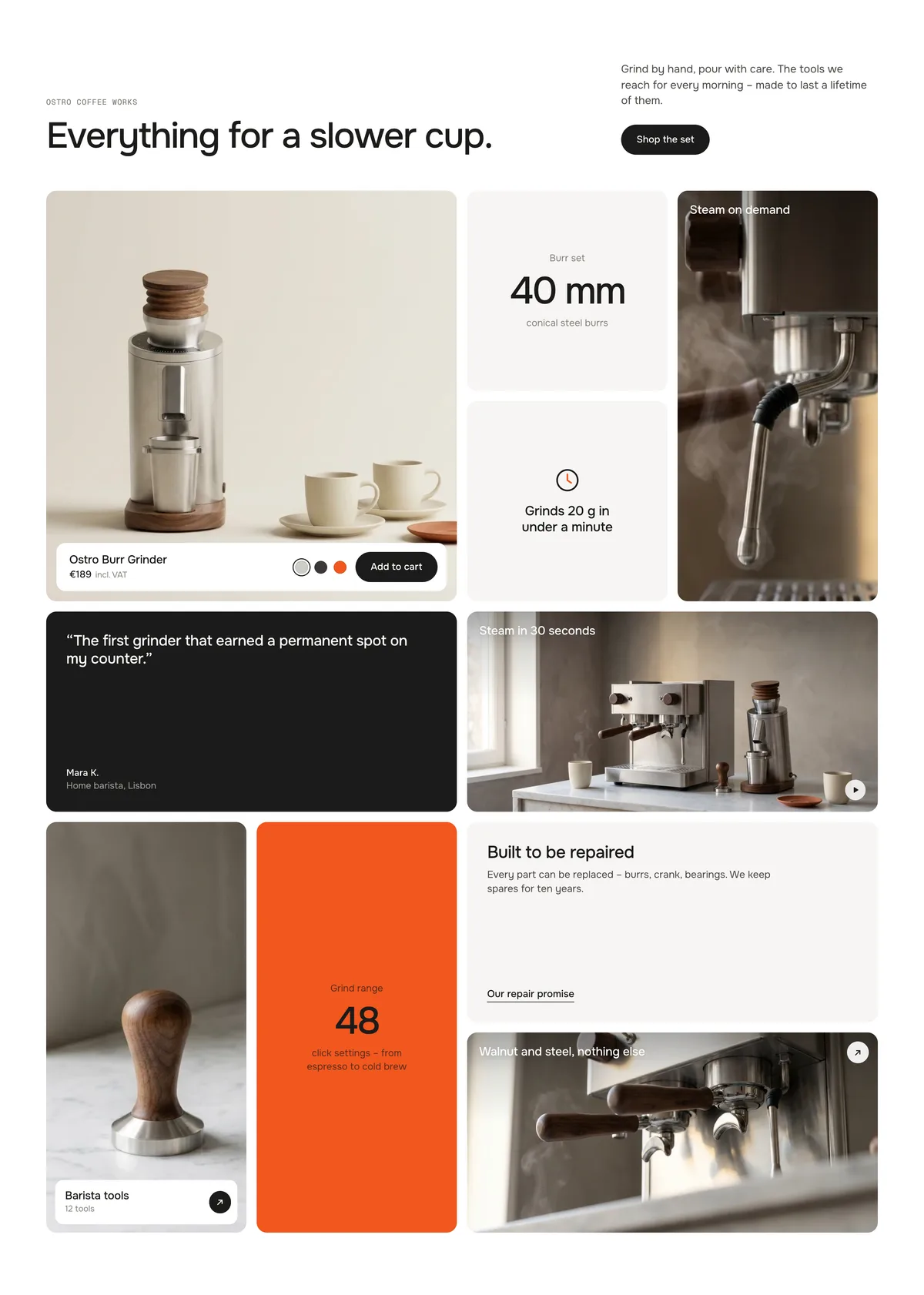
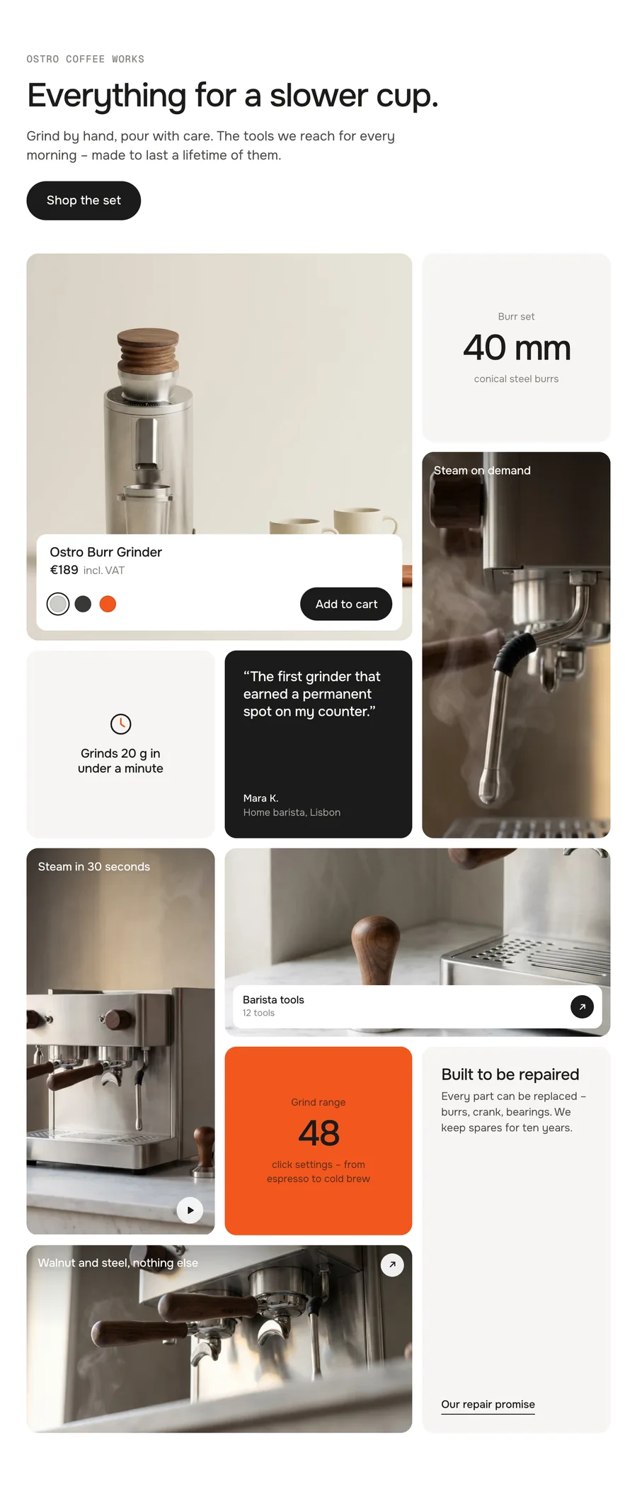
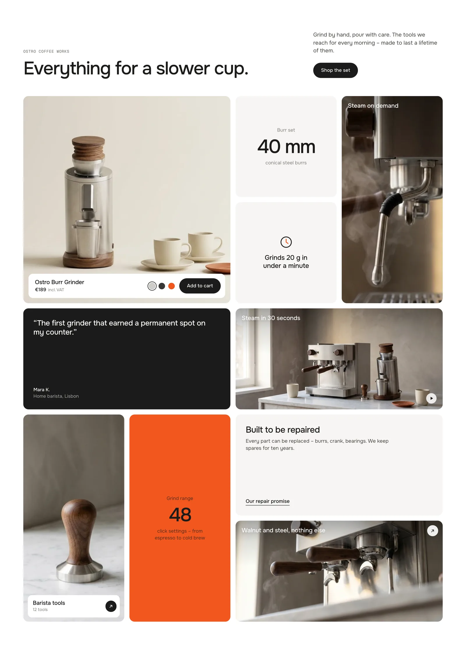
Up to twelve tiles – your product with add to cart, key figures, features, pictures, a video, quotes, text and collections. Pick a size per tile or leave it on Auto, and the grid packs itself without holes on desktop, tablet and phone. Move the mouse across a tile and it swings with the speed and direction of your hand, then settles back.
In your theme code editor (Online Store → ⋯ → Edit code), click the sections folder, then “New File”, name it and hit Enter.
02
Paste the code
In the file that just opened, paste the code below. Then hit Save (top right corner).
Note: Shopify shows no confirmation when a section saves – that’s normal.
03
Add it in the theme editor
Saved? Then reload the theme editor – otherwise the new section sometimes doesn’t show up. After that: Edit theme → Add section → . Everything else is in the sidebar – the Docs below explain every setting.
Code
One file. Copy it, paste it, done.
sections/werk-momentum-bento.liquid
Locked
{%- comment -%} werk · Momentum Bento · v1.4.0 · werk.build/license – do not remove {%- endcomment -%}{%- liquid assign s = section.settings assign n = section.blocks.size # Demo images and fonts load from the werk demo store's Files (Shopify CDN), so the section looks the same in any store. # Demo motif: Ostro Coffee Works (fictional) – it reuses the espresso pictures of Hotspot Index (grinder, steam wand, # group head, tamper); only the video loop is Momentum Bento's own file. assign werk_cdn = 'https://cdn.shopify.com/s/files/1/0954/8303/5932/files/' assign demo_base = werk_cdn | append: 'werk-hotspot-index-' assign demo_tiles = 'steam-wand,group-head,hero' | split: ',' assign demo_video = werk_cdn | append: 'werk-momentum-bento-espresso.mp4' assign font_url = werk_cdn | append: 'werk-onest.woff2'
3346 lines · Liquid, CSS & vanilla JS
Free – just add your email
Every section is free during launch. Enter your email once and copy any code you like.
Edit theme → open the page → Add section → . It comes with ten demo tiles.
2
Pick your product
Click the Product block and choose a product. The tile shows its picture, name, price, colours and an add to cart button.
3
Write your tiles
Every tile is a block. Add, remove and reorder them – the grid packs itself again every time, without gaps.
4
Move the mouse across it
Preview the page and sweep the mouse over the tiles. Each one gets a push in the direction and speed of your hand, then swings back.
The grid packs itself
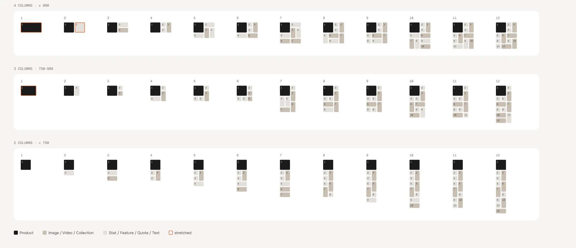
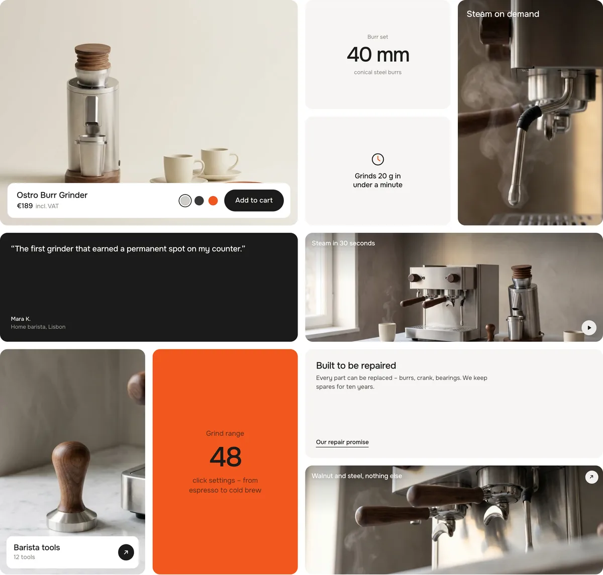
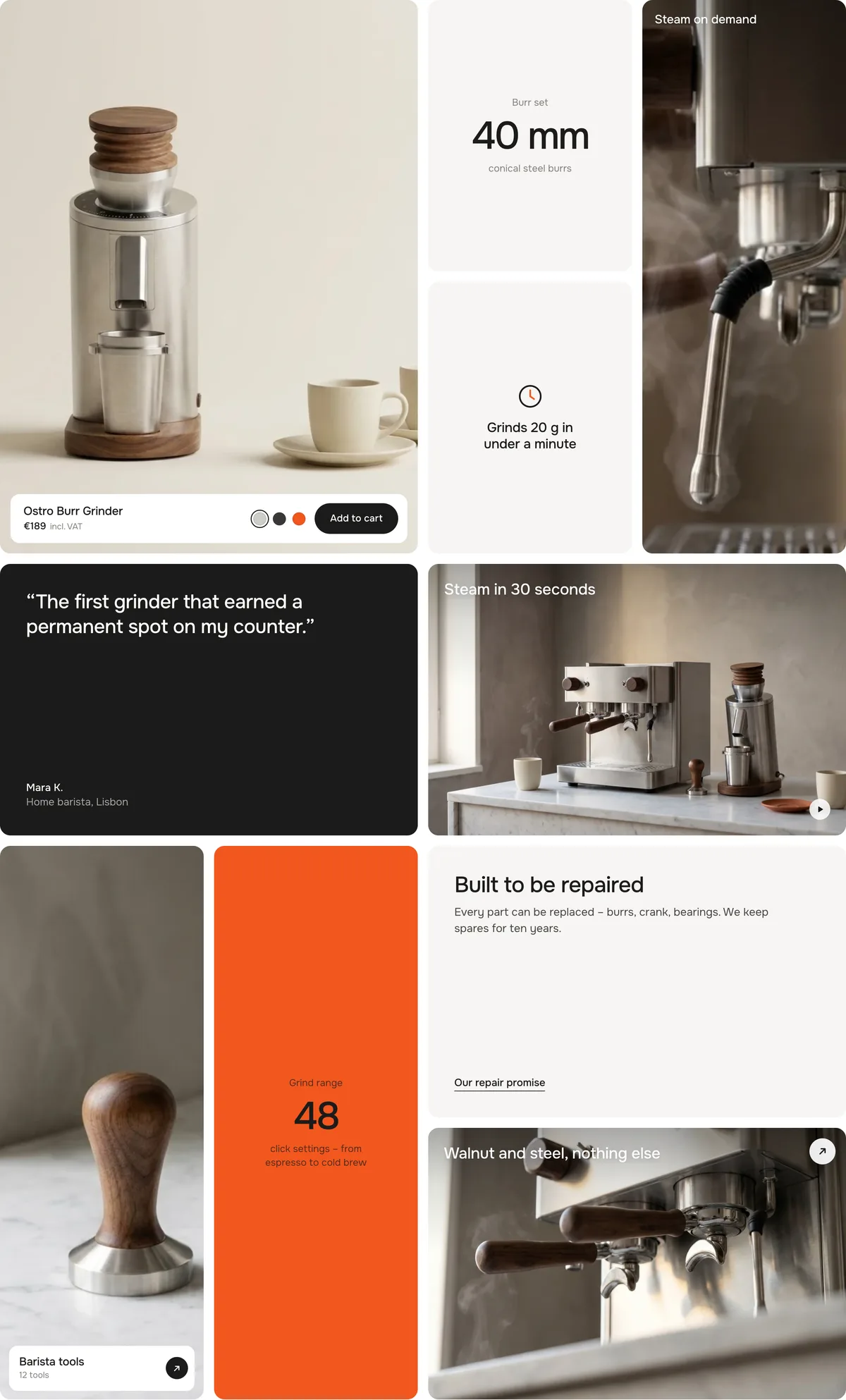
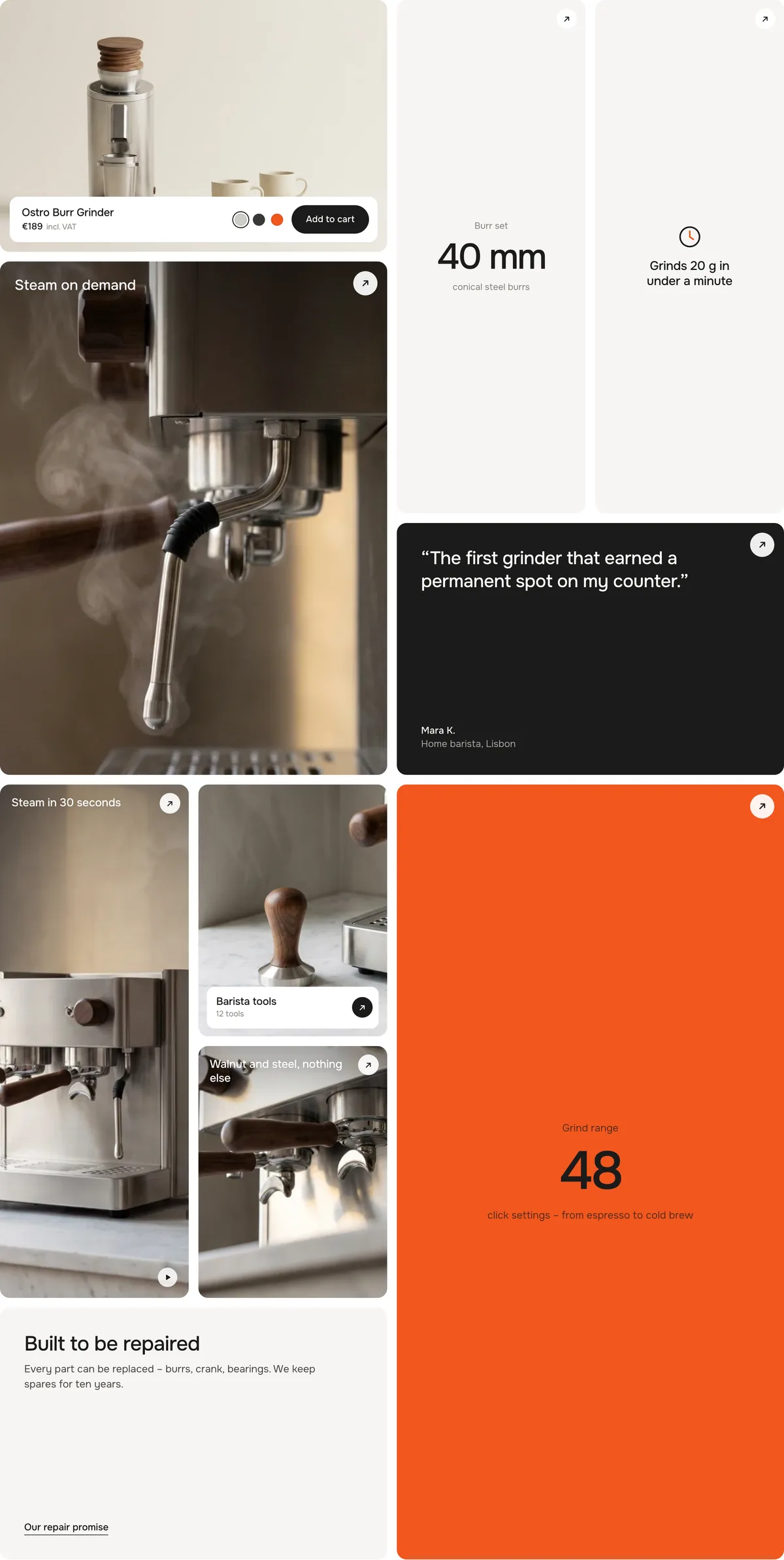
The grid has four columns on wide screens, three on tablets and two on phones – measured on the section's width, so a half-width section packs like a tablet. For every width the tiles are placed again in block order: each one takes the first free spot where its size fits. Where a hole would stay, a neighbouring tile grows into it. The result: no gaps, for any number of tiles.
All tiles on Auto: 4, 3 and 2 columns · an orange outline marks a tile that grew to close a gap
The grid is placed on the server, so it stands before any script runs – and without one.
Momentum hover
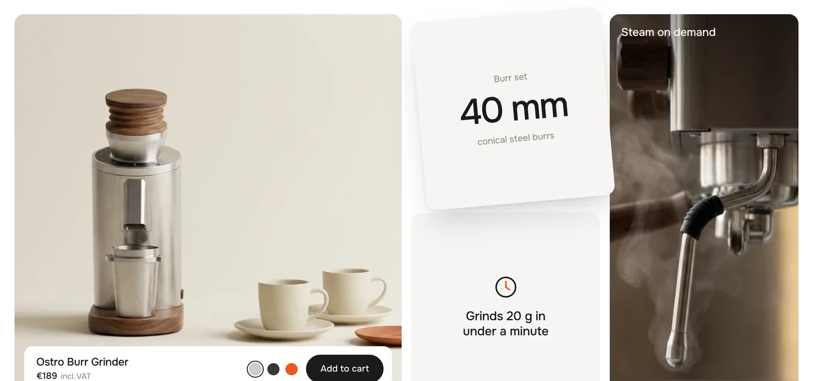
Move the mouse across a tile and it gets a push in the direction and speed of the mouse. Where you hit it decides the spin: brush past the bottom and it turns one way, the top and it turns the other – like a card you flick on a table. A spring brings it back to rest.
A quick move to the right across the lower half: the tile is pushed right and turns
Only the tile moves – its place in the grid stays, so nothing around it jumps. Buttons, colours and links inside keep working.
Tiles fade in
When the grid scrolls into view, the tiles fade up one after the other, in block order.
Eyebrow
Default · Ostro Coffee Works
A small mono line above the heading, e.g. your brand or the collection.
Heading
Default · Everything for a slower cup.
The big line. Bold and italic work.
Text
Default · Grind by hand, pour with care. The too…
A few sentences on the right of the heading.
Button label
Default · Shop the set
The button below the text. Leave it empty to hide it.
Button link
Default · /collections/all
Where the button goes.
Tile shape
Default · Square 1:1
The shape of one grid cell. Wide and tall tiles keep it: a wide tile is two cells next to each other.
Square 1:1
Landscape 4:3
Portrait 3:4
Landscape 4:3Portrait 3:4
Sizes
Every tile has a Size. Auto is the default.
SizeCellsGood for
Autopicked for youMost tiles – product gets Large, pictures and videos Tall or Wide in turn, the rest Small
Small1 × 1Key figures, features, short quotes
Wide2 × 1Videos, wide pictures, text
Tall1 × 2Portrait pictures, a key figure that should stand out
Large2 × 2The product, your best picture
Fixed sizes in an awkward order – the grid still closes every gap
Product
One per section.
SettingWhat it doesDefault
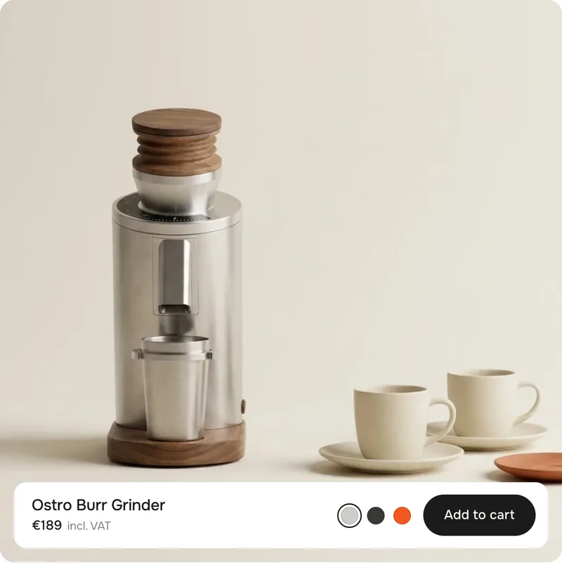
ProductShows its picture, name, price, colours and an add to cart button. Leave it empty to show our demo grinder.Empty
ImageReplaces the product picture – e.g. a mood shot instead of the packshot.Empty
Name · without productThe name while no product is picked.Ostro Burr Grinder
Price · without productThe price while no product is picked.€189
Note next to the priceA short grey line, e.g. incl. VAT. Leave it empty to hide it.incl. VAT
Show colorsThe product's colour option as swatches. Picking one switches the variant, the price and – if the variant has one – the picture.On
Button labelThe add to cart button. Leave it empty to hide it.Add to cart
Button link · without productWithout a product the button becomes this link – or, without a link, a demo button.Empty
Added labelShown on the button after adding.Added
Sold out labelShown on the button when the variant is sold out.Sold out
SizeAuto makes it Large.Auto
Picture, name, price, note, colours, add to cart
The buy bar follows the tile
TileBuy bar
520 px wide or moreOne row: name and price, colours, button
NarrowerTwo rows: name and price on top, colours and button below
340 px or smallerName, price and a round + button
Wide and flatPicture on the left, name, price, colours and button on the right
Adding goes straight to the cart and tells your theme – the cart count in the header updates without a reload (Horizon, Dawn and themes built on them).
Theme editor
Momentum Bento
Product
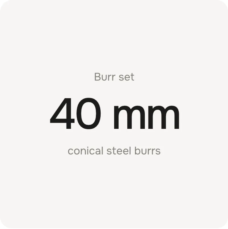
Key figure: 40 mm
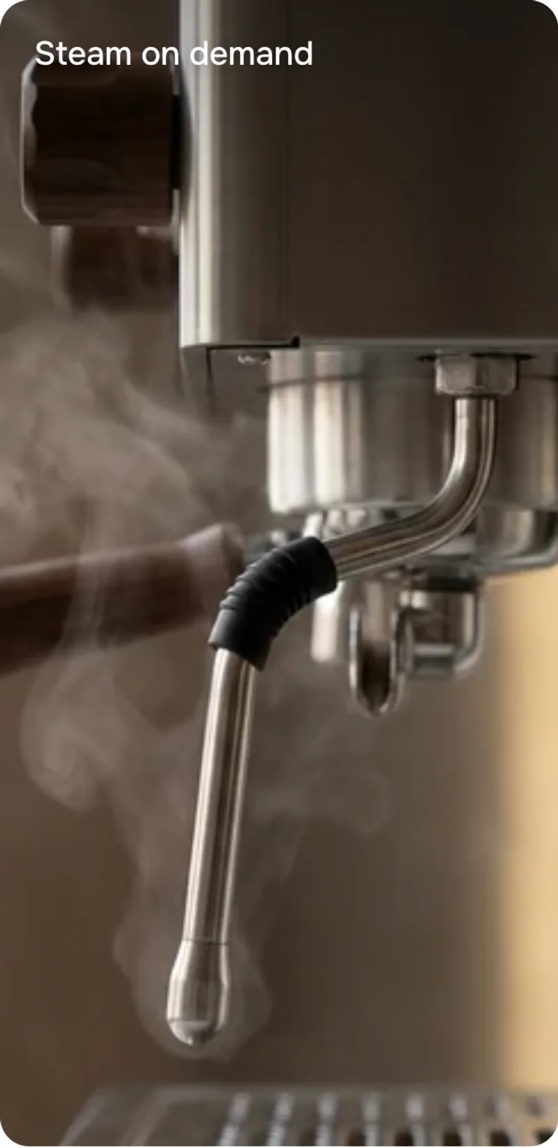
Image: Steam on demand
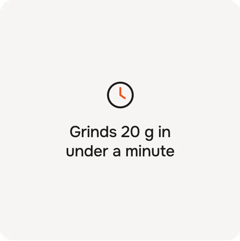
Feature: Grinds 20 g
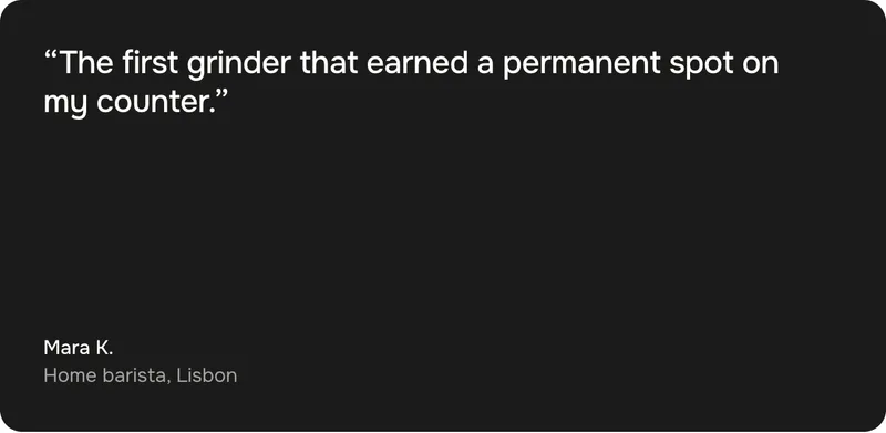
Quote: Mara K.
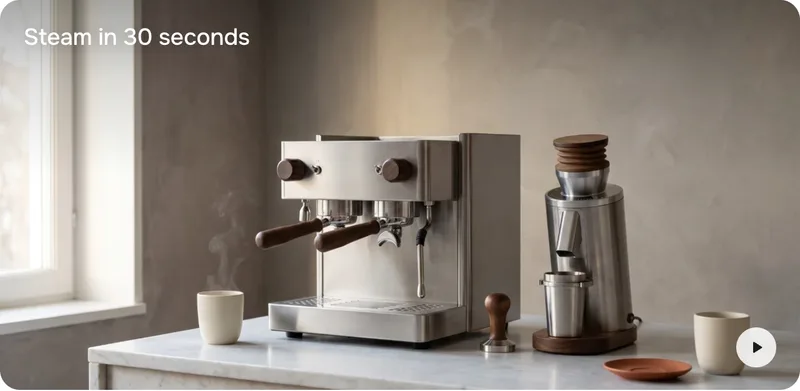
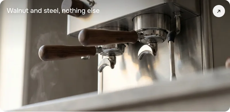
Video: Steam in 30 seconds
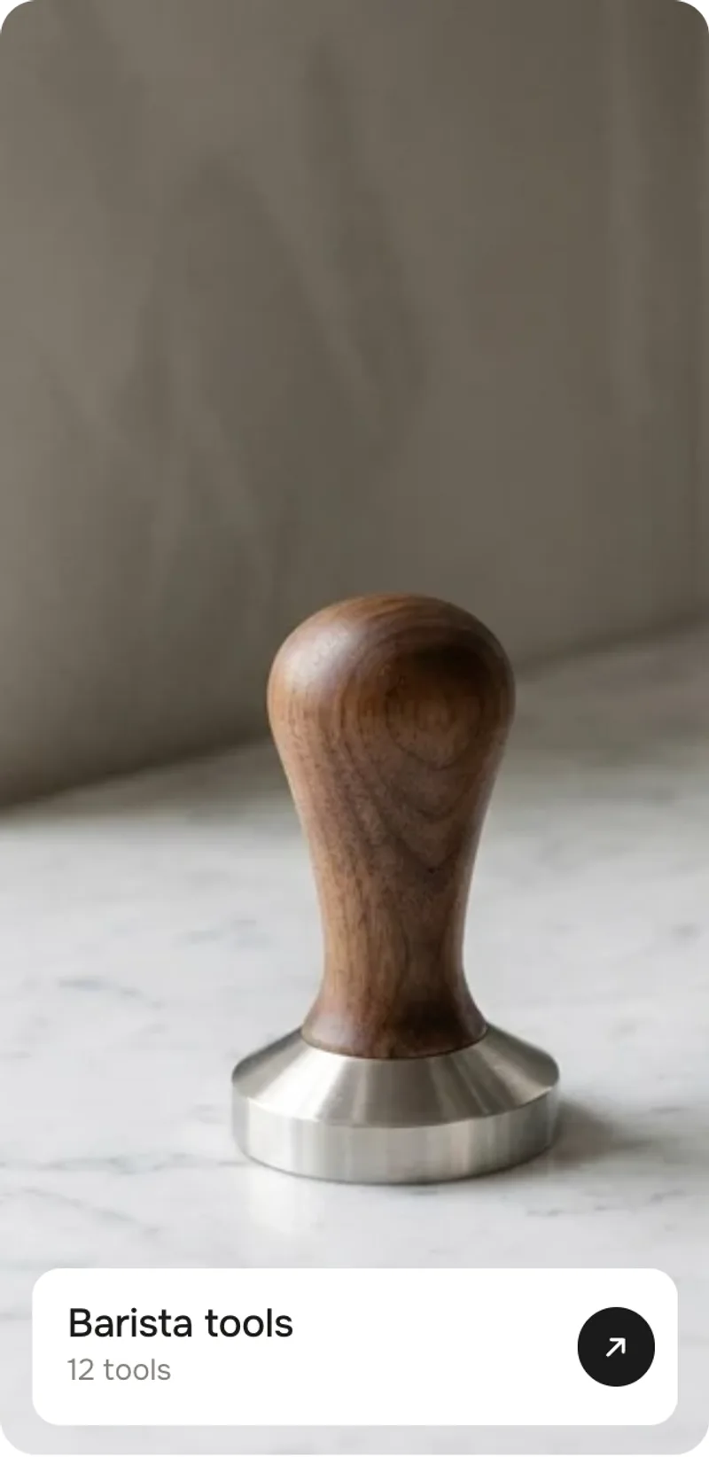
Collection: Barista tools
The order of the blocks is the order in the grid. Every tile has a Size, and the text tiles have a Tile tone.
Key figureKey figure – a small line, a big number, a short text
FeatureFeature – an icon and one sentence
ImageImage – a picture with a label
VideoVideo – a muted loop with a pause button
QuoteQuote – a quote, a name and a detail
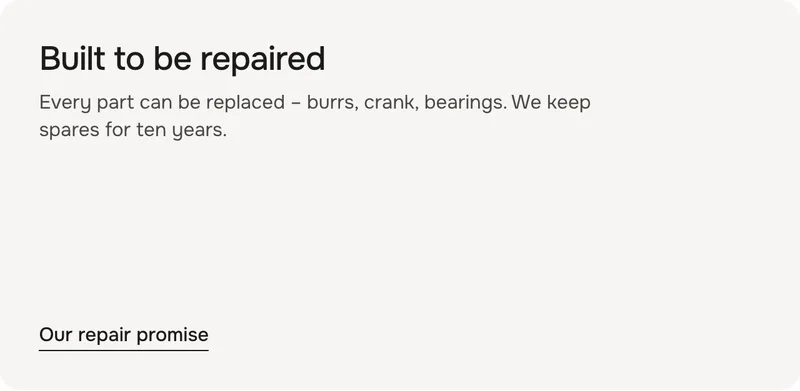
TextText – a heading, a few lines and a link
CollectionCollection – picture, title, count and an arrow
Key figure
A number that sticks.
SettingWhat it doesDefault
Small lineAbove the number. Leave it empty to hide it.Burr set
NumberThe big line – keep it short.40 mm
TextBelow the number.conical steel burrs
Tile toneLight, dark or accent.Light
SizeAuto makes it Small.Auto
LinkOptional – the whole tile becomes a link.Empty
Feature
One sentence with an icon.
SettingWhat it doesDefault
IconOne of eight icons, or None.Clock
Own iconYour own icon instead – a square SVG or PNG.Empty
TextThe sentence.Grinds 20 g in under a minute
Tile toneLight, dark or accent.Light
SizeAuto makes it Small.Auto
LinkOptional – the whole tile becomes a link.Empty
ImageShows our demo picture until you pick your own.Demo picture
LabelTop left on the picture. Leave it empty to hide it.Steam on demand
Label colorDark or light. A light label gets a soft shade from the top, so it reads on bright pictures too.Dark
SizeAuto makes pictures Tall and Wide in turn.Auto
LinkOptional – the whole tile becomes a link.Empty
Video
A muted loop that plays while it's in view.
SettingWhat it doesDefault
VideoPlays muted in a loop while it's in view. Shows our demo video until you pick your own.Demo video
LabelTop left on the video. Leave it empty to hide it.Steam in 30 seconds
Label colorDark or light.Light
SizeAuto makes videos Tall and Wide in turn, like pictures.Auto
LinkOptional – the whole tile becomes a link.Empty
The round button bottom right pauses and plays the video. Visitors who prefer reduced motion see a still picture and press play themselves.
Quote
A voice from a customer.
SettingWhat it doesDefault
QuoteThe quote, with its quotation marks.“The first grinder that earned a permanent spot on my counter.”
NameBelow the quote.Mara K.
DetailA grey line under the name. Leave it empty to hide it.Home barista, Lisbon
Tile toneLight, dark or accent.Dark
SizeAuto makes it Small.Auto
LinkOptional – the whole tile becomes a link.Empty
Text
A heading and a few lines – for a promise, a story or a service.
SettingWhat it doesDefault
HeadingThe bold line on top.Built to be repaired
TextA few lines below.Every part can be replaced – burrs, crank, bearings. We keep spares for ten years.
Link labelShown at the bottom when the tile has a link.Our repair promise
LinkOptional – the whole tile becomes a link.Empty
Tile toneLight, dark or accent.Light
SizeAuto makes it Small.Auto
Collection
A way into a collection.
SettingWhat it doesDefault
CollectionTakes its picture, title and link. Leave it empty to show our demo picture.Empty
ImageReplaces the collection picture.Empty
TitleLeave it empty to use the collection's title.Barista tools
Subtitle[count] becomes the number of products.[count] tools
LinkReplaces the collection link.Empty
SizeAuto makes it Tall or Wide, like a picture.Auto
[count]The number of products in the collection[count] tools→12 tools
Tile tone
Key figure, feature, text and quote come in three tones – the colours themselves are set once for the section.
Light · dark · accent
The chip turns dark on hover, the arrow slides out and back in, the picture zooms in a little
Buttons, colours and the video's pause button sit on top of the link – they keep doing their own thing.
Momentum hover
Default · On
Move the mouse across a tile and it gets a push in that direction and speed, then swings back. Only with a mouse or trackpad.
Push
Default · 50%
How far a tile travels with the mouse. 0 % keeps it in place and only lets it spin.
Spin
Default · 50%
How much a tile turns depending on where the mouse hits it. 0 % only pushes.
Damping
Default · 40%
How quickly a tile comes back to rest. Low swings out a few times, high settles at once.
Wobble on tap
Default · On
On touch screens there is no hover – a tile wobbles a little where it is tapped instead. Scrolling and links are not affected.
Animations
Default · On
Off: the tiles show right away and nothing moves – no fade-in, no momentum, no wobble. Visitors who turned on “reduce motion” on their device always see it like this.
Easing
Default · werk Signature
The curve of the tiles fading in.
werk Signature
Smooth
Bounce
Snap
Glide
werk SignatureSlow start, soft landing
SmoothEven and quiet
BounceTiles shoot a little past their place
SnapQuick start, gentle stop
GlideSlow in, slow out
Padding top
Default · 96px
Space above the section.
Padding bottom
Default · 96px
Space below the section.
Fonts
Default · Design fonts
Onest and Geist Mono from werk's CDN. Use theme fonts swaps every font at once. Or swap each one with its own URL – Self-hosted font URL replaces Onest; Label font URL replaces Geist Mono (the small labels and numbers). Empty keeps werk’s font.
Colors
Default · Design colors
Background, text, body text, muted text, tiles, dark tiles, accent tiles and the buy bar – or Use theme colors, which takes the colours of the page around the section and mixes the rest from them. Button and Button text give the buttons their own colours – empty keeps the design.
1Background#FFFFFFSection background, text on dark tiles
2Text#1C1B1AHeading, numbers, names, text on accent tiles
3Body text#4A4844The text next to the heading and in text tiles
4Text muted#85827CEyebrow, small lines, details
5Tiles#F6F5F3Light tiles
6Dark tiles#1C1B1ADark tiles
7Accent tiles#F2571FAccent tiles and the icon detail
8Buy bar & chips#FFFFFFThe bar on the product, collection bar, link chip, pause button
Buttons
Default · Clean
Use theme buttons gives the head button and add to cart your theme's style. Button style sets how they react on hover – and the text link of the text tile.
Match theme (the default) lines the section up with your theme's page margin – in Horizon the same edge as header and footer. Themes without one, like Dawn, keep the werk edge. werk default always uses the werk edge, Custom takes your own values in px (desktop and tablets / phones), None runs the content to the edge.
Desktop · four columns
Tablet · three columns
Phone · two columns
DesktopTabletPhone
Columns432
HeadHeading left, text and button rightStackedStacked
Product buy barOne rowTwo rowsTwo rows
MouseMomentum hoverWobble on tap (touch)Wobble on tap
The editor shows the tile
Pick a block and the section scrolls to its tile and outlines it for a moment. Add or remove a block and the grid packs itself again.
No jumping
The grid is placed before the page loads – no layout shift, and without JavaScript it simply stands still.
Keyboard
Linked tiles are reached with Tab and show a clear focus ring. The momentum is a mouse effect only – nothing moves while you tab.
Light on the page
The movement runs only while a tile swings, the video only while it's in view. No libraries.
AI label
Using an AI-generated picture? Switch on AI label under that picture and pick a corner. The text and the look – pill, info dot or upright along the edge – are set once for the whole section, under AI label. Product and collection tiles get one only for an own picture, not for Shopify's.
Horizon4.2TestedAdd to cart (cart count and drawer update), theme fonts, colours and buttons, two sections on one page
Dawn16TestedAdd to cart (cart bubble updates), theme fonts, colours and buttons, two sections on one page
Nothing moves when I move the mouse.
Momentum hover or Animations is off, Push and Spin are both at 0 %, or your device asks for reduced motion. On touch screens there is no hover – tap a tile to see the wobble.
A tile is bigger than I set it.
It grew to close a gap. Change the order of the blocks or the size of a neighbour – or put the tile on Auto and let the grid choose.
The grid looks different on my phone.
That's on purpose: with fewer columns the tiles are packed again, so a Wide tile can fill a row and a picture can turn from tall to wide.
The product has no colours or no button.
The product has no colour option (swatches or an option called Color), Show colors is off, or the tile is very small – then the bar shows name, price and a round + button.
The video doesn't play.
It only plays while it's in view. With reduced motion or Animations off it waits for the play button. In iPhone low power mode the browser blocks autoplay – the play button still works.
1.4.012 Oct 2026
NewSide padding. Match theme (the default) lines the section up with your theme's page margin – in Horizon the same edge as header and footer. Themes without one, like Dawn, keep the werk edge. werk default always uses the werk edge, Custom takes your own values in px (desktop and tablets / phones), None runs the content to the edge.
1.3.011 Oct 2026
NewAI label per picture (EU AI Act). Under every own picture and video a switch with the corner; the text and the look – pill, info dot that opens on hover, or upright along the edge – are set once under AI label. Off by default, nothing changes until you switch it on. Product and collection pictures from Shopify never get one.
1.2.06 Oct 2026
NewLabel font URL (Fonts) – swap Geist Mono, the small labels and numbers, for your own .woff2. With Self-hosted font URL every font can now be swapped on its own; Use theme fonts still swaps all of them.
1.1.06 Oct 2026
NewButton and Button text colours (Colors). Empty = as designed – nothing changes until you pick one. Hidden while Use theme colors or Use theme buttons is on.
1.0.04 Oct 2026
NewFirst stable release. Same code as 0.1.0 after its fixes: demo on the espresso pictures of Hotspot Index with its own video loop, a soft shade behind light labels, a stronger push and spin (damping 40 by default), no sideways scrolling while a tile swings at the edge, plus the docs.
NewTested: layout stress test (52 runs: 13 cases × 1440 / 1280×640 / 768 / 390, no holes, every text inside its tile), function check (push, spin, rest, no layout shift, clickable controls, tap wobble, Animations off), Liquid packer = reference on 3 000+ random lists, Horizon and Dawn in the dev store (add to cart with cart count, theme fonts / colours / buttons, two sections on one page).
* Built for Online Store 2.0 and tested in Shopify's Horizon and Dawn themes. Heavily customised or older themes can still clash with it – if something looks off, write us and we'll take a look.


 Background#FFFFFFSection background, text on dark tilesText#1C1B1AHeading, numbers, names, text on accent tilesBody text#4A4844The text next to the heading and in text tilesText muted#85827CEyebrow, small lines, detailsTiles#F6F5F3Light tilesDark tiles#1C1B1ADark tilesAccent tiles#F2571FAccent tiles and the icon detailBuy bar & chips#FFFFFFThe bar on the product, collection bar, link chip, pause button