Product
Outfit Builder
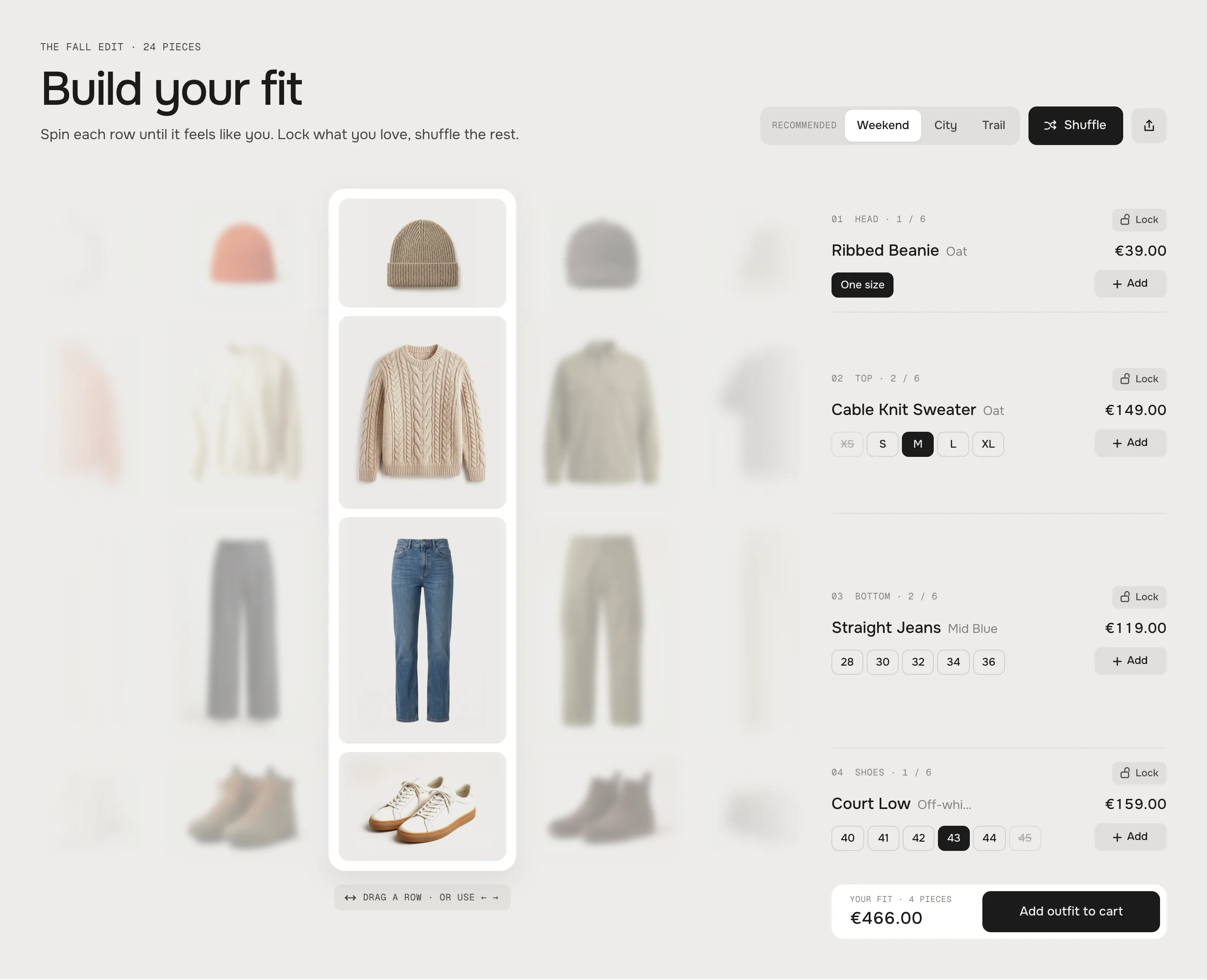
Two to five endless rows of products, one above the other. Visitors drag, throw or shuffle each row like a slot machine; whatever stands in the spotlight column is the outfit. Pick a size per piece, add one piece or the whole outfit, lock what you love, share the exact fit as a link – and under a product page it turns into "Shop the fit".
- Access
- Free
- Page types
- Home, Landing pages, Product, Collection
- Compatibility
- All Shopify 2.0 themes*
- Styles
- 1
- Customise
- 78 settings · 2 block types
Installation
Takes about two minutes. No app needed.
- 01
Create a new section
In your theme code editor (Online Store → ⋯ → Edit code), click the sections folder, then “New File”, name it and hit Enter.
- 02
Paste the code
In the file that just opened, paste the code below. Then hit Save (top right corner).
Note: Shopify shows no confirmation when a section saves – that’s normal.
- 03
Add it in the theme editor
Saved? Then reload the theme editor – otherwise the new section sometimes doesn’t show up. After that: Edit theme → Add section → . Everything else is in the sidebar – the Docs below explain every setting.
Code
One file. Copy it, paste it, done.
Free – just add your email
Every section is free during launch. Enter your email once and copy any code you like.
Already signed up?
More like this
Docs
Every setting, what it does and where you see it. All in the theme editor, no code.
What you can change
Every numbered spot has its own chapter below.
- 1
Add the section
Edit theme → open the page → Add section → . It comes with four rows (Head, Top, Bottom, Shoes) of demo pieces and three looks. - 2
Point every row at a collection
Click a Row block and pick a Collection – e.g. hats, tops, trousers, shoes. Or switch Source to Products and hand-pick up to 24. - 3
Build your looks
Click a Look block, give it a name and pick one product per row. The first look is what visitors see first. - 4
Spin it
Preview the page: drag a row, use the arrows, shuffle, pick sizes and add the outfit to the cart.
- 1
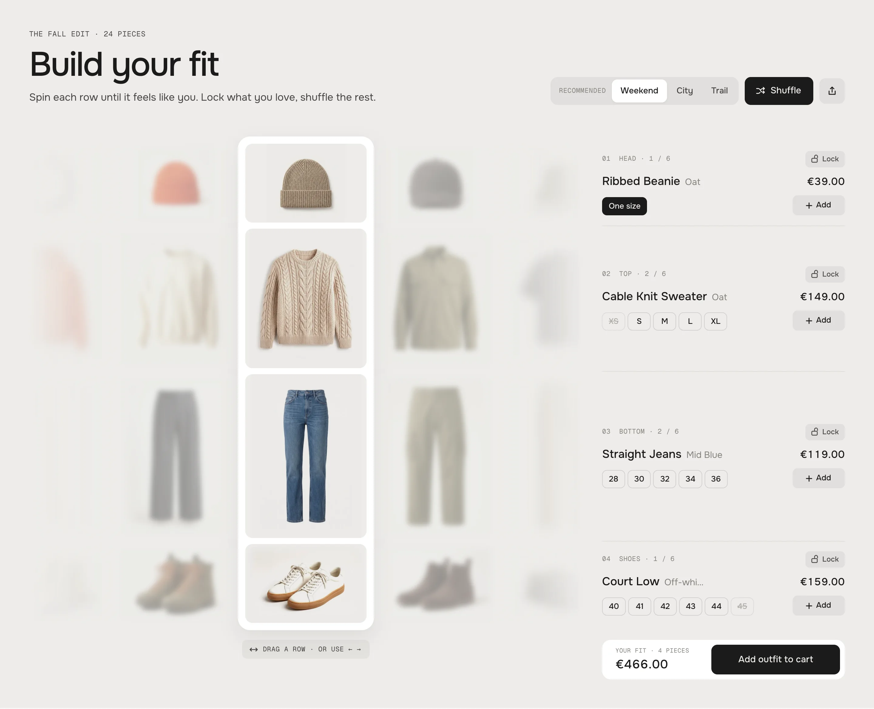
The spotlight in the middle, the pieces beside it soft and faded Spinning a row
Every row is an endless band. Visitors drag it (mouse or finger) and throw it – it rolls on and lands on the nearest piece. A horizontal trackpad swipe works too, and hovering a row shows two arrows at the spotlight. With the keyboard: Tab to a row, then ← and →. A click on a piece beside the spotlight spins it in.
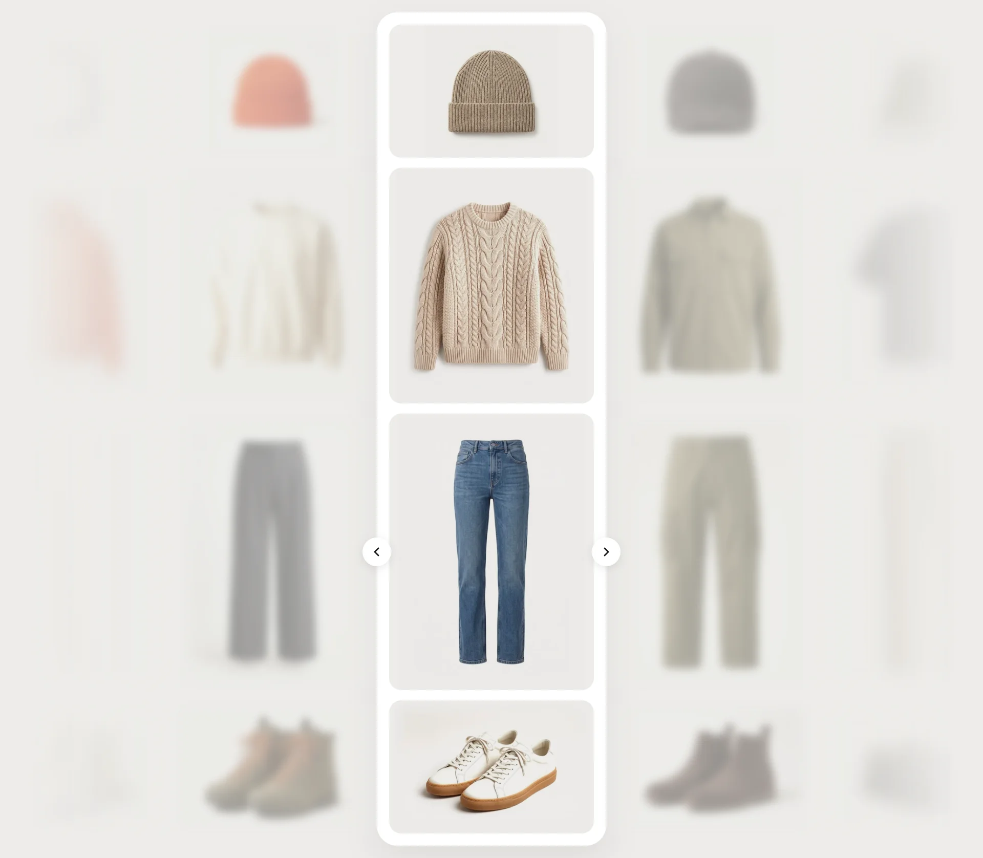
HoverHover – arrows at the spotlight 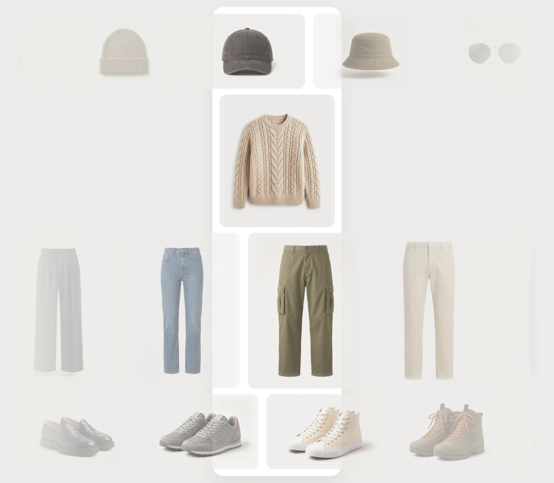
SpinningSpinning – every piece sharp while it moves Beside the spotlight
The pieces next to the spotlight are blurred and faded, the outer ones twice as much. While a row moves, the blur steps aside so everything stays smooth. Both are settings in Style.
The info column
Next to every row (on desktop) its piece in the spotlight: number and title of the row, name, colour, price, colour swatches, size chips, lock and add. On tablets the four pieces sit as cards below the rows, on phones in a sheet – see Phone & tablet.
Eyebrow
Default · The fall edit · 24 piecesA small mono line, e.g. the name of the edit.
Heading
Default · Build your fitThe big line.
Text
Default · Spin each row until it feels like you.…One or two sentences below. Bold, italic and links work.
Theme editor
Outfit BuilderRow: HeadRow: TopRow: BottomRow: ShoesLook: WeekendLook: CityLook: TrailRow
One band of products.
SettingWhat it doesDefaultTitleThe small label in the info column (01 Head …).RowSourceCollection or Products.CollectionCollectionThe first 24 products of the collection, in its order. New products show up by themselves.EmptyProductsUp to 24 products you pick by hand.EmptyHeightAutomatic, Small, Medium, Large or Extra large.AutomaticWithout a collection or products a row shows our demo pieces, so the section looks finished the moment you add it. A row with one product doesn't spin; an empty collection hides its row (the editor shows a note).
Look
One outfit. Up to three – after the third, the theme editor offers no more looks.
SettingWhat it doesDefaultNameThe chip.WeekendRow 1 … Row 5One product per row, in the order of the rows. Leave a row empty to keep it as it is.EmptyShow looks
Default · OnShows the chips. A look without any product for your rows hides itself; without looks the chips disappear.
Start with
Default · The first lookWhat visitors see first: the first look, the first piece of every row, or a random outfit. A shared link always wins.
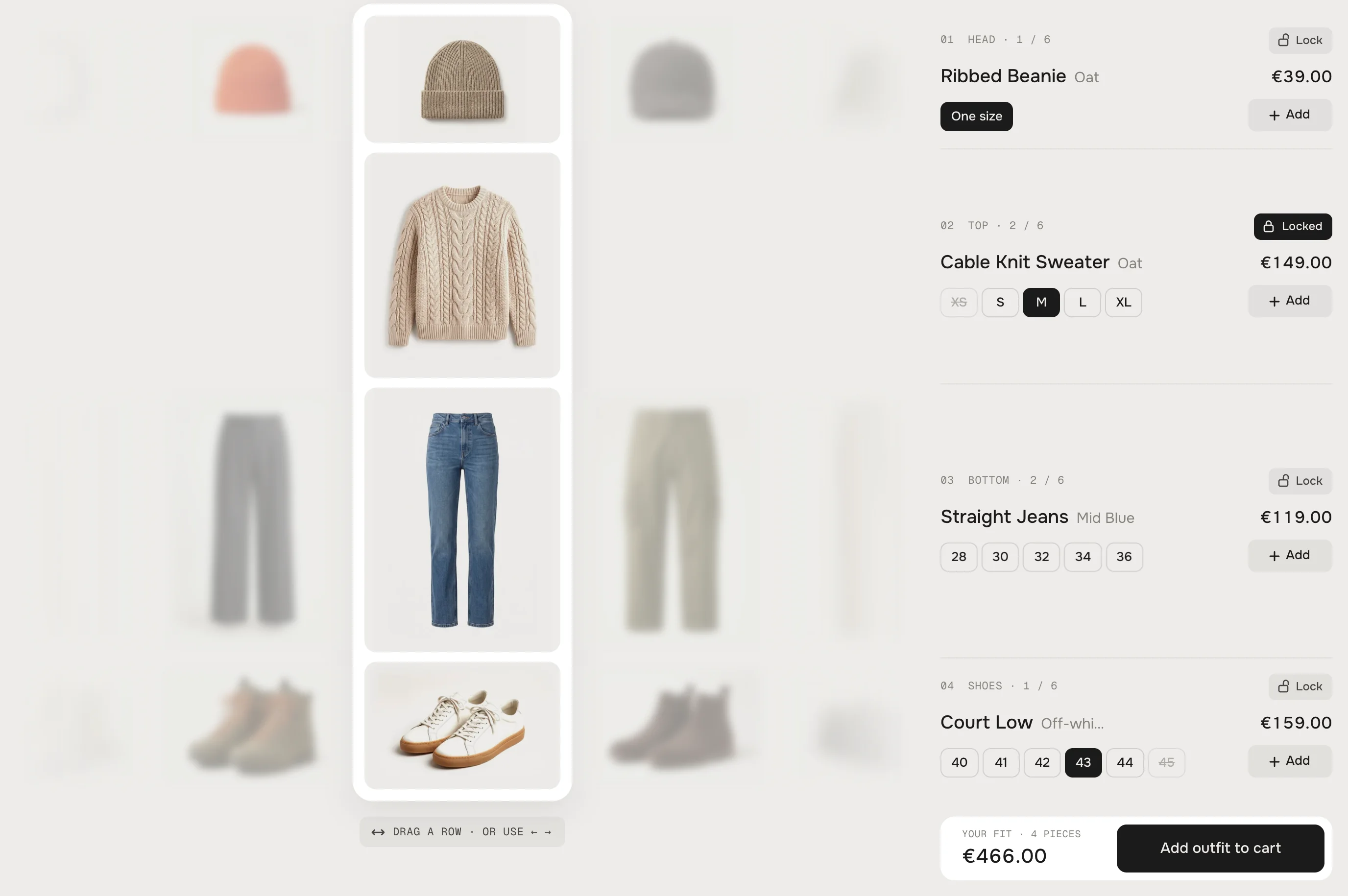
Top locked: the neighbours step aside, Shuffle leaves it alone Show shuffle
Default · OnThe Shuffle button. It never lands on the same piece or on a sold-out one.
Show lock
Default · OnA lock in every row's info. Locked rows can't be dragged and the pieces beside them fade out. Press L on a focused row to lock it.
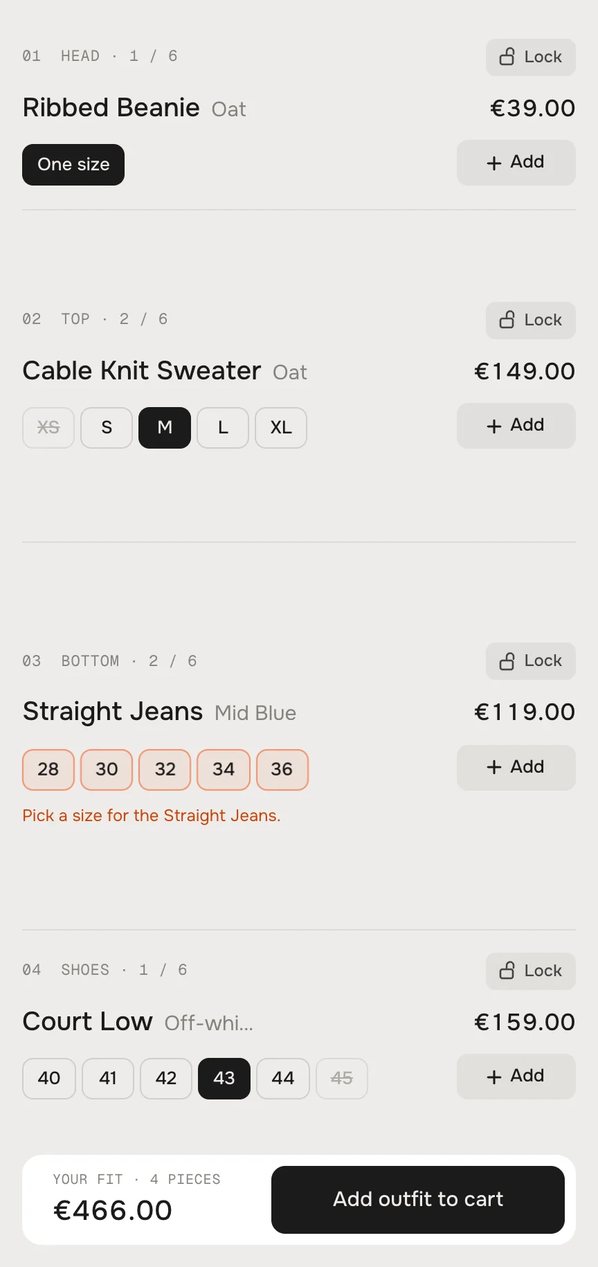
Add outfit with a size missing: the chips light up and ask for it Sizes
The chips come from the product's size option – an option called Size (also Größe, Taille, Talla, Maat), or the only option of a product. Sold-out sizes are crossed out. A product with one variant or without sizes shows One size and is ready to go.
Colours
A product with a colour option (Color, Colour, Farbe, Couleur, Kleur) of two or more values gets a line of swatches between its name and its sizes. A click swaps the picture in the row – the old one fades out – and the price, the sizes and what's sold out follow the colour. The size stays when the new colour has it. A colour that is sold out in every size is crossed out.
Show colour swatches
Default · OnThe swatch line. Off, every piece stays on the colour of its first available variant.
Add each piece
Default · OnThe Add button per piece – label, spinner, Added.
Show total and add outfit
Default · OnThe total of all pieces in the spotlight and Add outfit to cart. All pieces go into the cart at once. If a size is missing, the row lights up in the accent colour and asks for it – on phones the sheet opens.
Adding tells your theme – the cart count in the header updates without a reload (Horizon, Dawn and themes built on them).
Fix the current product
Default · OnOn a product page the current product stays in the row whose source holds it – labelled This item, no spinning. The other rows suggest what goes with it.
Row for the product
Default · 2The row for the product when it isn't in any row's source.
Use Shopify recommendations
Default · OnWhich pieces the other rows start on: first a look that holds the product, then Shopify's complementary products (set them in the Search & Discovery app), then the first piece of each row.
Heading on product pages
Default · Wear it withHeading, eyebrow and text have their own fields on product pages – [product] becomes the product's name.
[product]The product's name (product pages)The [product] stays.The Cable Knit Sweater stays.[count]The number of pieces[count] pieces added4 pieces addedThe size in the fixed row follows the variant picked on the product page.
Spotlight
Default · RailA white rail behind the middle column, an outline, or nothing.
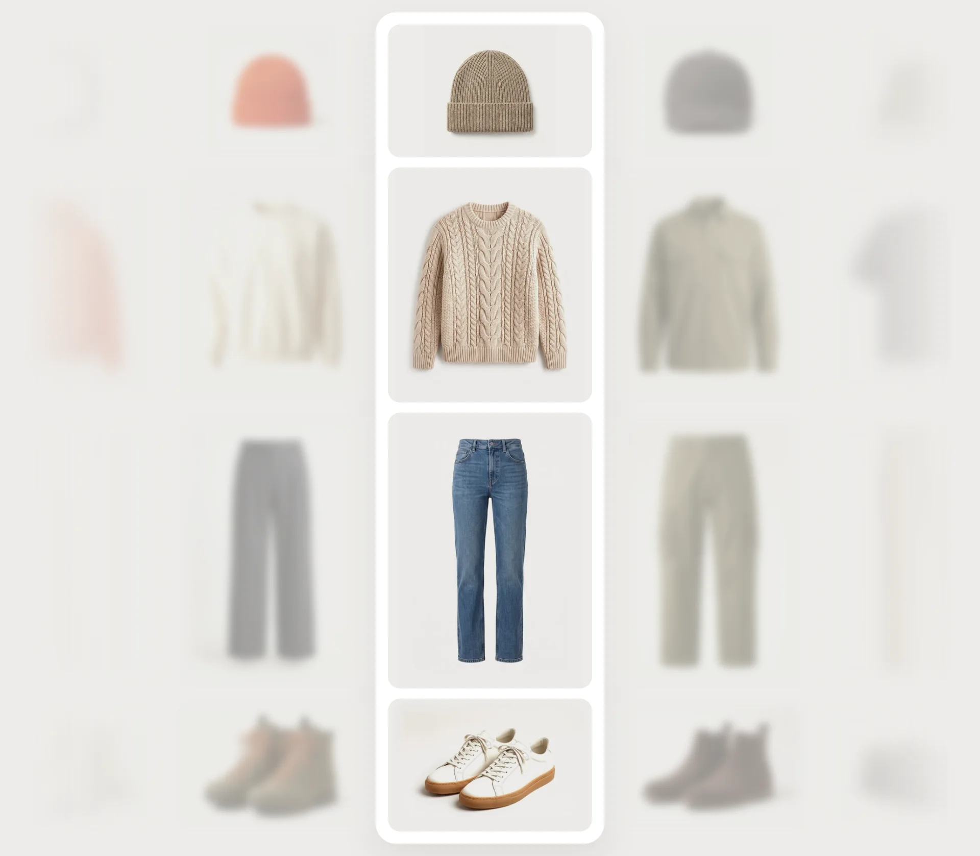
RailRail 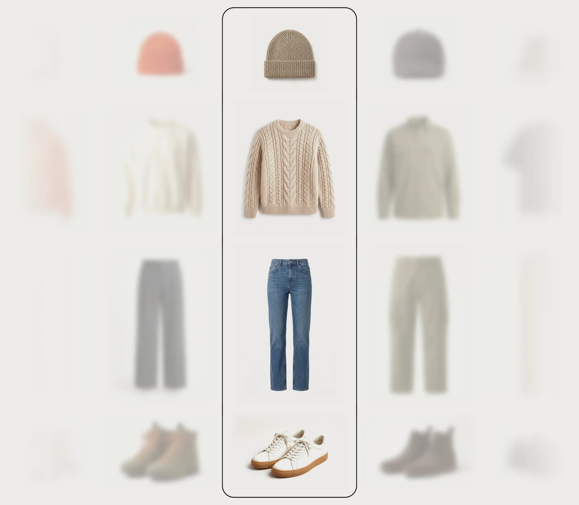
OutlineOutline 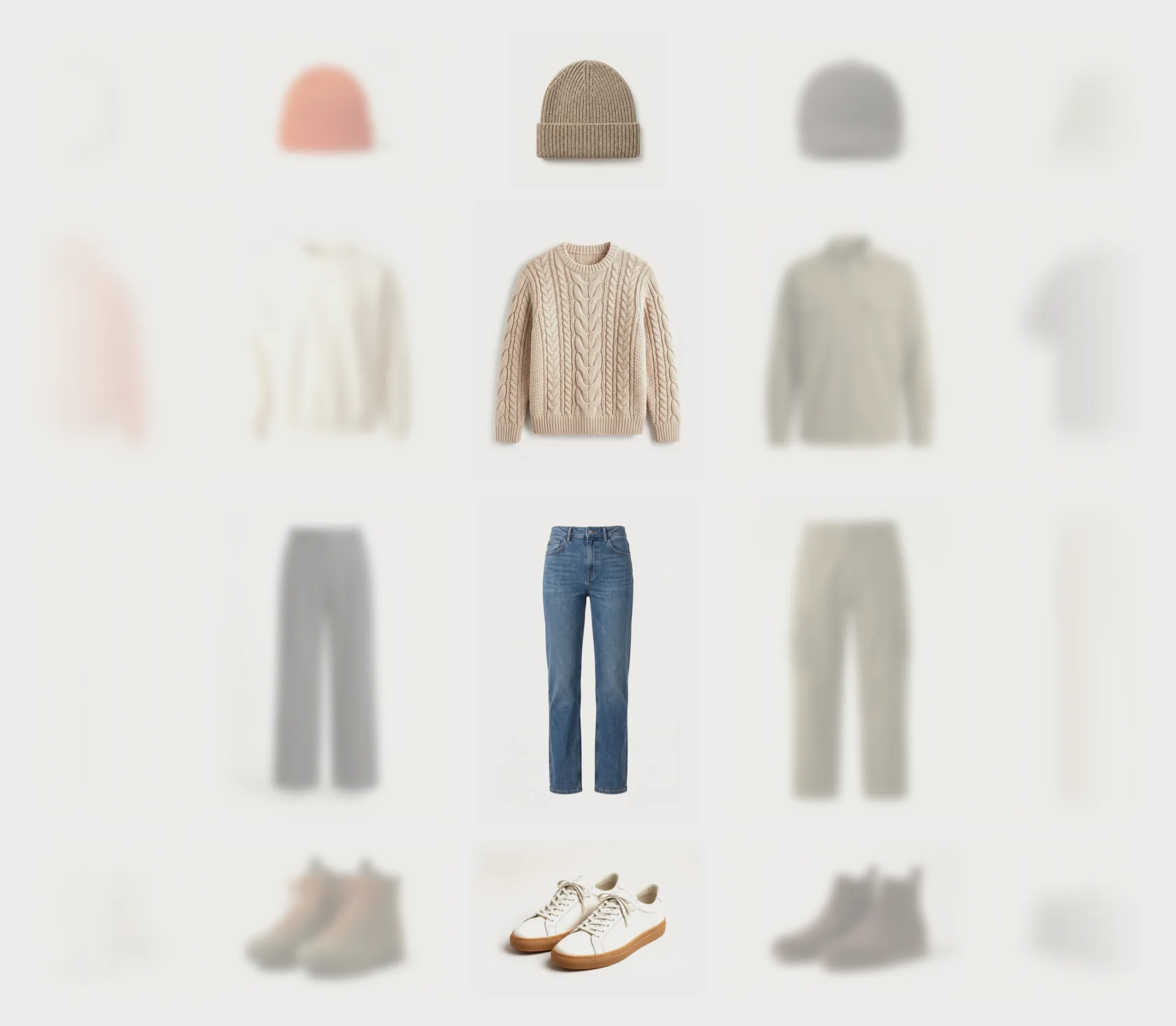
NoneNone Blur beside the spotlight
Default · 4pxHow soft the pieces beside the spotlight are – the outer ones twice as much.
Opacity beside the spotlight
Default · 40%How faded they are – the outer ones about half of it.
Pictures
Default · Whole pieceWhole piece keeps the picture as it is; Fill the tile crops it to the tile.
Blend white photo backgrounds
Default · OnPackshots on white melt into the tile colour, so the pieces float.
Easing
Default · werk SignatureHow the rows land after a shuffle or a look.
werk SignatureSlow start, soft landing SmoothEven and quiet BounceRows roll a little past their piece SnapQuick start, gentle stop GlideSlow in, slow out Animations
Default · OnOff: rows jump instead of spinning. Visitors who turned on “reduce motion” on their device always see it like this – dragging still works.
Fonts
Default · Design fontsOnest and Geist Mono from werk's CDN. Use theme fonts swaps every font at once. Or swap each one with its own URL – Self-hosted font URL replaces Onest; Label font URL replaces Geist Mono (the small labels and numbers). Empty keeps werk’s font.
Button and Button text in Colors give the buttons their own colours – empty keeps the design.
 Background#EDECE9Section backgroundText#1C1B1AHeading, names, pricesText muted#85827CLabels, coloursTiles#EDECE9Behind every piece – the same as the background, so only the spotlight shows itSpotlight and bar#FFFFFFThe rail, the active look, the totalAccent#F2571FMissing sizes, focus ringLines#DEDBD5Between the infos
Buttons
Default · CleanUse theme buttons gives Shuffle and Add outfit your theme's style. Button style sets how they react on hover.
Hover them – click a button for loading → added
View product CleanGrows a touch, the underline runs out and back View product Dot to arrowThe dot grows into an arrow View product Rolling textThe label rolls up, a copy follows View product FillColour wipes in from the left View product ShineA band of light passes over Every text you see – from Recommended to Sizes missing – is a setting under Labels.
Side padding
Default · Match themeMatch theme (the default) lines the section up with your theme's page margin – in Horizon the same edge as header and footer. Themes without one, like Dawn, keep the werk edge. werk default always uses the werk edge, Custom takes your own values in px (desktop and tablets / phones), None runs the content to the edge.
Desktop · info beside every row 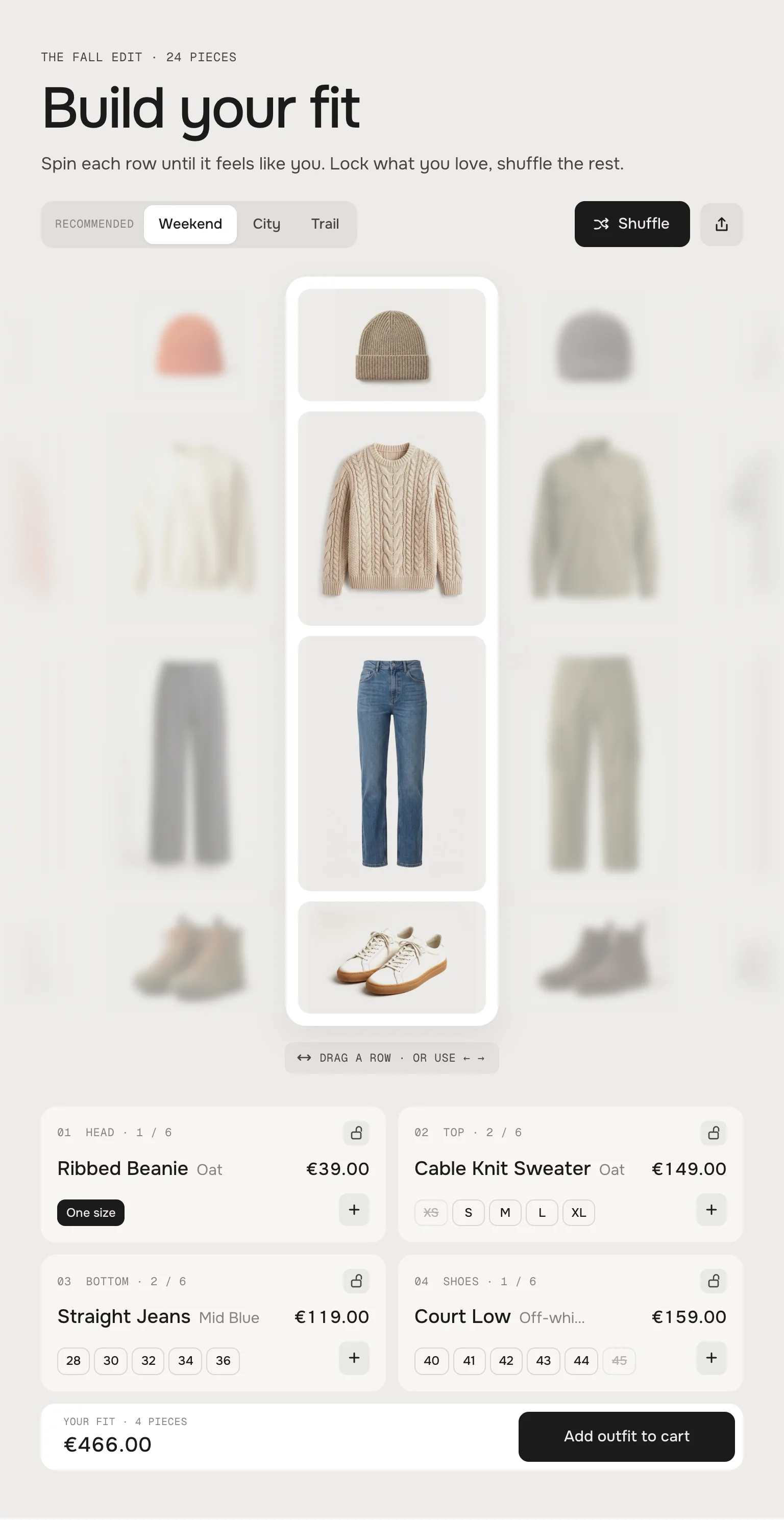
Tablet · info cards below 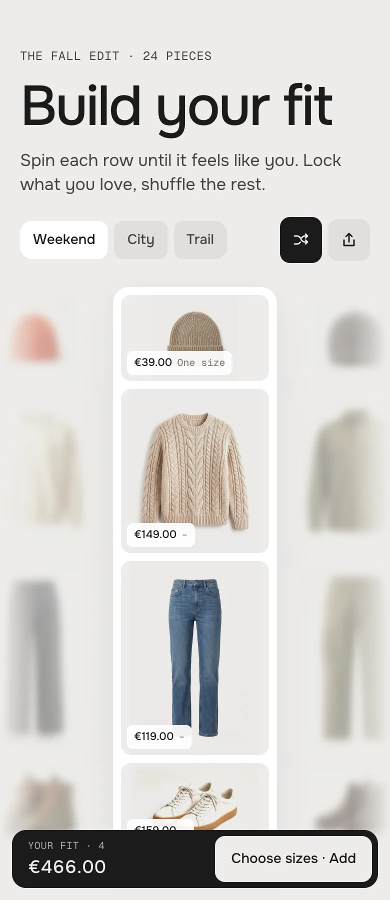
Phone · price on the spotlight, a bar below 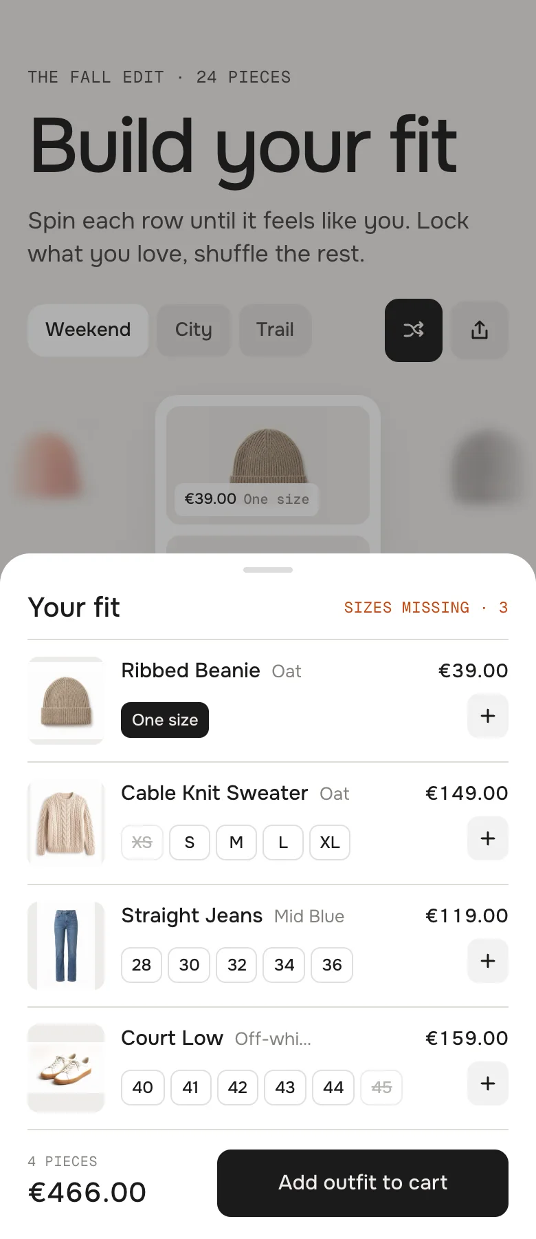
The bar opens a sheet: sizes, add and the total DesktopTabletPhoneRowsLeft of the info columnFull widthFull widthInfoBeside every rowCards, two per lineIn a sheetTotalBelow the infoBelow the cardsA bar at the bottom of the screenHint (Drag a row)ShownShownHiddenThe editor plays your looks
Pick a Look block and the rows spin to it; pick a Row block and the page scrolls to it.
Scrolling stays the page's
On phones a vertical swipe scrolls the page – only a sideways swipe moves a row.
Without JavaScript
Every row is a plain strip you can swipe, every piece links to its product.
Light on the page
One loop, and only while a row moves. No libraries.
Horizon4.2TestedAdd outfit and add piece (cart count updates), Shop the fit, theme fonts, colours and buttonsDawn16TestedAdd outfit and add piece (cart bubble updates), Shop the fit, theme fonts, colours and buttonsA picture is cut in the wrong place.
Only when Pictures fills the tile. Set a focal point on the product picture in Shopify (Products → the product → click the picture → Edit) – the tile keeps that spot in view. Cut-outs on white look best fitted.
A row shows the demo pieces.
It has no source yet – pick a Collection, or switch Source to Products and pick some.
A piece has no size chips.
Its product has no option called Size (or Größe, Taille …) and more than one option. Rename the size option, or the piece is added in its first available variant.
A look does nothing.
None of its products is set for these rows, so its chip hides itself. Pick one product per row.
Shop the fit doesn't show up.
The section is on a page, not on the product template – or Fix the current product is off.
The other rows start on the first piece.
No look holds the product and Shopify has no complementary products for it yet. Add a look with it, or set complementary products in Search & Discovery.
- NewSide padding. Match theme (the default) lines the section up with your theme's page margin – in Horizon the same edge as header and footer. Themes without one, like Dawn, keep the werk edge. werk default always uses the werk edge, Custom takes your own values in px (desktop and tablets / phones), None runs the content to the edge.
- NewThe theme editor now stops at 5 rows and 3 looks – before it let you add more, and the extra ones simply didn't show. The section shows at most 3 looks.
- NewCropped pictures keep the focal point you set on the image in Shopify (Content → Files or the product media) in view – the product pictures when Pictures is set to fill the tile. Before, they were always cut around the centre.
- NewLabel font URL (Fonts) – swap Geist Mono, the small labels and numbers, for your own .woff2. With Self-hosted font URL every font can now be swapped on its own; Use theme fonts still swaps all of them.
- NewButton and Button text colours (Colors). Empty = as designed – nothing changes until you pick one. Hidden while Use theme colors or Use theme buttons is on.
- NewPhone sheet closes by dragging: the grabber now has a finger-sized hit area and the head ("Your fit") drags too (buttons in it still click). Down past 90 px or a flick closes the sheet, a shorter drag springs back softly instead of jumping. A tap on the grabber still closes, a tap on the head does nothing. The file header shows the real version again (it said v1.0.0 since 1.1.0).
* Built for Online Store 2.0 and tested in Shopify's Horizon and Dawn themes. Heavily customised or older themes can still clash with it – if something looks off, write us and we'll take a look.