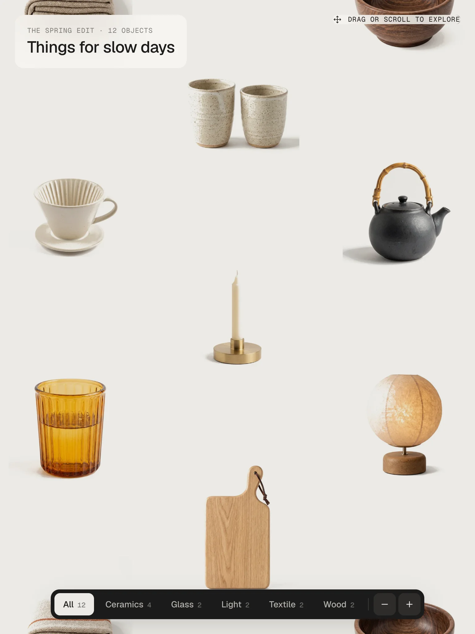
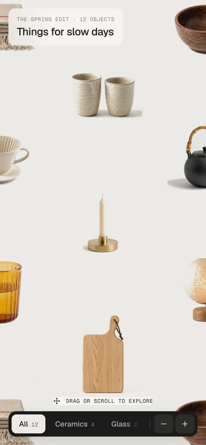
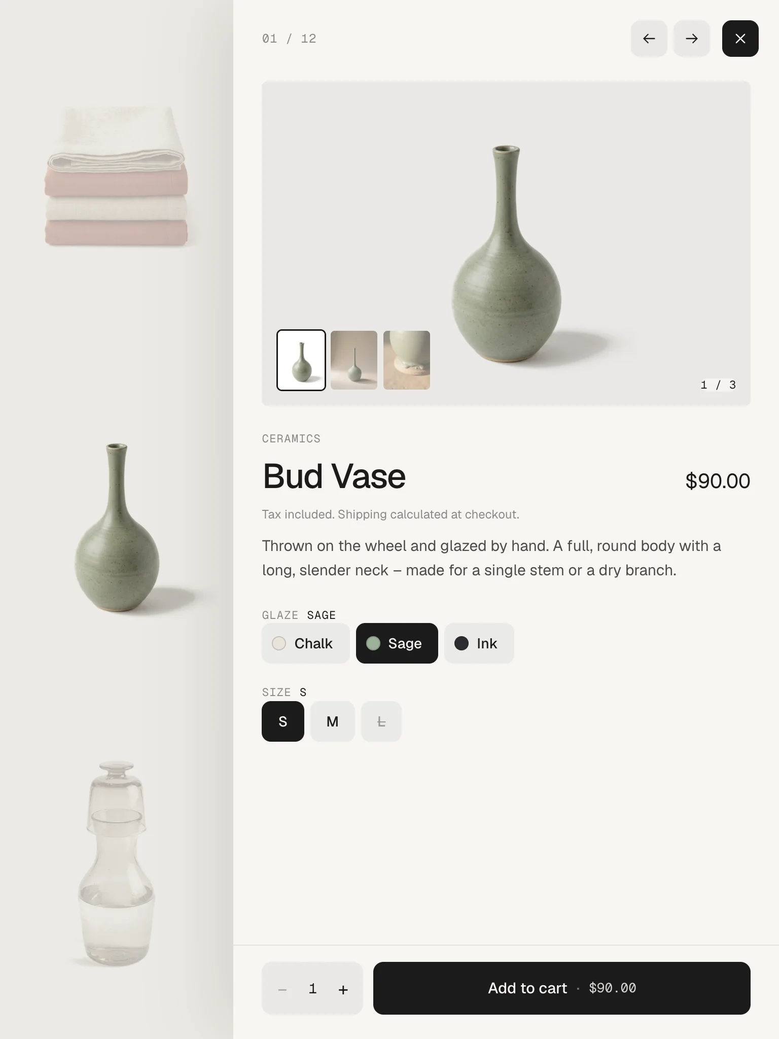
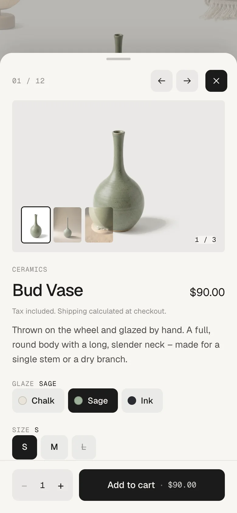
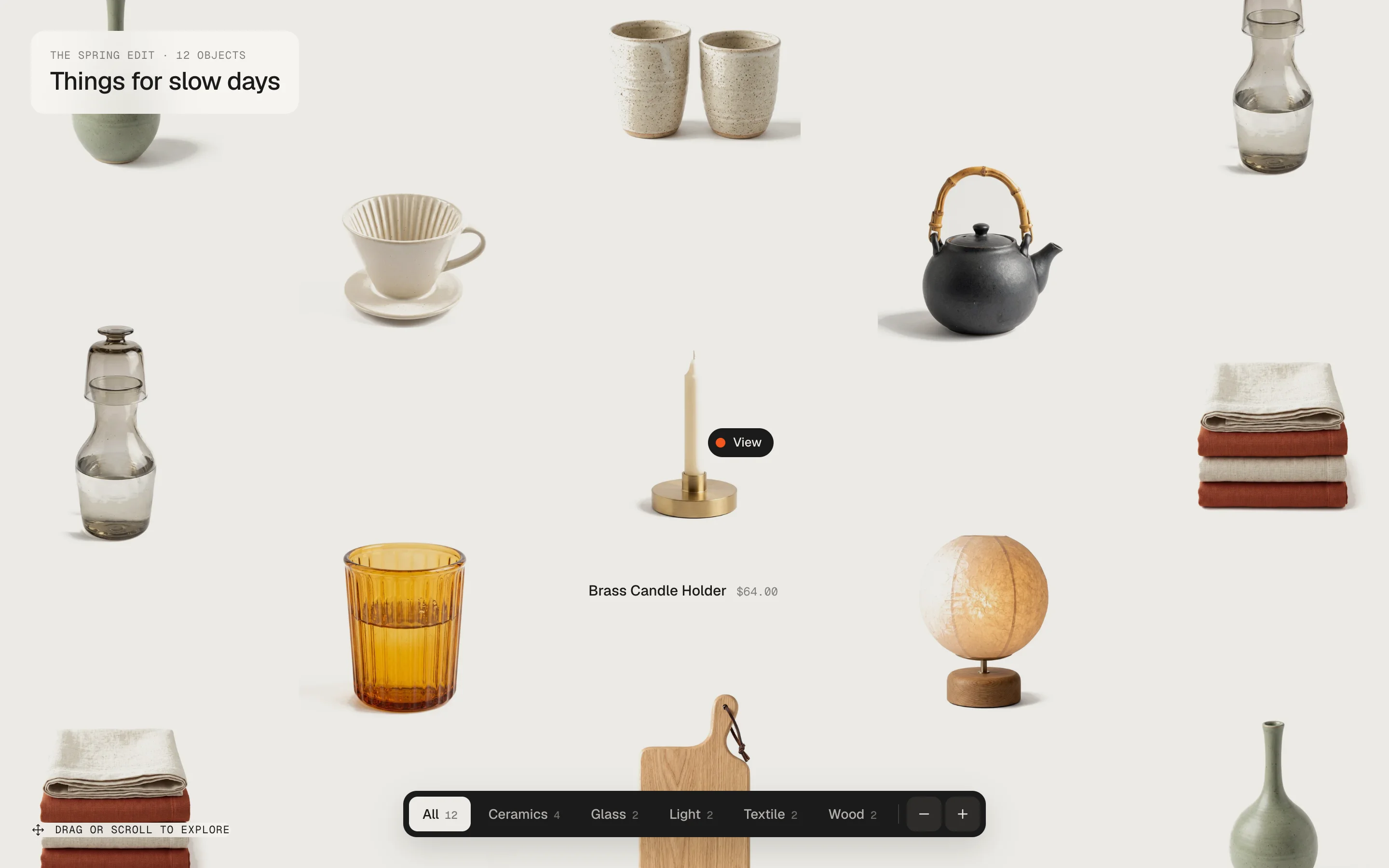
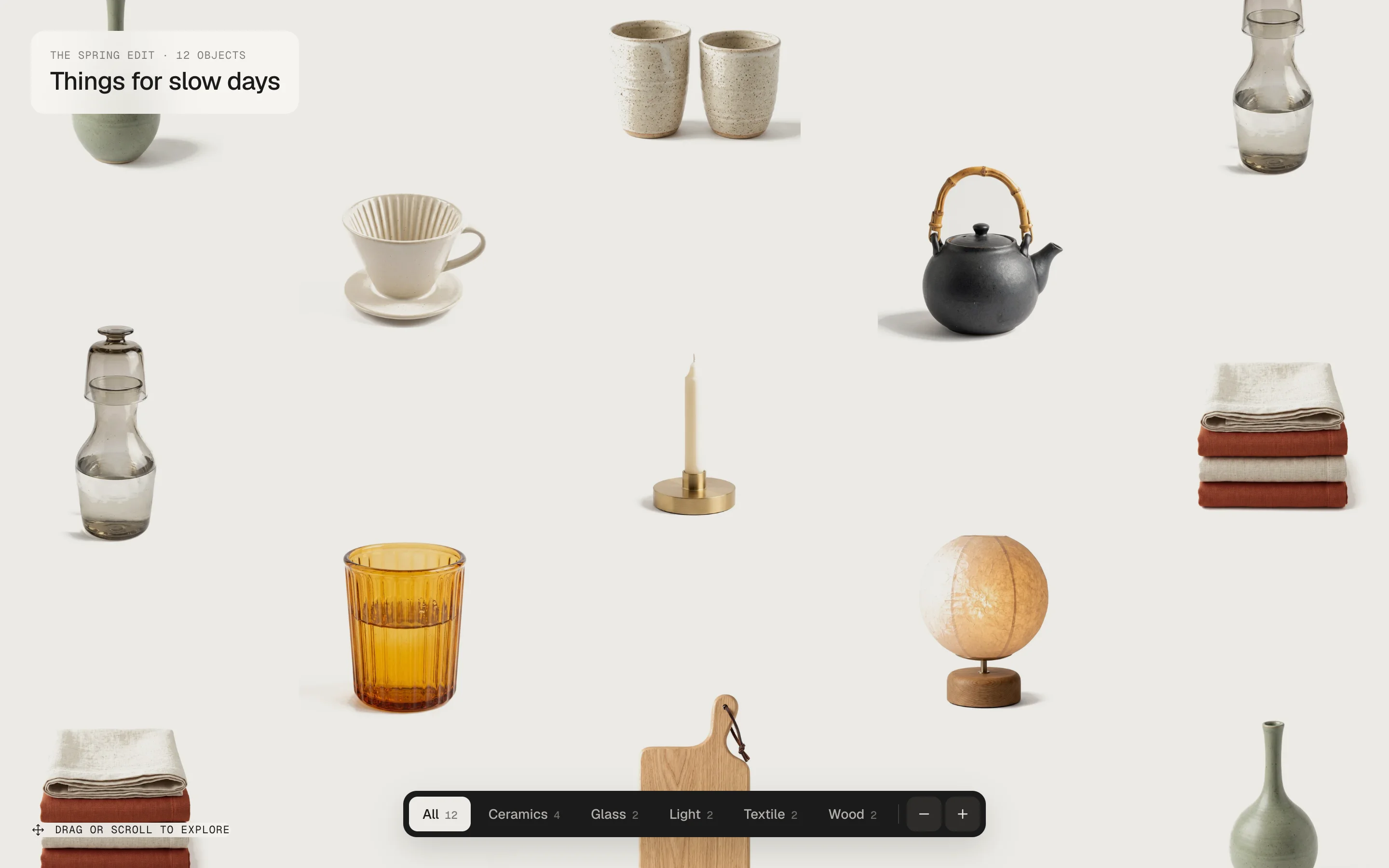
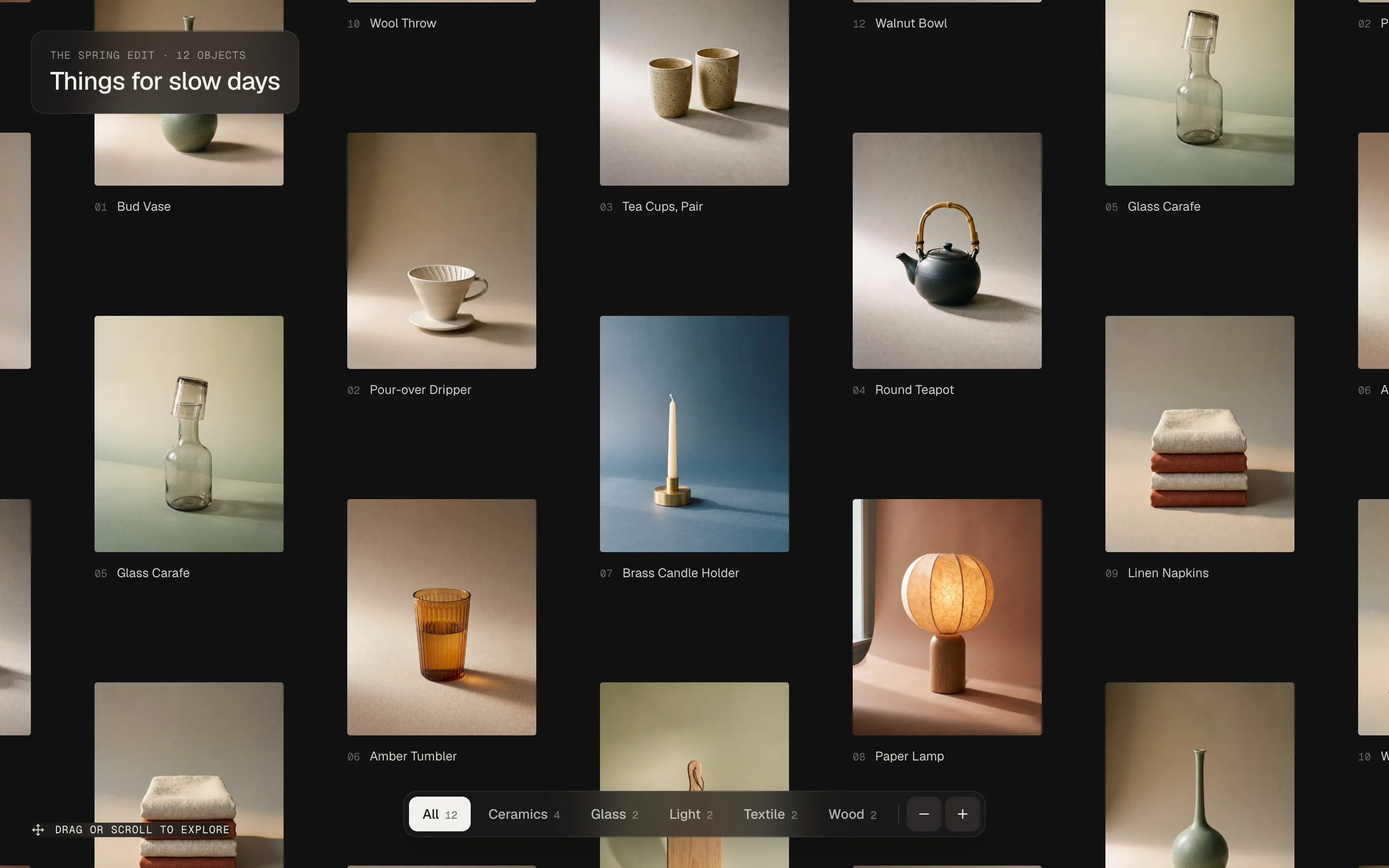
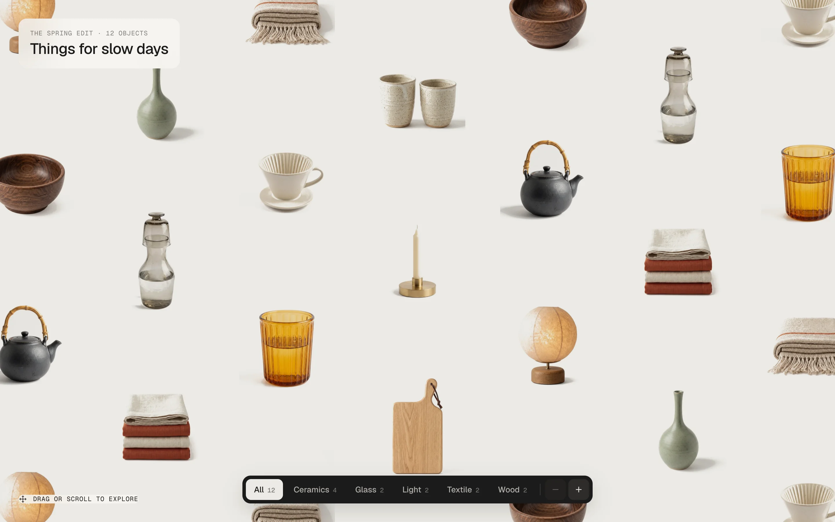
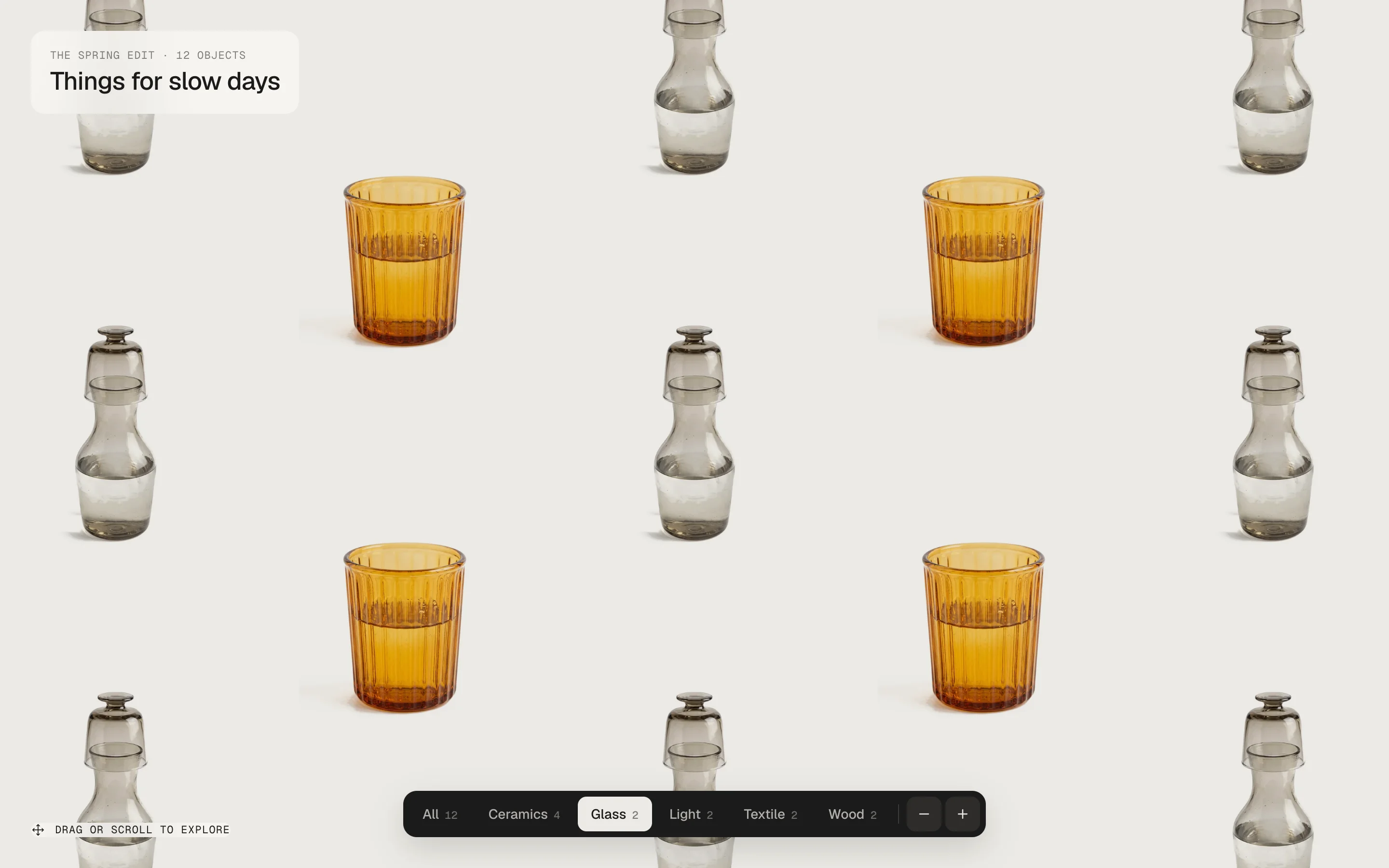
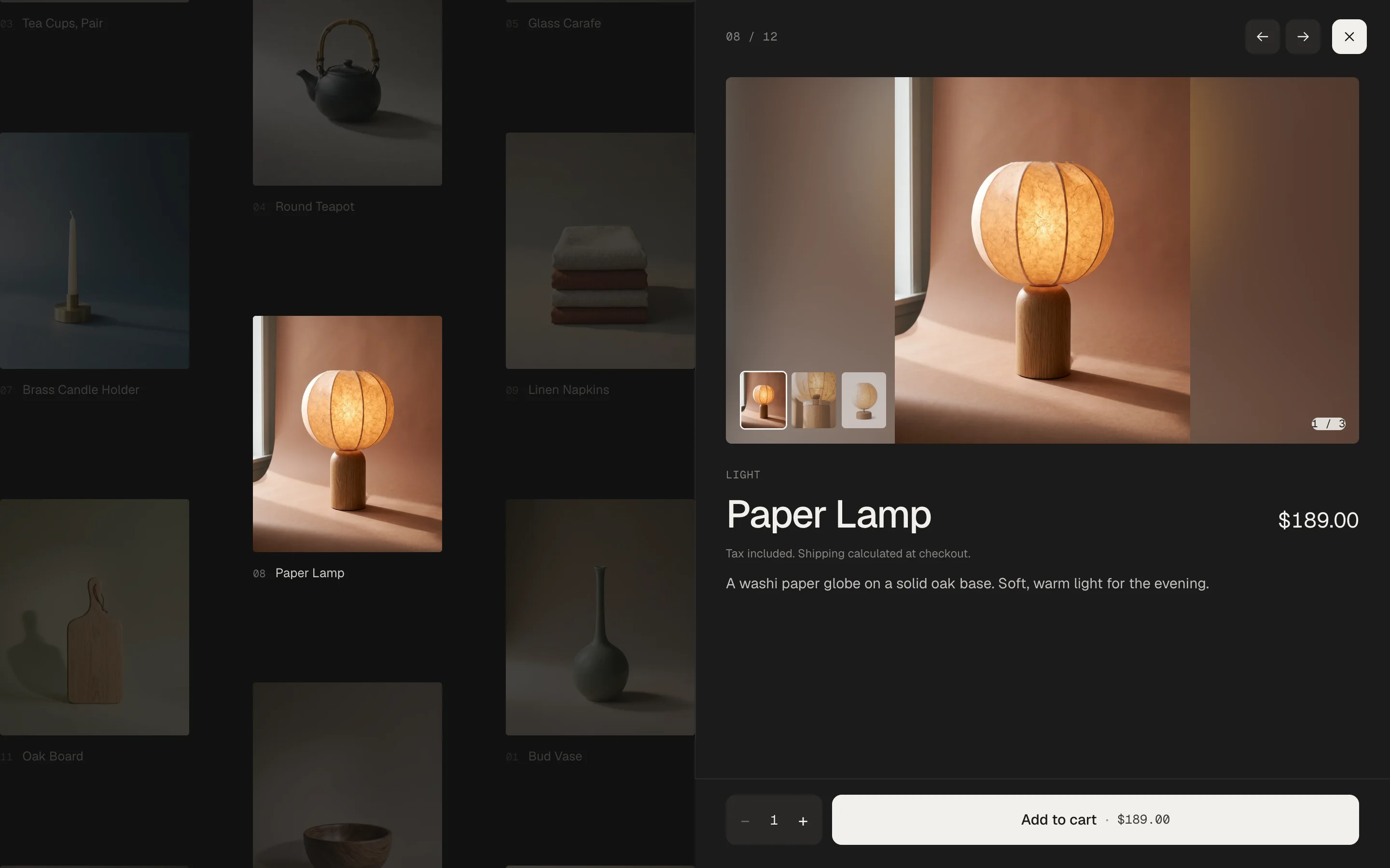
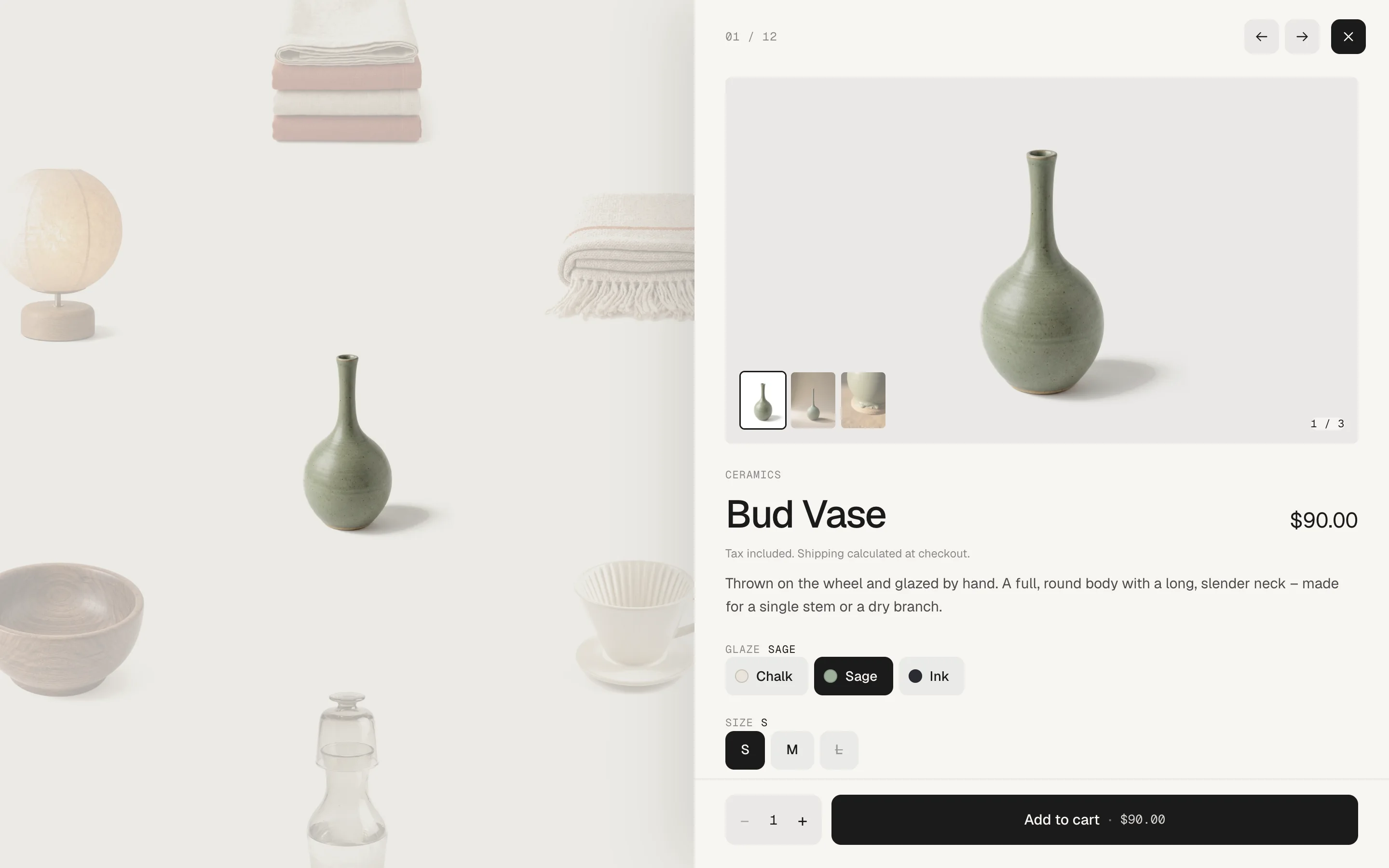
A full-screen canvas that never ends – your collection repeats in every direction, staggered like a pinboard. Visitors drag, throw and scroll through it, filter by type and zoom. A click glides the product into the free half of the screen and opens a panel with all pictures, variants, quantity and add to cart. Two looks – Studio with cut-outs floating on a calm surface, Gallery on a dark stage with captions.
In your theme code editor (Online Store → ⋯ → Edit code), click the sections folder, then “New File”, name it and hit Enter.
02
Paste the code
In the file that just opened, paste the code below. Then hit Save (top right corner).
Note: Shopify shows no confirmation when a section saves – that’s normal.
03
Add it in the theme editor
Saved? Then reload the theme editor – otherwise the new section sometimes doesn’t show up. After that: Edit theme → Add section → . Everything else is in the sidebar – the Docs below explain every setting.
Code
One file. Copy it, paste it, done.
sections/werk-product-canvas.liquid
Locked
{%- comment -%} werk · Product Canvas · v1.2.0 · werk.build/license – do not remove {%- endcomment -%}{%- liquid assign s = section.settings # Demo pictures and fonts load from the werk demo store's Files (Shopify CDN), so the section looks the same in any store. assign werk_cdn = 'https://cdn.shopify.com/s/files/1/0954/8303/5932/files/' assign sans_url = werk_cdn | append: 'werk-geist.woff2' assign mono_url = werk_cdn | append: 'werk-geist-mono.woff2' if s.font_url != blank assign sans_url = s.font_url endif if s.mono_font_url != blank assign mono_url = s.mono_font_url
3105 lines · Liquid, CSS & vanilla JS
Free – just add your email
Every section is free during launch. Enter your email once and copy any code you like.
Product Canvas fills the screen and the mouse wheel moves the canvas, not the page. Put it on a page of its own (Online Store → Pages → a new page with its own template) or first on your home page.
2
Add the section
Edit theme → open that page → Add section → – Studio or Gallery. It shows our twelve demo objects until you pick your products.
3
Pick a collection
Click the section and choose a Collection. Its products fill the canvas, in the collection's order. Want a hand-picked set instead? Add Product blocks – they replace the collection.
4
Click a product
Preview the page, drag the canvas and click a tile: the panel opens with pictures, variants and add to cart.
Two looks
•Studio – A calm, light surface with your products floating on it. Name and price appear under a tile when the mouse rests on it, with a small cursor dot that says View.
•Gallery – A dark stage with a number and name under every picture. On hover the tile shows the product's second picture.
StudioGallery
Moving around
Drag with the mouse or a finger – let go while moving and the canvas glides on. The mouse wheel and trackpad move it in both directions, the arrow keys too. The columns sit half a tile apart, like a pinboard, and next to each other there are never two of the same product.
Opening a product
A click glides the product into the middle of the free half of the screen, the rest steps back, and the panel slides in from the right. On phones it rises from the bottom as a sheet.
← and → in the panel go to the products next to it on the canvas – the canvas follows. Close with ✕, Esc, a click on the canvas, the back button or – on phones – by pulling the sheet down.
Collection
Default · Empty
Its products fill the canvas, up to the number below. Leave it empty to show our demo objects.
Products shown
Default · 24
How many products of the collection come onto the canvas – few products simply repeat more often.
Tile size
Default · Medium
The size of the tiles at the start. Visitors can still zoom one step smaller and one bigger.
Small
Medium
Large
Tile format
Default · Portrait 4:5
The format of every tile. Portrait suits most packshots.
Portrait 4:5
Square 1:1
Landscape 4:3
Pictures
Default · Cut-outs – whole object, white melts away
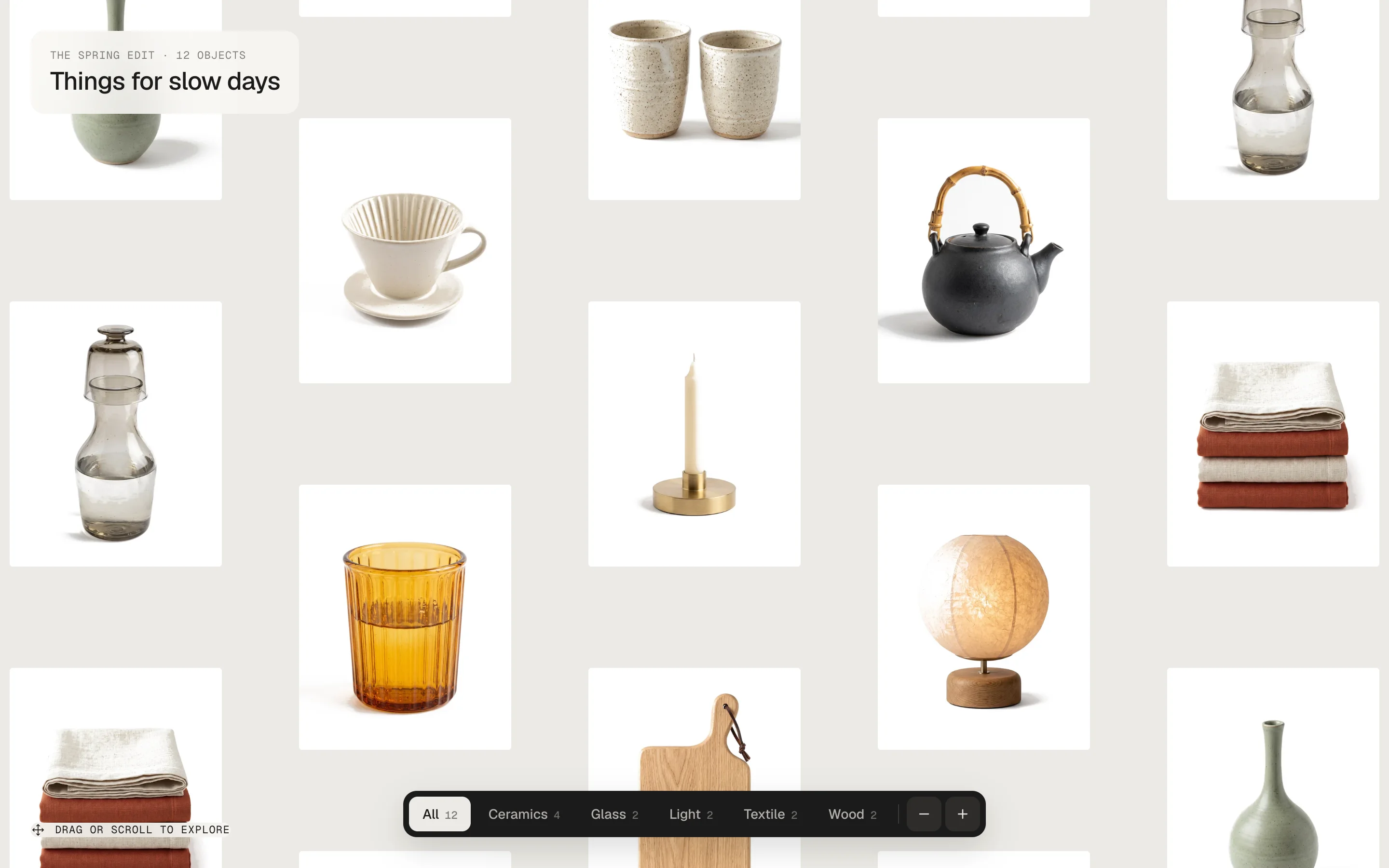
Fill the tile crops the picture to the tile. Cut-outs show the whole object – in Studio white becomes the canvas colour.
Fill the tile
Cut-outs – whole object, white melts away
Fill the tileCut-outs
Info on hover
Default · On
Studio: name and price under the tile. Gallery: the second product picture. Only with a mouse – touch goes straight to the panel.
Cursor label
Default · View
The word next to the orange dot that follows the mouse over a tile. Leave it empty for the dot alone.
Zoom buttons
Default · On
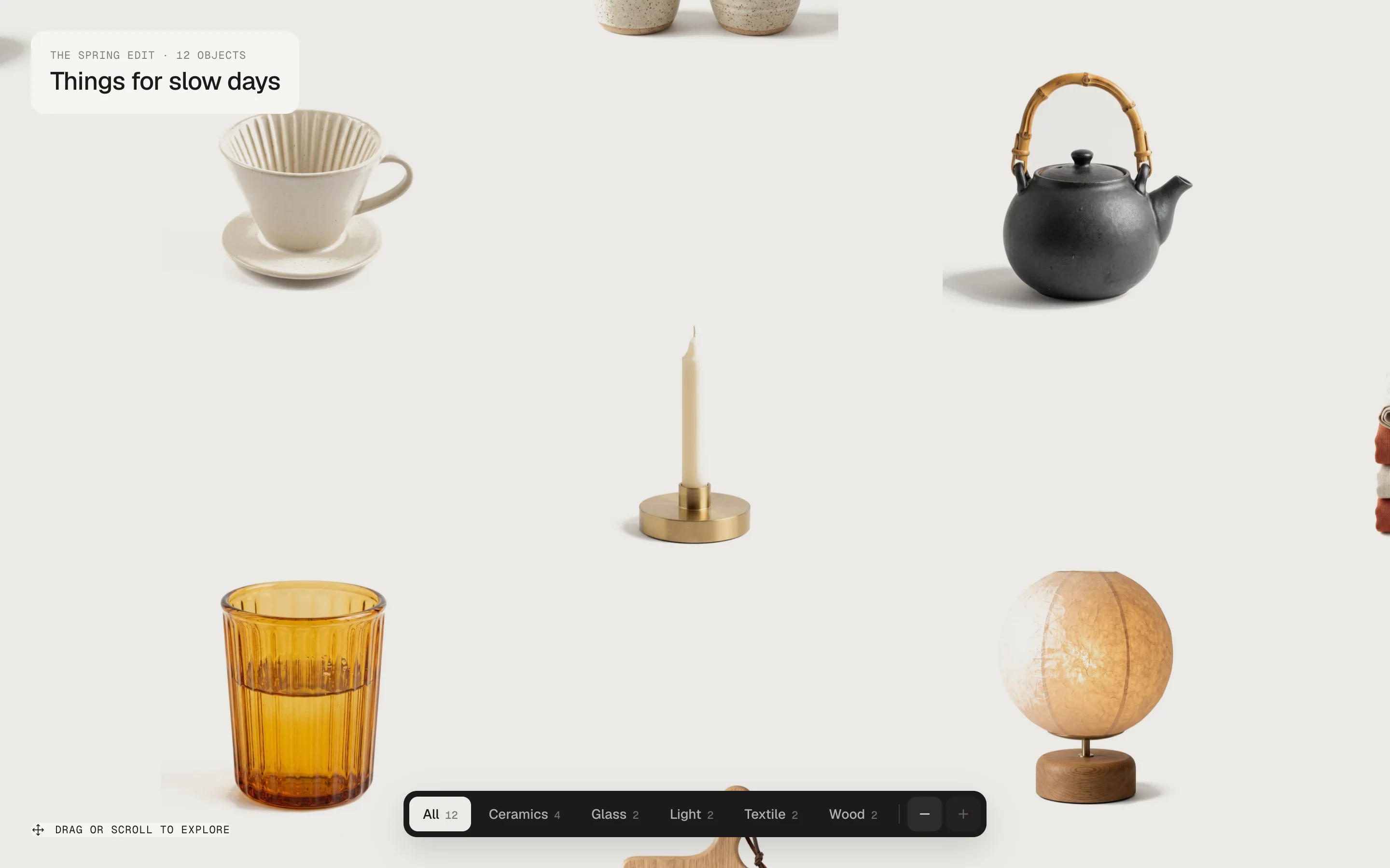
The − and + in the dock: 75 %, 100 % and 135 %, the middle of the screen stays where it is.
SmallerBigger
Show hint
Default · On
A small note in the corner that disappears after the first move. It moves above the dock when a long intro or a wide dock would touch it.
Hint
Default · Drag or scroll to explore
The text of the hint.
Drag speed
Default · Normal
How far the canvas moves per centimetre of dragging – and how far a throw carries it.
Calm
Normal
Fast
Wheel speed
Default · Normal
How far one turn of the mouse wheel or a trackpad swipe moves the canvas.
Calm
Normal
Fast
Logo
Default · Empty
Your logo above the text.
Logo width
Default · 96px
The logo's width.
Eyebrow
Default · The spring edit · 12 objects
The small mono line, e.g. the name of the edit and the number of products.
Heading
Default · Things for slow days
The heading of the canvas. It also names the canvas for screen readers.
Card style
Default · Glass
How the card sits on the canvas.
Glass
Solid
None – text only
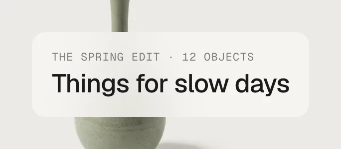
GlassGlass – frosted, the tiles shimmer through
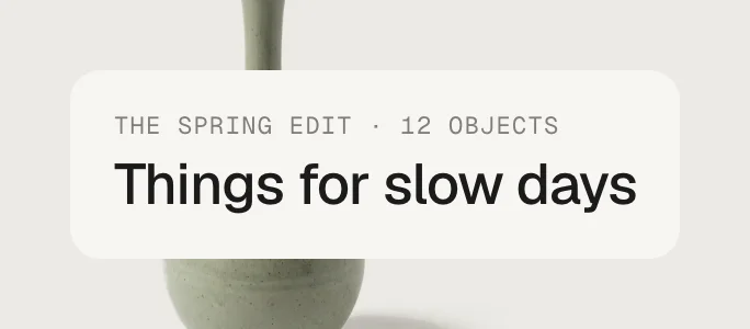
SolidSolid – the panel colour, nothing shows through
NoneNone – only the text on the canvas
Only Glass – the two products fill the canvas
Filter by
Default · Product type
Product type, Tags or Block group (the field Group of each product block). The chips only show with at least two groups.
No filter
Product type
Tags
Block group
Tag prefix
Default · Empty
With Tags: only tags starting with this become chips – e.g. canvas: for canvas:Ceramics. The prefix is cut off in the chip.
First chip
Default · All
The first chip, which shows everything again.
Panel width
Default · 50%
From 990 px wide. Tablets use 70 %, phones a sheet of 88 % of the screen.
Line above the title
Default · Product type
The small line above the title.
Nothing
Vendor
Product type
All product pictures
Default · On
All product pictures with thumbnails – on phones and tablets you can also swipe sideways on the big picture. Off: only the first picture. A variant with its own picture shows it when it is picked.
Short description
Default · On
The first 42 words of the product description, as plain text.
Quantity
Default · On
The − 1 + next to the button.
After add to cart
Default · Stay – the button says “Added”
Stay keeps the panel open – the button rolls to Added. Open the theme's cart opens your theme's cart drawer (Horizon, Dawn and themes built on them), or the cart page.
Stay – the button says “Added”
Open the theme's cart
Link to the open product
Default · On
Every open product gets its own address – ending in #product-handle. Share it, and the canvas opens with that product. The back button closes the panel.
Variants
Every option of the product becomes a row of buttons. Options with Shopify swatches (colour or picture) show them as a dot. Values that are sold out together with the other picks are crossed out, and the button says Sold out.
Gallery: the panel takes the dark colours
Adding goes straight to the cart and tells your theme – the cart count in the header updates without a reload (Horizon, Dawn and themes built on them).
Theme editor
Product Canvas
Product: Bud Vase
Product: Tea Cups, Pair
Product: Paper Lamp
Product
One tile per block, in the order of the blocks. Up to 50.
SettingWhat it doesDefault
ProductThe product on the tile and in the panel.Empty
Tile pictureA picture just for the tile – e.g. a cut-out on white. Otherwise the product's first picture.Empty
GroupFor the filter Block group – e.g. Ceramics.Empty
Fonts
Default · Design fonts
Geist and Geist Mono from werk's CDN. Use theme fonts swaps every font at once. Or swap each one with its own URL – Self-hosted font URL replaces Geist; Label font URL replaces Geist Mono (the small labels and numbers). Empty keeps werk’s font.
Colors
Default · Design colors
Canvas, canvas text, panel, panel text, button and button text – or Use theme colors, which takes the colours of the page around the section and mixes the panel from them.
Off: no gliding and no fading – the canvas jumps. Dragging always works. Visitors who turned on “reduce motion” on their device always see it like this.
Easing
Default · werk Signature
The curve of the panel and of the canvas gliding to a product.
werk Signature
Smooth
Bounce
Snap
Glide
werk SignatureSlow start, soft landing
SmoothEven and quiet
BounceThe panel shoots a little past
SnapQuick start, gentle stop
GlideSlow in, slow out
Add to cartAdd to cartThe button in the panel
AddedAddedThe button right after adding
Sold outSold outThe button, and the label on sold-out tiles
Choose an optionChoose [option]The button while an option has no pick
Price fromfrom [price]Under a tile when the variants have different prices
Link to the product pageView full detailsUnder the variants – empty hides it
Note under the priceTax included. Shipping calculated at checkout.Under the title – empty hides it
ErrorCouldn't add it to the cart. [message]Under the button
[option]The name of the first option nobody pickedChoose [option]→Choose Size
[price]The lowest price of the productfrom [price]→from $90.00
[message]The reason Shopify givesCouldn't add it to the cart. [message]→
The texts for screen readers (Screen reader: …) name the canvas, the buttons and the pictures.
Desktop · panel on the right
Tablet · panel 70 %
Phone · sheet from the bottom
DesktopTabletPhone
PanelRight, Panel width (40–60 %)Right, 70 %Sheet, 88 % of the screen – pull it down to close
DockCentred at the bottomCentred at the bottomFull width, the chips scroll sideways
HintBottom leftTop rightAbove the dock
Hover info and cursorYesWith a mouseNo – a tap opens the product
TabletPhone
Full screen on purpose
The canvas is as high as the screen and takes the mouse wheel. Below it, visitors reach the rest of the page with the scrollbar or the keyboard – that's why it belongs on a page of its own or at the very top.
Keyboard and screen readers
Tab goes through a hidden list of all products – each one moves to the middle with a ring, Enter opens it. Arrow keys move the canvas, + and − zoom.
The editor opens the product
Pick a product block and its panel opens.
Light on the page
Only as many tiles as fit on the screen exist – they are reused while you move. One loop, and only while something moves. No libraries.
AI label
Using an AI-generated picture? Switch on AI label under that picture and pick a corner. The text and the look – pill, info dot or upright along the edge – are set once for the whole section, under AI label. Only for own tile pictures – product pictures never get one.
Horizon4.2TestedAdd to cart, theme fonts, colours and buttons
Dawn16TestedAdd to cart (cart bubble updates), theme fonts, colours and buttons
A picture is cut in the wrong place.
Only when the tiles are filled, not with cut-outs. Set a focal point on the picture in Shopify (Products → the product → click the picture → Edit, or Content → Files for a block picture) – the tile keeps that spot in view.
I can't scroll past the section.
The canvas takes the mouse wheel – it's meant to be the only thing on its page or the first on the home page. Move it, or use the scrollbar / keyboard to get below it.
My pictures sit in white boxes.
Your packshots have a white background and Pictures is set to Fill the tile. Set it to Cut-outs (Studio), or give the products a Tile picture.
The cut-outs show a light grey box.
The background of the picture isn't quite white. Lift it to pure white (or use a PNG without background).
There is no filter.
It shows from two groups on: check Filter by – the products need different product types, tags with your prefix, or a Group on the blocks.
Swatches don't show, only words.
Add swatches to the option values in Shopify (Products → the product → the option) – the panel shows them as dots.
The cart count doesn't update.
Your theme doesn't listen for the cart events of Horizon or Dawn. Use After add to cart → Open the theme's cart, or reload the page.
1.2.011 Oct 2026
NewAI label per picture (EU AI Act). Under every own picture and video a switch with the corner; the text and the look – pill, info dot that opens on hover, or upright along the edge – are set once under AI label. Off by default, nothing changes until you switch it on. Product and collection pictures from Shopify never get one.
NewThe old single note (Show AI label) is replaced by the labels per picture. Its setting stays, but only shows in the editor while it is on – turn it off and switch the label on at the picture. AI label is now the text of the labels.
1.1.16 Oct 2026
NewCropped pictures keep the focal point you set on the image in Shopify (Content → Files or the product media) in view – the tile pictures when they fill the tile. Before, they were always cut around the centre.
1.1.06 Oct 2026
NewLabel font URL (Fonts) – swap Geist Mono, the small labels and numbers, for your own .woff2. With Self-hosted font URL every font can now be swapped on its own; Use theme fonts still swaps all of them.
1.0.65 Oct 2026
NewTouch: swipe sideways on the big picture to go through the product's photos. The picture follows the finger; past ~50 px or a quick flick it turns, otherwise it springs back, with a rubber band at the first and last photo. Up and down still scrolls the sheet, thumbnails still work. Mouse unchanged (thumbnails).
1.0.55 Oct 2026
NewPhones (≤ 749 px): tiles, filter chips and zoom work again. The dim layer behind the product sheet stayed on top of the canvas while invisible and swallowed every tap; it only catches taps now while the sheet is open (a tap on it closes the sheet).
1.0.45 Oct 2026
NewThe hover cursor no longer flies in from the top-left corner: its position sat in transform, which the grow-in scale shrank too, so it started at 60 % of the way. The position now lives in translate.
NewQuick sweeps across the canvas keep the cursor between tiles (gaps under 140 ms don't hide it), and when it appears it starts on the pointer. It follows a little tighter.
* Built for Online Store 2.0 and tested in Shopify's Horizon and Dawn themes. Heavily customised or older themes can still clash with it – if something looks off, write us and we'll take a look.

 Canvas#ECEAE5The surface (Studio) – Gallery #121211Canvas text#1C1B1ACaptions, dock (Studio)Panel#F7F6F3Panel, intro card, hintPanel text#1C1B1ATitle, price, variantsButton#1C1B1AAdd to cart (Gallery: #F2F0EB)Button text#F7F6F3Text on the button