Product
Product Finder
Ask with picture tiles, lists or colour swatches, or let visitors swipe cards – love it or not. Every answer gives points to your results; the best one shows with a score profile and its products, with add to cart right there. Liked product cards come first. Three looks, a check in the theme editor that shows which answer counts for which result, a shareable result link and analytics events.
- Access
- Free
- Page types
- Home, Landing pages, Collection
- Compatibility
- All Shopify 2.0 themes*
- Styles
- 3
- Customise
- 122 settings · 6 block types
Installation
Takes about two minutes. No app needed.
- 01
Create a new section
In your theme code editor (Online Store → ⋯ → Edit code), click the sections folder, then “New File”, name it and hit Enter.
- 02
Paste the code
In the file that just opened, paste the code below. Then hit Save (top right corner).
Note: Shopify shows no confirmation when a section saves – that’s normal.
- 03
Add it in the theme editor
Saved? Then reload the theme editor – otherwise the new section sometimes doesn’t show up. After that: Edit theme → Add section → . Everything else is in the sidebar – the Docs below explain every setting.
Code
One file. Copy it, paste it, done.
Free – just add your email
Every section is free during launch. Enter your email once and copy any code you like.
Already signed up?
More like this
Docs
How a quiz becomes a result – steps, points, results and every setting. All in the theme editor, no code, no app.
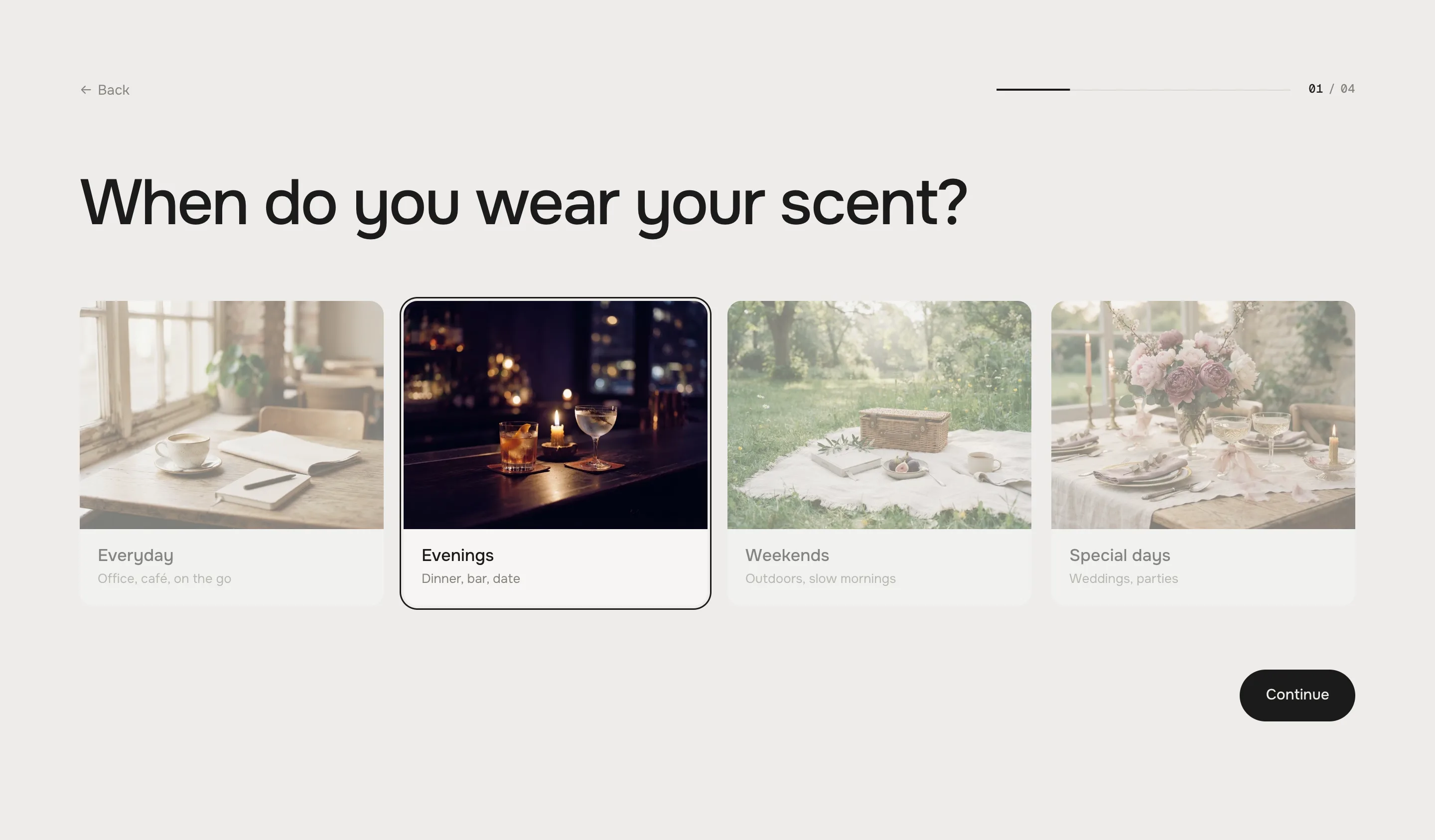
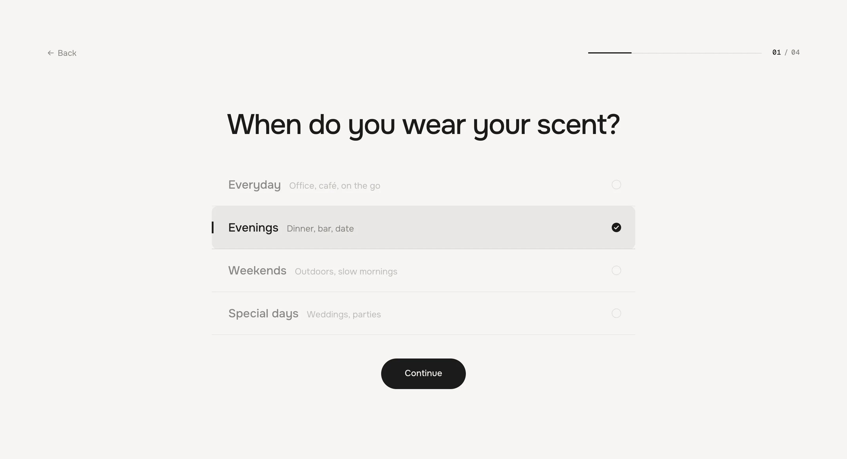
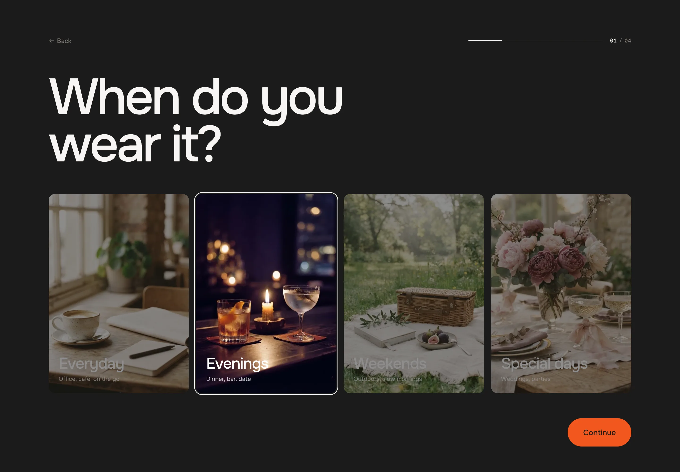
- 1
Open a page
In the theme editor, pick the home page or a landing page. - 2
Add the section
Add section → . Pick Classic, Minimal or Bold – each comes with the scent demo, so you see a full quiz right away. - 3
Name your results
Open the Result blocks: give each a short Key (e.g. woody), a title, a picture and its products. - 4
Write your steps
Change the questions and answers, or the swipe cards. Every answer says which result keys it gives points to. - 5
Check the check
Above the section the editor shows every answer against every result – fix what it flags, then save.
- 1
Results and keys
Each Result block has a Key – a short word like woody. Answers and cards point to these keys. Keys are written in lower case without spaces; Woody, woody and „woody “ are all the same key.
One step, then its answers
Blocks form one flat list. A Question or Swipe block opens a step; the Answer or Card blocks below it belong to it, up to the next step. Result blocks can sit anywhere – they don't break a step.
Theme editor
Result: The FiresideQuestion: When do you wear your scent?EverydayEveningsAnswerSwipe: What speaks to you?Summer meadowCard:Sel MarinCard:Fair steps
Every step counts the same, however many answers or cards it has: its points are scaled so the best a result can get in that step is 1. Weight of this step makes one count more (2 = double) or less (0.5 = half).
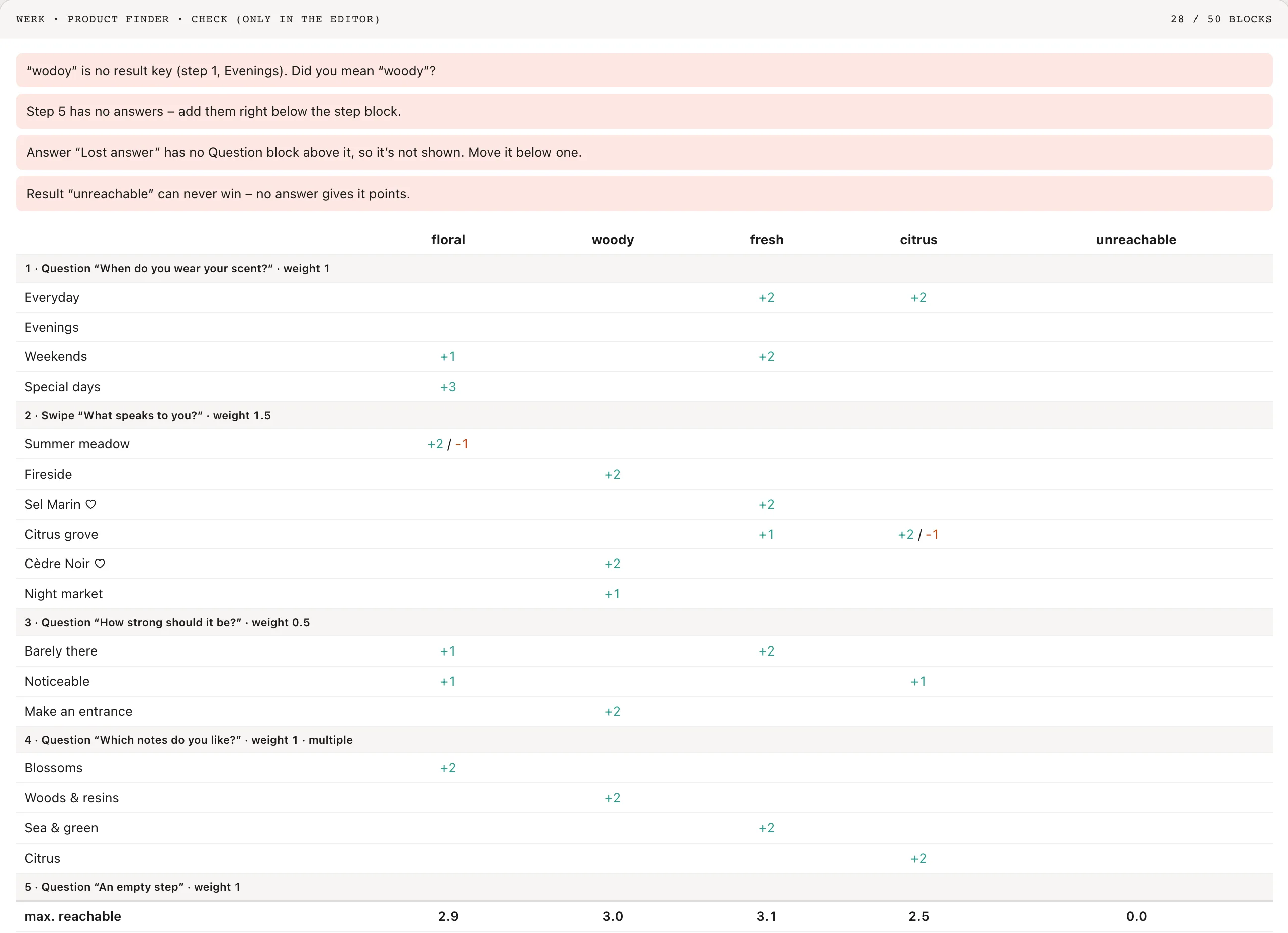
The check: a typo in a key, an answer without a question, a result nobody can reach – and every answer against every result Who wins
The result with the most points. On a tie, the one higher up in the block list. If nothing scored, the result with Show when nothing scores – or the first one.
Show intro
Default · OnOff: the first step shows right away.
Show progress
Default · OnOne thin line that fills up to the current step, with the step number next to it (02 / 04) – it rolls when you move on.
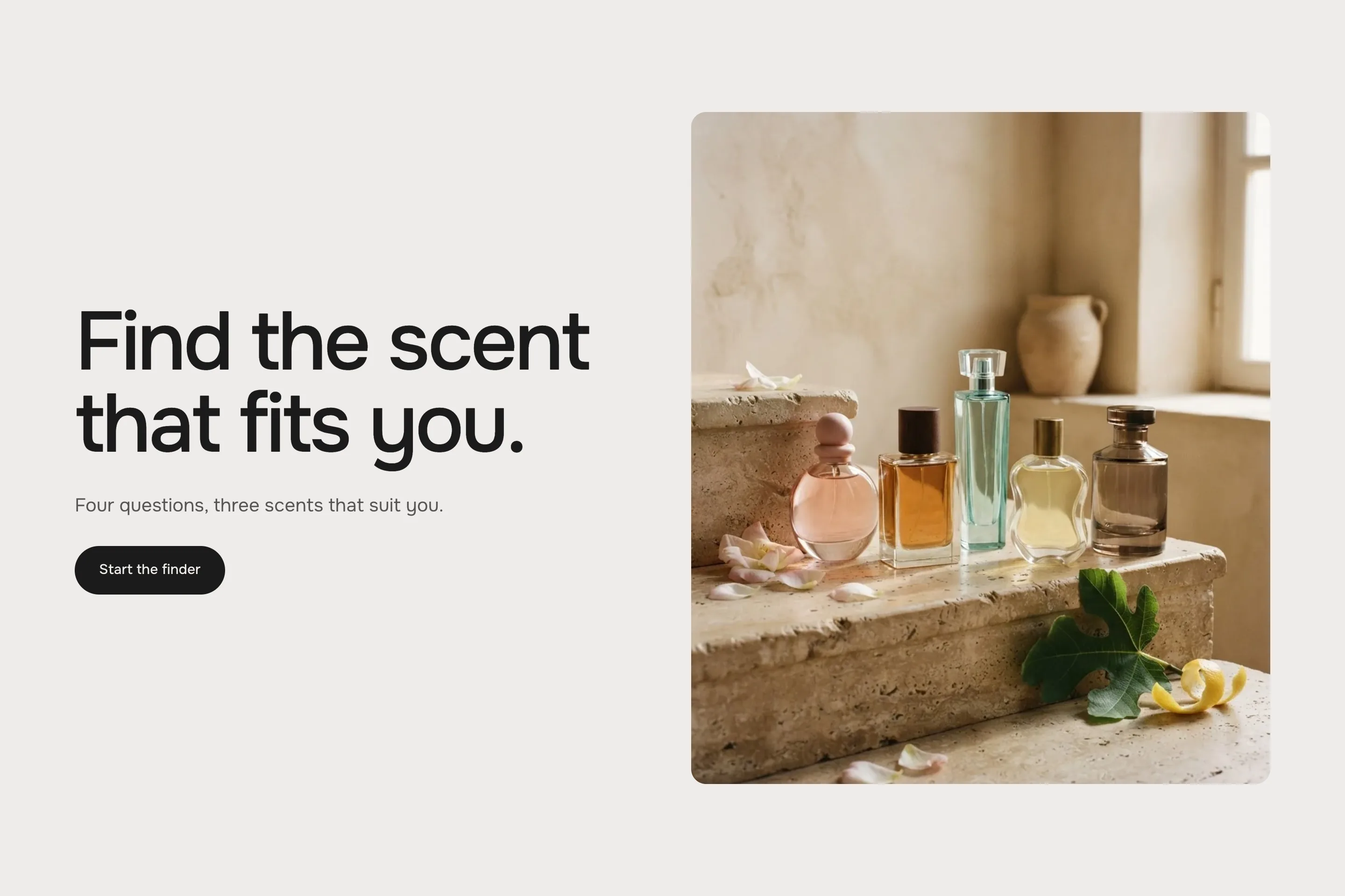
The intro with its picture – Classic and Bold Back goes one step back – in a swipe step it first takes back the last card. Continue stays off until an answer is picked; on the last step it says See my result.
Step: Question
SettingWhat it doesQuestionThe big heading of the step.HintOptional short line below it – worth it where it tells something, e.g. Pick as many as you like.Step nameOptional, e.g. Intensity – for the editor check and the analytics events.AnswersPick one (radio buttons) or Pick several (check boxes). A picked tile gets a ring that settles onto it, a picked row a soft tint with an ink bar that glides from row to row; the other answers step back.LayoutPicture tiles, List or Color swatches.Weight of this step0 to 3, default 1.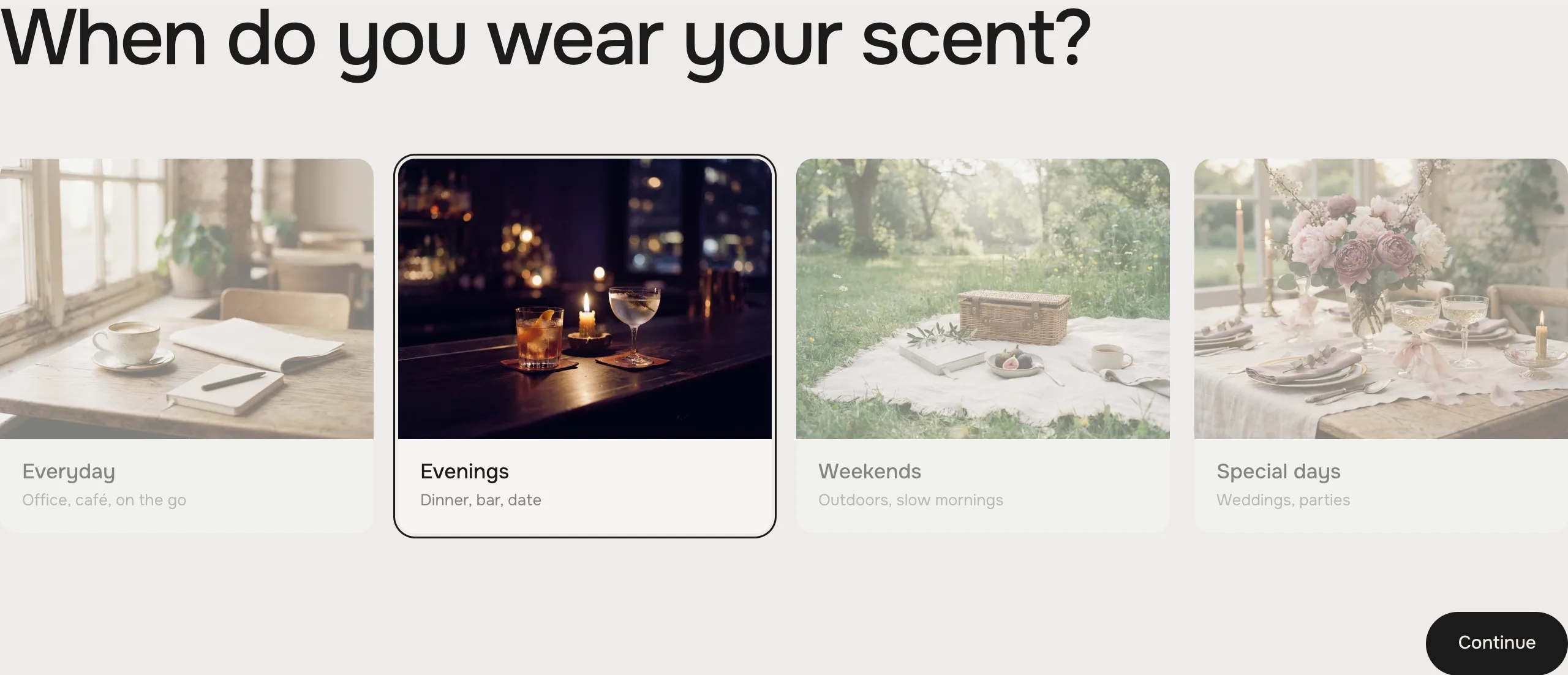
Picture tilesPicture tiles – four in a row, two on phones 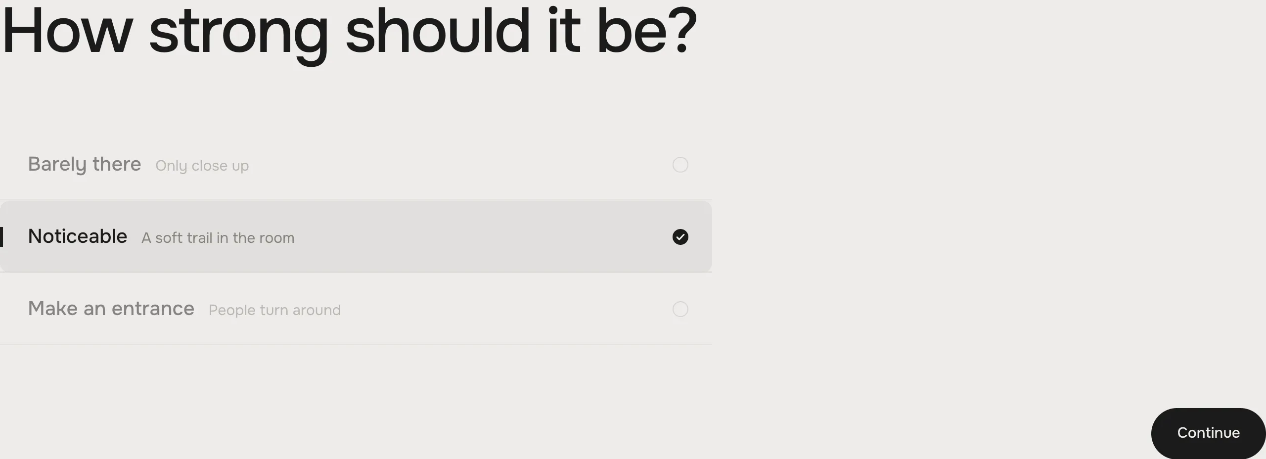
ListList – numbered rows, the picked one fills 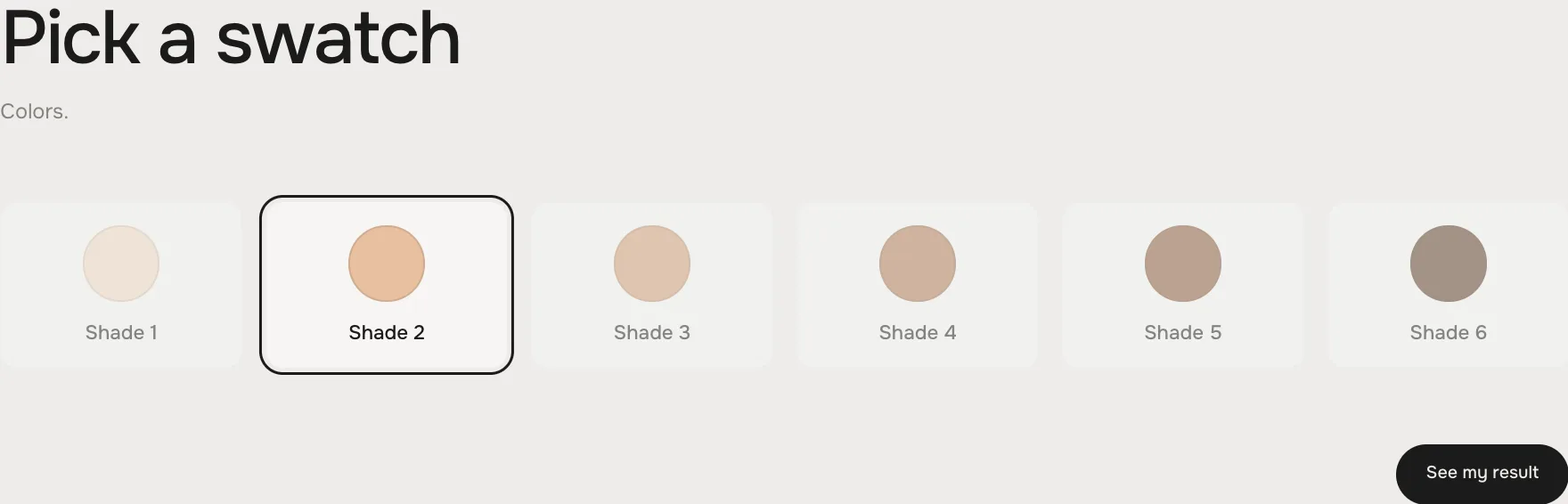
Color swatchesColor swatches – a round swatch per answer, e.g. for shades Answer
SettingWhat it doesLabel / Sub labelThe answer and a short line under it.ImageFor picture tiles. Without one the tile is text only.SwatchFor color swatches.Result 1–3 · PointsUp to three result keys and 0–3 points each.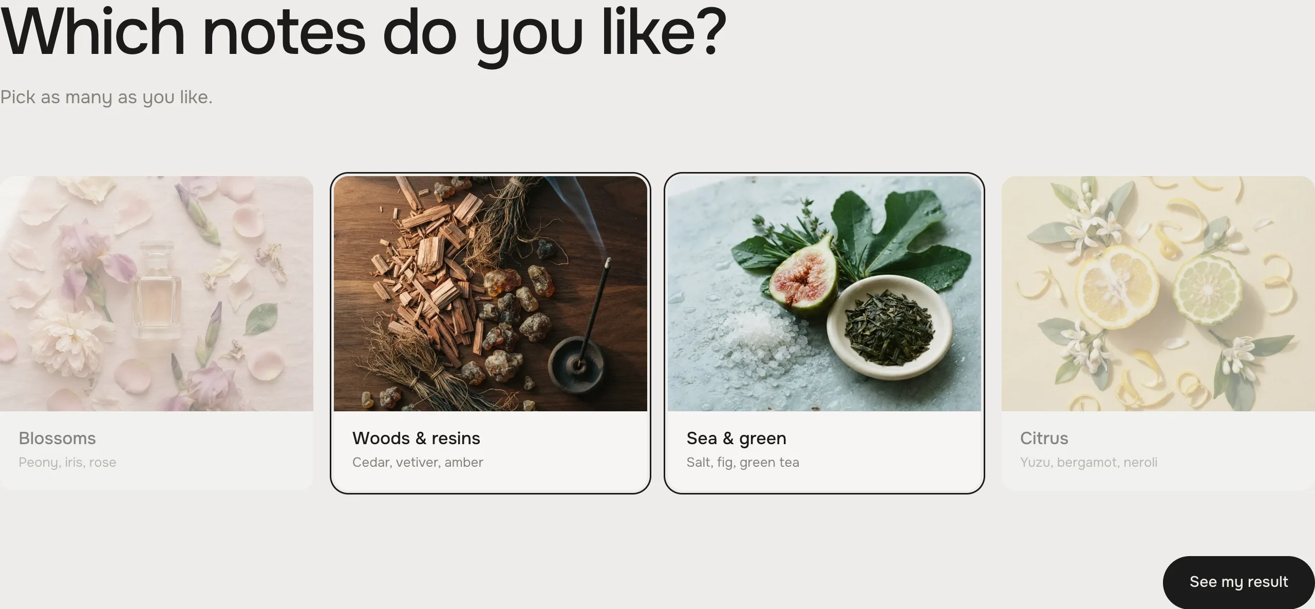
Pick several: every picked answer counts 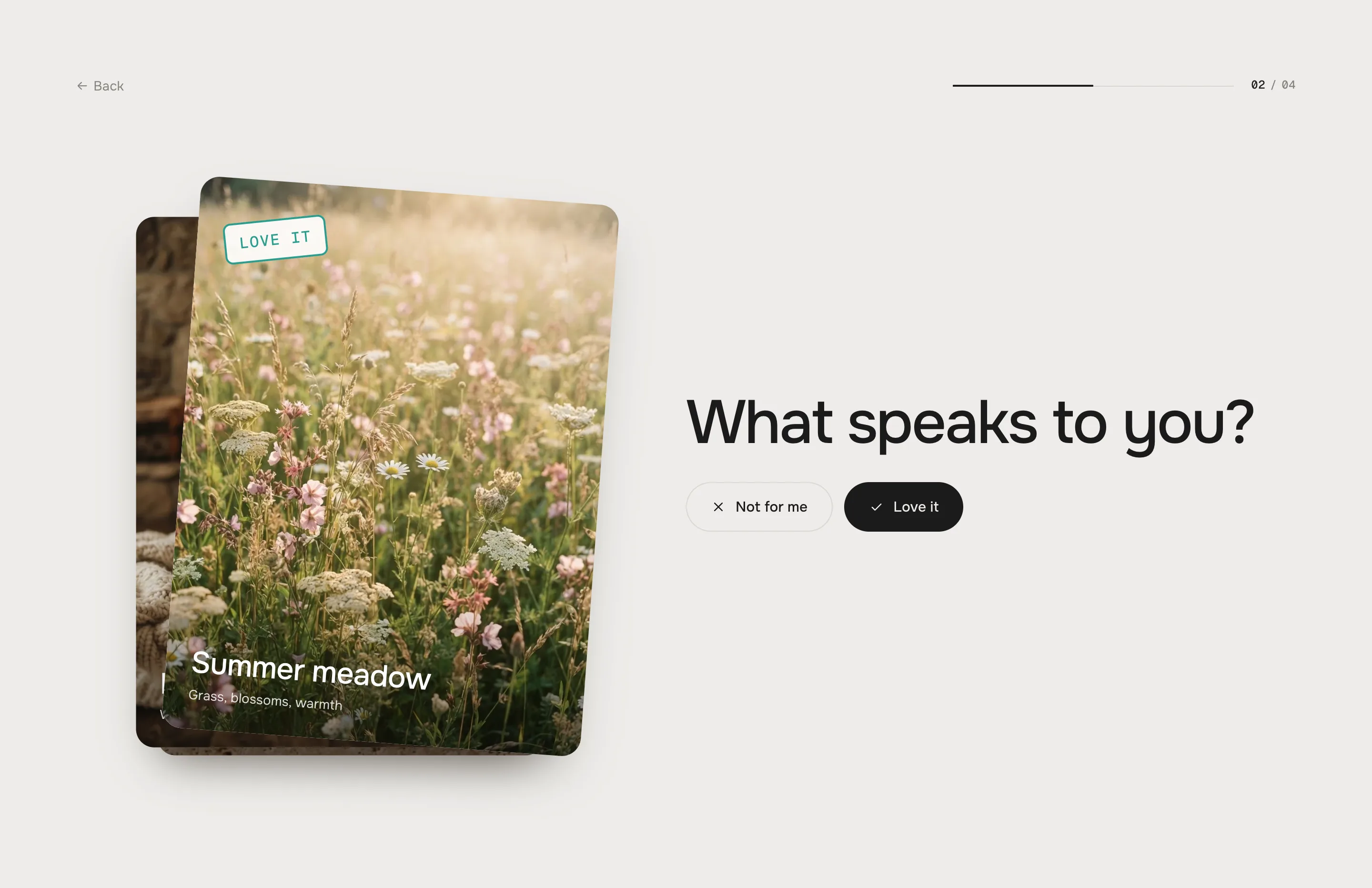
Dragging right shows Love it, left Not for me Step: Swipe
SettingWhat it doesHeading / HintThe heading next to the stack and a short line.Step nameOptional, e.g. Moods.Like / NopeThe button texts – also on the stamps while dragging.Weight of this stepAll cards together count like one step.Card: Image
SettingWhat it doesImage · Label · Sub labelThe card.On „Love it“Up to two result keys with 0–3 points.On „Not for me“One result key with 0 to −3 points – a no can count against a result.Card: Product
SettingWhat it doesProductPicture, title and price come from the product.Instead of the priceOptional, e.g. Eau de parfum.Show in the result when likedA loved product card comes first in the result, tagged Liked by you.After the last card the step moves on by itself.
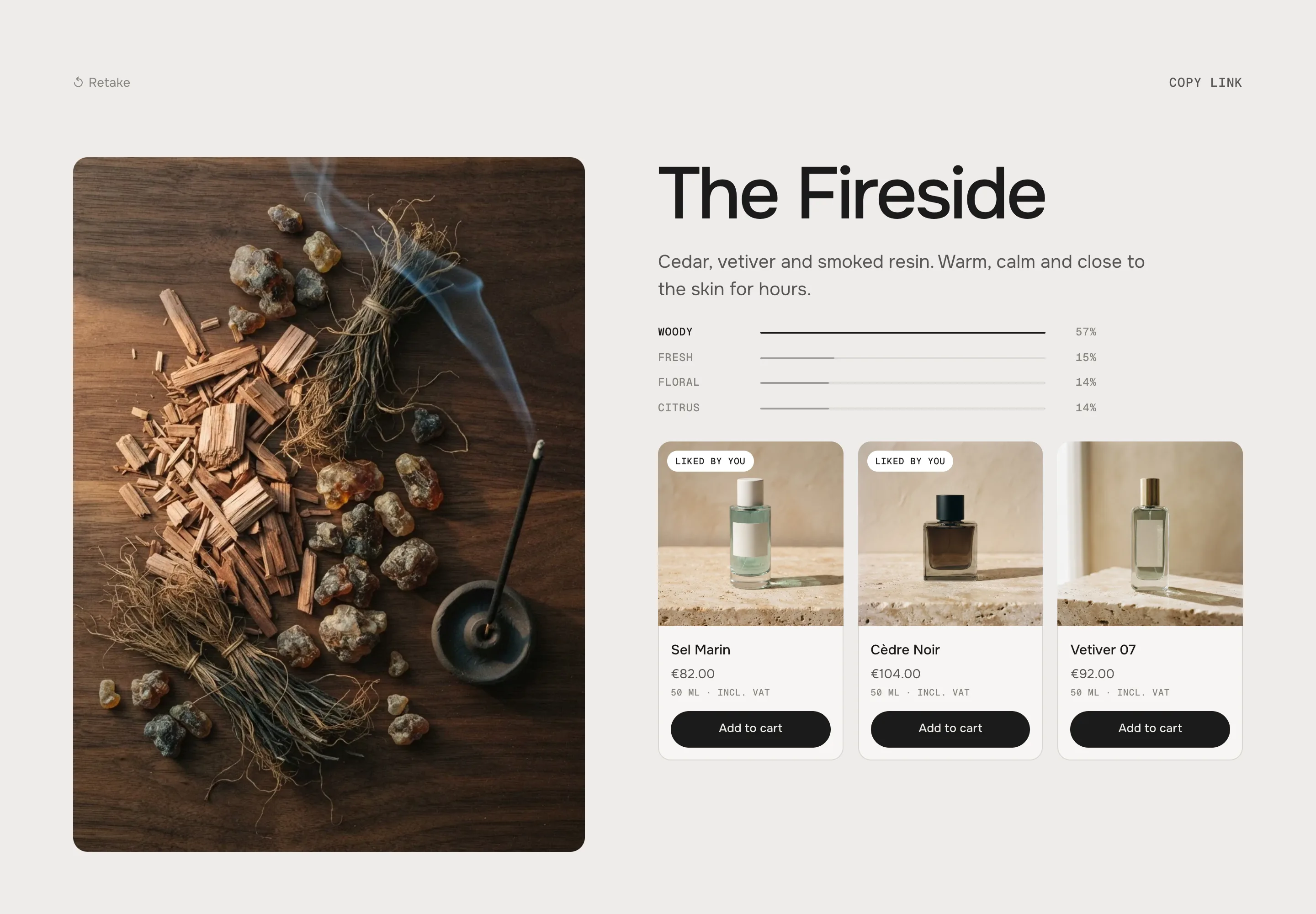
The Fireside: profile, then the liked products first Result
SettingWhat it doesKeyShort and unique, e.g. woody. Answers and cards point to it.Title · Text · ImageThe result. Minimal shows no picture.Profile labelIts name in the score profile, e.g. Woody. Empty = the key.ProductsUp to 8. Single-variant products get add to cart, others link to the product (Choose options).Link text · LinkOptional, e.g. Shop all woody scents.Show when nothing scoresThe fallback.Show the score profile
Default · OnHow much of each result is in the answers, as shares – thin lines in Classic and Bold, one bar in Minimal.
Max. products
Default · 3Liked product cards count in. Duplicates show once.
After add to cart
Default · Stay on the resultOpen the cart opens your theme's cart drawer (Horizon, Dawn) – or goes to the cart page.
Prices show the unit price when the product has one, and your Tax note next to it.
- Keyboard hint (screen readers)Use the left and right arrow keysRead out on the swipe stack, not shownLiked tagLiked by youOn products that were loved
Fonts
Default · Design fontsOnest and Geist Mono from werk's CDN – or Use theme fonts, which swaps every font at once. Or swap each one with its own URL: Self-hosted font URL replaces Onest, Label font URL replaces Geist Mono (the small labels and numbers). Empty keeps werk's font.
Colors
Default · Design colorsBackground, text, muted text, tiles and cards, lines, the accent (Bold: the winning line in the profile and the buttons), Love it and Not for me – or Use theme colors, which takes the colours of the page around the section. Bold's preset starts dark. Button and Button text give the buttons their own colours – empty keeps the design.
Buttons
Default · CleanUse theme buttons gives Start, Continue and Add to cart your theme's style. Button style sets how buttons and links react on hover.
Hover them – click a button for loading → added
Shop all woody scents CleanGrows a touch, the underline runs out and back Shop all woody scents Dot to arrowThe dot grows into an arrow Shop all woody scents Rolling textThe label rolls up, a copy follows Shop all woody scents FillColour wipes in from the left Shop all woody scents ShineA band of light passes over Animations & easing
Default · On · werk SignatureSteps slide in, cards fly out, bars grow. Visitors who turned on “reduce motion” on their device see the steps change without movement.
werk SignatureSlow start, soft landing SmoothEven and quiet BounceA small overshoot SnapQuick start, gentle stop GlideSlow in, slow out Padding top
Default · 72pxThe space above the section. Padding bottom works the same below it.
Side padding
Default · Match themeMatch theme (the default) lines the section up with your theme's page margin – in Horizon the same edge as header and footer. Themes without one, like Dawn, keep the werk edge. werk default always uses the werk edge, Custom takes your own values in px (desktop and tablets / phones), None runs the content to the edge.
Desktop · Classic result 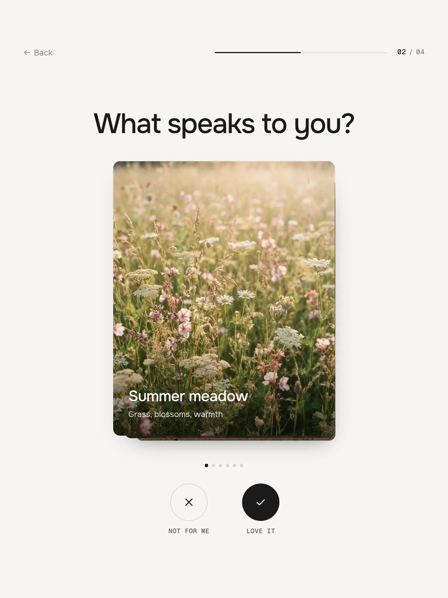
Tablet · Minimal swipe 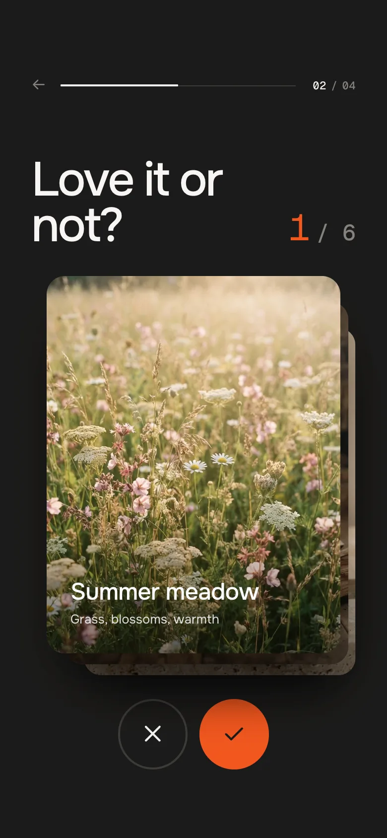
Phone · Bold swipe DesktopTabletPhonePicture tilesFour in a rowTwo in a rowTwo in a row, label onlySwipeStack next to the headingHeading, stack, buttonsHeading, stack, buttons side by sideContinueAt the rightAt the rightFull width, stays at the bottom while you scrollResult productsThree in a row (Bold: four)Three in a rowA swipe row (Bold: a list)Works without a mouse
Questions are real radio buttons and check boxes. In a swipe step the arrow keys decide, and screen readers hear every decision and the result.
In the theme editor
Click a block and the section shows its step or result. The check above the section updates whenever you change a key or points.
Fits the screen
Every step and the result fit the window below your header – nobody scrolls in the middle of the quiz. If a step is too tall, the whole section scales down a little (never so far that text gets hard to read).
Two finders on one page
They don't share anything. Give the second one its own Link parameter.
AI label
Using an AI-generated picture? Switch on AI label under that picture and pick a corner. The text and the look – pill, info dot or upright along the edge – are set once for the whole section, under AI label. Product pictures from Shopify never get one.
Horizon4.2TestedAdd to cart updates the cart count, theme switches measuredDawn16TestedAdd to cart updates the cart bubbleAn answer doesn't show up.
It's above the first step, or under a Swipe block (cards go under Swipe, answers under Question). The check names it.
A result never wins.
No answer or card gives it points – or only a few. The check shows the most it can reach.
The same result always wins.
One step hands it far more points. Lower that step's weight, or give the other results points there too.
Add to cart says Choose options.
The product has several variants – the button links to the product page so the visitor picks one.
The result link opens the intro.
The key in the link doesn't match a result key, or Link parameter was changed after the link was copied.
- ImprovedCleaner: no eyebrows (intro, steps, result), no “4 steps · 1 min”, no hints next to Continue, no card counter or keyboard line under the swipe buttons, no “Product” / “Your result” tags, no “Picked for you” heading, no answer numbers, no arrow in the buttons. The settings for these texts stay (hidden), so saved settings keep working; the keyboard hint is now read out to screen readers only.
- NewProgress: one hairline that fills up step by step and a rolling step number (02 / 04) instead of segments with step names.
- NewChoices from the werk option presets (Glide): a picked tile gets a ring that settles onto it (the old one fades – nothing travels across the pictures), a picked row a soft tint with an ink bar that glides from row to row and a tick that draws itself; the other answers step back. Bold no longer frames picked tiles in orange.
- NewMotion: the old step leaves quickly, the new one builds up – the heading rises word by word, then the answers one after another, Continue last. Intro and result pictures open from below; the intro plays when it comes into view. Profile lines grow one after another.
- NewScore profile in shares (48 %) instead of raw points, on thin lines.
- NewFocus rings in the text colour, never the accent.
- NewPresets: no hint under single-choice questions and the swipe step, shorter intro text.
- NewEvery step fits the screen: the section measures its tallest step and result (with the products it can show) and scales the whole design down until it fits below the theme header – no scrolling during the quiz. Never below 66 % (82 % on phones), so very long texts stay readable; on phones a result with products may still scroll like any product list.
- NewBold on tablets: bigger answer tiles; Minimal: picture tiles keep their width.
- NewTested: 96 preview runs without findings (16 stress runs with very long texts at the readable minimum), real mouse and touch walk-through in all looks.
- NewFirst stable release. Same code as 0.1.0, plus the docs, the showroom page and the preview videos.
* Built for Online Store 2.0 and tested in Shopify's Horizon and Dawn themes. Heavily customised or older themes can still clash with it – if something looks off, write us and we'll take a look.