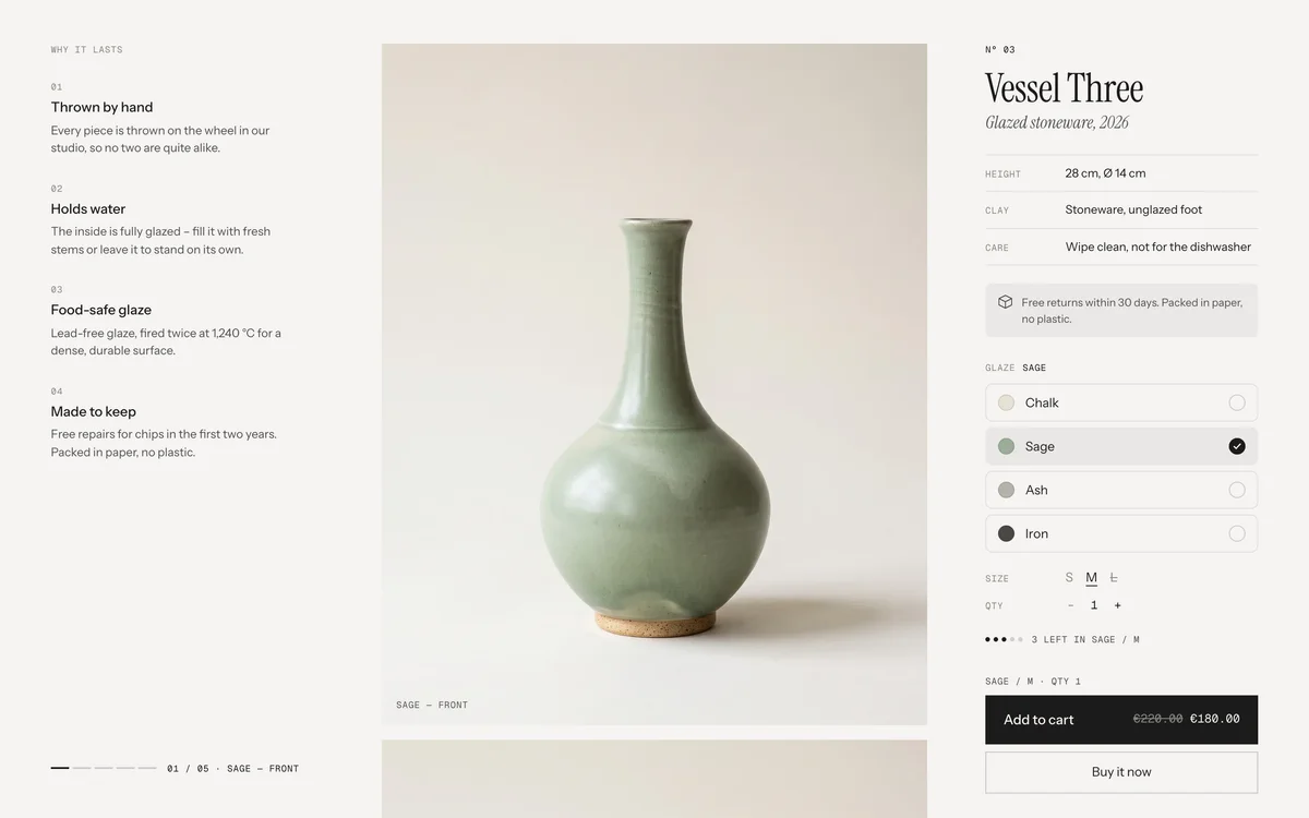
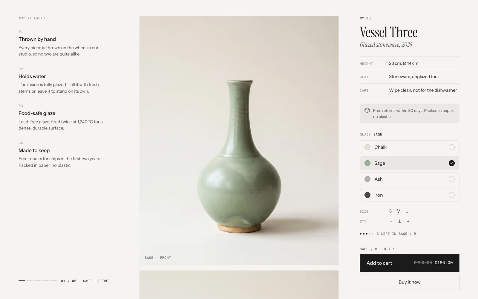
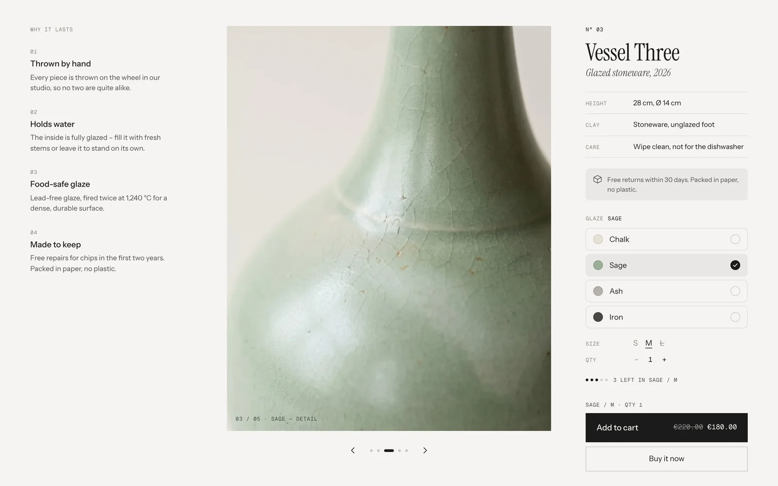
The outer columns stay put while the pictures move. On the left, numbered features tell why the product is worth it; on the right, the buy box has spec rows, a note, options as rows with swatches and an add to cart with the price inside. Stack lets every picture of the chosen colour scroll past, Spotlight shows one at a time and changes it as you scroll.
In your theme code editor (Online Store → ⋯ → Edit code), click the sections folder, then “New File”, name it and hit Enter.
02
Paste the code
In the file that just opened, paste the code below. Then hit Save (top right corner).
Note: Shopify shows no confirmation when a section saves – that’s normal.
03
Add it in the theme editor
Saved? Then reload the theme editor – otherwise the new section sometimes doesn’t show up. After that: Edit theme → Add section → . Everything else is in the sidebar – the Docs below explain every setting.
Code
One file. Copy it, paste it, done.
sections/werk-product-showcase.liquid
Locked
{%- comment -%} werk · Product Showcase · v1.4.0 · werk.build/license – do not remove {%- endcomment -%}{%- liquid assign s = section.settings # Demo images and fonts load from the werk demo store's Files (Shopify CDN), so the section looks the same in any store. # The demo product is the one of the Product Buy Box, so the images are shared. assign werk_cdn = 'https://cdn.shopify.com/s/files/1/0954/8303/5932/files/' assign demo_img = werk_cdn | append: 'werk-product-buy-box-' assign demo_title = 'Vessel Three' assign serif_url = werk_cdn | append: 'werk-instrument-serif.woff2' assign serif_i_url = werk_cdn | append: 'werk-instrument-serif-italic.woff2' assign sans_url = werk_cdn | append: 'werk-instrument-sans.woff2' assign mono_url = werk_cdn | append: 'werk-geist-mono.woff2'
3937 lines · Liquid, CSS & vanilla JS
Free – just add your email
Every section is free during launch. Enter your email once and copy any code you like.
Edit theme → Products → Default product, or the template your products use.
2
Add the section
Add section → – Stack or – Spotlight. The preset brings every block in a sensible order.
3
Hide the theme’s product information
Otherwise the product shows twice. The section takes the page’s product on its own.
4
Write your features
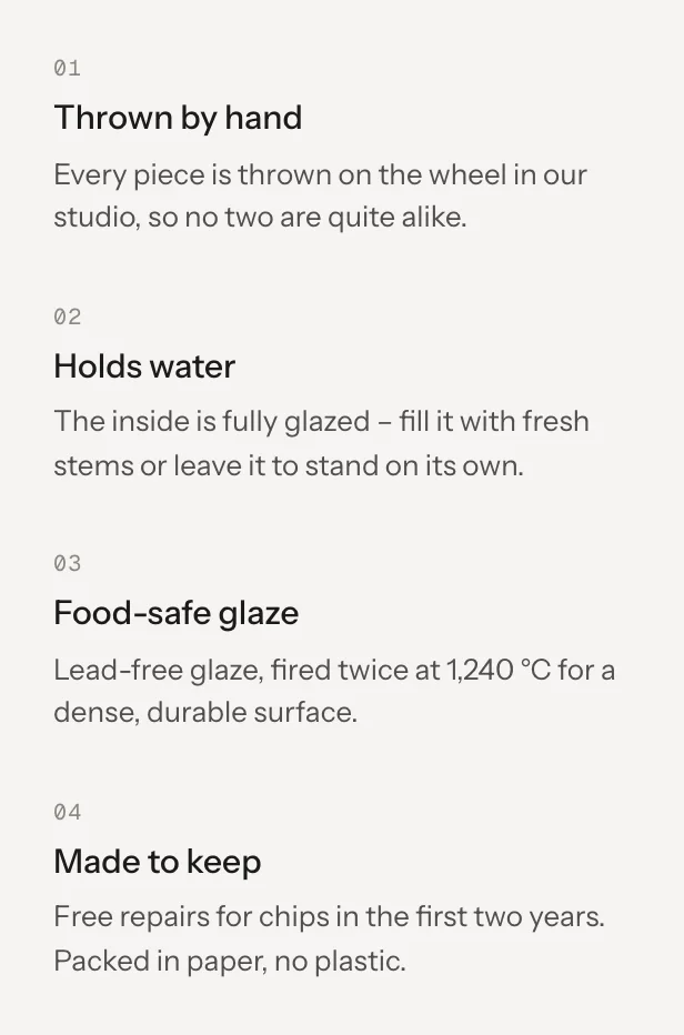
The Feature blocks fill the left column – four short reasons to buy, a title and a sentence each.
5
Tag your images per colour
In the product admin, add #sage – your colour as spelled in the option – to each image’s alt text. Then the pictures follow the chosen colour.
Two columns that stay
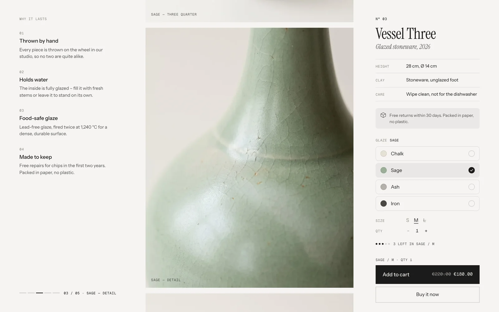
The info column and the buy box stick to the screen while the pictures scroll past. In the buy box, everything up to the options stands at the top; from the receipt line or the buy buttons on, the blocks sit at the foot of the screen – so Add to cart is always where the thumb expects it.
Scrolled to the third picture – both columns stay
A column taller than the screen sticks with its end in view, so nothing is ever out of reach. Both columns keep clear of your theme’s sticky header and of a bar docked at the bottom – a floating nav, a cookie or a chat bar.
The pictures follow the colour
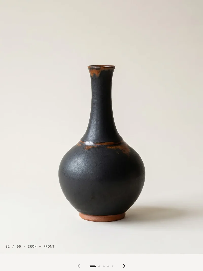
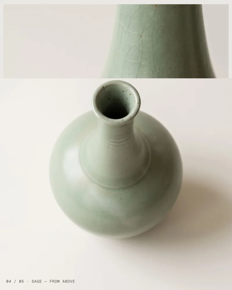
A picture belongs to a colour through the variant image or a #tag at the end of its alt text. Pictures without a tag show for every colour. Pick a colour and only its pictures show, starting at 01.
Sage chosenIron chosen
Alt text
Products → your product → Media → click an image → alt text.
Sage — front #sageShows for Sage. The caption on the picture reads “Sage — front”.
Detail of the glazeNo tag: shows for every colour.
Options as rows
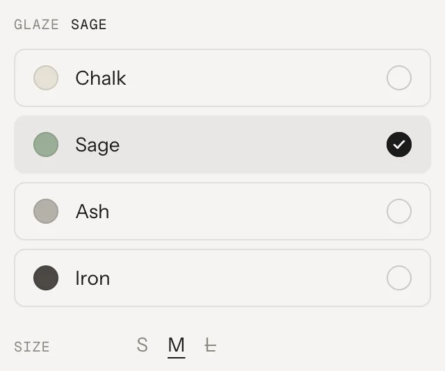
The first option – usually the colour – shows as rows: its swatch, the name and a check that draws itself in. Swatches come from Shopify: Products → your product → the option → link it to a colour (Shopify’s option swatches). Values without a swatch get a row without the circle. A value that’s sold out in the current choice is struck through and says Sold out – it can still be picked, the button then says Sold out.
Rows (default)Words
After “Add to cart”
A spinner, then a check that draws itself. With Split on, the dark button shrinks to the right and becomes Checkout while View cart wipes in from the left. No cart drawer – the theme hears about the new item, so cart counts that listen update.
Placeholders
Words in brackets fill themselves. Use them in any text setting that lists them.
[count]Items left of the chosen variant[count] left in [variant]→3 left in Sage / M
[variant]The chosen options – left out with the word in front of it when a product has noneLast one in [variant]→Last one in Iron / S
[n]QuantityQty [n]→Qty 2
[h] [m]Hours and minutes to the cut-offOrder within [h] h [m] m→Order within 3 h 12 m
[day]Weekday it shipsShips [day]→Ships Monday
[date] [from] [to]Arrival date, or first and last day of a window→ [from] – [to]→→ Wed 30 Sep – Fri 2 Oct
[weekday] [d] [month]Parts of a date[weekday], [d]. [month]→Mi., 30. Sep.
[Word]In the shipping note: links the word to your shipping policy[Shipping] calculated at checkout.→Shipping calculated at checkout.
Look
Look
Default · Stack
Two ways to show the pictures. The columns, the blocks and the sticky bar are the same in both.
StackEvery picture of the chosen colour, one below the other, each with its caption in the corner. A thin rail at the foot of the info column shows where you are – 03 / 05 · Detail – and jumps to a picture on click.
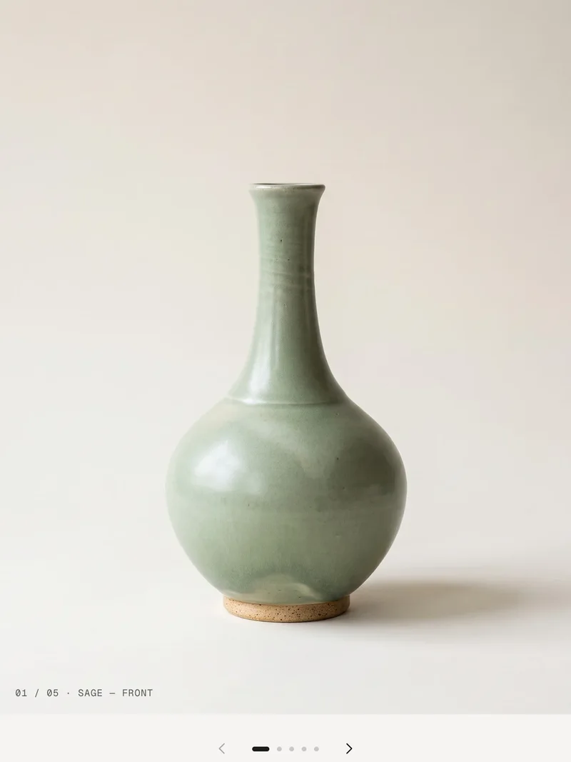
SpotlightOne picture at a time. Scrolling changes it: the next one wipes in from the direction you scroll, the old one eases back. Arrows and dots below the picture, and ← → on the keyboard, jump to a picture. Prefer clicks only? Turn off Change images by scrolling.
Spotlight · one picture at a time
The change in Spotlight
The new picture is revealed from the bottom when you scroll down, from the top when you scroll up. With Change images by scrolling off it comes from the bottom for the next picture and from the top for the previous one. Visitors who turned on “reduce motion” see the picture change without the wipe.
Scrolling down: 03 wipes in over 02
Change images by scrolling
Default · On
What changes the picture in Spotlight – on computers, tablets and phones alike.
OnThe picture stays put and every bit of scrolling brings the next one; the section is as long as the pictures need. On phones too: the picture sticks under the header together with the title and the start of the buy box below it, so nothing jumps while the pictures change – after the last one the page scrolls on. Arrows, dots and ← → jump as well.
OffThe picture stays while visitors scroll on, the section is as short as its content. Only an active click changes it: the arrows and dots below the picture, ← → on the keyboard – and on phones a swipe through the picture row.
Only visible in the Spotlight look
Scroll per image
Default · 70%
How far visitors scroll before the next picture shows – a share of the screen height. Lower is quicker, higher gives each picture more time. Spotlight only, and only with Change images by scrolling on.
Only visible in the Spotlight look
Product
Default · Empty
Leave it empty on product pages – the section takes the page’s product. Pick one for landing pages or the home page. Without any product it shows the demo vase.
Pictures
Image ratio
Default · 4:5
The pictures’ shape. They are cropped to fit.
4:5Portrait, like a print.
3:4A little wider.
1:1Square.
Original (first image)The ratio of the product’s first image.
Only show images of the chosen color
Default · On
Filters the pictures by colour – see How it works. Off: every picture, always.
Image captions
Default · On
The alt text of each picture, without the #tag, small in its corner. Stack also shows it in the rail; Spotlight puts the counter in front of it.
Gallery name
Default · Product images
Only read by screen readers.
Previous image
Default · Previous image
Arrow below the image. Only read by screen readers.
Only visible in the Spotlight look
Next image
Default · Next image
Arrow below the image. Only read by screen readers.
Only visible in the Spotlight look
Four Feature blocks
Heading
Default · Why it lasts
A small line above the features. Empty: no heading.
Number the features
Default · On
01, 02, 03 … above each feature, counted in their order.
Feature
A title and a short text. Add as many as you like – they always go to the left column, wherever they are in the block list. A feature without title and text stays hidden.
SettingWhat it doesDefault
TitleOne line, medium weight.Thrown by hand
TextRich text, a sentence or two.Every piece is thrown on the wheel …
Rail
Stack only, on desktop: segments and the counter at the foot of the column. It follows the picture at the middle of the screen; click a segment to go there.
Eyebrow
A small line above the title, e.g. a catalogue number.
SettingWhat it doesDefault
TextPlain text. Connect a metafield with the database icon to fill it per product.Nº 03
Title
The product title, set in the serif. It’s the page’s heading on product pages. No settings.
Subtitle
The italic line under the title – material, year, maker.
SettingWhat it doesDefault
TextPlain text, set in italics. Metafield possible.Glazed stoneware, 2026
Text
A short text. Add it as often as you like.
SettingWhat it doesDefault
TextRich text. Empty = the block stays hidden.Empty
Spec row
A label and a value between thin lines – height, material, care. Rows that follow each other form one list. A long label wraps in its column, a long value next to it.
SettingWhat it doesDefault
LabelSmall caps on the left.Height
ValueThe value. Connect a metafield with the database icon to fill it per product.28 cm, Ø 14 cm
Note
A soft grey box with an icon – returns, shipping, guarantees.
SettingWhat it doesDefault
IconNone, Parcel, Return, Truck, Shield, Leaf or Gift.Parcel
TextOne or two lines, links allowed. Empty = the block stays hidden.Free returns within 30 days. Packed in paper, no plastic.
Price
The price of the chosen variant. When it changes, only the digits that differ roll. A compare-at price shows crossed out. Not in the preset – the price is in the button; add it if you want it under the title as well.
SettingWhat it doesDefault
Show tax and shipping noteA small line under the price. Required in Germany and many EU countries.On
Prices include taxShown when your prices include tax.Tax included.
Prices exclude taxShown when they don’t.Tax excluded.
Shipping noteThe [word] in brackets links to your shipping policy.[Shipping] calculated at checkout.
Options
Every product option. Products without variants show nothing.
SettingWhat it doesDefault
StyleRows for the first option, words for the rest · Rows for all options · Words for all options.Rows for the first option
Sold out (in a row)Next to a value that’s sold out in the current choice. Empty = only struck through.Sold out
Quantity
Minus, number, plus. Stops at the stock of the variant when you don’t sell beyond it.
SettingWhat it doesDefault
LabelThe word in front of the number.Qty
Minus buttonScreen readers only.Decrease quantity
Plus buttonScreen readers only.Increase quantity
Low stock
Five dots and a short line when few items are left of the chosen variant. Only for variants whose inventory is tracked and that stop selling at 0.
SettingWhat it doesDefault
Show fromShows at this many items or fewer, 1–20.5
Few left[count], [variant][count] left in [variant]
Last oneWhen exactly one is left.Last one in [variant]
Sold outWhen the variant is sold out.Sold out in [variant]
Receipt line
Sums up the choice in mono above the button. Only the part that changed fades. Errors from the cart show here for a moment.
SettingWhat it doesDefault
Quantity[n] = quantity. Empty = left out. The shipping day comes from the Delivery promise block.Qty [n]
Buy buttons
Add to cart with the price inside, optionally Shopify’s dynamic checkout below. The sticky bar uses the same texts.
SettingWhat it doesDefault
Show dynamic checkout buttonShopify’s Buy it now / express checkout, in an outline.On
Split into View cart / Checkout after addingOff: the button goes back to Add to cart after 2.4 s.On
Price in the buttonThe price right in the button, with the compare-at price struck through. A long label gets “…”, the price always stays.On
Add to cartButton label.Add to cart
Sold outLabel for sold-out variants.Sold out
AddedRight after adding.Added
View cartLeft half after the split.View cart
CheckoutRight half after the split.Checkout
Delivery promise
When the order leaves and arrives, with a week strip up to the arrival. Counts in your shop’s time zone and updates every 30 seconds. Transit days count only days you ship on, minus the days off.
SettingWhat it doesDefault
Order cut-off24 h, e.g. 14:00. Empty = block hidden.14:00
Ships onMonday to Friday, Monday to Saturday or Every day.Monday to Friday
Delivery takes at leastDays, 1–14.2
Delivery takes at mostDays, 1–14. More than at least = a window.2
No shipping onDays off as MM-DD, separated by commas.12-24, 12-25, 12-26, 12-31, 01-01
Before the cut-off[h], [m]Order within [h] h [m] m
Last hour before the cut-off[m]Order within [m] min
Ships todayAlso in the receipt line.Ships today
Ships tomorrowAfter the cut-off.Ships tomorrow
Ships later[day] – full name here, short in the receipt line.Ships [day]
Arrival[date]→ [date]
Arrival window[from], [to]. Same month: it shows once.→ [from] – [to]
WeekdaysStarting with Sunday, separated by commas.Sunday, Monday, …
Weekdays, shortFor dates and the receipt line.Sun, Mon, …
Weekdays in the stripTwo letters each.Su, Mo, …
Months, shortJanuary to December.Jan, Feb, …
Collapsible
A heading with a plus that opens its text inline. Collapsibles next to each other form one row, only one open at a time.
SettingWhat it doesDefault
HeadingThe word in the row.Details
ContentRich text. Empty = the product description.Empty
Sticky bar on phones
Default · On
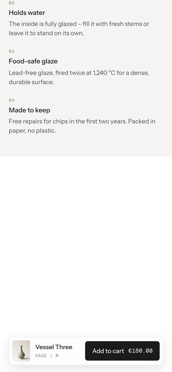
On phones, once the buy buttons have scrolled away, a card rises at the bottom: picture, title, the choice and Add to cart with the price. It hides when the buy buttons come back. With several showcases on one page, it belongs to the last one scrolled past.
Padding top
Default · 48px
Space above the section. Scales down on smaller screens.
Padding bottom
Default · 48px
Space below the section.
Animations
Default · On
The columns settle in once, prices roll, the check draws itself, Spotlight wipes. Visitors who turned on “reduce motion” on their device see no animation.
Easing
Default · werk Signature
The feel of every movement.
werk Signature
Smooth
Bounce
Snap
Glide
werk SignatureSlow start, soft landing
SmoothEven and quiet
BounceA small overshoot
SnapQuick start, gentle stop
GlideSlow in, slow out
Use theme fonts
Default · Off
Off: Instrument Serif for the title and italic line, Instrument Sans for text, Geist Mono for labels. On: your theme’s heading and body fonts. Use theme fonts swaps every font at once. Or swap each one with its own URL – Self-hosted font URL replaces Instrument Sans; Heading font URL replaces Instrument Serif (the headings and the italic lines); Label font URL replaces Geist Mono (the small labels and numbers). Empty keeps werk’s font.
Self-hosted font URL (.woff2)
Default · Empty
Replaces Instrument Sans. Upload the file to Content → Files and paste its URL.
Use theme colors
Default · Off
Takes the text and background of the page around the section and hides the fields below. Muted text, lines and the picture background are then mixed from them. Button and Button text give the buttons their own colours – empty keeps the design.
4Image background#E9E7E2Behind pictures while they load
Use theme buttons
Default · Off
Gives Add to cart your theme’s style – then only the text links follow Button style.
Button style
Default · Clean
How buttons and text links react on hover.
Clean
Dot to arrow
Rolling text
Fill
Shine
Hover them – click a button for loading → added
DetailsCleanGrows a touch, the underline runs out and backDetailsDot to arrowThe dot grows into an arrowDetailsRolling textThe label rolls up, a copy followsDetailsFillColour wipes in from the leftDetailsShineA band of light passes over
HeadingWhy it lastsAbove the features (Info column)
Gallery nameProduct imagesScreen readers only
Previous imagePrevious imageThe arrow left of the dots (Spotlight); screen readers only Only in Spotlight
Next imageNext imageThe arrow right of the dots (Spotlight); screen readers only Only in Spotlight
Sold out (in a row)Sold outOptions block, next to a sold-out value
Side padding
Default · Match theme
Match theme (the default) lines the section up with your theme's page margin – in Horizon the same edge as header and footer. Themes without one, like Dawn, keep the werk edge. werk default always uses the werk edge, Custom takes your own values in px (desktop and tablets / phones), None runs the content to the edge.
Desktop · three columns
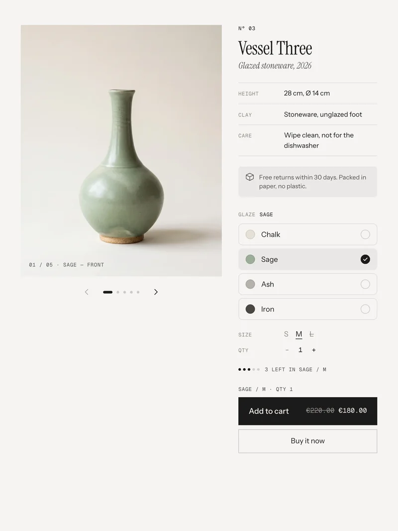
Tablet · pictures and buy box, features below
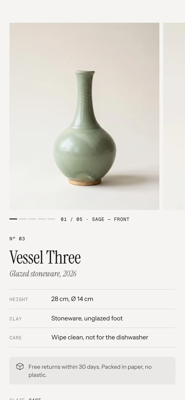
Phone · swipe row, one column
TabletBelow 990 px: the pictures left, the buy box right and sticky, the features under the pictures. Spotlight keeps its arrows and dots.
PhoneBelow 750 px: the pictures become a swipe row – the next one peeks in – with segments (Stack) or dots (Spotlight) and the caption below. Then the buy box, then the features. Spotlight with Change images by scrolling on keeps the picture with the title right below it in place and changes it as you scroll.
Sticky barPhones only – on bigger screens the buy box is always in view.
No cart drawer
After adding, the section sends two cart events. Horizon listens and updates right away; in Dawn and the themes built on it the section refreshes the cart count and drawer itself. Other themes catch up on the next page.
shopify:cart:lines-update · cart:refresh
Swatches come from Shopify
The rows show the swatch you set on the option value in the product admin – a colour or an image. No extra settings in the section.
Docked navs and bars
A bar fixed at the bottom of the screen – a floating nav, a cookie or chat bar – is measured, and the columns end above it.
Not supported yet
Subscription-only products, gift card recipient fields, B2B quantity rules, unit prices and store pickup. Videos and 3D models are skipped – the pictures are images only.
Horizon4.2TestedCart count updates live
Dawn16TestedCart count and drawer refreshed by the section
A picture is cut in the wrong place.
Every picture fills its frame. Set a focal point on the picture in Shopify (Products → the product → click the picture → Edit) – the section keeps that spot in view.
The product shows twice.
Hide or remove your theme’s own product information section on the same template.
All pictures show for every colour.
The #tag must match the option value – #sage for Sage – and sit at the end of the alt text. Or switch off Only show images of the chosen color if you want all pictures.
The rows have no colour circles.
The option values have no swatch yet. Products → your product → the colour option → link it to a colour, or switch the Options block to Words.
The columns don’t stick.
A parent element of the section in your theme has overflow: hidden – sticky can’t work inside it. Move the section into a template without that wrapper, or ask us.
Spotlight changes too fast or too slow.
Change Scroll per image – lower is quicker.
Visitors should look at a picture without it changing as they scroll.
Turn off Change images by scrolling. Then only the arrows and dots (on phones also a swipe) change the picture, and the page scrolls on as usual.
The cart count doesn’t change after adding.
Horizon and Dawn-based themes update right away. Other themes may not listen to the cart event – the item is in the cart, the count updates on the next page.
1.4.012 Oct 2026
NewSide padding. Match theme (the default) lines the section up with your theme's page margin – in Horizon the same edge as header and footer. Themes without one, like Dawn, keep the werk edge. werk default always uses the werk edge, Custom takes your own values in px (desktop and tablets / phones), None runs the content to the edge.
1.3.111 Oct 2026
NewPhones, Spotlight with Change images by scrolling: the title now sits right under the picture while the pictures change – picture, title and buy box stay in place together, instead of the picture alone with an empty stretch below it.
1.3.011 Oct 2026
NewChange images by scrolling (Spotlight, on by default). On: the picture changes as the visitor scrolls – now on phones too, where Spotlight keeps its sticky picture instead of the swipe row. Off: the picture only changes on an active click – arrows, dots, ← →, and a swipe on phones – and the section loses its long scroll distance.
1.2.16 Oct 2026
NewCropped pictures keep the focal point you set on the image in Shopify (Content → Files or the product media) in view – the gallery pictures. Before, they were always cut around the centre.
1.2.06 Oct 2026
NewHeading font URL and Label font URL (Fonts) – swap Instrument Serif (headings, italic lines) and Geist Mono (labels, numbers) for your own .woff2. With Self-hosted font URL every font can now be swapped on its own; Use theme fonts still swaps all of them.
1.1.06 Oct 2026
NewButton and Button text colours (Colors). Empty = as designed – nothing changes until you pick one. Hidden while Use theme colors or Use theme buttons is on.
* Built for Online Store 2.0 and tested in Shopify's Horizon and Dawn themes. Heavily customised or older themes can still clash with it – if something looks off, write us and we'll take a look.


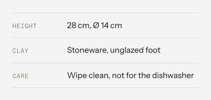 SettingWhat it doesDefaultLabelSmall caps on the left.HeightValueThe value. Connect a metafield with the database icon to fill it per product.28 cm, Ø 14 cm
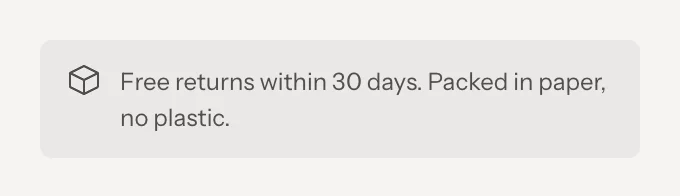 SettingWhat it doesDefaultIconNone, Parcel, Return, Truck, Shield, Leaf or Gift.ParcelTextOne or two lines, links allowed. Empty = the block stays hidden.Free returns within 30 days. Packed in paper, no plastic.
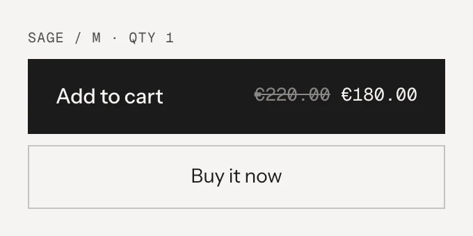 SettingWhat it doesDefaultShow dynamic checkout buttonShopify’s Buy it now / express checkout, in an outline.OnSplit into View cart / Checkout after addingOff: the button goes back to Add to cart after 2.4 s.OnPrice in the buttonThe price right in the button, with the compare-at price struck through. A long label gets “…”, the price always stays.OnAdd to cartButton label.Add to cartSold outLabel for sold-out variants.Sold outAddedRight after adding.AddedView cartLeft half after the split.View cartCheckoutRight half after the split.Checkout