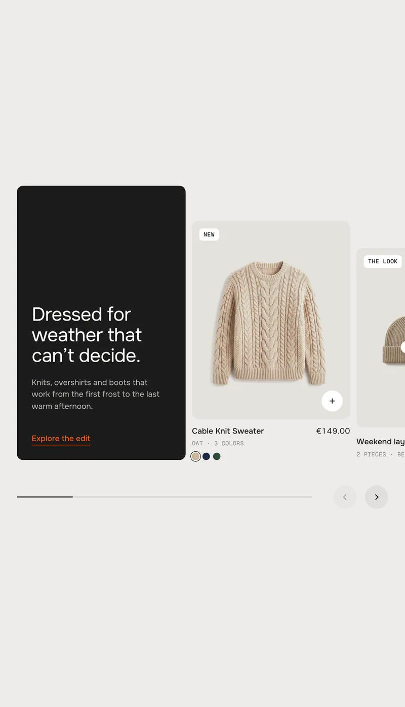
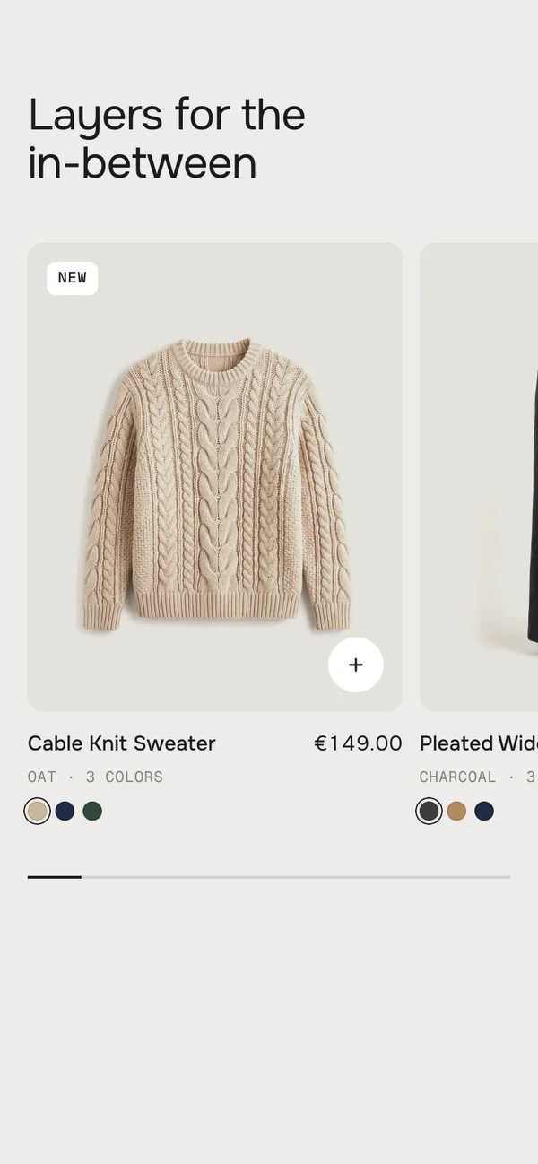
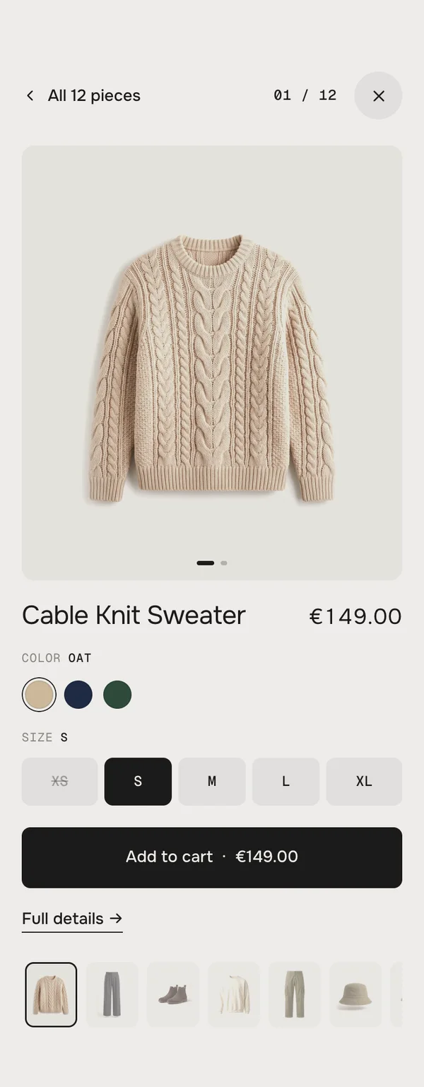
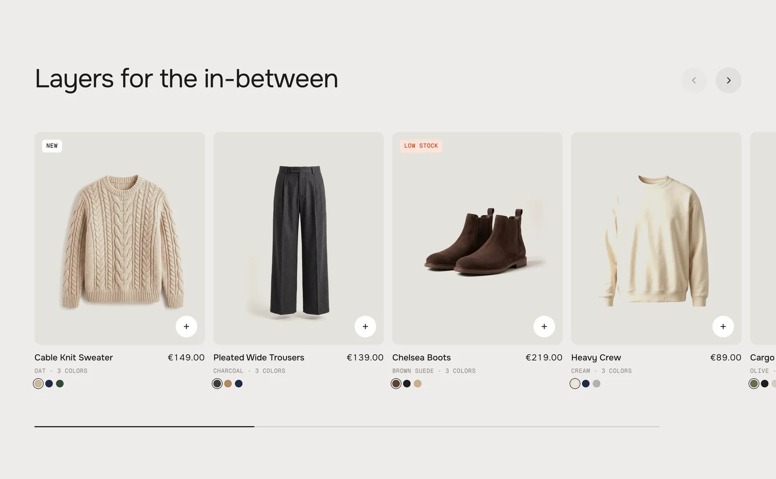
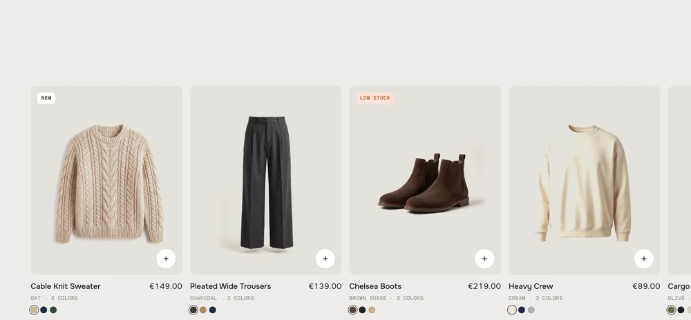
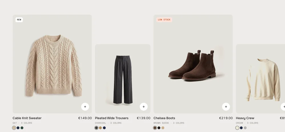
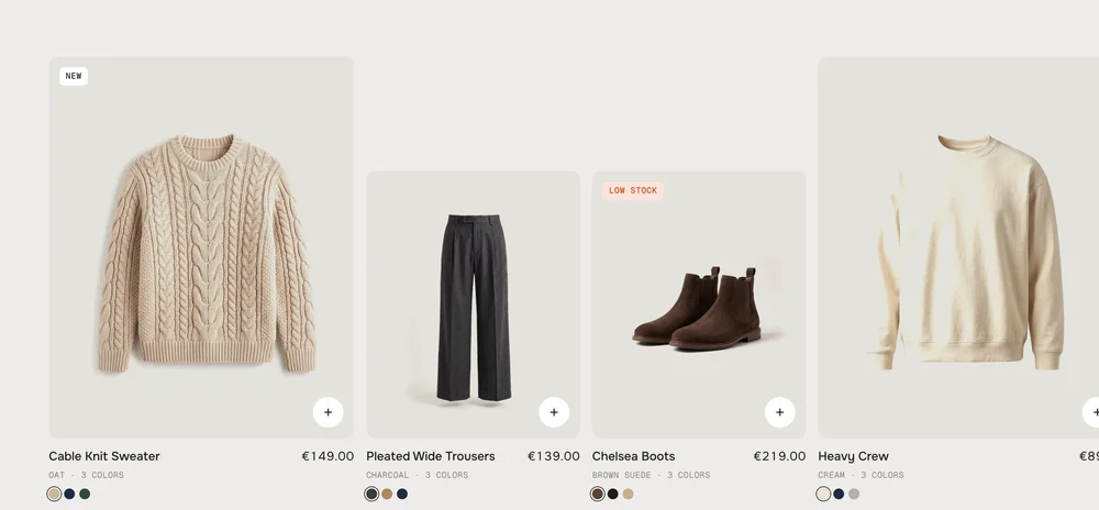
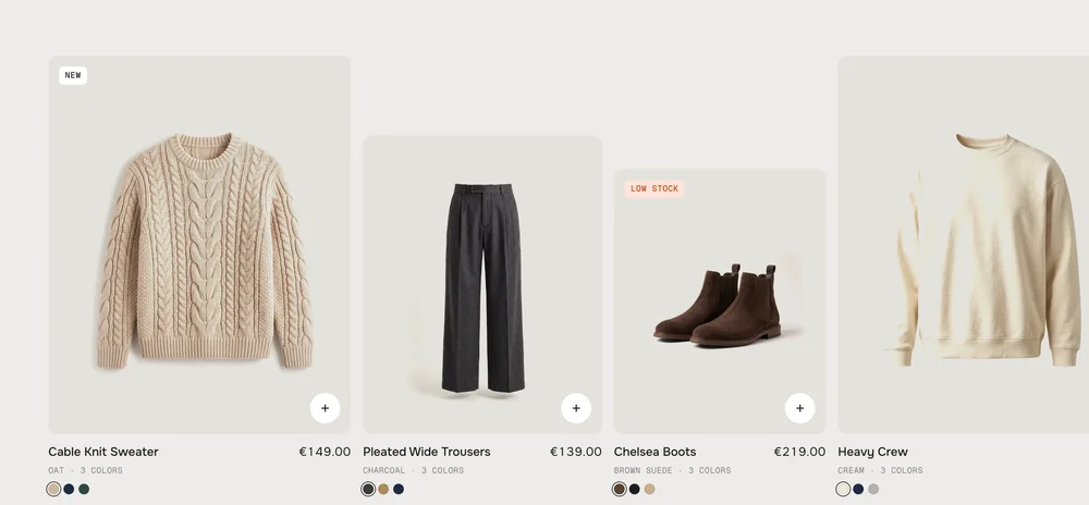
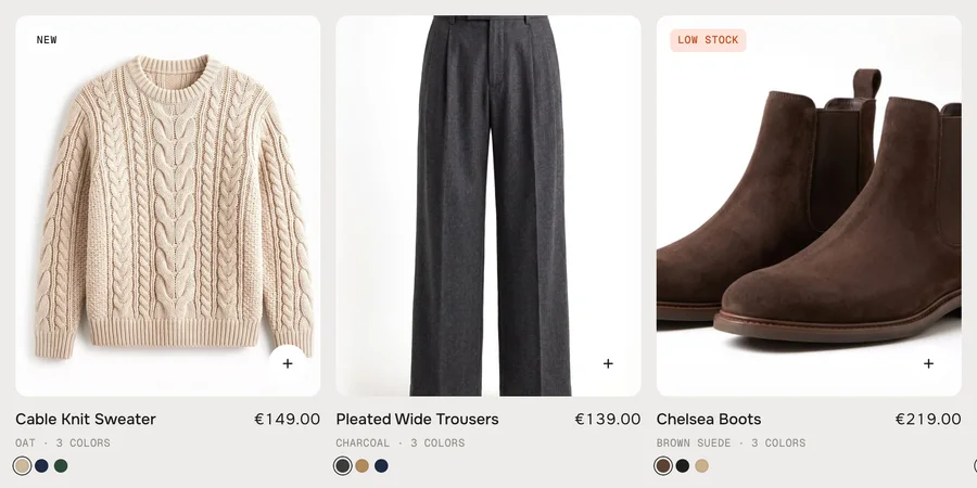
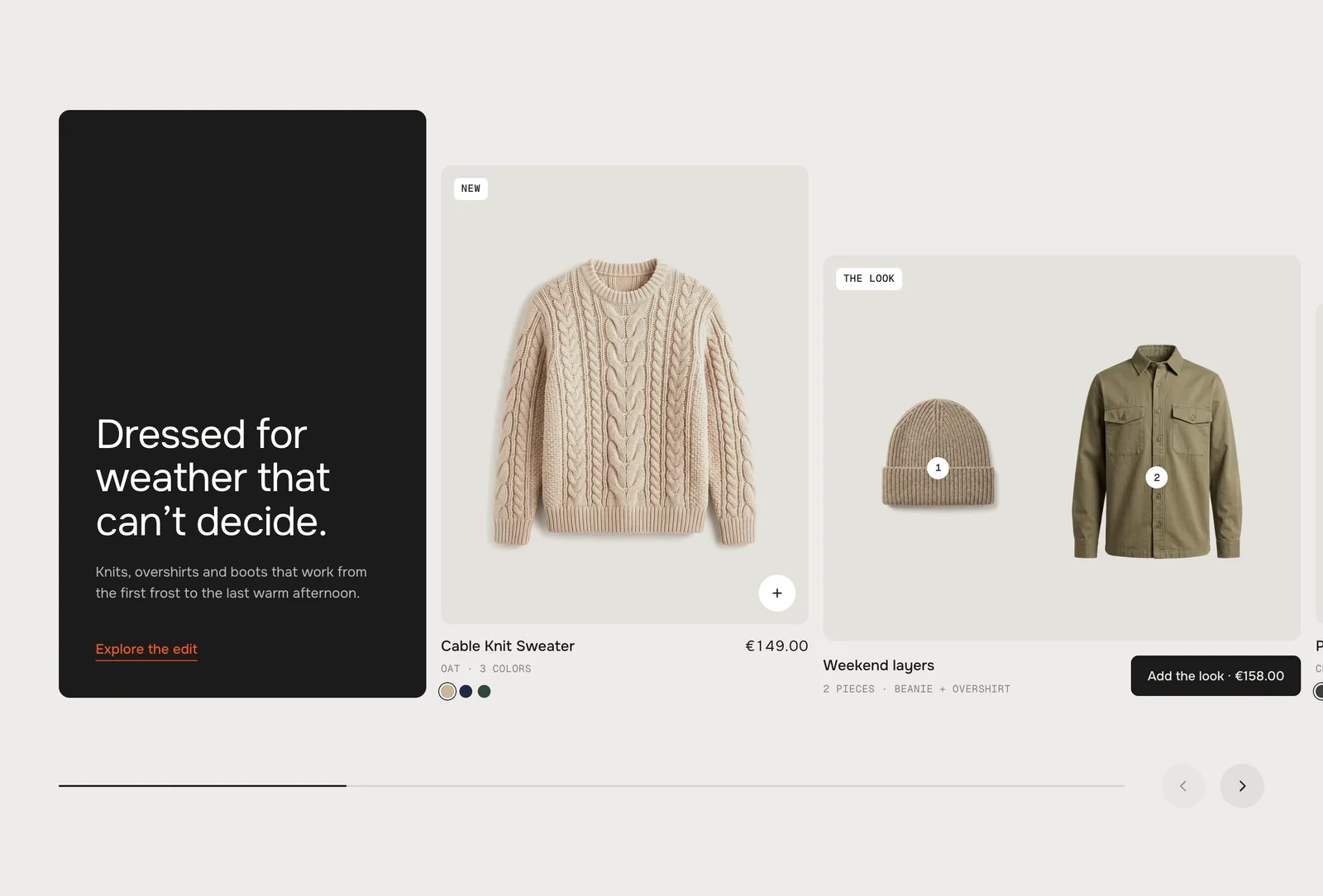
Products from a collection or hand-picked, in a row you can drag, throw or scroll – the cards lean with the speed and the pictures run a touch slower than their cards. Hover shows the second picture and the sizes in stock, the + turns into a size bar right in the card, and a click grows the picture into a big view with a small buy box. Classic keeps the cards even; Editorial adds a story tile, card sizes and shoppable looks.
In your theme code editor (Online Store → ⋯ → Edit code), click the sections folder, then “New File”, name it and hit Enter.
02
Paste the code
In the file that just opened, paste the code below. Then hit Save (top right corner).
Note: Shopify shows no confirmation when a section saves – that’s normal.
03
Add it in the theme editor
Saved? Then reload the theme editor – otherwise the new section sometimes doesn’t show up. After that: Edit theme → Add section → . Everything else is in the sidebar – the Docs below explain every setting.
Code
One file. Copy it, paste it, done.
sections/werk-product-slider.liquid
Locked
{%- comment -%} werk · Product Slider · v1.2.0 · werk.build/license – do not remove {%- endcomment -%}{%- liquid assign s = section.settings # Demo pictures and fonts load from the werk demo store's Files (Shopify CDN), so the section looks the same in any store. # Demo pieces = the Outfit Builder cut-outs (and their colour pictures), worn second pictures are Product Slider's own. assign werk_cdn = 'https://cdn.shopify.com/s/files/1/0954/8303/5932/files/' assign ob = werk_cdn | append: 'werk-outfit-builder-' assign hv = werk_cdn | append: 'werk-product-slider-hover-' assign font_url = werk_cdn | append: 'werk-onest.woff2' assign mono_url = werk_cdn | append: 'werk-geist-mono.woff2' if s.font_url != blank assign font_url = s.font_url
4734 lines · Liquid, CSS & vanilla JS
Free – just add your email
Every section is free during launch. Enter your email once and copy any code you like.
Edit theme → open the page → Add section → – Classic or – Editorial. It comes with twelve demo pieces, so it looks finished right away.
2
Pick your products
Choose a Collection – or add Product blocks to hand-pick them. The demo pieces leave as soon as you do.
3
Check the cards
Hover a card: the second picture and the sizes in stock. Click the + to add a size, click the picture to open the dual view.
4
Add a story or a look
Add block → Story for a text tile, Look for two or three pieces on one tile with one button.
Look
Default · Classic
How the row is built.
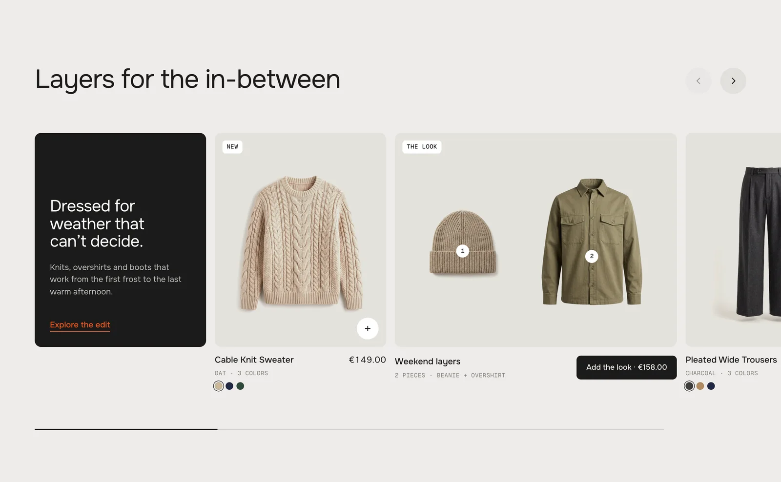
ClassicEven cards under a heading, arrows at the top right. A story tile is as wide as a card.
EditorialA story tile carries the heading, the cards come in sizes and sit on one base line, look tiles get more room. The arrows move down next to the progress bar.
Heading
Default · Layers for the in-between
The line above the row. Bold, italic and links work. Leave it empty to hide it – the Editorial preset does, because its story tile is the heading.
Card sizes
Default · Large, small
A pattern of card sizes that repeats along the collection. Product blocks set their own Card size instead.
All the same
Large, small
Large, small, small
Large, medium, small
Only visible in the Editorial look
All the sameEvery card medium
Large, smallThe default
Large, small, smallOne big card, two small ones
Large, medium, smallThree steps
Collection
Default · Empty
The products of this collection, in its order. New products show up by themselves.
Number of products
Default · 12
How many products of the collection the row shows – 2 to 24.
Hand-picked products
Add Product blocks and the row shows exactly these, in the order of the blocks – the collection is ignored. A product may appear twice.
Theme editor
Product Slider
Story
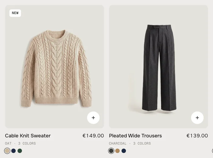
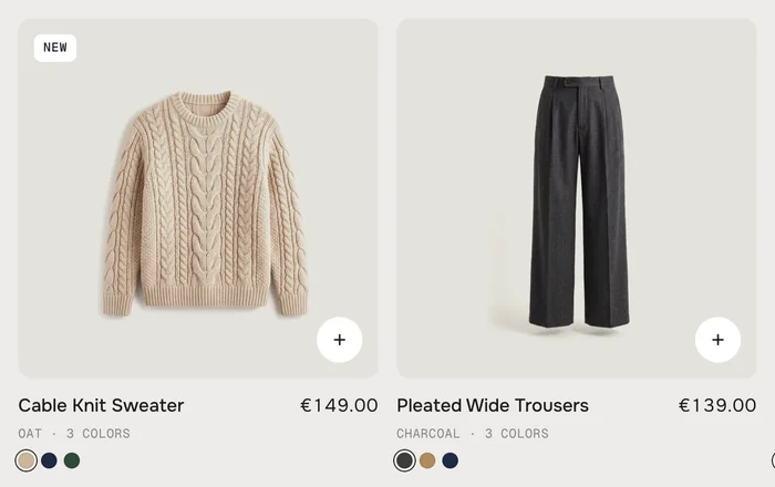
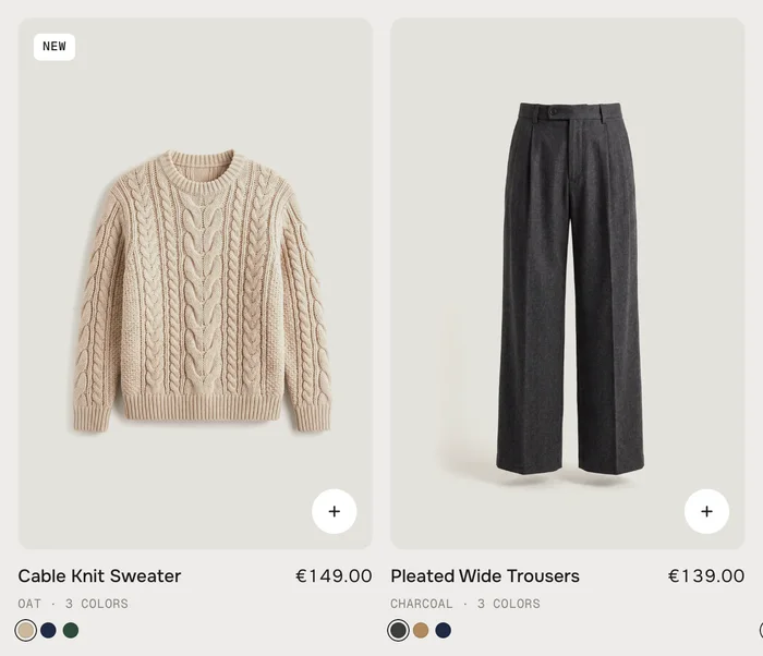
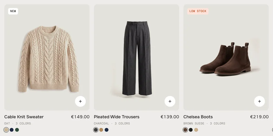
Product: Cable Knit Sweater
Look
Product: Pleated Wide Trousers
Product: Chelsea Boots
Product
One card.
SettingWhat it doesDefault
ProductThe product of this card. A block without a product is skipped.Empty
PictureYour own picture for the card instead of the product picture.Empty
Hover pictureYour own second picture. It also joins the gallery of the dual view, in second place.Empty
BadgeYour own badge text, e.g. Back in stock. Replaces the automatic badge.Empty
Card sizeSmall, Medium or Large. Only in EditorialMedium
What a card shows
Name and price – with the old price crossed out when the product is on sale. Below, a small line: the chosen color and how many colors there are, or the product type when a product has no colors. Prices use your store's money format.
Demo pieces
Without a collection and without product blocks the row shows twelve demo pieces, with colors, sizes and worn second pictures. They are placeholders: their links go to your All products page.
No products
A collection without products shows a short note instead of the row: pick a collection with products, or add product blocks.
Picture shape
Default · Portrait 4:5
The shape of every product picture in the row.
Portrait 4:5
Square 1:1
Tall 2:3
Portrait 4The default
Square 1For flat lays and objects
Tall 2For worn pictures
Pictures
Default · Cut-outs on the tile
How a picture sits in its tile.
Cut-outs on the tileThe whole product with some air around it. White backdrops melt into the tile color, so the product seems to float.
Fill the tileEvery picture is cropped to fill the tile.
Cut-outs on the tileFill the tile
Second picture on hover
Default · On
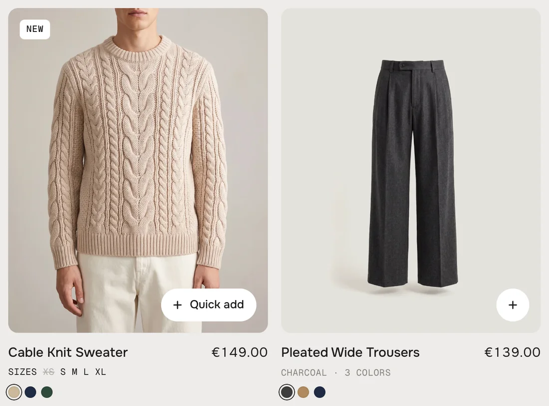
With the mouse on a card the second picture rises over the first. Without colors it is the product's second picture; a Product block can bring its own.
Hover: the second picture, the sizes in stock – and the + grows into Quick add
A second picture per color
A color's pictures are the picture of its variant first, then every product picture whose alt text contains the color as a tag: for Navy, for Heather grey – lowercase, spaces become hyphens. The card's hover picture is the chosen color's second picture, and the dual view shows only that color's pictures. A color without a second picture shows no hover picture.
1
Give every color a variant picture
Products → the product → Variants → pick the picture of each color.
2
Tag the other pictures
Click a product picture → Add alt text → end the text with the tag, e.g. “Worn, front ”.
The section reads the first ten pictures of a product. Hover pictures always fill their tile, and only load when a card is hovered for the first time.
Sizes on hover
Default · On
On hover the line under the name rolls to the sizes of the chosen color – sold-out sizes are crossed out. The line is named after what it lists: Sizes for a size option (Size, Größe, Taille, Talla, Maat, Taglia), otherwise the option's own name, e.g. Scent.
Colors
Default · On
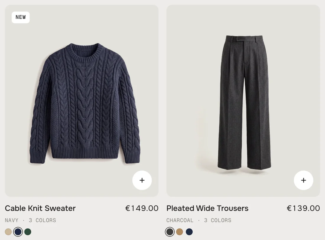
A row of dots under the card for products with two or more colors – up to six, then “+2”. Hovering a dot previews the color, a click keeps it: picture, hover picture, price, sizes and quick add follow.
Navy picked on the first card: picture and line follow
Badges
Default · On
A small label in the corner of the picture. One per card, in this order: Sold out, Sale (the product has a compare-at price), Low stock, New (the product has the tag ). A Product block's own Badge replaces them.
Low stock from
Default · 5
Low stock shows when the product's first available variant has this many pieces left or fewer. Only for products whose inventory Shopify tracks.
Quick add
Default · On
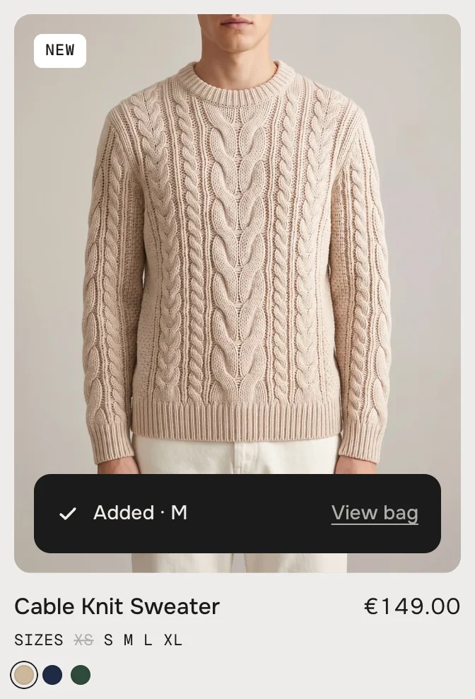
A round + on every picture. With the mouse on it, it grows into Quick add. What a click does depends on the product:
One variant, or only colorsIt goes straight into the cart, in the chosen color.
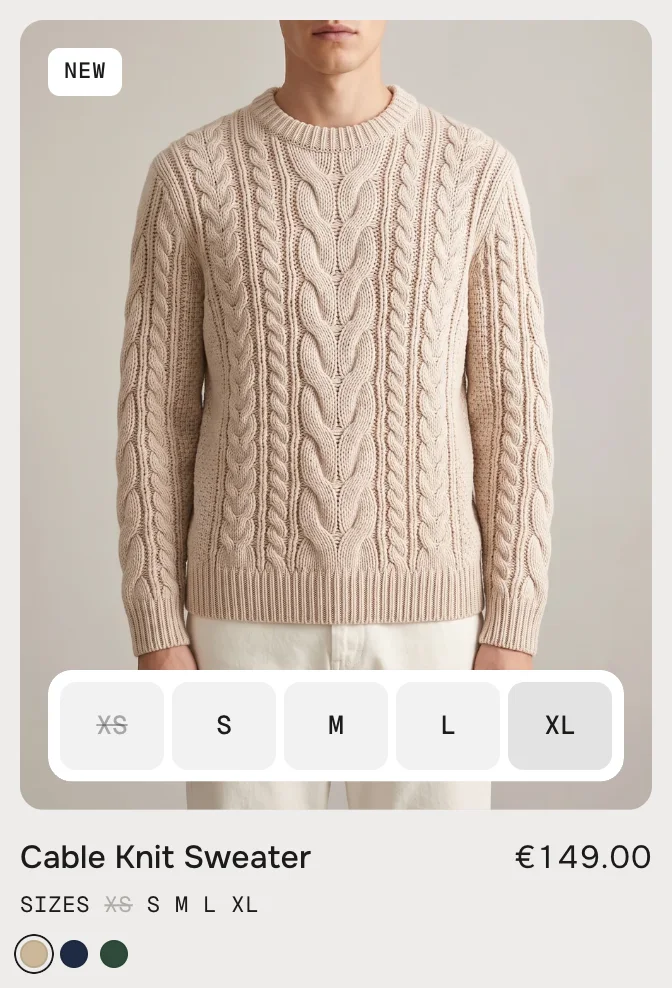
SizesThe + opens a bar with the sizes of the chosen color, sold-out ones crossed out. One click on a size adds it.
More optionsMaterial, length, pack size: the dual view opens, where every option can be chosen.
SizesThe size bar in the card
AddedAdded – with a link to the cart
After the click
The picked size grows into a dark bar: Adding, then Added with the size and View bag – a link to the cart. A moment later the bar folds back into the +. The cart count in your header updates without a reload.
Good to know
•Many or long values (14 shoe sizes, “Black pepper”) wrap into rows of equal chips.
•A sold-out product shows Sold out instead of Quick add; a sold-out color too.
•Products that can only be bought as a subscription have no + – they need a plan chosen on the product page.
•A click outside, a drag of the row or Escape closes the size bar.
•If the cart refuses (e.g. not enough stock), its message shows under the card for a moment.
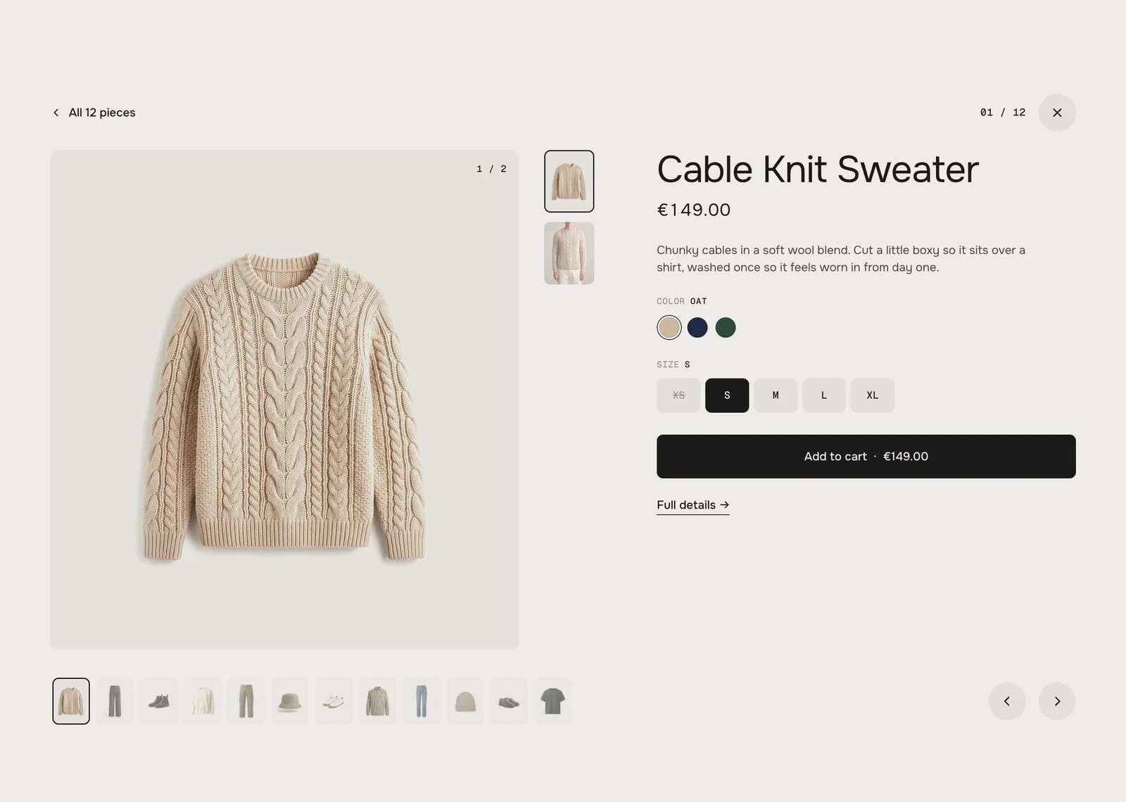
The dual view: gallery, colors, sizes, Add to cart – and the row's products as a rail below
Dual view
Default · On
A click on a picture or a name opens the product big. Off: picture and name link to the product page. ⌘ / Ctrl / Shift + click always opens the product page in a new tab or window.
What it shows
•The picture – It flies out of the card and grows. A card that shows its hover picture opens on that picture.
•Gallery – Thumbnails next to the picture (dots on tablets and phones), with the pictures of the chosen color.
•Name, price and text – The first 40 words of the product description.
•Options – Colors as dots, everything else as chips; sold-out values are crossed out. Price and button follow the choice. An option with a single value is hidden – except the size.
•Add to cart – With the price in the button. It fills while the cart answers, then shows Added.
•Full details – A link to the product page.
•The rail – Every product of the row as a small picture. A click, the arrows or ← → step to the next product; after the last one it starts over.
Closing
“All 12 pieces” at the top left, the X or Escape close it. The picture flies back into its card, and the row stands where that card is.
Where a tile sits
With a collection, Position says after how many products the tile sits – 0 puts it in front. With Product blocks the order of the blocks counts, and Position is ignored.
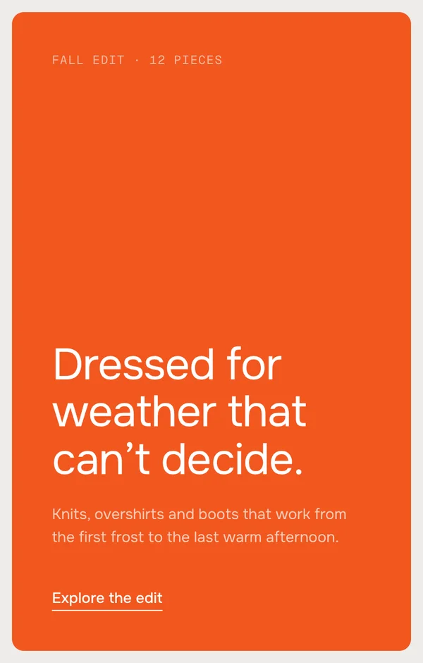
Story
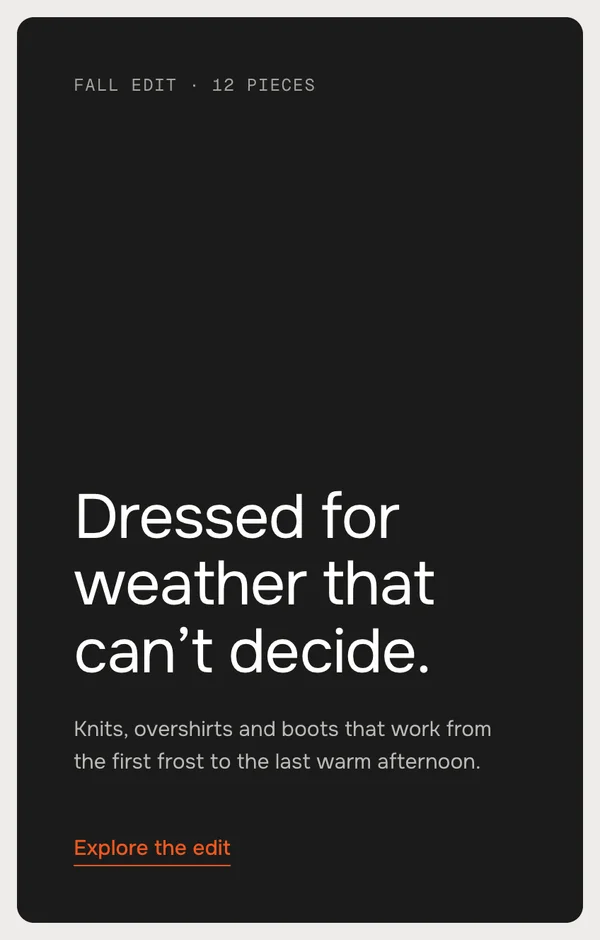
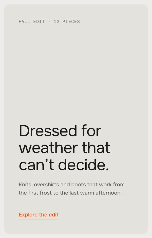
A tile with a heading, a text and a link. In Editorial it is the heading of the section.
SettingWhat it doesDefault
Small lineA small label at the top. [n] becomes the number of products.Empty
HeadingThe big line. Bold, italic and links work.Dressed for weather that can’t decide.
TextOne or two sentences below.Knits, overshirts and boots …
Link labelThe text of the link. Leave it empty to hide the link.Explore the collection
LinkWhere it goes. Empty: your All products page.Empty
Background pictureA picture behind the text. A dark gradient lies over it and the text turns white.Empty
ToneDark (Story tile color), Light (Tiles color) or Accent.Dark
SizeLarge is the tile's full width, Medium one step narrower. Only in EditorialLarge
PositionAfter how many products the tile sits, with a collection.0
Look
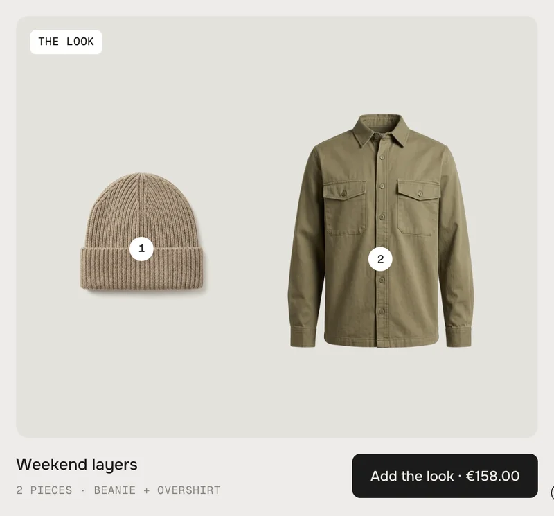
Two or three products on one tile, numbered. A number opens that piece in the dual view; the button adds the whole look.
SettingWhat it doesDefault
Piece 1The first product.Empty
Piece 2The second product.Empty
Piece 3An optional third product.Empty
NameThe name of the look, under the tile.Weekend layers
Small lineThe line under the name. [n] = number of pieces, [pieces] = their short names (the last word of each product name).[n] pieces · [pieces]
BadgeThe label in the corner. Empty hides it.The look
ButtonThe label. [price] becomes the price of all pieces together. Empty hides the button.Add the look [price]
PictureA styled picture of the whole look. It fills the tile, and the pieces sit small in its corner.Empty
PositionAfter how many products the tile sits, with a collection.1
SizeLarge is the tile's full width, Medium one step narrower. Only in EditorialLarge
Add the look
•Nothing to choose – Every piece has a single variant in stock: all pieces go into the cart at once, and the button shows Added.
•Sizes or colors to choose – The dual view opens with only the pieces of the look (“The look · 2 pieces”). After Add to cart it steps to the next piece by itself.
Add the look with sizes to choose: the dual view shows only the pieces
In the Classic look
A story tile is as wide as a card and grows with its text; a look tile is as high as the card pictures.
Classic with a story tile in front and a look after the first product
[n]Story: the number of products. Look: the number of pieces[n] pieces · [pieces]→2 pieces · Beanie + Overshirt
[pieces]Look: the last word of each piece's nameRibbed Beanie + Twill Overshirt→Beanie + Overshirt
[price]Look: the price of all pieces togetherAdd the look [price]→Add the look · €158.00
Moving the row
•Drag and throw – With the mouse: drag the row and let go. It rolls on with the speed of the throw and lands on a card.
•Swipe and scroll – Touch and trackpads scroll the row the usual way; it snaps to the cards.
•Arrows – One click moves by as many cards as fit. They hide when everything fits, and on phones.
•Progress bar – Shows where you are. Click it or drag it to jump.
•Keyboard – Tab to the row, then ← and → move card by card.
Progress bar
Default · On
The thin line below the row.
Tilt while moving
Default · On
While the row moves, the cards lean a touch into the direction – less than one degree – and spring back. Only with a mouse or trackpad.
Picture parallax
Default · On
The picture runs a little slower than its card, so the row gets depth.
Animations
Default · On
Off: no reveal when the section scrolls into view, no tilt, no parallax, and the dual view opens without the flying picture. Dragging, quick add and everything else still work. Visitors who turned on “reduce motion” on their device always see it like this.
Easing
Default · werk Signature
The feel of every movement – the hover picture, the size bar, the picture that grows into the dual view.
werk Signature
Smooth
Bounce
Snap
Glide
werk SignatureSlow start, soft landing
SmoothEven and quiet
BounceA small overshoot
SnapQuick start, gentle stop
GlideSlow in, slow out
Fonts
Default · Design fonts
Onest and Geist Mono from werk's CDN. Use theme fonts swaps every font at once: text and labels take your body font, headings your heading font. Or swap each one with its own URL – Self-hosted font URL replaces Onest; Label font URL replaces Geist Mono (badges, the color line, sizes). Paste the URL of a .woff2 file from Content → Files. Empty keeps werk's font.
Use theme colors
Default · Off
Takes the text and background color of the page around the section; tiles, muted text, badges and the story tile are mixed from these two. Off, every color is yours:
1Background#EDECE9Section background
2Text#1C1B1AHeading, names, prices, progress bar
3Body text#4A4844The description in the dual view
4Text muted#85827CThe color line, labels, counters
5Tiles#E4E2DDBehind every picture; the light story tile
6Badges & quick add#FFFFFFBadges, the +, the size bar
7Story tile#1C1B1AThe dark story tile
8Story tile text#FFFFFFText on the dark story tile
9Accent#F2571FStory link, the accent story tile, the low stock badge
Button and Button text give the two buttons – Add the look and Add to cart in the dual view – their own colors; empty keeps the design (text color on background color).
Buttons
Default · Clean
Use theme buttons gives Add the look and Add to cart your theme's button style. Button style sets how Add the look and the text links (the story link, Full details) react on hover.
Space above the section, 0 to 200 px. Tablets use 60 % of it, phones 55 %.
Padding bottom
Default · 96px
Space below the section – scaled the same way.
Quick addQuick addThe + on hover, and its label for screen readers
SizesSizesThe sizes line under the name
AddingAddingQuick add, while the cart answers
AddedAddedQuick add, Add to cart and Add the look, once it is in the cart
View bagView bagLink to the cart after quick add. Empty hides it
Sold outSold outBadge, the + and Add to cart of a sold-out product
Sale badgeSaleBadge of a product with a compare-at price
Low stock badgeLow stockBadge from Low stock from
New badgeNewBadge of products tagged new
Colors count[n] colorsUnder the name: “Oat · 3 colors”
Add to cartAdd to cartThe button in the dual view, followed by the price
Full detailsFull detailsLink to the product page in the dual view
Back to the rowAll [n] piecesTop left in the dual view
Back from a lookThe look · [n] piecesTop left in the dual view, opened from a look
ErrorCouldn't add – please try again.When the cart can't be reached
Screen reader: rowProductsName of the row for screen readers
Screen reader: dual viewProduct detailsName of the dual view for screen readers
Screen reader: previousPreviousThe left arrows
Screen reader: nextNextThe right arrows
Screen reader: closeCloseThe X of the dual view
[n] in Colors count is the number of colors, in Back to the row the number of products and in Back from a look the number of pieces.
Side padding
Default · Match theme
Match theme (the default) lines the section up with your theme's page margin – in Horizon the same edge as header and footer. Themes without one, like Dawn, keep the werk edge. werk default always uses the werk edge, Custom takes your own values in px (desktop and tablets / phones), None runs the content to the edge.
Desktop · Classic
Tablet · Editorial
Phone · Classic
DesktopTabletPhone
RowDrag, throw, arrows, progress barSwipe, arrows, progress barSwipe, progress bar – no arrows
Cards in viewAbout fourAbout threeOne and the edge of the next
Hover picture and sizes lineWith the mouse––
Quick add+ grows into Quick addTap the +Tap the +
Dual viewPicture, thumbnails, buy boxPicture with dots, buy box beside itPicture with dots, buy box below, no description
Phone: swipe the picture to see the next one, tap the rail for another product
Tilt and the hover effects need a mouse; touch screens skip them. Padding shrinks on its own – see Style.
The cart updates live
Quick add, Add to cart and Add the look tell your theme – the cart count in the header updates without a reload.
The editor jumps to your block
Click a Product, Story or Look block and the row scrolls to it.
Nothing waits for the network
Options, prices, stock and pictures of every product are part of the page. Colors, sizes and the dual view answer at once.
Without JavaScript
The row is a plain strip to swipe, and every card links to its product.
Safari and iPhone
Cut-outs melt into the tile on every browser. On Safari the section prepares each cut-out once, so a picture may appear a blink later.
Light on the page
One loop for progress, tilt and parallax – and only while the row moves and is in view. No libraries.
AI label
Using an AI-generated picture? Switch on AI label under that picture and pick a corner. The text and the look – pill, info dot or upright along the edge – are set once for the whole section, under AI label. Only for own pictures (card, hover, story, look) – product pictures never get one.
Dawn16TestedQuick add, dual view, look (cart bubble and drawer update), theme fonts, colors and buttons
A picture is cut in the wrong place.
Set a focal point on the picture in Shopify: Products → the product → click the picture → Edit → Focal point (for a Story or Look picture: Content → Files → the picture). The section keeps that spot in view wherever a picture is cropped – cards, hover pictures, the dual view. Cut-outs are never cropped and stay centered.
A packshot shows a light box around it.
Its backdrop isn't quite white, or the picture has a shadow up to its edge. Use pictures on pure white, change Tiles to the backdrop's tone – or switch Pictures to Fill the tile.
A photo sits small on the tile, like a cut-out.
Its border is light and even all around, so the section reads it as a cut-out. Crop it closer, or switch Pictures to Fill the tile.
The hover picture shows the wrong color – or none.
Give every color a variant picture and tag its other pictures with the color in the alt text, e.g. . A color without a second picture shows none.
The colors don't show up.
The option must be called Color (or Colour, Farbe, Couleur, Kleur, Colore) or use Shopify swatches, and have at least two values. Colors must be on in the section.
A color dot shows a piece of the picture.
The color has no Shopify swatch and its name isn't a color name browsers know (“Oat”, “Forest green”). Add a swatch to the option value in Shopify.
The + opens the dual view instead of the sizes.
The product has more options than color and size. Its choices need the dual view.
A product has no +.
It can only be bought as a subscription – or Quick add is off.
Quick add says Added, but the cart is empty.
The section still shows the demo pieces. Pick a collection or add Product blocks.
Add the look opens the dual view.
At least one piece has a size or color to choose. Pieces with a single variant are added at once.
The look tile is empty.
Its pieces aren't picked. The demo look only shows together with the demo pieces.
A story or look sits at the wrong place.
With Product blocks the order of the blocks counts – drag the block. Position only works with a collection.
The Low stock badge never shows.
Shopify must track the product's inventory, and the first available variant must be at or below Low stock from.
The arrows are missing.
All cards fit into the row – or you are on a phone, where the row is swiped.
1.2.012 Oct 2026
NewSide padding. Match theme (the default) lines the section up with your theme's page margin – in Horizon the same edge as header and footer. Themes without one, like Dawn, keep the werk edge. werk default always uses the werk edge, Custom takes your own values in px (desktop and tablets / phones), None runs the content to the edge.
1.1.011 Oct 2026
NewAI label per picture (EU AI Act). Under every own picture and video a switch with the corner; the text and the look – pill, info dot that opens on hover, or upright along the edge – are set once under AI label. Off by default, nothing changes until you switch it on. Product and collection pictures from Shopify never get one.
1.0.111 Oct 2026
NewiPhone / Safari: every cut-out was downloaded up to three times (the picture, once more to bake the tile colour into it, and the fallback size after that). Now once – the loaded picture itself is baked.
NewPhones no longer ask for 3× pictures (1100 px for a 270 px card); 800 px at most.
NewPictures further along the row loaded only when swiped into view. The whole row now loads as soon as the section comes near.
NewDual view: the big picture starts with the card's picture – it is there at once and sharpens when the large file has arrived – instead of an empty tile; staying on a card with the mouse loads its large picture before the click. The first hover pictures load when the browser is idle (mouse devices).
NewStory tile: the link reads “Explore the collection” by default.
1.0.010 Oct 2026
NewFirst stable release. Same code as 0.2.15 – looks Classic and Editorial, quick add in the card, dual view, story and look tiles.
* Built for Online Store 2.0 and tested in Shopify's Horizon and Dawn themes. Heavily customised or older themes can still clash with it – if something looks off, write us and we'll take a look.
 SettingWhat it doesDefaultSmall lineA small label at the top. [n] becomes the number of products.EmptyHeadingThe big line. Bold, italic and links work.Dressed for weather that can’t decide.TextOne or two sentences below.Knits, overshirts and boots …Link labelThe text of the link. Leave it empty to hide the link.Explore the collectionLinkWhere it goes. Empty: your All products page.EmptyBackground pictureA picture behind the text. A dark gradient lies over it and the text turns white.EmptyToneDark (Story tile color), Light (Tiles color) or Accent.DarkSizeLarge is the tile's full width, Medium one step narrower. Only in EditorialLargePositionAfter how many products the tile sits, with a collection.0
 SettingWhat it doesDefaultPiece 1The first product.EmptyPiece 2The second product.EmptyPiece 3An optional third product.EmptyNameThe name of the look, under the tile.Weekend layersSmall lineThe line under the name. [n] = number of pieces, [pieces] = their short names (the last word of each product name).[n] pieces · [pieces]BadgeThe label in the corner. Empty hides it.The lookButtonThe label. [price] becomes the price of all pieces together. Empty hides the button.Add the look [price]PictureA styled picture of the whole look. It fills the tile, and the pieces sit small in its corner.EmptyPositionAfter how many products the tile sits, with a collection.1SizeLarge is the tile's full width, Medium one step narrower. Only in EditorialLarge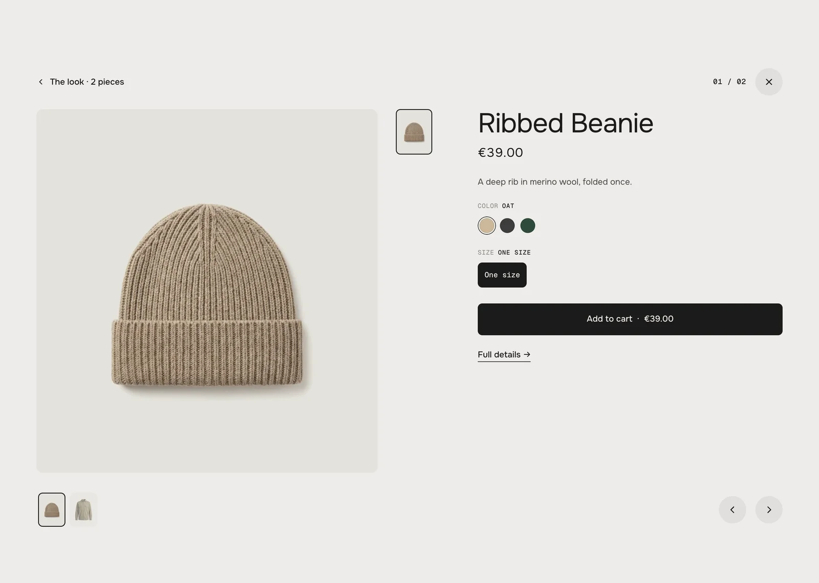
 Background#EDECE9Section backgroundText#1C1B1AHeading, names, prices, progress barBody text#4A4844The description in the dual viewText muted#85827CThe color line, labels, countersTiles#E4E2DDBehind every picture; the light story tileBadges & quick add#FFFFFFBadges, the +, the size barStory tile#1C1B1AThe dark story tileStory tile text#FFFFFFText on the dark story tileAccent#F2571FStory link, the accent story tile, the low stock badge