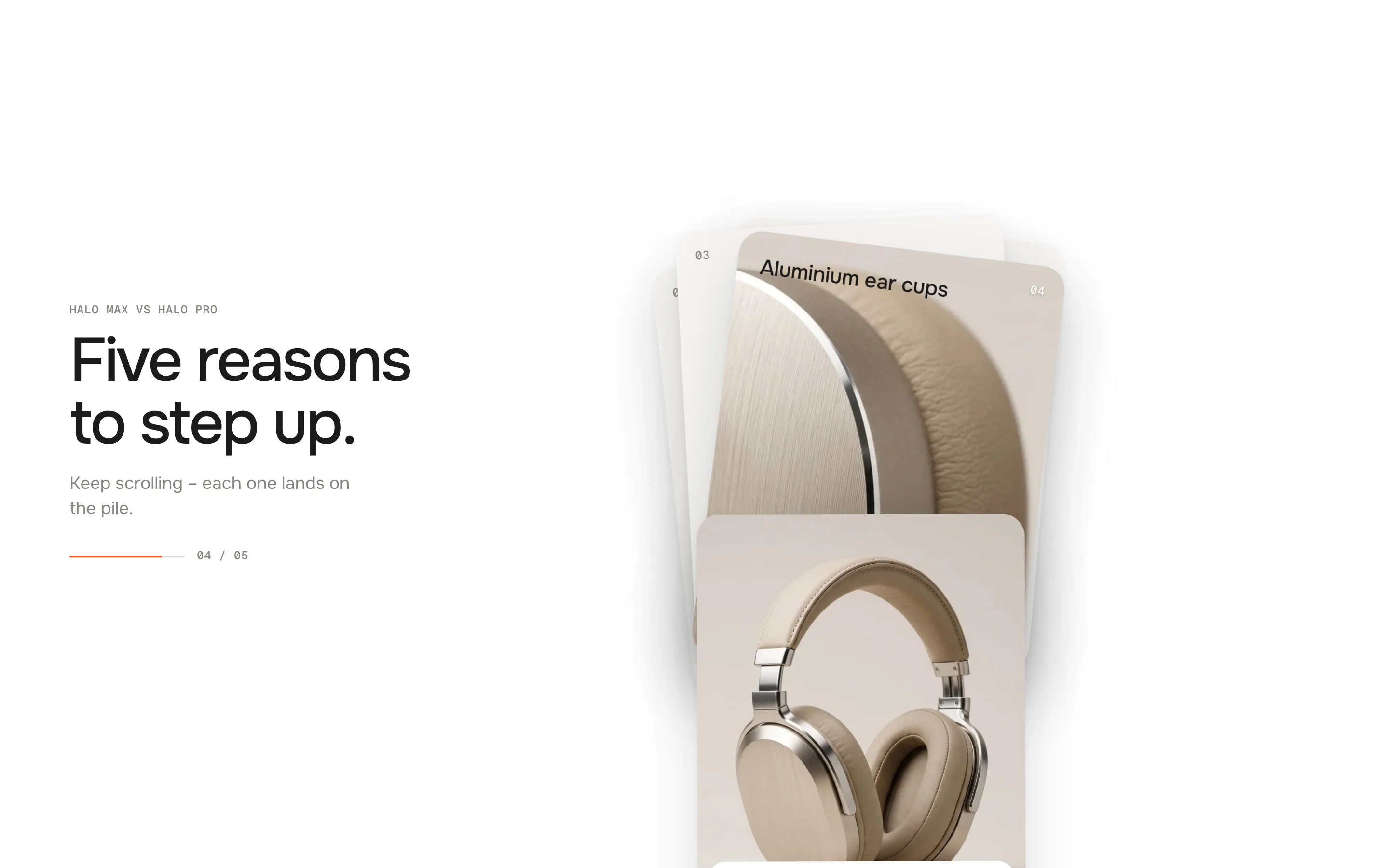
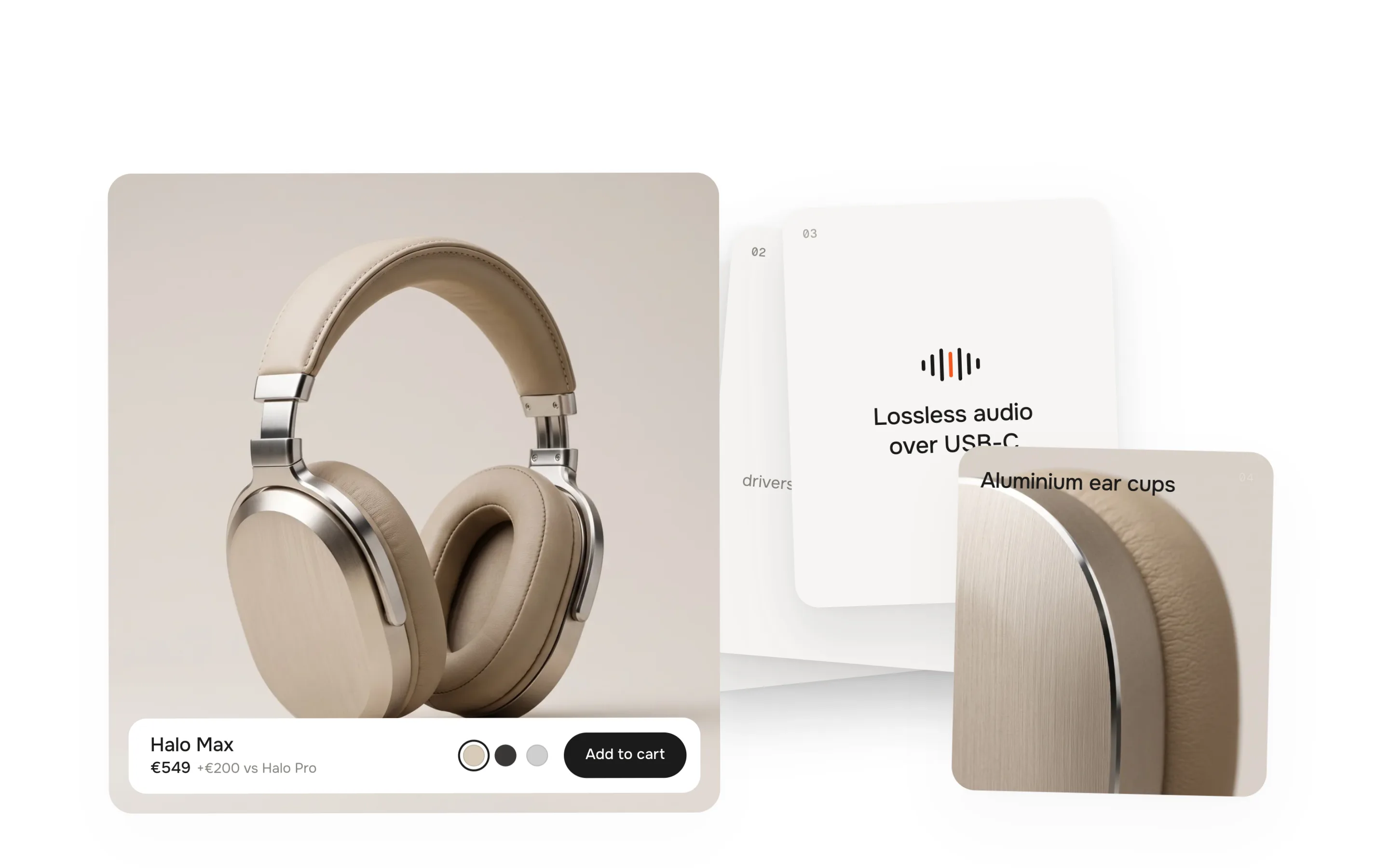
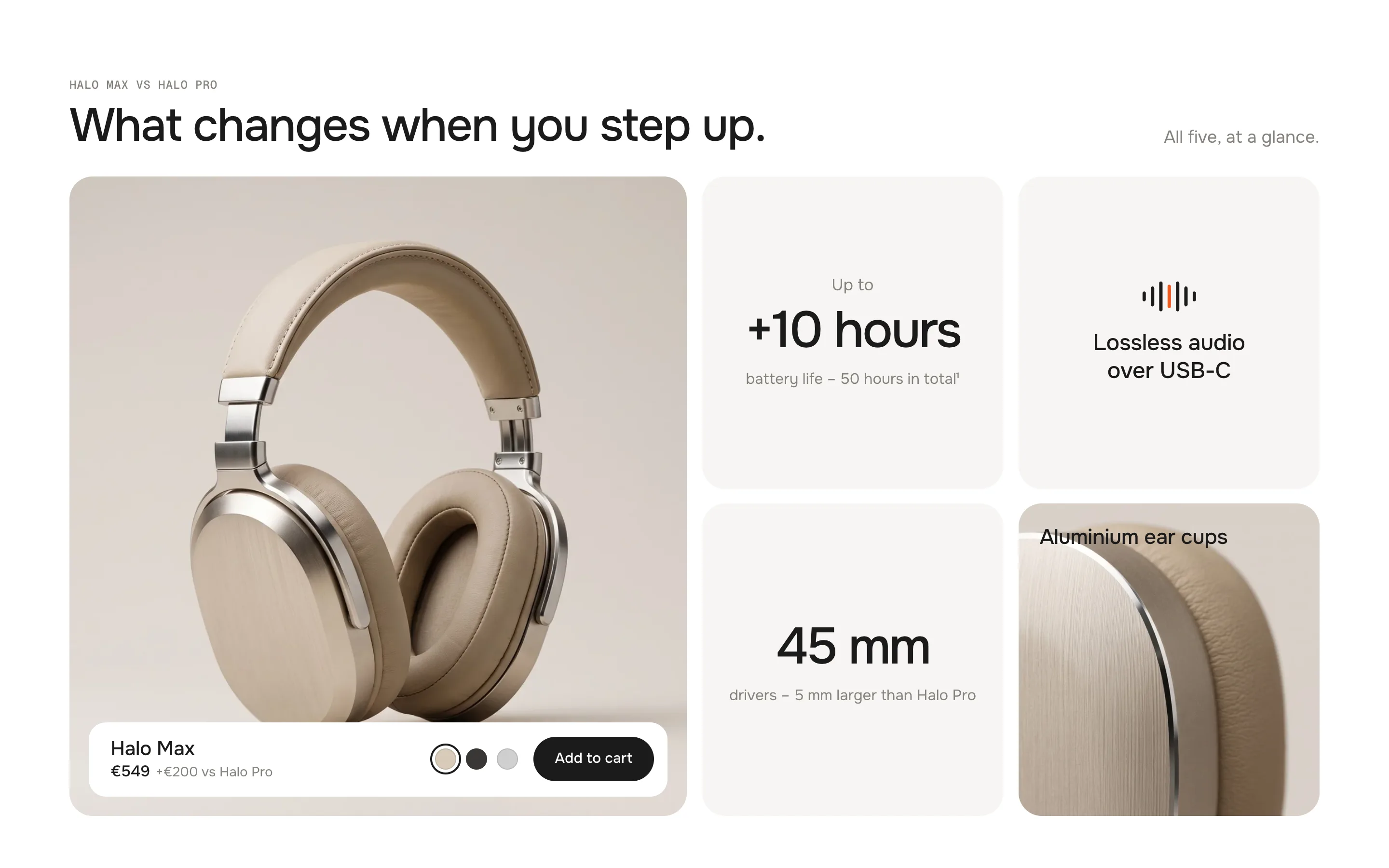
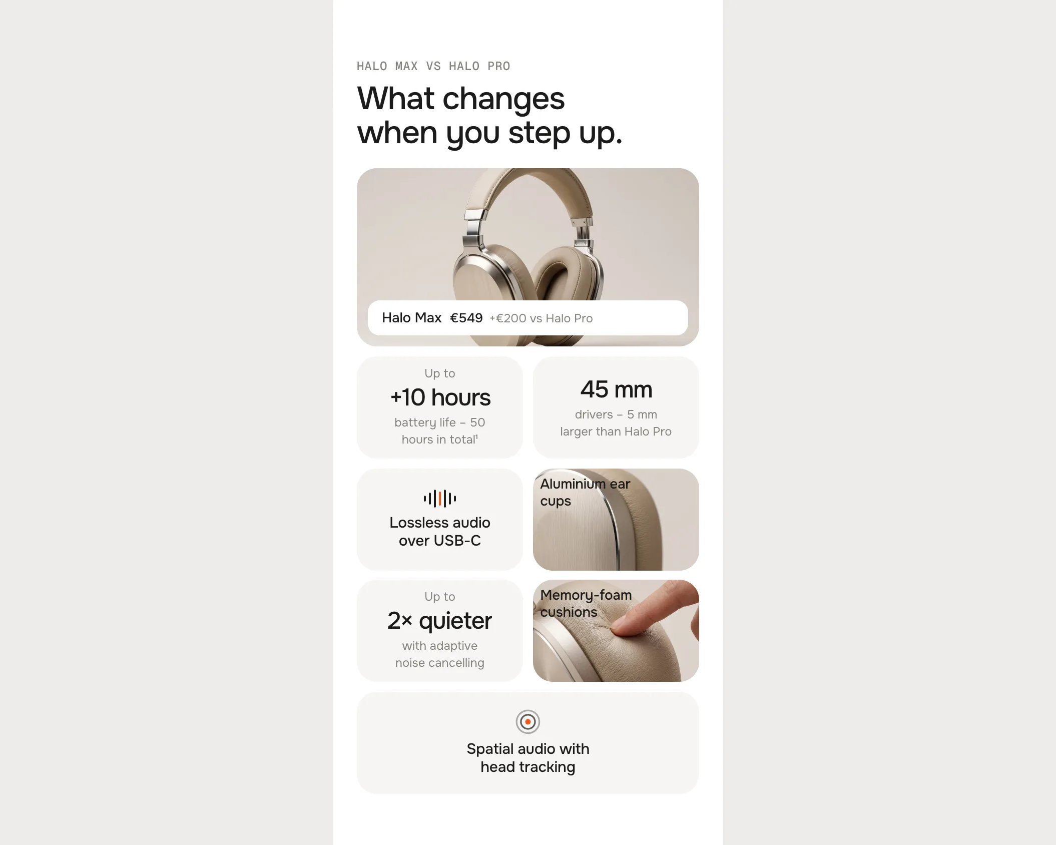
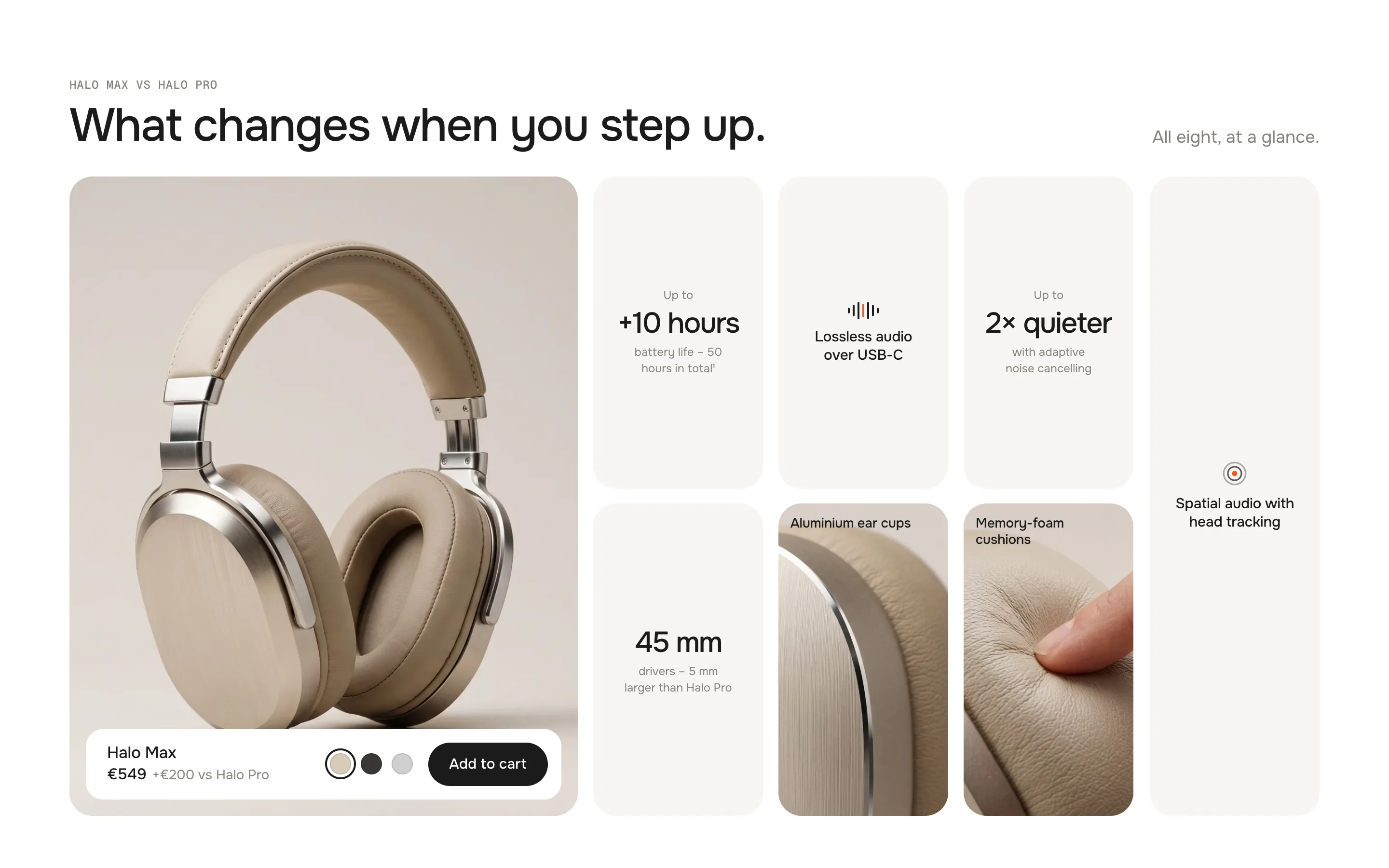
Two to eight cards fly onto a stack, one per scroll step, each landing with a small bounce. Then the stack deals itself out – every card grows into its cell of a bento grid – a hero with your product and an add to cart, plus key figures, features and pictures. Scroll back up and it all plays in reverse.
In your theme code editor (Online Store → ⋯ → Edit code), click the sections folder, then “New File”, name it and hit Enter.
02
Paste the code
In the file that just opened, paste the code below. Then hit Save (top right corner).
Note: Shopify shows no confirmation when a section saves – that’s normal.
03
Add it in the theme editor
Saved? Then reload the theme editor – otherwise the new section sometimes doesn’t show up. After that: Edit theme → Add section → . Everything else is in the sidebar – the Docs below explain every setting.
Code
One file. Copy it, paste it, done.
sections/werk-stack-to-bento.liquid
Locked
{%- comment -%} werk · Stack to Bento · v1.4.0 · werk.build/license – do not remove {%- endcomment -%}{%- liquid assign s = section.settings assign n = section.blocks.size # Demo images and fonts load from the werk demo store's Files (Shopify CDN), so the section looks the same in any store. # The demo reuses the Halo series of Product Comparison: Halo Max on the hero, details on the image tiles. assign werk_cdn = 'https://cdn.shopify.com/s/files/1/0954/8303/5932/files/' assign demo_base = werk_cdn | append: 'werk-product-comparison-' assign demo_tiles = 'detail-cup,detail-cushion,detail-headband' | split: ',' assign font_url = werk_cdn | append: 'werk-onest.woff2' assign mono_url = werk_cdn | append: 'werk-geist-mono.woff2' if s.font_url != blank
2150 lines · Liquid, CSS & vanilla JS
Free – just add your email
Every section is free during launch. Enter your email once and copy any code you like.
Edit theme → open the page → Add section → . It comes with five demo cards: the hero, two key figures, a feature and a picture.
2
Pick your product
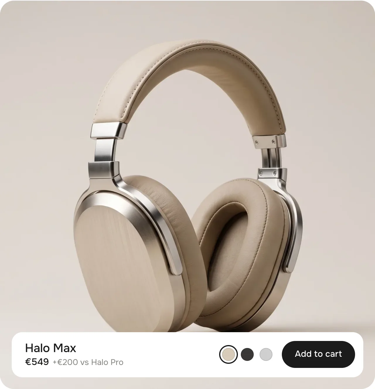
Click the Hero block and choose a Product. The card shows its picture, name, price, colours and an add to cart button.
3
Write your tiles
Every other card is a block – Key figure, Feature or Image. Click one to edit it: the section jumps to the bento and points at the card.
4
Scroll through it
Preview the page and scroll: the cards land on the pile, then deal themselves into the grid. Scroll back up and it plays in reverse.
The pile1 · The pile – cards fly in one by one and land with a small bounce
The deal2 · The deal – hero first, every card grows into its cell
The bento3 · The bento – the grid stays and the page scrolls on
The pile
On the left the eyebrow, the intro heading and a counter (03 / 05). On the right the cards arrive one per scroll step – each with a slight tilt, like a card that was dropped, and a small squash when it lands. The hero lands last, on top. On tablets and phones the pile sits below the intro.
The orange line and the count follow the cards that have landed
The deal
The intro fades out. The cards leave the pile from the top down – hero first – and each one flies into its cell of the grid: it grows to the cell's size, loses its tilt and shadow, and lifts a little on the way. The text inside follows the card's new size. Then the bento heading fades in.
Backwards and in the editor
Scroll back up and the cards stack again – the bounce only plays on the way down. In the theme editor, picking a block jumps straight to the bento.
Eyebrow
Default · Halo Max vs Halo Pro
A small mono line above both headings, e.g. the product line or a comparison.
Intro heading
Default · [count] reasons to step up.
Shown while the cards pile up. Bold and italic work.
Intro text
Default · Keep scrolling – each one lands on the…
The grey line under the intro heading.
Bento heading
Default · What changes when you step up.
The heading of the bento – it fades in once the cards sit in the grid.
Bento subheading
Default · All [count], at a glance.
Desktop only, on the right of the bento heading.
[count]The number of cards as a word[count] reasons to step up.→Five reasons to step up.
The intro heading writes it with a capital (Five), the bento subheading in lower case (five) – so the text stays right when you add or remove a card.
Hero
One per section.
SettingWhat it doesDefault
ProductShows its picture, name, price, colours and an add to cart button. Leave it empty to show the demo.Empty
ImageReplaces the product picture – e.g. a mood shot instead of the packshot.Empty
Name · without productThe name while no product is picked.Halo Max
Price · without productThe price while no product is picked.€549
Note next to the priceA short grey line, e.g. the difference to another model. Leave it empty to hide it.+€200 vs Halo Pro
Show colorsThe product's colour option as swatches. Picking one switches the variant, the price and – if the variant has one – the picture. The swatches only show when the hero card is at least 520 px wide – the theme editor's preview is often narrower, so check on a wide screen.On
Button labelThe add to cart button. Leave it empty to hide it.Add to cart
Button link · without productWithout a product the button becomes this link – or, without a link, a demo button.Empty
Added labelShown on the button after adding.Added
Sold out labelShown on the button when the variant is sold out.Sold out
Picture, name, price, note, colours, add to cart
When the card gets small
The buy bar follows the card's size: below 520 px wide (smaller laptops, tablets, many cards) the swatches step aside and the button gets compact, below 340 px the button steps aside too, and on a flat card the bar shrinks to one line.
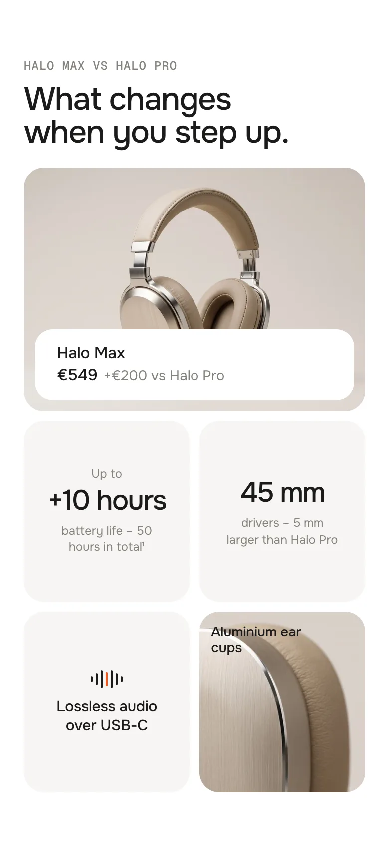
Phone with eight cards: the buy bar shows name and price
Adding goes straight to the cart and tells your theme – the cart count in the header updates without a reload (Horizon, Dawn and themes built on them).
Theme editor
Stack to Bento
Hero
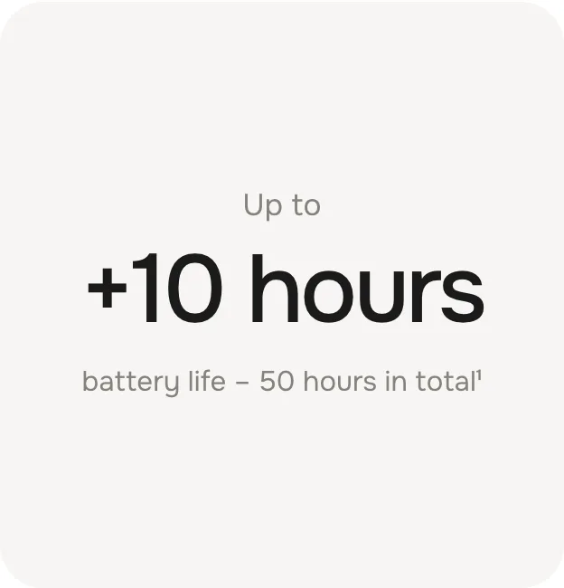
Key figure: +10 hours
Key figure: 45 mm
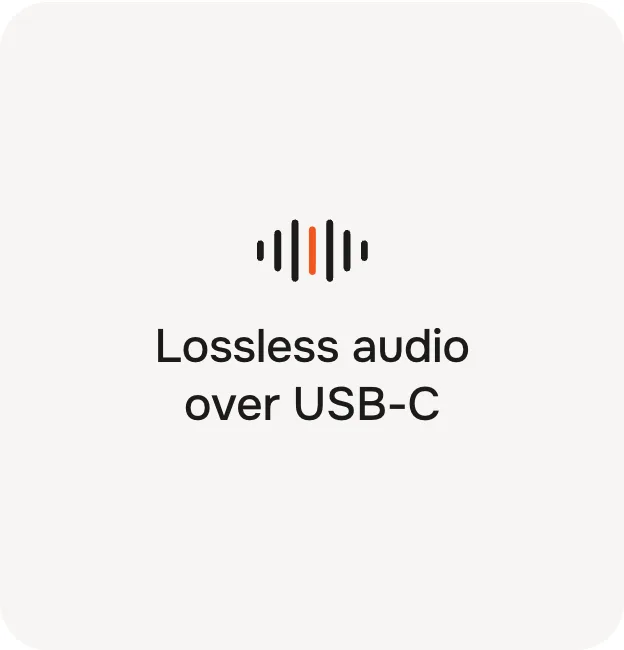
Feature: Lossless audio
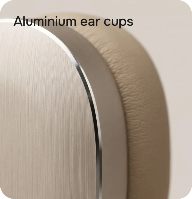
Image: Aluminium ear cups
The order of the blocks is the order on the pile and in the grid. The hero can sit anywhere in the list – it always lands last and takes the big cell.
Key figureKey figure – a small line, a big number, a short text
FeatureFeature – an icon and one sentence
ImageImage – a picture with a label
Key figure
A number that tells the difference.
SettingWhat it doesDefault
Small lineAbove the number, e.g. Up to. Leave it empty to hide it.Up to
NumberThe big line – keep it short.+10 hours
TextBelow the number.battery life – 50 hours in total¹
LinkOptional – the whole tile becomes a link.Empty
Feature
One sentence with an icon.
SettingWhat it doesDefault
IconOne of seven icons, or None.Sound wave
Own iconYour own icon instead – a square SVG or PNG.Empty
TextThe sentence.Lossless audio over USB-C
LinkOptional – the whole tile becomes a link.Empty
ImageShows our demo picture until you pick your own.Demo picture
LabelTop left on the picture. Leave it empty to hide it.Aluminium ear cups
Label colorDark or light – pick light on dark pictures.Dark
LinkOptional – the whole tile becomes a link.Empty
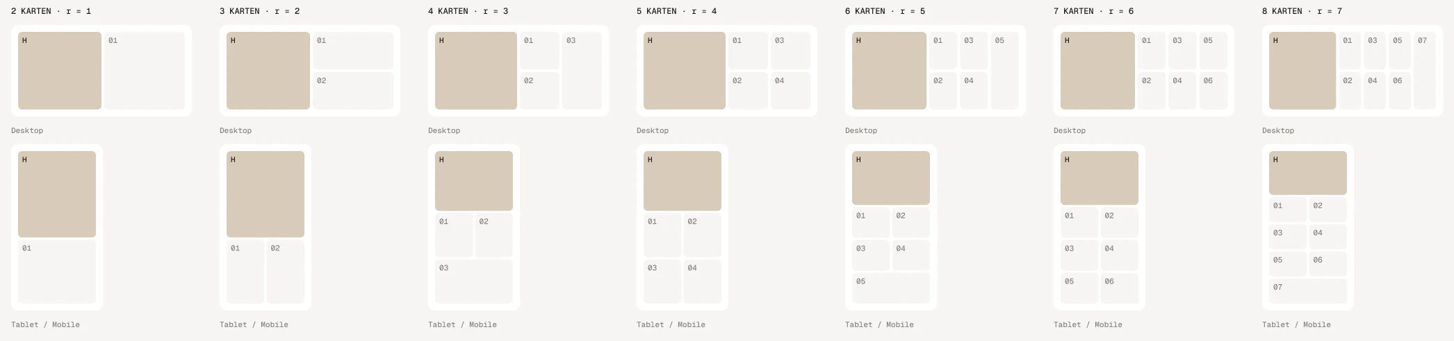
Desktop on top, tablet and phone below · H = the hero
DesktopTablet & phone
HeroTwo columns, both rows, on the leftFull width on top
TilesTwo rows, filled column by columnTwo columns
Odd number of tilesThe last tile is tallThe last tile is wide
Many cardsThe hero keeps at least 42 % of the widthThe hero row grows from 3 tile rows on
Five cardsEight cards
Scroll per card
Default · 42vh
How far visitors scroll for one card to land. The whole section grows with the number of cards – about 5 screens with five cards, 6.5 with eight. Shorter feels snappier, longer gives every card more time.
Bounce when a card lands
Default · On
The small squash when a card lands. It only plays while scrolling down.
Animations
Default · On
Off: the section is one screen high and shows the bento right away – no pile, no deal. Visitors who turned on “reduce motion” on their device always see it like this.
Easing
Default · werk Signature
The curve of the cards on their way into the grid – and of the hover on linked tiles.
werk Signature
Smooth
Bounce
Snap
Glide
werk SignatureSlow start, soft landing
SmoothEven and quiet
BounceCards shoot a little past their cell
SnapQuick start, gentle stop
GlideSlow in, slow out
Padding top
Default · 0px
Space above the section. The stage fills the screen, so 0 is the default.
Padding bottom
Default · 0px
Space below the section.
Fonts
Default · Design fonts
Onest and Geist Mono from werk's CDN. Use theme fonts swaps every font at once. Or swap each one with its own URL – Self-hosted font URL replaces Onest; Label font URL replaces Geist Mono (the small labels and numbers). Empty keeps werk’s font.
Colors
Default · Design colors
Background, text, muted text, tiles, buy bar, accent and lines – or Use theme colors, which takes the colours of the page around the section and mixes the rest from them. Button and Button text give the buttons their own colours – empty keeps the design.
1Background#FFFFFFSection background
2Text#1C1B1AHeadings, numbers, name
3Text muted#85827CEyebrow, small lines, texts
4Tiles#F6F5F3Key figure and feature tiles
5Buy bar#FFFFFFThe bar on the hero
6Accent#F2571FCounter line, icon detail, focus ring
7Lines#E2DFD9The counter's track
Buttons
Default · Clean
Use theme buttons gives the add to cart button your theme's style. Button style sets how it reacts on hover.
Hover them – click a button for loading → added
View productCleanGrows a touch, the underline runs out and backView productDot to arrowThe dot grows into an arrowView productRolling textThe label rolls up, a copy followsView productFillColour wipes in from the leftView productShineA band of light passes over
Side padding
Default · Match theme
Match theme (the default) lines the section up with your theme's page margin – in Horizon the same edge as header and footer. Themes without one, like Dawn, keep the werk edge. werk default always uses the werk edge, Custom takes your own values in px (desktop and tablets / phones), None runs the content to the edge.
Desktop · intro beside the pile
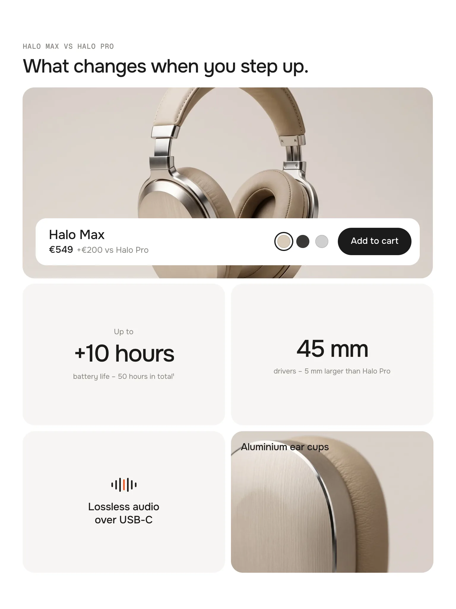
Tablet · hero on top
Phone · two tiles per row
DesktopTabletPhone
PileRight of the introBelow the introBelow the intro
BentoHero left, tiles in two rowsHero on top, tiles in two columnsHero on top, tiles in two columns
Buy barName, price, colours, buttonName and priceName and price
Bento subheadingShownHiddenHidden
The editor jumps to the bento
Pick a block and the section scrolls to its end and points at the card – no scrolling through the pile while you edit.
Links when they're in place
Linked tiles and the add to cart button only react once the card sits in its cell – nobody clicks a flying card.
No jumping on load
The section is as tall as its scroll before the script runs, and without JavaScript the bento shows as a plain grid.
Light on the page
One loop, and only while the section is in view. No libraries.
AI label
Using an AI-generated picture? Switch on AI label under that picture and pick a corner. The text and the look – pill, info dot or upright along the edge – are set once for the whole section, under AI label. The hero gets one only for an own picture, not for the product's.
Horizon4.2TestedAdd to cart, theme fonts, colours and buttons
Dawn16TestedAdd to cart (cart bubble updates), theme fonts, colours and buttons
I only see the grid, no pile.
Animations are off, the section has only one card, or your device asks for reduced motion. In all three cases the bento shows right away.
The section is too long / too short.
Change Scroll per card. Every card adds the same amount of scroll, so fewer cards also mean a shorter section.
I turned on Show colors but see no swatches.
The hero card is narrower than 520 px – this happens in the theme editor, whose preview is narrower than your screen, on smaller laptops and on tablets. Open the page on a wide screen to see them. Otherwise the product has no colour option (swatches or an option called Color).
The hero has no button.
Button label is empty, or the card is narrower than 340 px – then the buy bar only shows name and price.
My number ends with “…”.
It is longer than two lines in its tile. Shorten it, or put the rest into the text below.
The heading still says “Five” after I removed a card.
Write [count] instead of the number – it follows the number of cards.
1.4.012 Oct 2026
NewSide padding. Match theme (the default) lines the section up with your theme's page margin – in Horizon the same edge as header and footer. Themes without one, like Dawn, keep the werk edge. werk default always uses the werk edge, Custom takes your own values in px (desktop and tablets / phones), None runs the content to the edge.
1.3.011 Oct 2026
NewAI label per picture (EU AI Act). Under every own picture and video a switch with the corner; the text and the look – pill, info dot that opens on hover, or upright along the edge – are set once under AI label. Off by default, nothing changes until you switch it on. Product and collection pictures from Shopify never get one.
1.2.28 Oct 2026
NewShow colors now says in the editor that the swatches only show on a hero card of 520 px and wider – the editor preview is often narrower.
1.2.18 Oct 2026
FixedFix: Add to cart stays on a narrower hero. Below 520 px card width (desktop windows under about 1180 px, tablets) only the swatches step aside and the button gets compact; it steps aside only below 340 px.
1.2.06 Oct 2026
NewLabel font URL (Fonts) – swap Geist Mono, the small labels and numbers, for your own .woff2. With Self-hosted font URL every font can now be swapped on its own; Use theme fonts still swaps all of them.
1.1.06 Oct 2026
NewButton and Button text colours (Colors). Empty = as designed – nothing changes until you pick one. Hidden while Use theme colors or Use theme buttons is on.
* Built for Online Store 2.0 and tested in Shopify's Horizon and Dawn themes. Heavily customised or older themes can still clash with it – if something looks off, write us and we'll take a look.