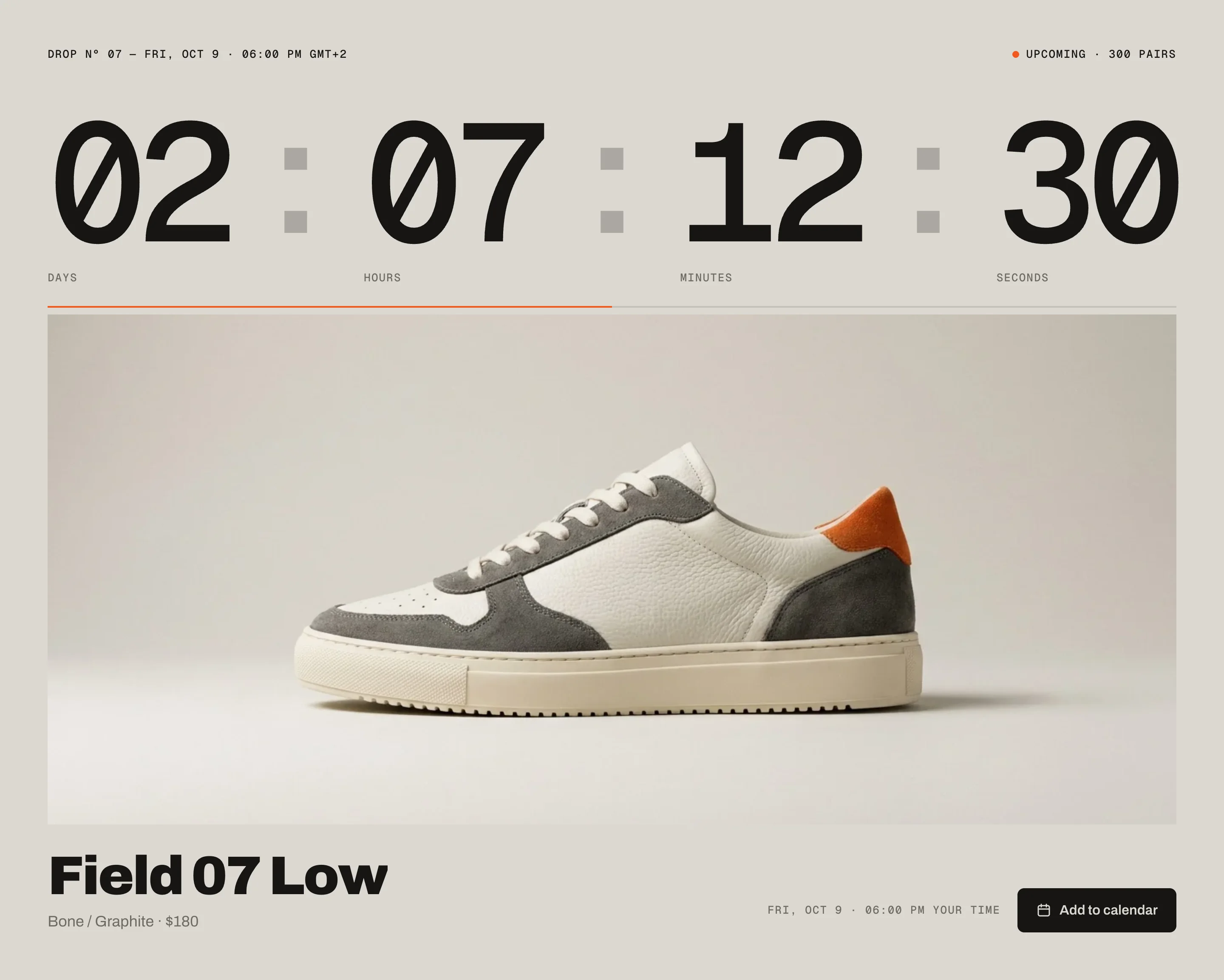
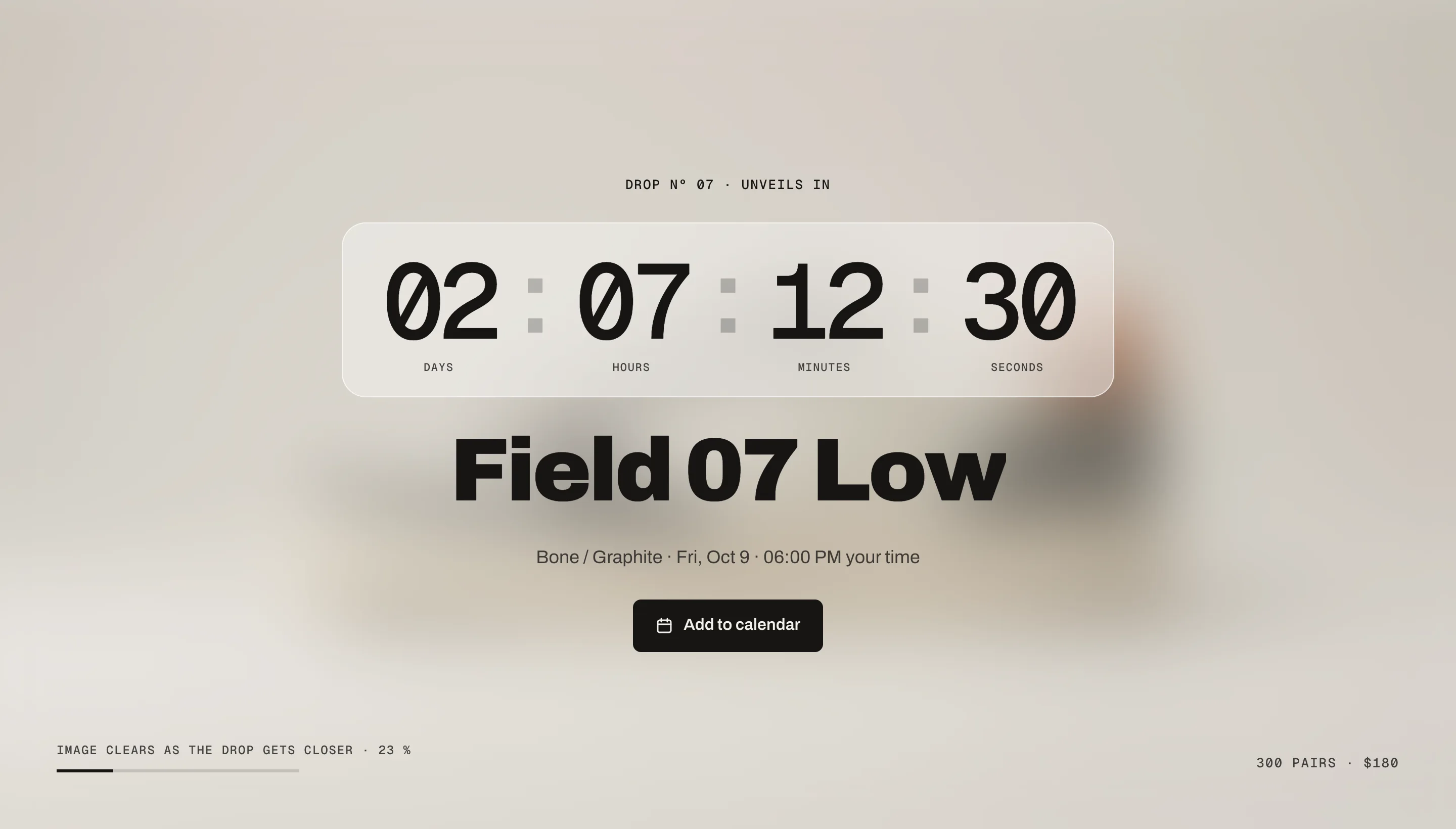
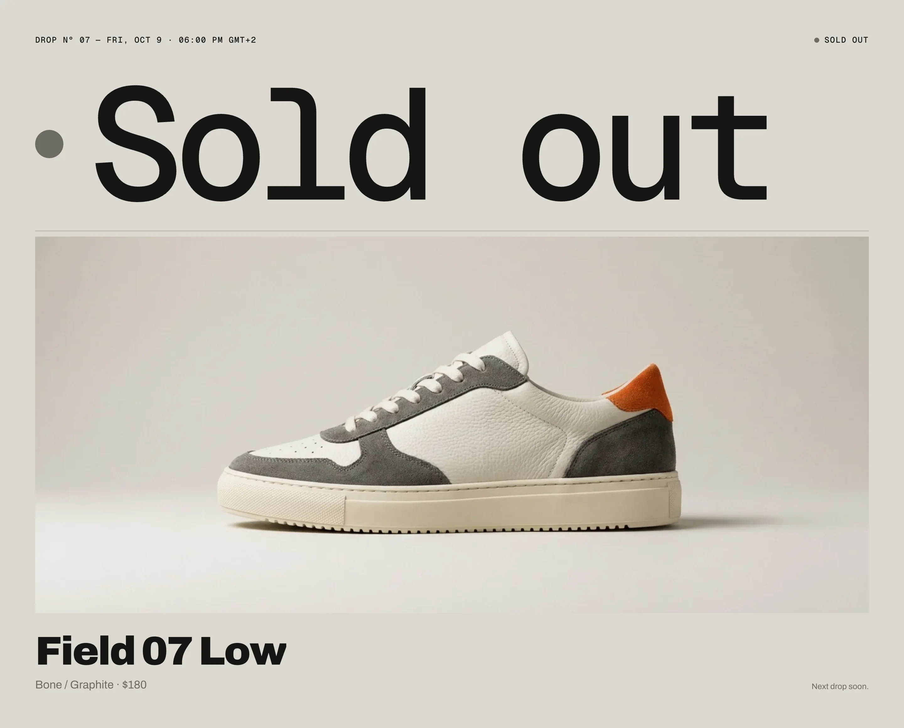
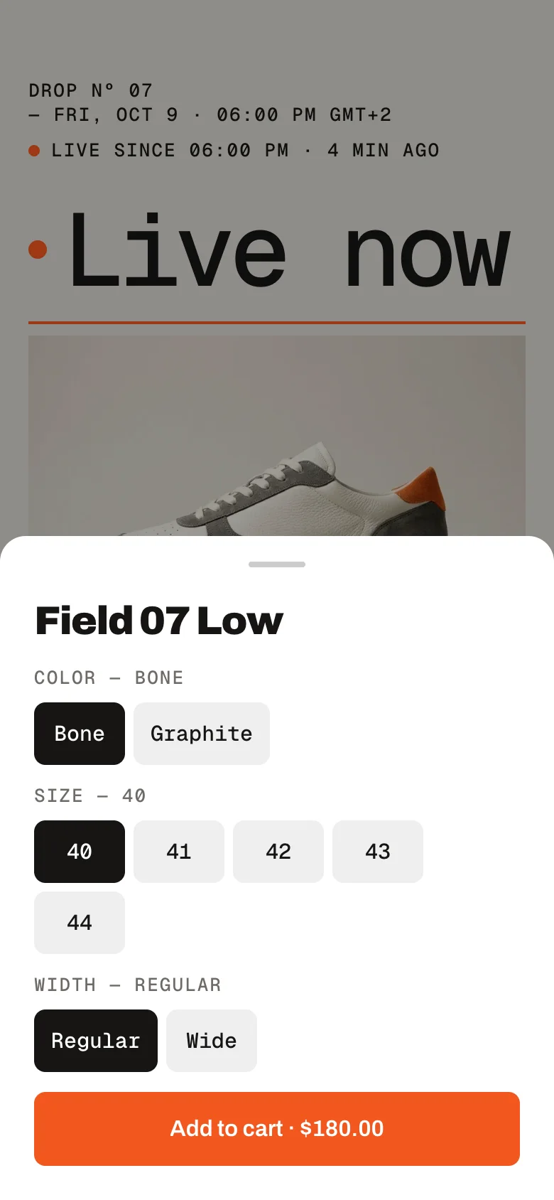
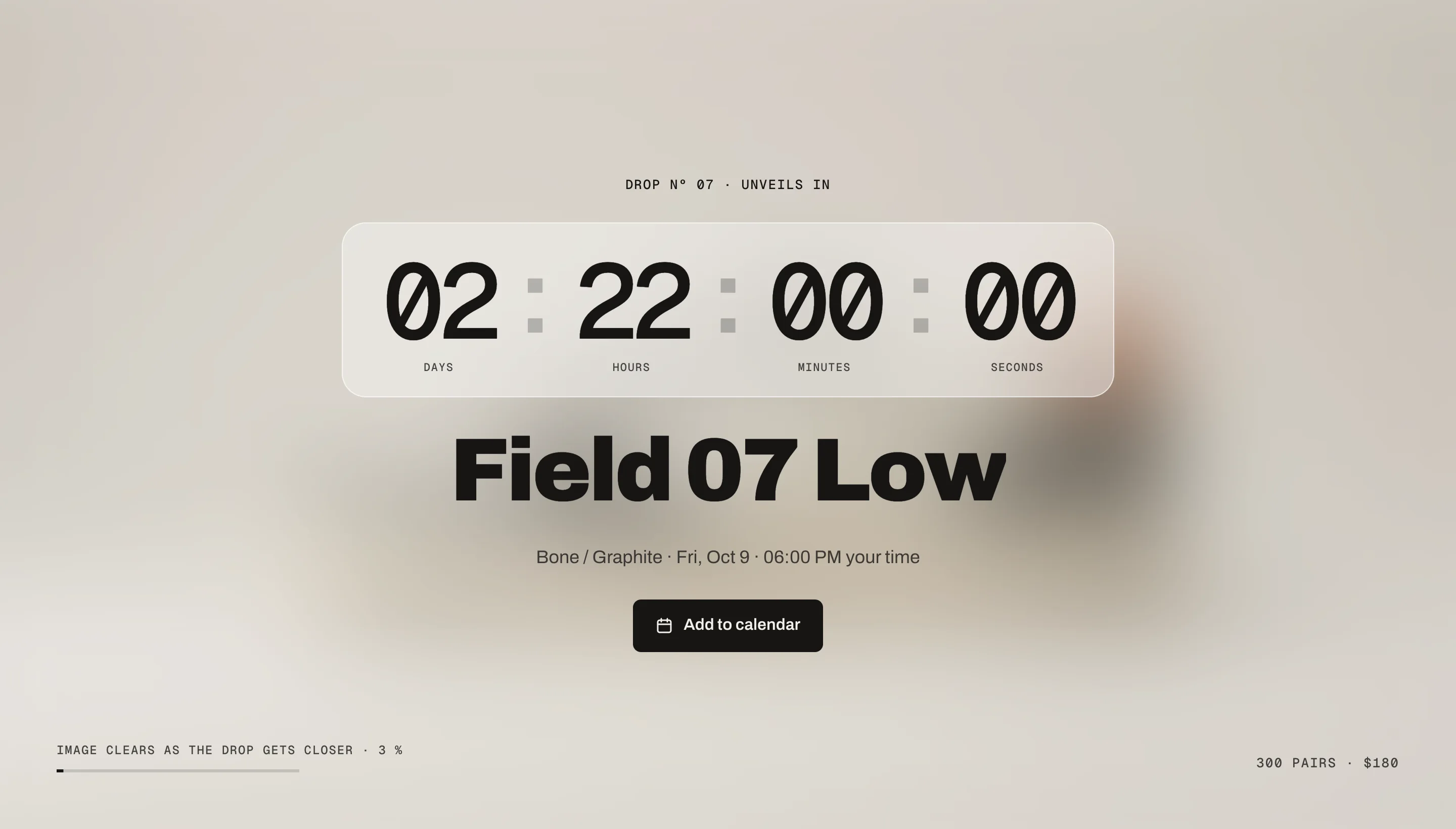
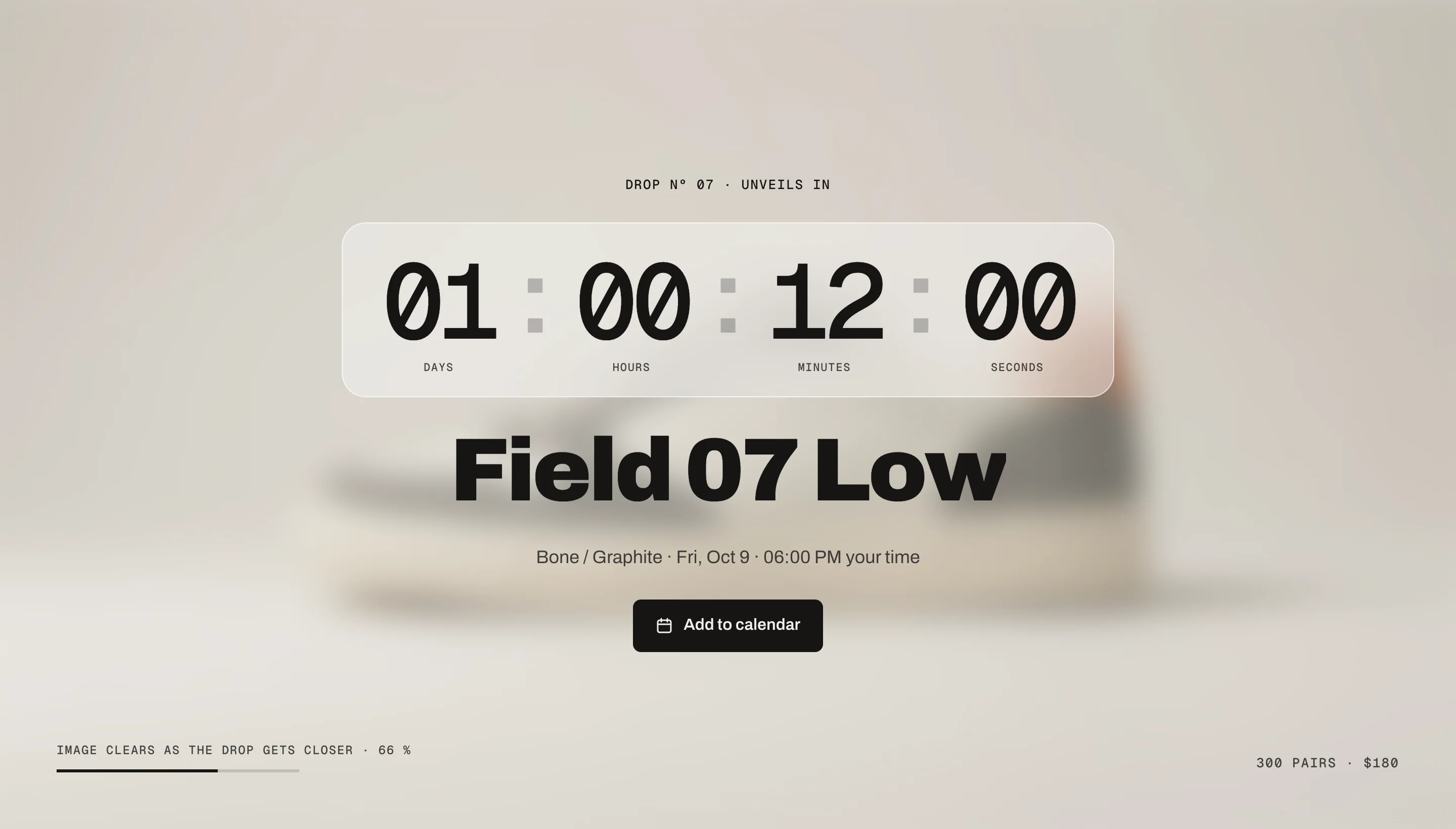
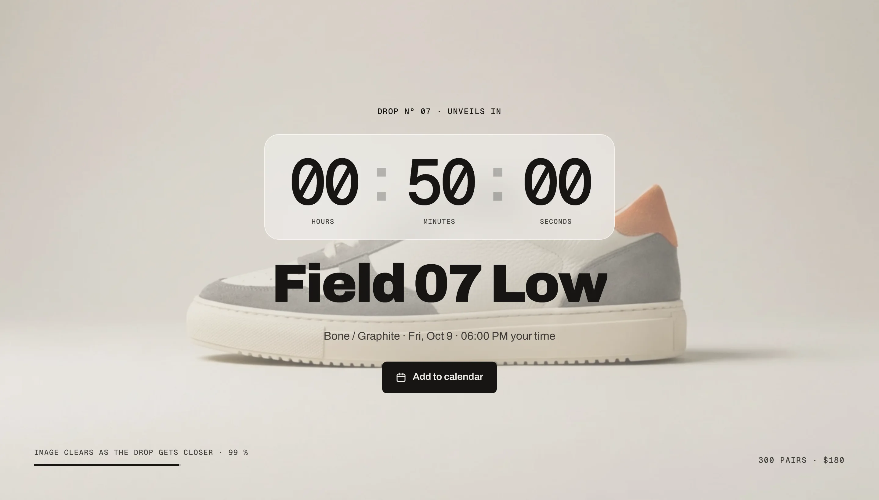
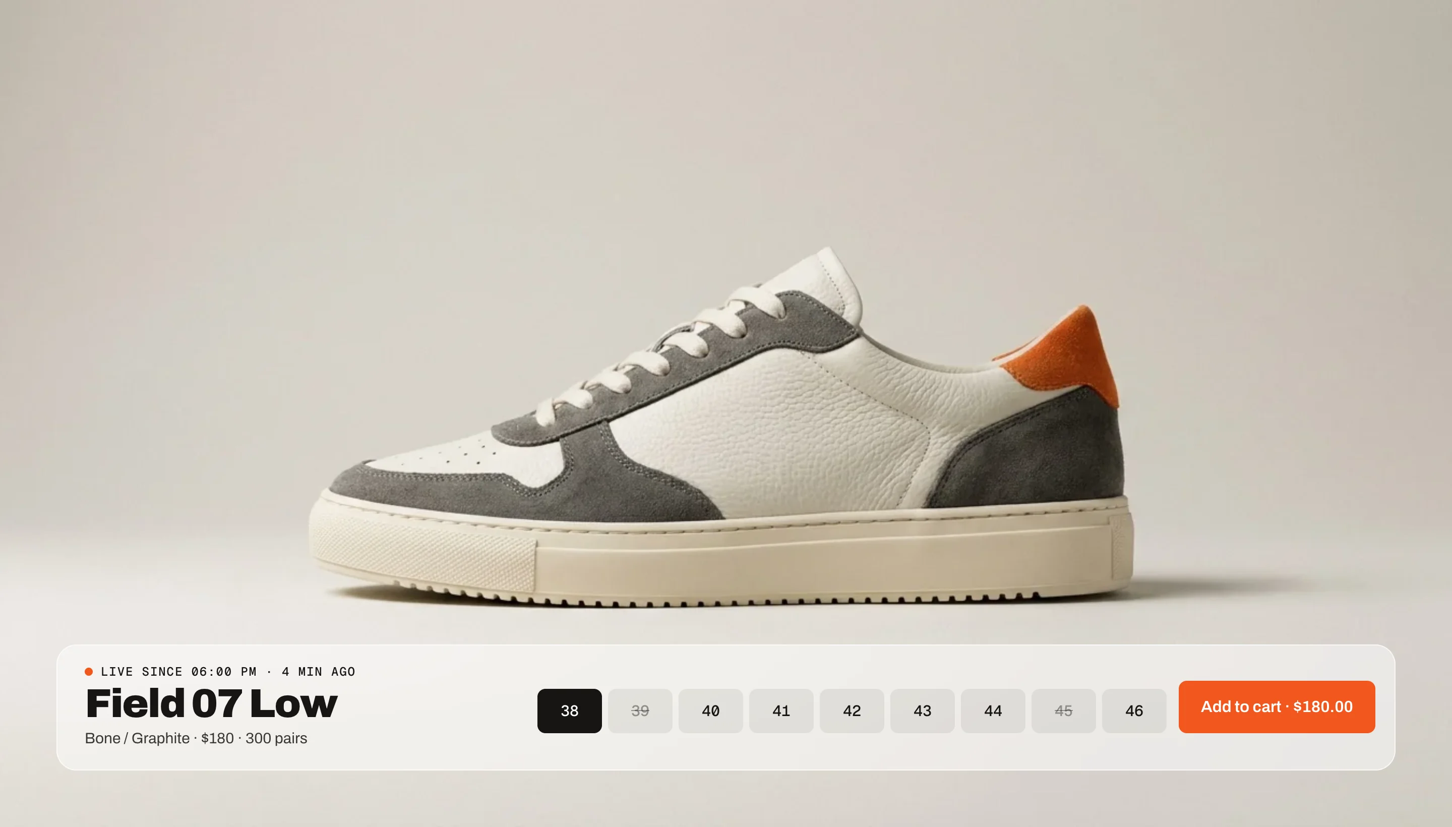
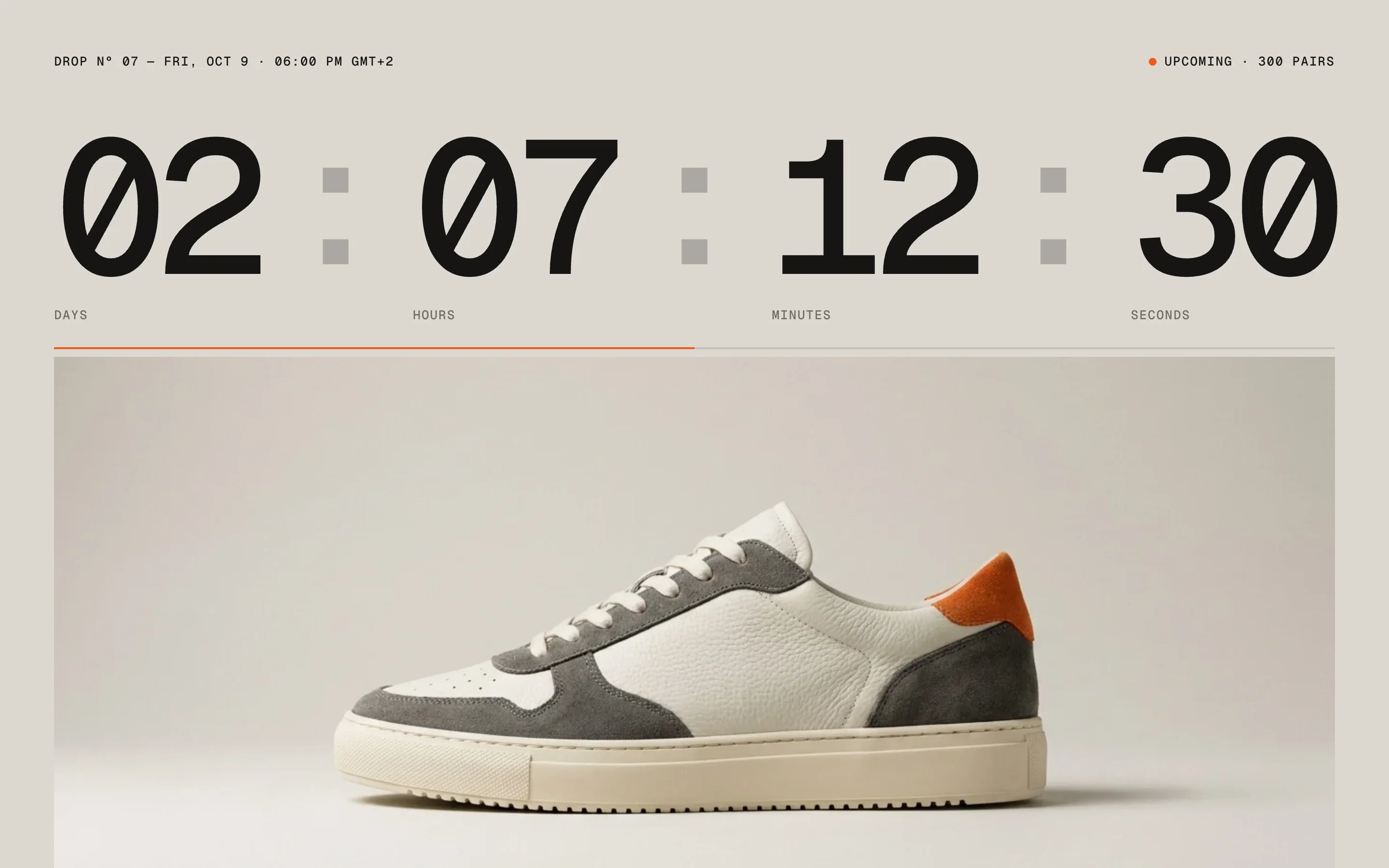
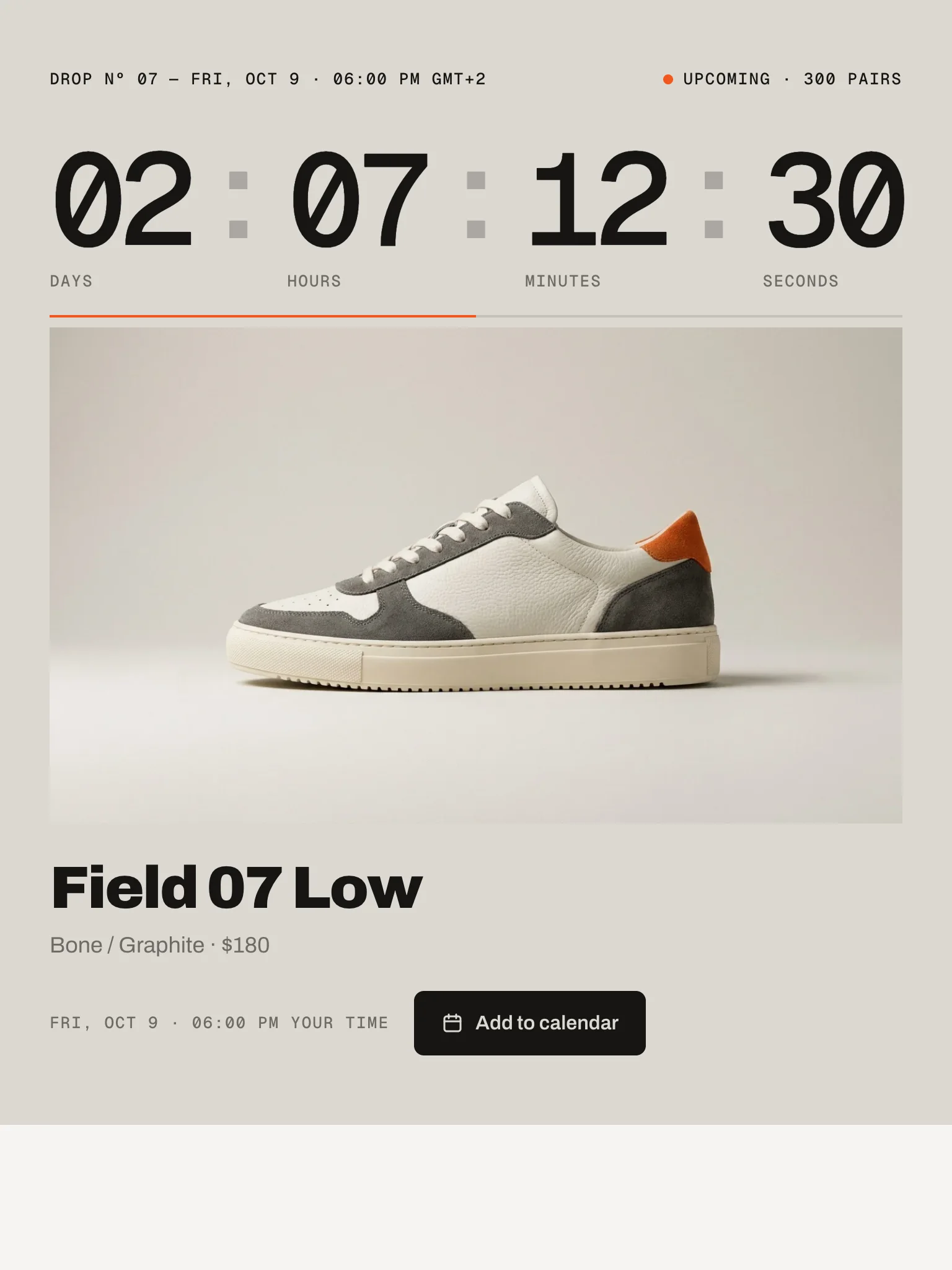
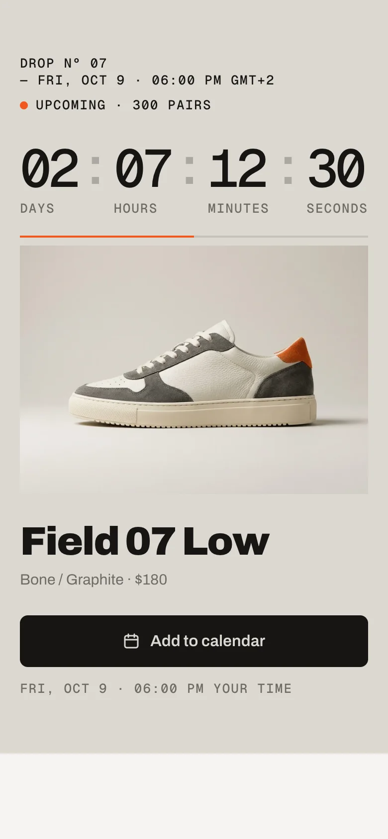
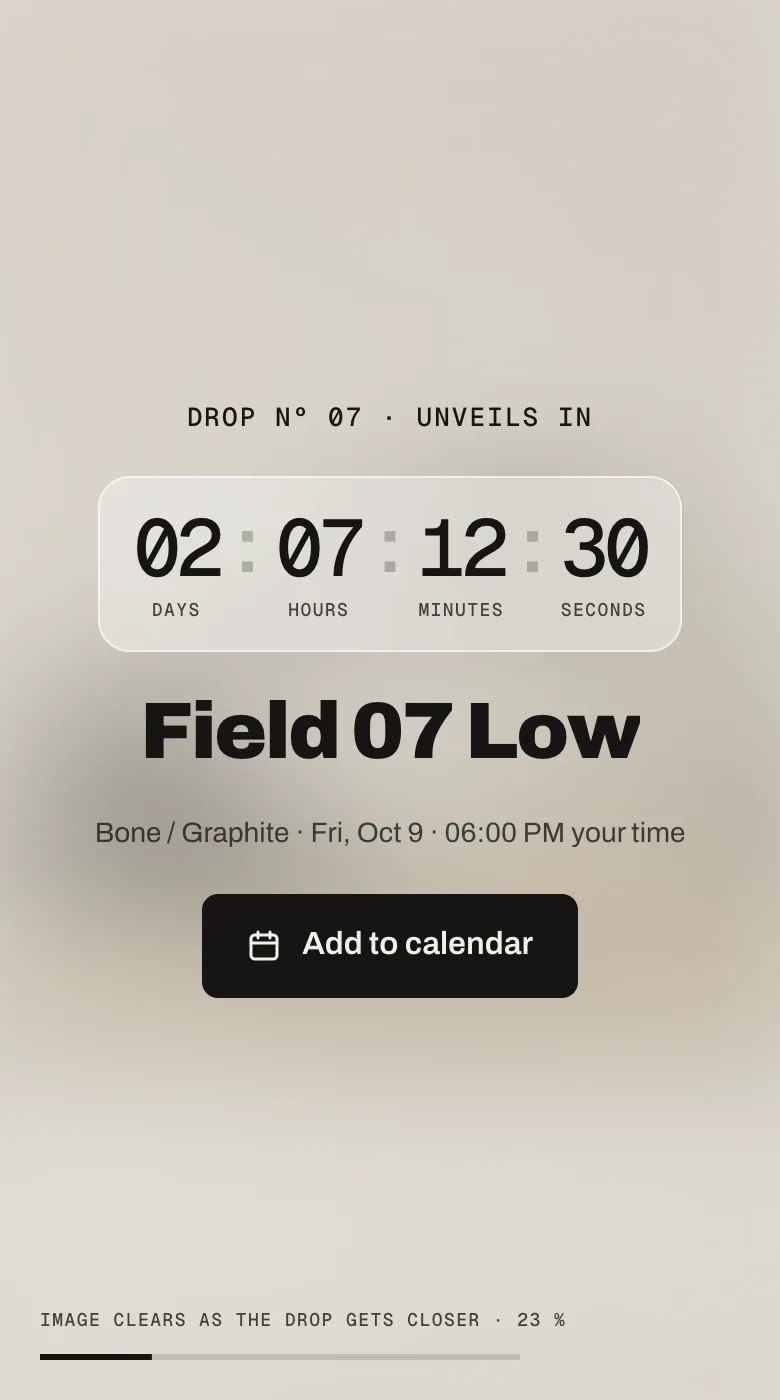
Huge rolling digits over the product (Odometer) or an image that sharpens as the drop gets closer (Veil). Visitors add the drop to their calendar, and at the drop time the section unlocks the product without a reload – options and add to cart right where the countdown was.
In your theme code editor (Online Store → ⋯ → Edit code), click the sections folder, then “New File”, name it and hit Enter.
02
Paste the code
In the file that just opened, paste the code below. Then hit Save (top right corner).
Note: Shopify shows no confirmation when a section saves – that’s normal.
03
Add it in the theme editor
Saved? Then reload the theme editor – otherwise the new section sometimes doesn’t show up. After that: Edit theme → Add section → . Everything else is in the sidebar – the Docs below explain every setting.
Code
One file. Copy it, paste it, done.
sections/werk-drop-countdown.liquid
Locked
{%- comment -%} werk · Drop Countdown · v1.4.0 · werk.build/license – do not remove {%- endcomment -%}{%- liquid assign s = section.settings # Demo image and fonts load from the werk demo store's Files (Shopify CDN), so the section looks the same in any store. assign werk_cdn = 'https://cdn.shopify.com/s/files/1/0954/8303/5932/files/' assign demo_img = werk_cdn | append: 'werk-drop-countdown-side.jpg' assign display_url = werk_cdn | append: 'werk-archivo.woff2' assign mono_url = werk_cdn | append: 'werk-geist-mono.woff2' if s.font_url != blank assign display_url = s.font_url endif if s.mono_font_url != blank
2326 lines · Liquid, CSS & vanilla JS
Free – just add your email
Every section is free during launch. Enter your email once and copy any code you like.
Edit theme → open the page → Add section → – Odometer or – Veil.
2
Enter the drop time
Section settings → Drop date and time, e.g. 2026-10-17 18:00 – in your store’s time zone. Until you do, the section counts down to the next Friday 18:00 as a demo.
3
Pick the product
Product – or, when its publishing is scheduled for the drop, its handle in Or product handle.
4
Write the teaser
Eyebrow, Title, Subtitle, Price before the drop, Edition, and your own image. Save.
Drop date and time
Default · Empty
Always in your store’s time zone (Settings → General → Time zone). Visitors see the date and time in their own zone, with “your time” next to it. The clock follows Shopify’s server time – a visitor with a wrong clock on their device can’t open the drop early.
Product
Default · Empty
Use this when the product is already in your store and only the stock arrives at the drop. Until then the section shows your teaser, not the product.
Or product handle
Default · Empty
Shopify hides a product whose publishing is scheduled – the theme can’t see it before. Enter its handle (the last part of its URL, e.g. field-07-low). At the drop the section asks Shopify every few seconds until the product is there – usually within seconds, for up to about three minutes. No reload needed.
At the drop
Default · Buy here – options and add to cart
Buy hereOptions and Add to cart appear where the countdown was. See At the drop.
Link to the product pageA button to the product page (or the Link below).
Hide the sectionFor a teaser that’s only there before the drop. In the theme editor it stays visible.
Link
Default · Empty
Optional. Where “Go to the drop” leads: with Link to the product page, and when the product can’t be found at the drop. Empty: the product page.
Ends (optional)
Default · Empty
Optional, same format. For drops with an end – after it the section shows what you pick in After the end.
After the end
Default · Show a message
Show a message“This drop is over” (Texts → After the end).
Show sold outThe same as a sold-out drop.
Hide the section
OdometerVeil
Look
Default · Odometer – huge rolling digits
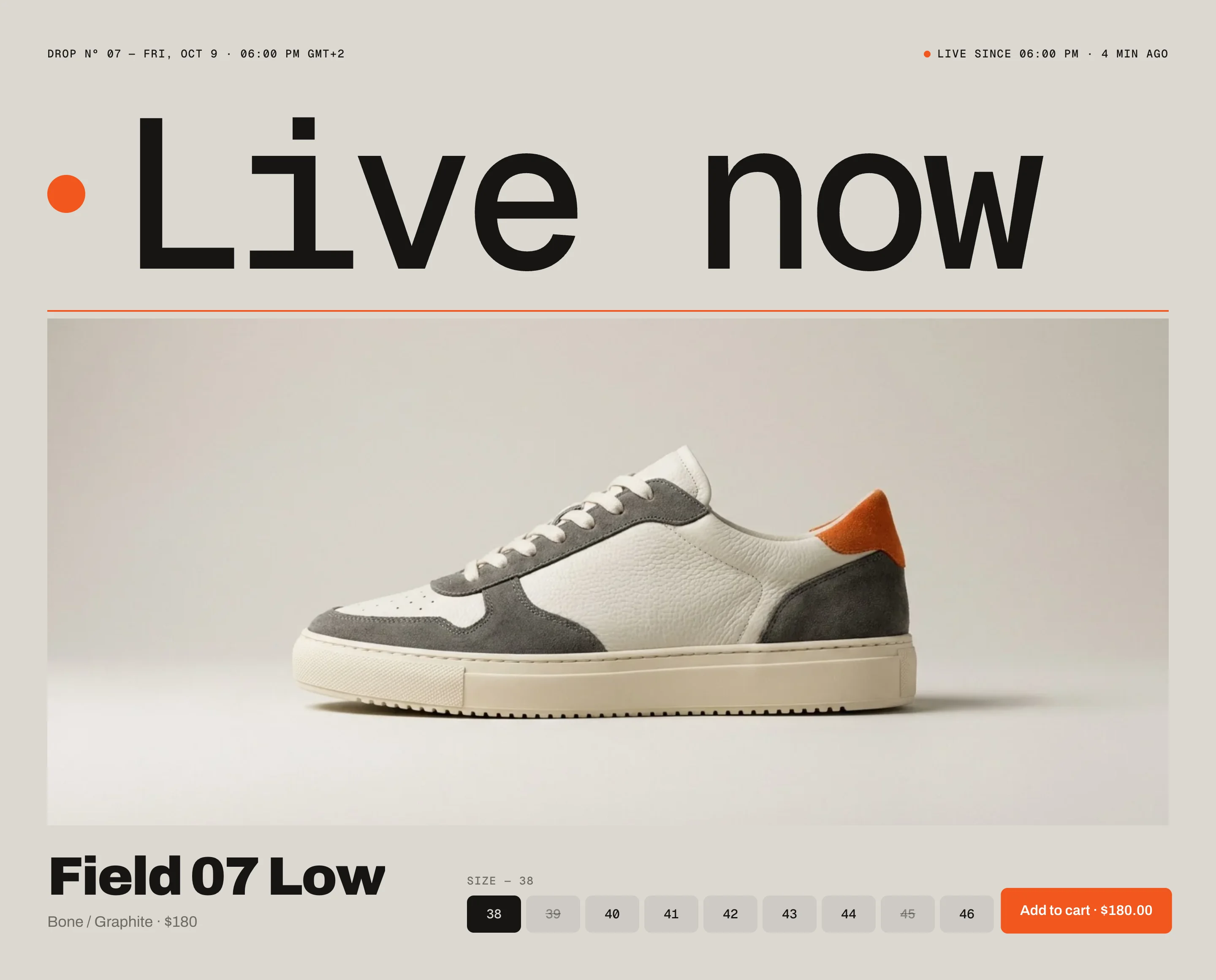
OdometerHuge rolling digits above the product. At the drop the digits make room for a big “Live now” and the buy area sits under the image.
VeilThe image fills the section and is blurred; it clears as the drop gets closer. At the drop it’s sharp and a glass bar with the buy area slides in. See Veil.
Before the dropUpcoming · 300 pairs
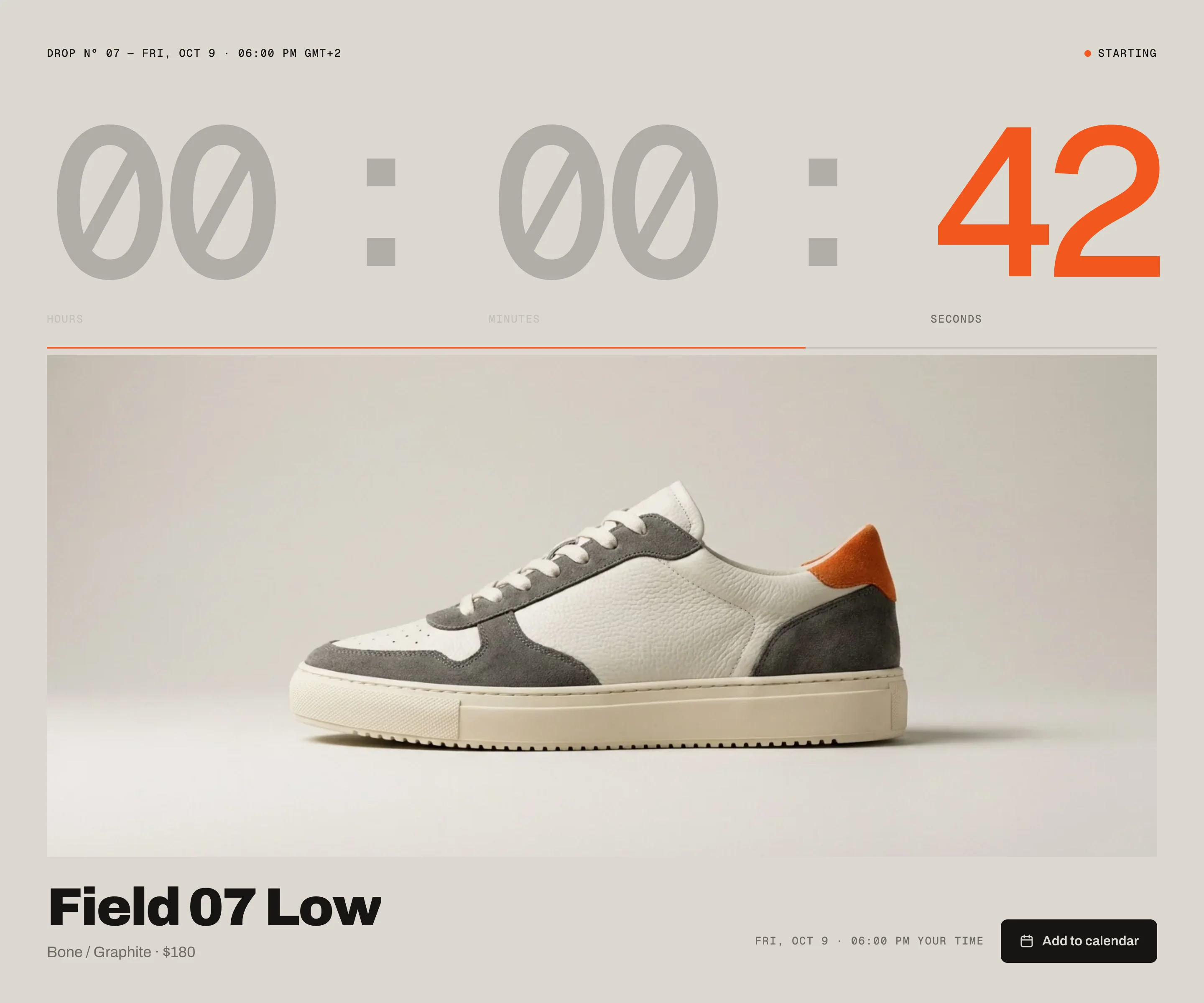
Last minuteLast minute: seconds in the accent colour
LiveLive now: options and Add to cart
Sold outSold out
Show seconds
Default · On
Off: hours and minutes only. In the last minute the seconds always show.
The status line
Top right in Odometer, in the bar in Veil. It follows the drop on its own:
WhenIt says
BeforeUpcoming · 300 pairs (Edition)
Last minuteStarting
At the drop, while the product loadsUnlocking …
LiveLive since 06:00 PM · 4 min ago
After an hourLive since 06:00 PM
After a dayLive since Oct 17, 06:00 PM
Sold outSold out – plus the Sold out note
The line under the digits fills once per minute – in the last minute it runs down with the seconds.
One variantNo options: just the button with the price
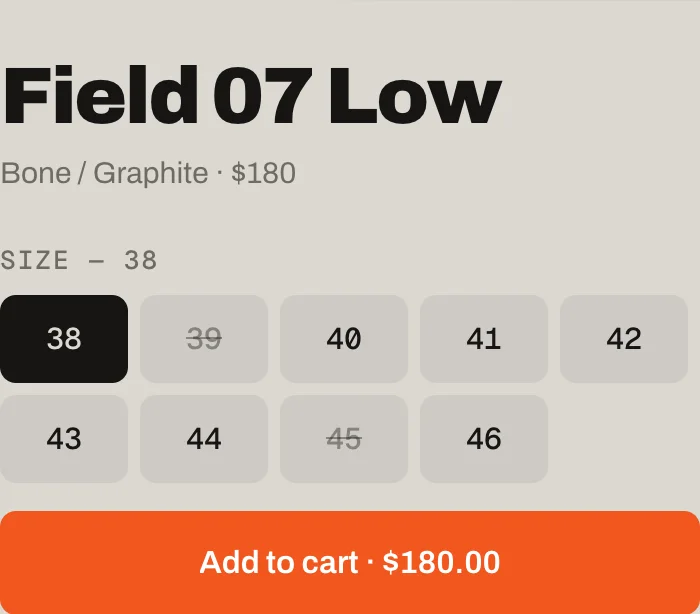
SizesOne option: chips, sold-out sizes crossed out
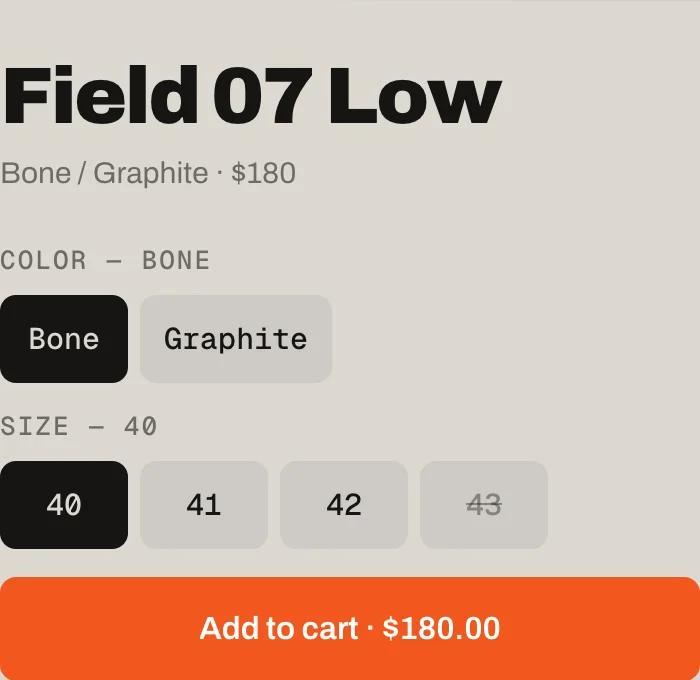
Two optionsTwo options: two rows, colours get a swatch
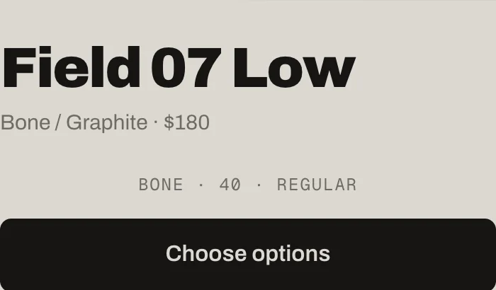
Choose optionsThree options or more than 20 values: Choose options
ProductOdometerVeil
No optionsButtonButton
1–2 optionsChips; long lists wrapChips up to 9 values, then a select
More than 24 values in one optionSelectSelect
3 options, or more than 20 values in allChoose options → panelChoose options → panel
Choose options on a phone: a sheet with every option and the price on the button
The first variant in stock is preselected. Sold-out combinations are crossed out; a click on one jumps to the nearest one in stock. After Add to cart the button says Added and your theme’s cart count updates without a reload.
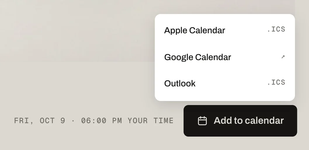
Apple Calendar and Outlook download an .ics file, Google opens a prefilled entry
Add to calendar button
Default · On
Apple Calendar and Outlook get an .ics file, Google a link. No form, no data.
Calendar entry: title
Default · Field 07 Low drops
Empty: the Title.
Calendar entry: text
Default · 300 pairs · EU 38–46 · first come, fir…
The text of the entry. The link to the page the visitor came from is added below it, so the entry leads back to the drop.
How long the entry is in the visitor's calendar. Short is fine – it's a reminder, not a meeting.
15 minutes
30 minutes
1 hour
Calendar entry: reminder
Default · 15 minutes before
Apple Calendar and Outlook ring at that time. Google ignores it and uses each person’s own default reminder.
None
5 minutes before
15 minutes before
1 hour before
1 day before
Image
Default · Empty
Landscape works best for Odometer, a calm, atmospheric picture for Veil.
Image fit
Default · Fill the frame
Fill the frameThe image is cropped to fill. The focal point you set on the image in Shopify stays in view.
FitThe whole image, for cut-outs and tall photos. The section takes the colour at the photo’s edges and continues it to the frame, so the photo sits on its own background.
Only visible in the Odometer look
FillFit
Eyebrow
Default · Drop Nº 07
A short line above the title, e.g. the drop number. Before the drop it sits next to Unveils, after it next to the time.
Title
Default · Field 07 Low
Up to two lines on desktop, three on phones. Longer names get smaller first, then cut with “…”.
Subtitle
Default · Bone / Graphite
A small line under the title, e.g. the colours. The visitor's local drop time follows it. Leave it empty to show only the time.
Price before the drop
Default · $180
Just text. At the drop the real price comes from Shopify.
Edition
Default · 300 pairs
Shows in the status line: Upcoming · 300 pairs.
70 hours before70 hours before
24 hours before24 hours before
50 minutes before50 minutes before
LiveLive: sharp, glass bar
Image clears over the last
Default · 72h
Before that the image stays fully blurred. 72 hours: three days before the drop it starts to clear.
Only visible in the Veil look
Blur at the start
Default · 44px
How blurred the image is before it starts to clear. Higher hides more of the product.
Only visible in the Veil look
Text on the image
Default · Auto – from the image's brightness
Auto measures how bright your image is and picks dark or light text. In the last hour a soft shade behind the text keeps it readable.
Auto – from the image's brightness
Dark
Light
Only visible in the Veil look
In the glass bar, more than 9 sizes become a select
[time]The drop time in the visitor’s zoneLive since [time]→Live since 06:00 PM
[n]Minutes since the drop – drops out after an hour[n] min ago→4 min ago
[message]Shopify’s reason when adding failsCouldn’t add it. [message]→Couldn’t add it. Size 42 is sold out.
Fonts
Default · Design fonts
Archivo and Geist Mono from werk’s CDN – or Use theme fonts. Self-hosted font URL replaces Archivo with your own file. Use theme fonts swaps every font at once. Or swap each one with its own URL – Self-hosted font URL replaces Archivo; Label font URL replaces Geist Mono (the small labels and numbers). Empty keeps werk’s font.
Colors
Default · Design colors
Background, text, muted text, the accent (live dot, last-minute seconds, Add to cart) and the image background – or Use theme colors, which takes the colours of the page around the section. Button and Button text give the buttons their own colours – empty keeps the design.
Buttons
Default · Clean
Use theme buttons gives the buttons your theme’s style. Button style sets how they react on hover.
The digits roll, the big word slides in, the glass bar rises. Visitors who turned on “reduce motion” on their device see the numbers change without the roll. Easing sets the feel of every movement.
werk SignatureSlow start, soft landing
SmoothEven and quiet
BounceA small overshoot
SnapQuick start, gentle stop
GlideSlow in, slow out
Padding top
Default · 56px
The Veil preset starts at 0 at the top and bottom, so the image runs edge to edge.
Side padding
Default · Match theme
Match theme (the default) lines the section up with your theme's page margin – in Horizon the same edge as header and footer. Themes without one, like Dawn, keep the werk edge. werk default always uses the werk edge, Custom takes your own values in px (desktop and tablets / phones), None runs the content to the edge.
Desktop · Odometer
Tablet
Phone · name above the button
DesktopPhone
OdometerName left, time and button rightName, button full width, time below
VeilCentred, bar as one rowCentred, bar wraps into two rows
Choose optionsPanel in the middleSheet from the bottom
Veil on a phone
One clock for everyone
The countdown follows Shopify’s server time, not the visitor’s device – everyone unlocks at the same second.
No reload at the drop
Visitors who wait on the page see the product appear. Visitors who arrive later get it straight away.
The cart updates live
The cart count in your header updates after Add to cart. Dawn and its siblings refresh their cart bubble too.
Nothing to clean up
After the drop the section keeps selling the product. Turn it into a sold-out note or hide it with Ends.
AI label
Using an AI-generated picture? Switch on AI label under that picture and pick a corner. The text and the look – pill, info dot or upright along the edge – are set once for the whole section, under AI label.
Horizon4.2TestedCart count updates live
Dawn16TestedCart bubble updates live
The countdown is off by some hours.
The drop time is read in your store’s time zone. Check Settings → General → Time zone, or enter the time in that zone.
It counts to a Friday I didn’t pick.
The date is empty or not in the format YYYY-MM-DD HH:MM – then the demo countdown runs. The theme editor shows a note.
At the drop it says “Go to the drop” instead of the options.
The product couldn’t be found within about three minutes: check the handle, and that the product is published to the Online Store at the drop time.
It says Sold out right away.
The product has no stock or isn’t available at the drop time. Stock that arrives later unlocks it on the next page load.
The calendar reminder doesn’t ring in Google.
Google uses each person’s own default reminders – the setting applies to Apple Calendar and Outlook.
1.4.012 Oct 2026
NewSide padding. Match theme (the default) lines the section up with your theme's page margin – in Horizon the same edge as header and footer. Themes without one, like Dawn, keep the werk edge. werk default always uses the werk edge, Custom takes your own values in px (desktop and tablets / phones), None runs the content to the edge.
1.3.011 Oct 2026
NewAI label per picture (EU AI Act). Under every own picture and video a switch with the corner; the text and the look – pill, info dot that opens on hover, or upright along the edge – are set once under AI label. Off by default, nothing changes until you switch it on. Product and collection pictures from Shopify never get one.
1.2.06 Oct 2026
NewLabel font URL (Fonts) – swap Geist Mono, the small labels and numbers, for your own .woff2. With Self-hosted font URL every font can now be swapped on its own; Use theme fonts still swaps all of them.
1.1.06 Oct 2026
NewButton and Button text colours (Colors). Empty = as designed – nothing changes until you pick one. Hidden while Use theme colors or Use theme buttons is on.
1.0.16 Oct 2026
NewTheme editor: the Veil texts only show while the look is Veil. Nothing you entered is lost when you switch.
1.0.04 Oct 2026
NewFirst stable release. Same code as 0.1.0, plus the docs.
* Built for Online Store 2.0 and tested in Shopify's Horizon and Dawn themes. Heavily customised or older themes can still clash with it – if something looks off, write us and we'll take a look.